Visual design fundamental
Visual design fundamentals are the building blocks for creating clear, organized, and aesthetically pleasing layouts.
Visual design fundamental
Visual design fundamentals are the building blocks for creating clear, organized, and aesthetically pleasing layouts.
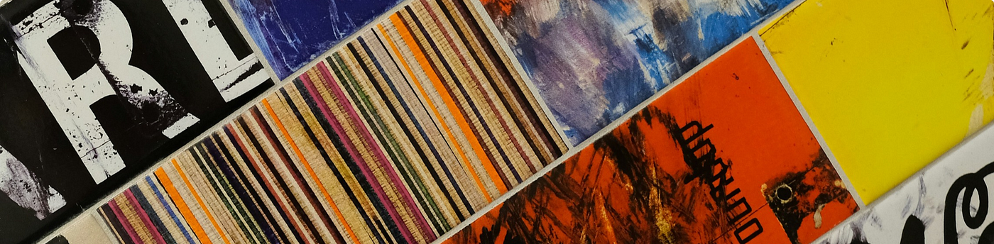
Visual design fundamentals are the basic building blocks and principles that make up successful visual communication. They’re like the grammar and vocabulary of the design world, and mastering them is essential for creating clear, impactful, and aesthetically pleasing designs.
Here’s a breakdown of the key elements and principles:
Elements:
- Line: Lines can be straight, curved, thick, thin, and can be used to create shapes, borders, and guide the viewer’s eye. (Imagine the lines in a bar graph or the curved lines in a logo)
- Shape: Shapes are two-dimensional enclosed areas. They can be geometric (squares, circles) or organic (freeform shapes like leaves). (Think of the different shapes used in icons or infographics)
- Color: Colors can evoke emotions, create hierarchy, and establish brand identity. (A calming blue used in a meditation app or the bold colors used on a fast-food restaurant sign)
- Space: This refers to the distances between elements on your design. It can be used to create a sense of balance, focus, or hierarchy. (The space between paragraphs in a text-heavy document or the intentional blank space around a product image on a website)
- Texture: Texture refers to the visual or tactile quality of a surface, and can be real or implied. (The grainy texture of a photo or the smooth, glossy texture of a button on an app)
Principles:
- Balance: Arranging elements to create a sense of visual stability and equilibrium. (Imagine a website layout where the elements on the left and right sides have equal visual weight)
- Contrast: Using differences in elements like size, color, or value to create visual interest and hierarchy. (A bright call-to-action button contrasted against a neutral background)
- Hierarchy: Organizing elements to guide the viewer’s eye and establish what’s most important. (Headings in a larger font size than body text)
- Repetition: Repeating elements or patterns to create a sense of unity and rhythm. (A company logo used consistently throughout their marketing materials)
Implementation Examples:
- A website: Using contrasting colors for the background and text to improve readability (contrast). Using a clear hierarchy with headings and subheadings to guide the user (hierarchy).
- A poster: Using bold shapes and colors to grab attention (contrast). Balancing the image and text for a visually pleasing composition (balance).
- A mobile app: Using negative space effectively to avoid cluttering the interface (space). Using clear and consistent icons to communicate functionality (repetition).
By understanding and applying these fundamentals, designers can create visuals that are not only beautiful but also effective in conveying their message.
메타데이터
- post_id
- 5eb308538786
- slug
- visual-design-fundamental-5eb308538786
- url
- https://medium.com/@rennymarcendy/visual-design-fundamental-5eb308538786
- canonical_url
- https://medium.com/@rennymarcendy/visual-design-fundamental-5eb308538786
- author_url
- https://medium.com/@rennymarcendy
- status
- ok
- fetched_at
- 2026-06-09 15:37:30





