New Data Visuals That Surface What Matters — DataViz Weekly
Explore four recent data visualization projects in DataViz Weekly, featuring charts and maps that bring important data forward.
New Data Visuals That Surface What Matters — DataViz Weekly
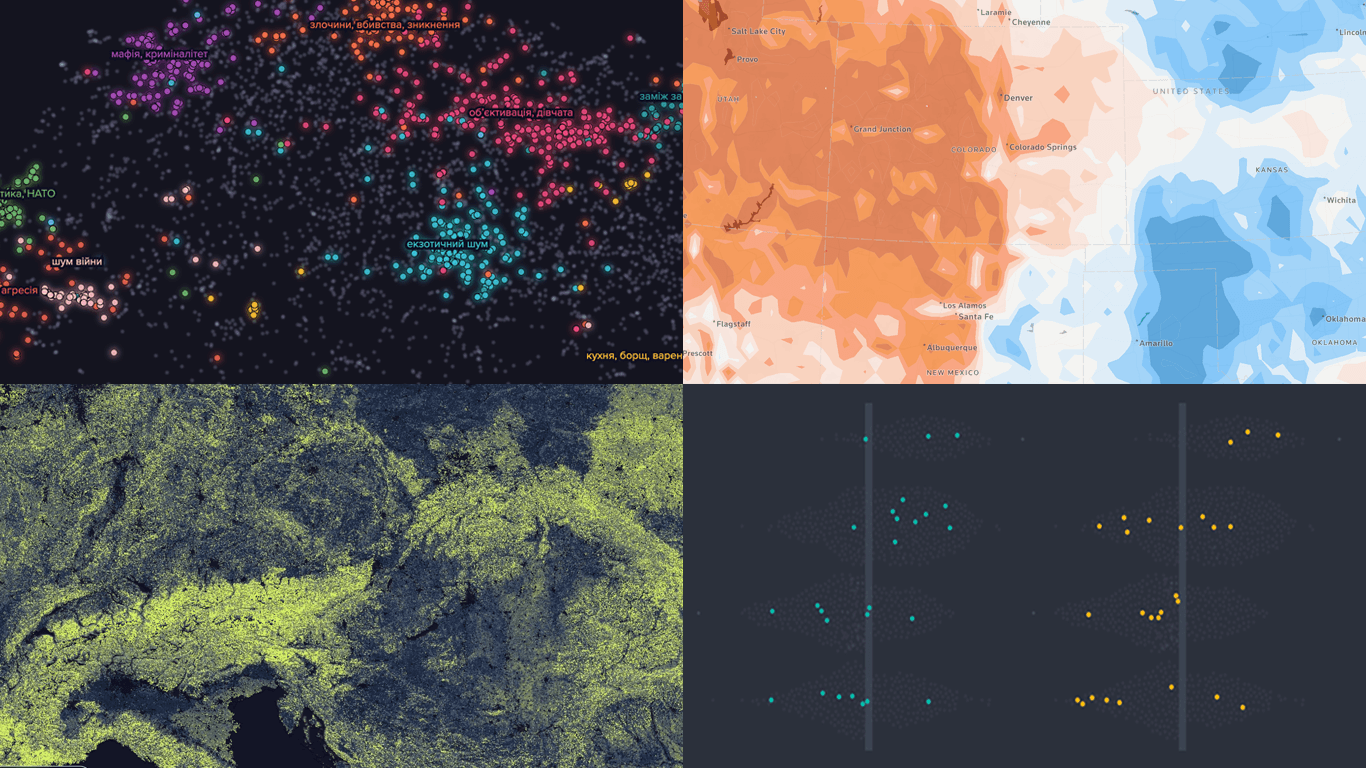
A trend, pattern, or relationship can sit inside the numbers until the right chart or map draws it out. Good data visualization brings the important part forward, in a form people can read, follow, and explore for themselves. DataViz Weekly is where we regularly highlight recent projects that show this in practice.
Here are our four picks for this edition:
- Daily temperatures against the historical norm — Reuters
- Physical profile of World Cup squads — The Straits Times
- Ukrainians in global film and TV — Texty.org.ua
- Underground fungal networks — SPUN

Daily Temperatures Against Historical Norms
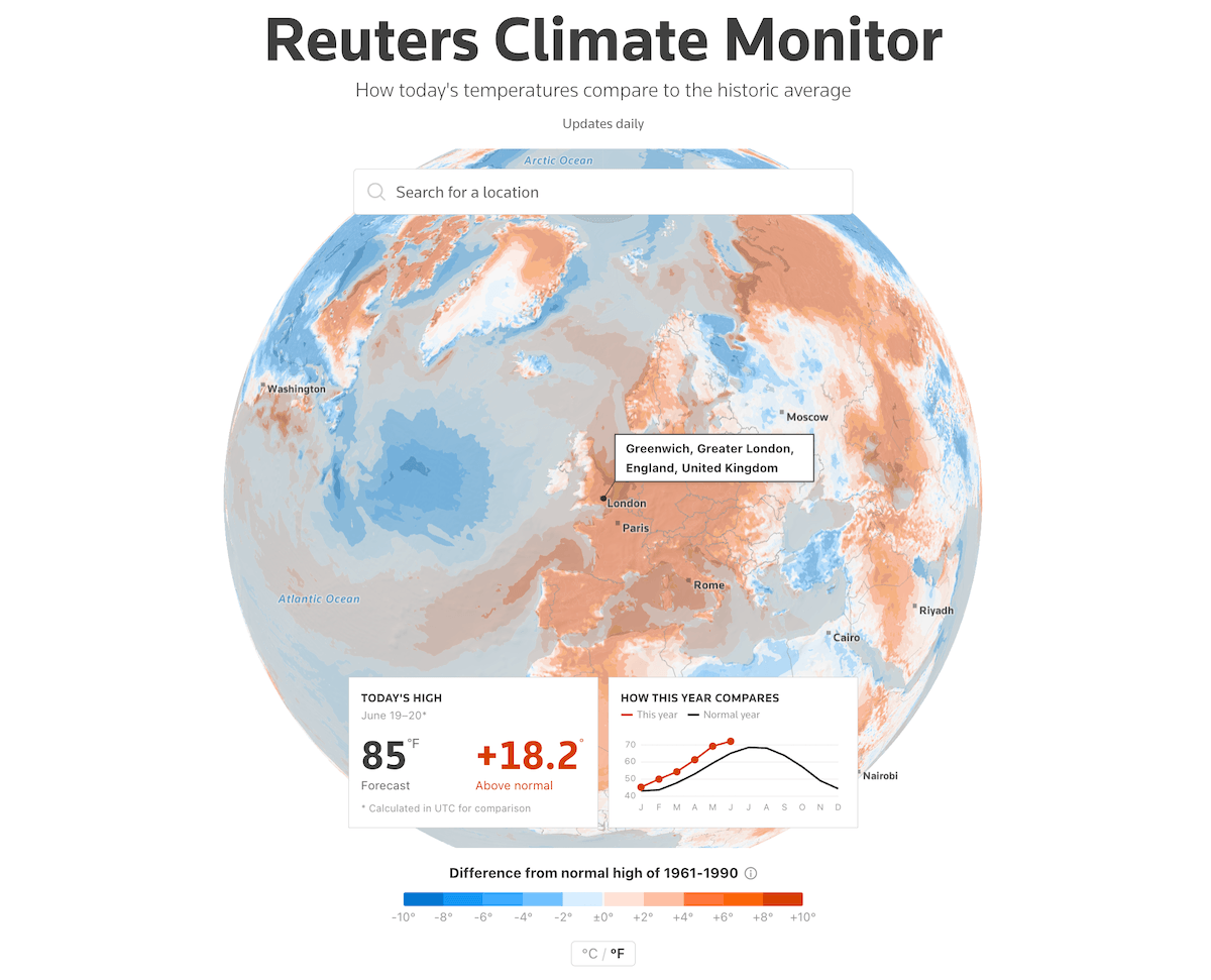
Heat is one of the clearest signals of a warming planet. On any given day, temperatures somewhere on Earth run well above or below what was normal a few decades ago.
Reuters published a daily-updating dashboard, the Climate Monitor, that compares each day’s forecast high with the local average from 1961 to 1990. The centerpiece is a 3D globe shaded on a diverging scale, blue where the day runs cooler than that baseline and orange where it runs warmer, with several cities labeled and a Celsius-Fahrenheit toggle. Search or click any spot and a panel gives its forecast high and the gap above or below normal, beside a small line chart tracing the location’s daily highs this year against the normal-year curve.
The same comparison runs worldwide as a fuller line chart, with the faint spread of individual past years behind it. A ranked table orders the six continents by their distance from normal, with a diverging bar beside each row. A grid of six area charts closes the piece, one per continent, tracing daily departures across the year in orange above the baseline and blue below, each flagging its hottest day so far.
👉 Check out the dashboard on Reuters, by Ben Welsh and Casey Miller.
Physical Profile of World Cup Squads
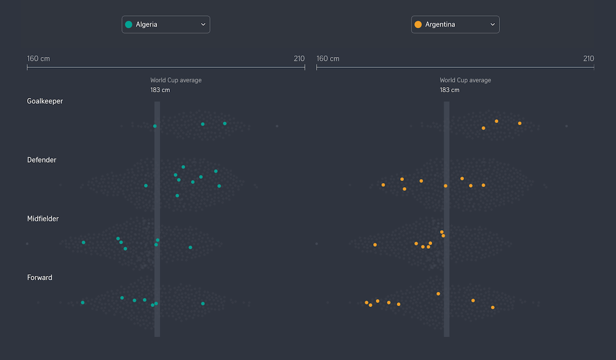
The 2026 World Cup is underway, the first with 48 teams and more than 1,200 players across three host nations. Beyond skill and tactics, the physical build of a squad varies from one nation to the next.
The Straits Times analyzed the heights of every player at the tournament by position and compared each national team against the others and against the general population back home. Drawing on football data sources and country population figures, the analysis starts with a chart that sets two selectable squads side by side, plotting each player as a colored dot in a beeswarm by position, over a faint cloud of every player at the tournament, with the World Cup average of 183 centimeters marked.
A dumbbell chart then ranks all 48 nations by squad height, each row drawn as two connected points, the squad average and the national population average, so the gap between team and country reads at a glance. A final visualization turns to age, giving each squad its own row with one dot per player along a shared scale, sorted from the youngest teams to the oldest.
Opening and closing the piece, an interactive tool takes a reader’s height, weight, year of birth, and stronger foot and matches them to the players and the squad they most resemble.
👉 See the interactive on The Straits Times, by Alyssa Mungcal, Brandon Kim, Deepanraj Ganesan, Lily Yu, Nur Hasya, Nurulshazanani Idris, and Roman Sverdan.
Ukrainians in Global Film and TV
Since Ukraine gained independence in 1991, its people have appeared in films and television series produced around the world. How they are portrayed on screen has drawn more attention in recent years.
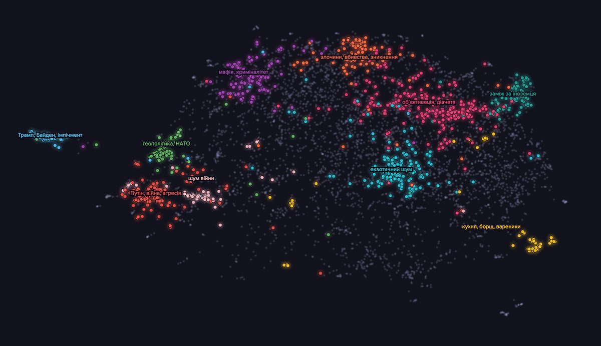
Texty.org.ua mined a large corpus of English-language film and television subtitles for every reference to Ukraine and Ukrainians since 1991, then grouped those references by theme to see which images of the country recur. The result is built around an interactive scatter plot where each dot is one short subtitle excerpt.
Excerpts that read alike sit near one another, by semantic similarity, and color marks the theme each belongs to. Ten labeled clusters appear, among them objectified portrayals of women, marriage to a foreigner, mafia and crime, war and aggression, geopolitics and NATO, and cuisine such as borscht, while grey dots fall outside the named groups.
As you scroll, the view settles on one cluster at a time alongside quotes and commentary, and a search box brings up any title to see where its mentions land. Two line charts add a time dimension: one traces the falling share of mentions that use the older form “the Ukraine” rather than “Ukraine,” and the other follows how often Ukraine is named alongside Russia across the years.
👉 Take a look at the article on Texty.org.ua, by Yevheniia Drozdova.
Mapping Underground Fungal Networks
Beneath most of the world’s plants lies a web of fungi that links their roots underground. These arbuscular mycorrhizal networks move carbon, nutrients, and water between plants and the soil, yet because they are microscopic and out of sight, their global scale has never been measured.
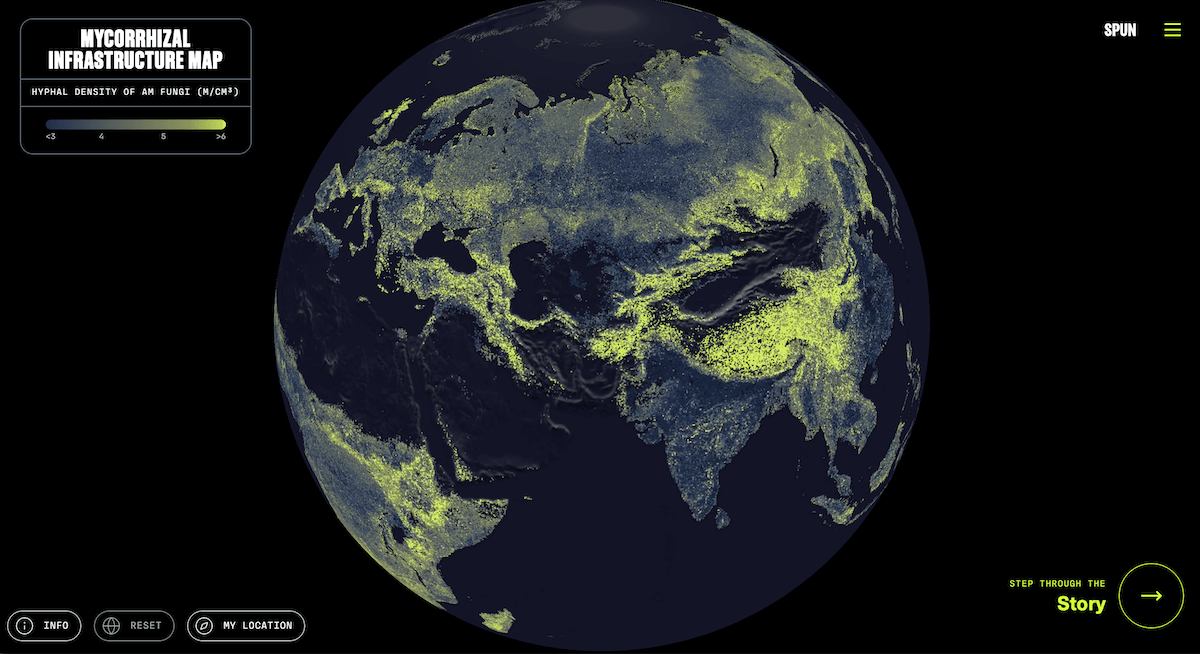
The Society for the Protection of Underground Networks (SPUN) published a map that visualizes these fungal networks based on a recent study published in Science. To build it, researchers assembled data from more than 16,000 soil cores worldwide, trained machine-learning models, and calibrated them against robotic imaging of over 300,000 living hyphae. The study’s headline figure is staggering: laid end to end, the fungal threads in the world’s topsoil would reach from the Earth to the Sun roughly a billion times.
The resulting Mycorrhizal Infrastructure Map is an interactive 3D globe whose land is shaded along a continuous scale, from dark teal where the predicted network density is low to bright yellow-green where it is high, measured in meters of hyphae per cubic centimeter of soil. The globe rotates and zooms, and returns a density reading for any point you tap.
A visual story accompanies the map, stepping through the science with its own visuals. One globe is dotted with thousands of sampling sites behind the estimate. Another threads a dashed mesh between those points, standing in for the modeling that fills the gaps. The closing sections tilt into oblique 3D terrain and zoom into single landscapes, grasslands first and croplands after, each carrying a readout with a spot’s coordinates, density, and global percentile.
👉 Explore the map and the story on SPUN, with the map designed by Moritz Stefaner (Truth & Beauty).
This edition once again shows how much the right visual form can do. A chart, map, or interactive story can pull the signal forward and give readers room to examine the data on their own. We will continue tracking recent work like this:
👉 DataViz Weekly on AnyChart Blog 👉 DataViz Weekly on Medium
Originally published at https://www.anychart.com on June 19, 2026.
메타데이터
- post_id
- a481022eb5dd
- slug
- data-matters-a481022eb5dd
- url
- https://medium.com/data-visualization-weekly/data-matters-a481022eb5dd
- canonical_url
- https://medium.com/data-visualization-weekly/data-matters-a481022eb5dd
- author_url
- https://medium.com/@anychart
- status
- ok
- fetched_at
- 2026-07-09 13:13:48