How to make ugly Arial look hella good
5 easy tips to make the Arial font better
How to make ugly Arial look hella good
If you must use Arial, here is how you can hack it.
Whether you like it or not, Arial is everywhere and sometimes you simply have no choice but to work with it. Maybe your client loves Arial, maybe it’s the brand font you are required to use, maybe you need a web-safe font for your email. All in all, as long as PC stays around and continues to favor Arial, designers should learn to be friends with Arial.
To be fair, Arial may be terrible looking, and in fact copied Helvetica, it is not a terrible font. For online reading, Arial actually makes quite a great choice for body copy due to its legible typography. However, when Arial is used as a display font (for titles and headlines, for example), it can look dull and lack personality.
Here are some ways you can make Arial look better when using it as a display font. All these tricks can be done while keeping Arial live text and not outlined or rasterized.
Arial hack #1: Tighten it up!
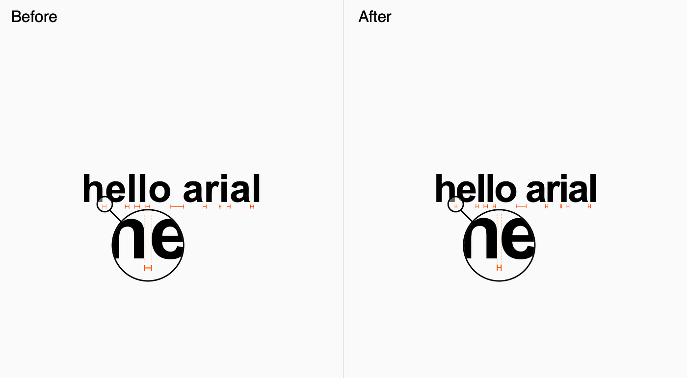
Arial with smaller spacing between characters
This trick works for both Arial Regular and Arial Bold. It can also be easily applied to a webpage by using the letter-spacing CSS property with a negative value.
It is not uncommon for designers to reduce the letter-spacing for fonts used as display fonts. Apple’s San Francisco font even comes with a text version and a display version where the display version has smaller built-in spacing between the characters to save designers some time.
Arial hack #2: Space it out with ALL CAPS
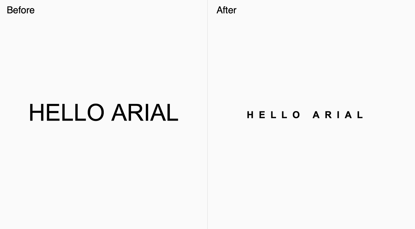
Uppercased, sized down, spaced out Arial
This is another classic typography treatment widely used by designers. This type treatment also works nicely as a subheading or tagline when paired with a larger type.
Don’t forget to reduce the font size and secure the surrounding white space for an elegant look.
Arial hack #3: Stack it tightly
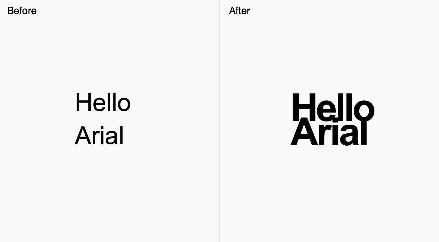
Arial Bold stacked with small line height
Arial is that you? You bet it is! This type treatment can be too much for day-to-day use, but its loud visual makes it great for callouts or logos.
Optional: use Arial Bold and reduce the kerning for a more dramatic effect (as shown above.)
Arial hack #4: Mix in different weights
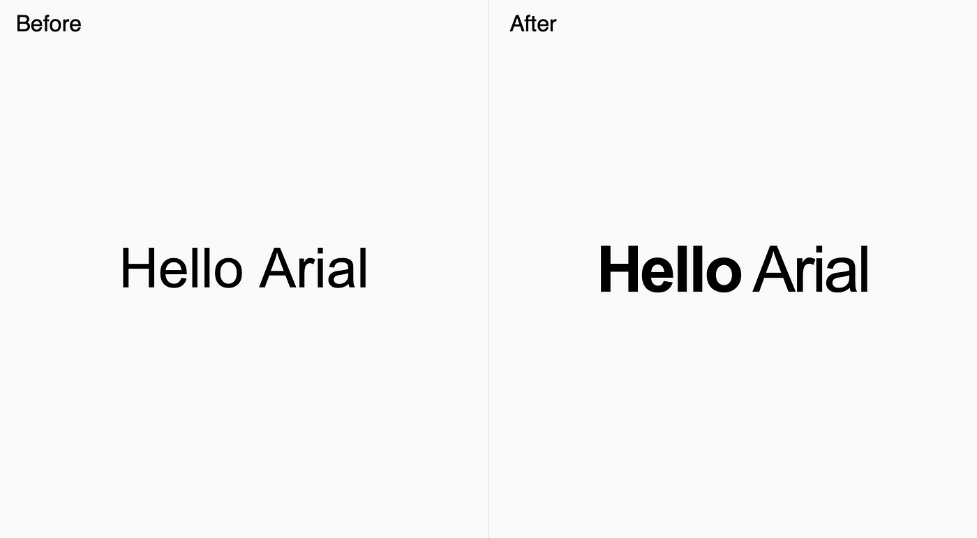
Arial Bold paired with Arial Regular
Pair Arial Regular with Arial Bold or Arial Black. Also, combine it with tighter kerning from hack #1 for a more compacted look.
This is an easy trick that’s great for emphasizing a few words in a headline while creating a unique look.
Arial hack #5: Outline uppercased Arial Black

Outlined and uppercased Arial Black
For all the minimalists out there, by using Arial Black with a 1px outline, you get to create a slick and modern style. This can be done in your design software and also in CSS.
Invert it and pair it with a black background will make it the most badass Arial you have ever seen.
Pro tip: You can mix and match all hacks above
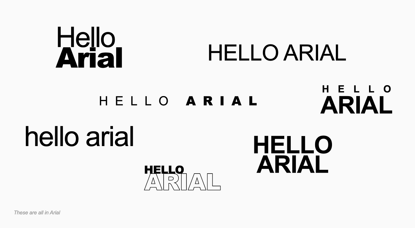
Be creative by mixing and matching all techniques above
Play around with different letter casing (all caps, title case, lowercase), spacing, font weights, text alignments, and inline vs stacking. The possibilities are endless.
All these tricks can be mostly applied to other fonts as well so give it a try if you haven’t. I focused on Arial because working with Arial seems to be a common struggle.
We all hate Arial, but….
Arial is one of the most popular fonts today. Having to work with it may not be pleasant but it is no news that a part of a designer’s job is to work with constraints. Nobody likes Arial, but if you can’t beat them, join them. Embrace Arial and it will make wonders for you. And pay your bills.

메타데이터
- post_id
- d92f51e61c1b
- slug
- how-to-make-ugly-arial-look-hella-good-d92f51e61c1b
- url
- https://medium.com/design-bootcamp/how-to-make-ugly-arial-look-hella-good-d92f51e61c1b
- canonical_url
- https://medium.com/design-bootcamp/how-to-make-ugly-arial-look-hella-good-d92f51e61c1b
- author_url
- https://medium.com/@gasolinehorse
- status
- ok
- fetched_at
- 2026-07-28 13:38:14