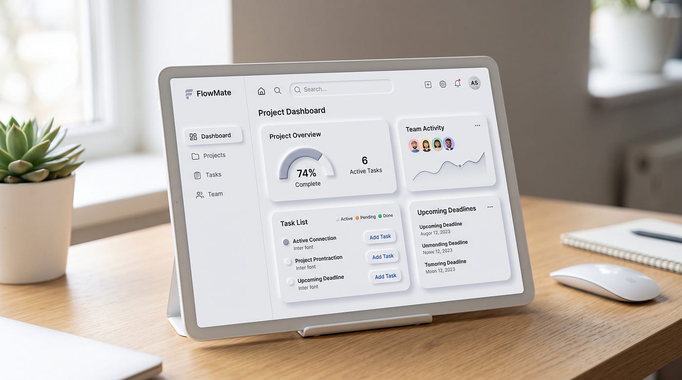
I Audited 40 Enterprise Dashboards. They All Failed the Same Way
The problem was never the data. It was who the dashboard was actually built for.
I Audited 40 Enterprise Dashboards. They All Failed the Same Way
The problem was never the data. It was who the dashboard was actually built for.
Somewhere around dashboard number twelve, I stopped taking notes on colors and chart types and started writing down a single question instead: what decision is this screen supposed to help someone make?
I was doing a discovery pass across a portfolio of internal tools for a client, the kind of engagement where you’re handed access to everything and told to figure out what’s worth fixing. Analytics dashboards, ops dashboards, executive dashboards, a dashboard someone had built specifically to track the health of other dashboards, which felt like a small, sad joke about where we’d ended up as an industry.
By the end of the audit I had gone through 40 of them. Different teams, different tools, different levels of polish. Some were built in Tableau, some in Looker, a few were custom React builds that someone clearly cared about. The visual quality varied wildly.
But the underlying pattern didn’t vary at all.
Almost every single one had been built to display information rather than answer a question. Charts stacked on charts. KPIs presented with no comparison point. Filters that let you slice the data eleven different ways with no indication of which slice actually mattered. Screens that looked impressive in a stakeholder demo and were nearly useless three months later when someone actually needed to make a decision under time pressure.
I remember sitting in a review meeting where a VP proudly clicked through a dashboard with fourteen visible metrics on a single screen, no hierarchy, no annotation, nothing telling you which number was good news and which was a warning sign. He said, “we have full visibility now.” Nobody in the room asked visibility into what, exactly, or visibility for whom.
That meeting is the reason I’m writing this.
The Difference Between a Dashboard and a Decision
Here’s the pattern I kept running into, stated as plainly as I can put it. Most enterprise dashboards are built to prove that data exists, not to help someone act on it.
Those are different jobs, and they require different design decisions. A dashboard built to prove data exists rewards completeness. Every metric that could conceivably matter gets a spot on the screen, because leaving something out feels like a risk. A dashboard built to support a decision rewards restraint. It shows you the two or three numbers that actually change what you do next, and it deliberately hides the rest behind a click.
Of the 40 dashboards I looked at, I’d estimate close to three out of four were built the first way. Comprehensive, dense, and almost entirely passive. You could look at them for a long time and come away informed, in a general sense, without ever being told what to do about what you’d just seen.
The clearest example was a customer support operations dashboard used by team leads to manage daily staffing. It displayed ticket volume, average response time, resolution rate, customer satisfaction score, agent utilization, and backlog size, all on one screen, all rendered with equal visual weight. Every number looked exactly as important as every other number.
When I sat with a team lead and watched her actually use it, she ignored five of the six metrics and scrolled straight to a small table at the bottom showing tickets aging past 24 hours. That was the number she needed to decide whether to pull someone off a lower priority queue. Everything else on the screen was context she’d already internalized from doing the job every day. The dashboard hadn’t been built around her actual decision. It had been built around what the data team was capable of measuring.
I asked her how long she’d been scrolling past those five metrics to get to the one she cared about. She said since the dashboard launched, over a year earlier. Nobody had asked her which number mattered most before building it.
What surprised me wasn’t that the dashboard was misaligned with her workflow. It was that she had simply adapted around the misalignment rather than reporting it. She didn’t think of it as the dashboard’s problem. She thought of it as something she’d learned to work around, the same way you learn which stair in your apartment creaks.
That’s the part that should worry anyone building internal tools. Users don’t always complain about bad interfaces. Often they just quietly build a personal workaround and never mention it, which means the feedback loop that’s supposed to tell you something is broken never fires.
Who Dashboards Are Actually Designed to Impress
Most people assume dashboards are built for the people who use them daily. In my experience across those 40 audits, that was rarely true. Dashboards are usually built for the person who approved the budget to build them.
This sounds cynical, but it explains almost every design decision I saw that otherwise made no sense. The dense, comprehensive layouts. The insistence on showing every metric a stakeholder might ask about in a meeting, rather than the two metrics an operator actually needs to do their job. The heavy use of large, satisfying looking numbers at the top of the screen, the kind that read well on a projector during a quarterly review but tell you nothing useful when you’re staring at them alone at 9am trying to decide whether to escalate an issue.
There’s a specific failure mode I started calling the demo dashboard. It’s built, consciously or not, to be presented once, in a room, to someone senior, as proof that a team has “visibility” or “data maturity.” It gets built for that one presentation. It performs well in that one presentation. And then it gets adopted as the permanent daily tool for people whose actual workflow was never considered, because by the time daily users start interacting with it, the political win has already been claimed.
I found four separate dashboards across the audit that had clearly been built primarily for a single executive review meeting, evidenced by version history showing almost no changes since the initial launch date, months or years earlier. The teams using them daily had simply adapted their behavior around a tool that had never been designed with their actual decisions in mind.
This is where the psychology gets interesting. Nielsen Norman Group has written extensively about the gap between what stakeholders say they want from a dashboard and what actually drives usage, and the pattern holds here. Stakeholders ask for comprehensiveness because comprehensiveness feels safe. Nobody gets criticized in a meeting for showing too much data. But comprehensiveness is almost always the wrong design goal for a tool someone has to use fifteen times a day under time pressure.
One lesson I didn’t expect from this audit is how often the person requesting the dashboard and the person using the dashboard had never actually spoken to each other. The requirements came down through a product manager, sometimes through two layers of product managers, and by the time they reached the design or engineering team building the thing, the actual daily user’s workflow had been abstracted into a bullet list of “must have metrics” with no decision context attached at all.
If you’re building an internal tool right now, this is worth checking directly. Ask whoever requested it who will use this daily, and then go watch that person work for twenty minutes before you design anything. It sounds obvious. In my experience it happens far less often than it should.
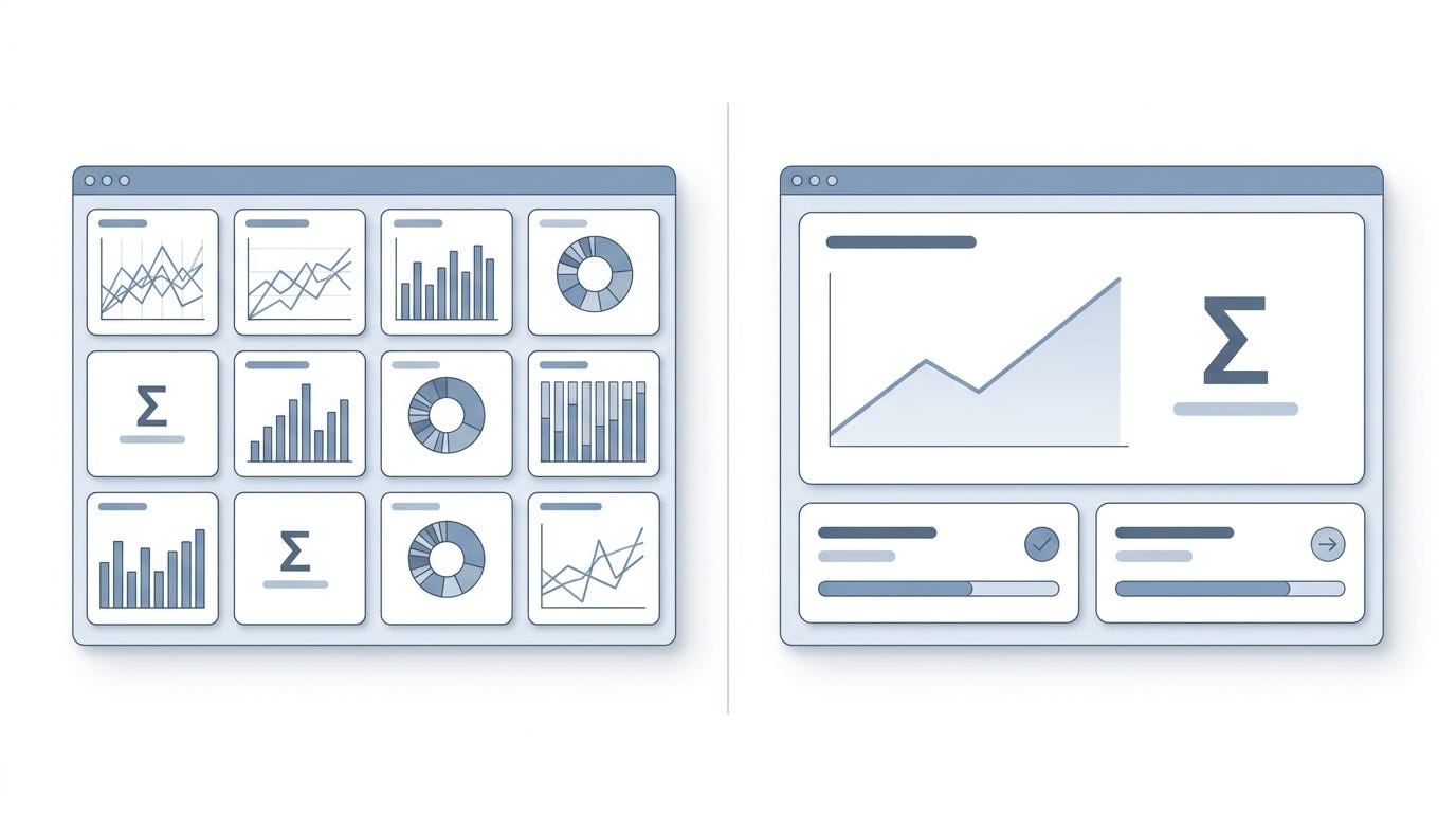
Diagram comparing two dashboard interfaces side by side
The Cognitive Load Nobody Budgets For
Here’s something that became obvious once I started watching real people use these tools instead of just reviewing screenshots. Every additional metric on a dashboard isn’t free. It costs the viewer processing time, and that cost compounds with every added element on the screen.
This is a well established idea in cognitive psychology, going back to research on visual search and working memory limits, but it gets ignored constantly in enterprise tool design because the cost is invisible to the people building the dashboard. The engineer who adds a fifteenth chart doesn’t feel the tax. The person staring at fifteen charts every morning at 8am, trying to figure out which one requires action today, feels it every single time.
I watched this play out with a sales operations dashboard that had grown over three years through a long series of well intentioned additions. Someone asked for a regional breakdown, so it got added. Someone else wanted a year over year comparison, so that got added too. A different stakeholder wanted pipeline velocity tracked separately from close rate. Each addition made sense in isolation. Nobody who approved any single addition was thinking about the cumulative effect on someone scanning the whole screen in under thirty seconds, which is roughly how long the actual users told me they typically spent looking at it before moving on with their day.
The result was a dashboard where the single most important number for daily decision making, whether the team was on pace to hit the monthly target, was visually identical in size and placement to a regional breakdown chart that maybe mattered once a quarter. There was no hierarchy communicating which of the fifteen elements on the screen deserved thirty seconds of attention and which deserved three seconds or none at all.
I redesigned that particular dashboard around a simple rule that I now apply as a starting point on every dashboard project. One primary metric, sized and positioned so it’s impossible to miss. Two or three supporting metrics that provide context for the primary one. Everything else moved behind a secondary view, accessible but not competing for attention on first glance.
The sales team’s response to the redesign was almost anticlimactic. Nobody sent an excited message. A few people mentioned it took them less time to check in the morning. That muted reaction is itself worth noting, because it’s the same pattern I’ve seen with other quiet, correct changes to internal tools. Good design in this context doesn’t generate enthusiasm. It generates the absence of friction, which people rarely think to mention because they’ve stopped noticing it.
What changed after I understood this wasn’t just how I laid out charts. It changed how I run early conversations with stakeholders. I now ask a specific question before any dashboard work begins: if you could only see one number on this screen, what would it be. The answers to that question are almost always more honest and more useful than the full list of “must have” metrics that comes out of a requirements meeting, because it forces someone to actually rank what matters instead of listing everything that theoretically could.
What Gets Lost When Nobody Owns the Decision
There’s a deeper issue underneath all of this, and it took me longer to see clearly. Most of these 40 dashboards had no clear owner responsible for whether they actually worked, only an owner responsible for whether they got built and shipped.
This distinction matters more than it sounds like it should. A dashboard that gets built and shipped on schedule is, from a project management perspective, a success. Whether anyone uses it correctly six months later, whether it actually improves decision speed or quality, whether people have quietly started ignoring half of it, none of that shows up in the original success criteria, because nobody defined success in those terms to begin with.
I found this out directly when I asked a data team lead how they measured whether a dashboard was working. His honest answer was adoption, meaning login counts and page views. That’s a measurement of exposure, not effectiveness. A dashboard can have high login counts because people are forced to check it as part of a daily standup ritual, while simultaneously being nearly useless for the actual decisions it was meant to support. Those two facts can coexist indefinitely, because nothing in the measurement framework would ever surface the contradiction.
This is where the business implications get real. Poor dashboard design isn’t a cosmetic problem. It’s a decision latency problem. Every extra second someone spends hunting for the number that matters, every misread metric caused by ambiguous hierarchy, every workaround someone quietly builds because the tool doesn’t match their workflow, all of that compounds across a team, across a quarter, across however many people are using the tool daily.
I tried to estimate this cost concretely on one project, for the support operations dashboard I mentioned earlier. The team lead I shadowed spent roughly ninety seconds each morning scrolling past metrics she didn’t need to find the one she did. Ninety seconds sounds trivial until you multiply it by every team lead doing the same scroll, every day, for a year, plus every moment of hesitation caused by unclear hierarchy during an actual staffing decision under pressure. None of that shows up on a P&L. All of it is real cost.
What I’ve learned is that the fix isn’t more data literacy training, which is the answer I hear proposed most often when a dashboard clearly isn’t working. Training people to interpret a badly designed tool more effectively treats the symptom. The actual fix is assigning ownership over outcomes, not just delivery. Someone needs to be accountable for whether the dashboard is still answering the right question a year after launch, the same way someone is accountable for whether a feature is still driving retention a year after it ships.
Very few organizations I’ve worked with treat internal tools with that level of ongoing scrutiny. External-facing products get iterated constantly because revenue is visibly at stake. Internal dashboards get built once and left alone for years, because the cost of their dysfunction is distributed quietly across dozens of individual daily frustrations rather than concentrated in a single metric anyone is watching.
The One Rule That Changed How I Build Dashboards Now
After going through all 40 of these audits, I settled on a framework I now use at the very start of every dashboard project, before a single wireframe gets made.
I ask three questions, in this order, and I refuse to move forward until I have honest answers to all three.
Who is looking at this screen, specifically, by role and by moment in their day. Not “the operations team.” A specific person, at a specific point in their workflow, usually under some form of time pressure.
What decision are they trying to make when they open this. Not what information do they want. What action comes next depending on what they see. If nobody can answer this clearly, that’s usually a sign the dashboard is being requested for visibility rather than action, which is worth naming honestly rather than building around anyway.
What would make them ignore everything else on the screen and act immediately. This is the question that surfaces the one number that actually deserves visual priority. Everything else gets organized around it, not next to it.
I used this framework on a rebuild of an internal fraud monitoring dashboard for a fintech client, one of the more consequential examples from the audit. The original version displayed around twenty metrics with equal visual weight, everything from transaction volume to geographic distribution to a rolling fraud rate percentage. Analysts using it told me they mentally filtered out most of the screen every single time, focusing only on a rate of change indicator that wasn’t even visually distinct from the rest.
We rebuilt it around a single primary signal, a threshold-based alert showing anomalous transaction patterns requiring immediate review, sized to dominate the top of the screen. Supporting context sat directly beneath it. Everything else moved to a secondary tab, still available, no longer competing for attention.
The measurable result, tracked over the following quarter, was a meaningful drop in the average time between an anomaly appearing in the data and an analyst opening a case to investigate it. That’s not a vanity metric. In fraud detection, that gap directly correlates with financial exposure. It was one of the clearer demonstrations I’ve had that this kind of design work isn’t a stylistic preference. It’s operational.
What I’ve learned, and what I’d say to anyone building an internal tool right now, is that the instinct to show everything comes from a reasonable place. Nobody wants to be blamed for hiding a metric that later turns out to matter. But that instinct, left unchecked, produces exactly the kind of dashboards I spent weeks documenting across this audit. Comprehensive, defensible in a meeting, and quietly useless to the person who actually has to act on what they’re looking at every single day.
The fix isn’t complicated, but it does require someone in the room willing to say no to a stakeholder’s request to add just one more metric. That conversation is uncomfortable. It’s also the entire job.
Somewhere in my notes from that engagement, I wrote down a sentence I still think about: a dashboard that shows everything is a dashboard that has decided nothing on the user’s behalf.
That’s the sentence I’d want someone to remember from all forty of those reviews. Not the specific tools, not the client names, not even the fraud detection example, satisfying as that outcome was. Just that one idea. Every dashboard is making a decision about what matters, whether the team building it admits that or not. The only question is whether that decision gets made deliberately, by someone who understands the actual work being done, or by default, through the slow accumulation of every stakeholder request nobody had the standing to refuse.
I think about that team lead scrolling past five metrics every morning more than I think about most of the flashier projects I’ve worked on. Nobody ever filed a complaint about that dashboard. It just sat there, technically functioning, quietly costing her ninety seconds and a small amount of friction every single day for a year, because the person who built it never asked her what she actually needed to see first.
That’s the pattern. Not bad intentions. Not lack of skill. Just a gap between who requests a tool and who lives inside it every day, and nobody positioned to close that gap before it shipped.
If you have access to a dashboard your team uses daily, right now, today, it’s worth going and actually watching someone use it. Not asking them if it works. Watching what they scroll past, what they ignore, what they’ve quietly built a workaround for. You’ll probably learn more in twenty minutes than any requirements document could tell you.
What’s the one metric on your team’s dashboard that everyone scrolls past, and has anyone ever asked why?
메타데이터
- post_id
- e8bda829b37a
- slug
- i-audited-40-enterprise-dashboards-they-all-failed-the-same-way-e8bda829b37a
- url
- https://medium.com/design-bootcamp/i-audited-40-enterprise-dashboards-they-all-failed-the-same-way-e8bda829b37a
- canonical_url
- https://medium.com/design-bootcamp/i-audited-40-enterprise-dashboards-they-all-failed-the-same-way-e8bda829b37a
- author_url
- https://medium.com/@Jason-Han
- status
- ok
- fetched_at
- 2026-07-16 05:23:09