Dark Mode Is Not an Inversion. Building It Right From the Token Layer Up
Why simply flipping colors fails — and how token-driven theming creates scalable, maintainable dark mode experiences.
Dark Mode Is Not an Inversion. Building It Right From the Token Layer Up
Why simply flipping colors fails — and how token-driven theming creates scalable, maintainable dark mode experiences.
Disclaimer: I earn a small amount when Medium members read my work, so this article is set to members-only. Not a member? You can still read the full article using my friend link.
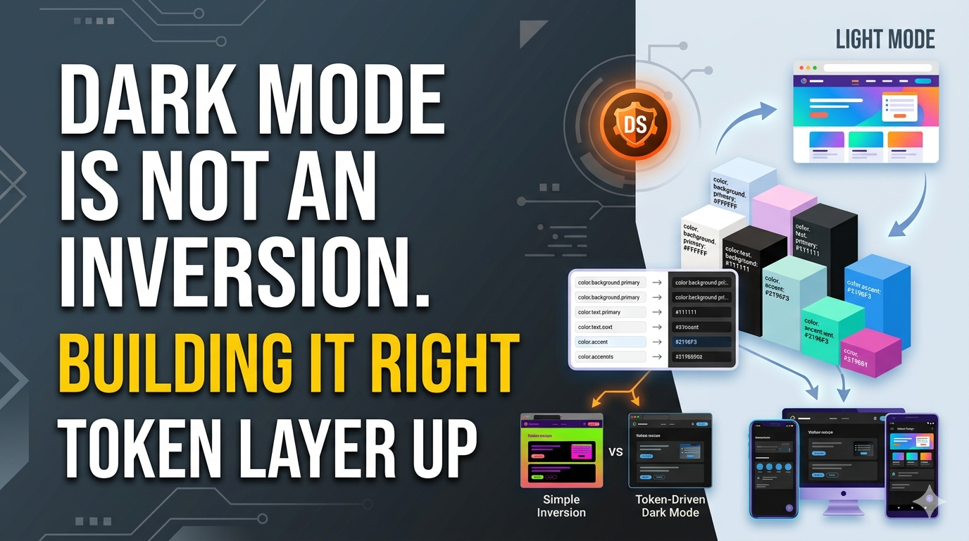
Dark mode isn’t just light mode flipped upside down. A token-driven approach creates scalable, accessible, and maintainable themes across products and platforms.
The Biggest Dark Mode Misconception
Dark mode has become one of the most requested features in digital products. From operating systems and productivity tools to banking apps and streaming platforms, users increasingly expect the option to switch between light and dark experiences. Yet many organizations still approach dark mode as if it were a simple visual trick. They invert colors, darken backgrounds, brighten text, and call it a day. The result often looks acceptable at first glance, but the experience quickly falls apart when users interact with the interface for extended periods.
The problem is that dark mode is not a color inversion exercise. It is a complete design system adaptation. A well-designed dark theme requires intentional decisions about hierarchy, contrast, elevation, accessibility, and emotional tone. Simply flipping black to white and white to black creates visual noise, inconsistent emphasis, and uncomfortable reading experiences. Imagine repainting a house without considering lighting, furniture, or room purpose. The paint changes, but the experience of living inside the house becomes awkward. The same thing happens when teams treat dark mode as a cosmetic filter.
Organizations that build successful dark experiences understand a critical principle: dark mode starts at the foundation of the design system. It begins with tokens, semantics, and component behavior rather than surface-level color replacements. That is where sustainable theming begins.
Why Color Inversion Fails
When designers invert colors mechanically, they ignore the relationships between interface elements. A color that works perfectly on a white background may become overwhelming on a dark surface. Shadows lose meaning. Borders become distracting. Accent colors appear oversaturated. Visual hierarchy collapses because elements compete for attention rather than guiding the user’s eye.
Consider a warning message in a light theme. Its visual prominence depends on surrounding context. If the same color is copied directly into dark mode, it may become too bright and dominate the entire screen. Users notice the warning, but they also lose focus on everything else. Effective dark themes require rebalancing visual weight, not merely replacing colors.
This is why mature design teams create dedicated dark mode systems rather than applying automated transformations. They design experiences intentionally rather than disguising existing interfaces with a darker costume.
Understanding the Purpose of Dark Mode
Dark mode exists for reasons beyond aesthetics. While many users appreciate its modern appearance, the primary benefits involve comfort, focus, accessibility, and environmental adaptability. Understanding these goals helps teams make better design decisions.
Users often interact with products in dimly lit environments. Reading bright interfaces at night can feel like staring into a flashlight. Dark mode reduces perceived brightness and creates a more comfortable viewing experience. This benefit is especially valuable for professionals who spend hours inside productivity tools, dashboards, development environments, and creative software.
Dark themes also help establish different emotional tones. Light interfaces often feel open, energetic, and informative. Dark interfaces frequently feel focused, premium, immersive, and cinematic. Streaming platforms, gaming applications, and creative tools leverage these characteristics effectively because dark surfaces help content stand out.
User Comfort and Accessibility
Accessibility plays a major role in dark mode design. Different users have different visual needs. Some individuals find dark themes easier to read, while others prefer light interfaces. The goal is not to declare one mode superior. The goal is to provide flexible experiences that accommodate diverse preferences and contexts.
Comfort depends on balance. Excessively bright text on pure black backgrounds creates visual strain because the contrast becomes too aggressive. Readers experience a phenomenon known as halation, where bright text appears to glow against dark surfaces. This effect reduces readability and increases fatigue during long sessions.
Well-designed dark themes soften these extremes. They maintain strong contrast without creating harsh visual conditions. Accessibility is not about maximizing contrast blindly; it is about creating sustainable readability.
Contextual Usage Scenarios
Context matters just as much as accessibility. A finance dashboard used in daylight conditions may prioritize clarity and data density. A media streaming platform used in dark living rooms may prioritize immersion. Both products can support dark mode, but their implementation strategies differ significantly.
This is why design systems must define theme behavior intentionally. Different products have different goals, users, and environments. Dark mode should support those realities rather than forcing a generic visual solution onto every interface.
The Difference Between Themes and Filters
One of the most important distinctions in design systems is the difference between a theme and a filter. A filter modifies appearance without changing underlying design decisions. A theme redefines those decisions according to a new context.
When organizations apply dark overlays or automated inversions, they create filters. When they redefine semantic colors, elevation models, typography treatments, and component states, they create themes. The difference may seem subtle, but the user experience impact is enormous.
A true theme understands meaning. A card surface remains a card surface regardless of theme. A success message remains a success message. A primary action remains a primary action. What changes is how those concepts are expressed visually under different lighting conditions and interface contexts.
Designing Intentional Experiences
Intentional theming requires asking better questions. Instead of asking, “What should this color become in dark mode?” teams should ask, “What purpose does this element serve, and how should that purpose be communicated in a dark environment?”
This shift transforms design discussions. Teams move away from visual substitution and toward semantic design thinking. The result is a system that scales gracefully rather than breaking under complexity.
Starting at the Token Layer
The foundation of modern theming is the design token system. Tokens represent design decisions in a reusable and platform-independent format. They define colors, typography, spacing, elevation, motion, and other foundational properties.
Without tokens, dark mode quickly becomes difficult to maintain. Designers manually update colors across hundreds of components. Developers duplicate styling logic. Inconsistencies multiply with every release. A token-driven approach eliminates these challenges by creating centralized design decisions.
Instead of assigning a component a hardcoded color value, designers assign a semantic token. The token determines how that component appears in light mode and dark mode. When themes change, the component automatically adapts.
What Design Tokens Actually Do
Think of tokens as the DNA of a design system. Components inherit behavior from token definitions. This structure allows organizations to scale interfaces across products, teams, and platforms without losing consistency.
Foundation Tokens vs Semantic Tokens
Foundation Tokens
- Raw design values such as colors, spacing, typography sizes, border radii, and shadows.
- Serve as the base building blocks of the design system.
- Semantic Tokens
- Meaning-based assignments such as Primary Surface, Secondary Text, or Error Background.
- Separate visual appearance from functional intent.
Component Tokens
- Values assigned to specific UI components like buttons, cards, inputs, and navigation elements.
- Help components inherit consistent styling behavior.
Theme Tokens
- Theme-specific variations that support both light and dark experiences.
- Allow interfaces to adapt without changing component structure.
Building a Semantic Color System
A successful dark theme depends on semantic color architecture. Instead of naming colors according to appearance, teams define colors according to purpose. This approach prevents chaos as products evolve.
Surface Tokens
Surfaces create the structural layers of an interface. Backgrounds, cards, modals, navigation panels, and containers all rely on surface tokens. In dark mode, these surfaces should not all share the same shade. Layering requires subtle variation.
Many inexperienced implementations use pure black everywhere. The result feels flat and lifeless. Effective dark themes create depth through carefully controlled surface differentiation.
Content Tokens
Content tokens define text, icons, and informational elements. These tokens ensure readability across varying surface levels. Rather than using pure white, many successful systems use softened light tones that reduce glare while maintaining accessibility.
Feedback and Status Tokens
Success, warning, error, and informational states require special attention in dark environments. Colors behave differently against dark backgrounds. Saturation, brightness, and perceived intensity often increase dramatically. Semantic token systems allow teams to calibrate these experiences thoughtfully.
Contrast and Accessibility Approaches
Pure Black + Pure White
- Creates extremely high contrast.
- Can lead to visual fatigue and eye strain during prolonged use.
- Often causes a “glowing text” effect known as halation.
Soft Dark Gray + Off-White
- Produces a more comfortable reading experience.
- Reduces glare while maintaining accessibility standards.
- Commonly used in modern applications and operating systems.
Layered Surface Tones
- Introduces subtle variations between backgrounds, cards, modals, and panels.
- Improves depth perception and visual hierarchy.
- Makes interfaces feel more refined and easier to navigate.
Avoiding Pure Black and Pure White
Many leading products avoid pure black (#000000) and pure white (#FFFFFF) combinations. Instead, they use softened tones that reduce visual strain. This approach improves readability and creates more sophisticated aesthetics.
ApproachResultPure Black + Pure WhiteHarsh contrast and eye strainSoft Dark Gray + Off-WhiteBetter comfort and readabilityLayered Surface TonesStronger depth perception
The goal is balance rather than extremes. Users should feel comfortable after hours of interaction, not just during a quick visual review.
Typography in Dark Mode
Typography behaves differently in dark environments. Letterforms often appear thicker due to contrast effects. Text spacing may require adjustments. Hierarchy must remain clear despite reduced luminance.
Readability Challenges
Designers frequently underestimate typography’s role in dark mode success. A beautiful color palette cannot compensate for difficult reading experiences. Long-form content, dashboards, documentation, and data-heavy products all depend on strong typographic systems.
Successful teams test typography extensively across devices, screen sizes, and lighting conditions. They optimize for real-world usage rather than design mockups.
Components That Need Special Attention
Certain components require more adaptation than others. Cards, modals, forms, tables, and navigation structures often reveal weaknesses in theme architecture.
Cards, Modals, and Navigation
These components rely heavily on elevation cues. Traditional shadows become less effective on dark backgrounds. Teams often introduce alternative depth indicators such as tonal variation, subtle borders, and layered surfaces.
Forms and Data Tables
Forms and tables present unique challenges because they contain dense information. Input states, focus indicators, validation messages, and data hierarchy must remain clear without overwhelming users.
A thoughtful token architecture helps maintain clarity while preserving consistency across themes.
Cross-Platform Dark Mode Considerations
Modern products rarely exist on a single platform. They span web applications, iOS devices, Android devices, and increasingly other ecosystems. A successful dark mode strategy must support all of them.
Web
- Must account for browser inconsistencies and varying display technologies.
- Requires responsive behavior across desktop, tablet, and mobile browsers.
- Needs support for user theme preferences and accessibility settings.
iOS
- Should align with Apple’s Human Interface Guidelines.
- Integrates with system-wide appearance settings.
- Benefits from native dark mode behaviors and animations.
Android
- Follows Material Design theming principles.
- Must accommodate a wide range of screen sizes and device manufacturers.
- Requires flexibility to support diverse hardware environments.
Testing and Governance
Dark mode should be treated as a product feature rather than a visual enhancement. That means testing, documentation, and governance are essential.
Maintaining Theme Consistency
Teams should review components regularly, document token usage, and establish clear contribution processes. Governance prevents fragmentation and ensures that future updates maintain theme integrity.
Without governance, dark mode slowly becomes inconsistent as new features introduce unplanned visual variations.
Future-Proofing Your Theme Architecture
Technology continues to evolve. Adaptive interfaces, AI-driven personalization, wearable devices, and emerging display technologies will create new theming challenges. Organizations that build semantic token systems today will be better positioned to adapt tomorrow.
Future-proofing is not about predicting every trend. It is about creating flexible foundations. Token-driven systems allow teams to respond to change without rebuilding entire design ecosystems.
FAQs
1. Why is color inversion not enough for dark mode?
Color inversion ignores hierarchy, accessibility, contrast balance, and component behavior. It changes appearance without redesigning the experience.
2. What are semantic tokens in dark mode design?
Semantic tokens represent meaning rather than specific colors. Examples include Surface Primary, Text Secondary, and Success Background.
3. Should dark mode use pure black backgrounds?
Not always. Many successful products use dark grays instead of pure black to improve comfort, depth, and readability.
4. How do design tokens help maintain dark mode?
Design tokens centralize design decisions, allowing components to adapt automatically across light and dark themes.
5. What is the biggest mistake teams make with dark mode?
The most common mistake is treating dark mode as a visual afterthought instead of designing it as a complete thematic system from the foundation up.
Conclusion
Dark mode is not an inversion. It is not a filter, an overlay, or a shortcut. If a dark theme is created by simply flipping colors, it may look different, but it does not function as a thoughtfully designed experience. That approach produces a costume rather than a system.
The strongest dark mode implementations begin at the token layer. They use semantic design decisions, accessibility-focused contrast strategies, adaptive component behavior, and scalable governance models. They understand that every visual element exists within a broader ecosystem of meaning and interaction.
When organizations embrace this mindset, dark mode becomes more than a feature. It becomes a natural extension of the design system itself — consistent, maintainable, accessible, and genuinely useful across every platform.
메타데이터
- post_id
- f2094136c038
- slug
- dark-mode-is-not-an-inversion-building-it-right-from-the-token-layer-up-f2094136c038
- url
- https://medium.com/@madheshp/dark-mode-is-not-an-inversion-building-it-right-from-the-token-layer-up-f2094136c038
- canonical_url
- https://medium.com/@madheshp/dark-mode-is-not-an-inversion-building-it-right-from-the-token-layer-up-f2094136c038
- author_url
- https://medium.com/@madheshp
- status
- ok
- fetched_at
- 2026-06-09 15:37:30