Plotly Newsletter, January 2026
The new year is officially here, and we’re starting it with fresh energy at Plotly! 🎊✨ Whether you’re joining virtually or face-to-face…
Plotly Newsletter, January 2026
The new year is officially here, and we’re starting it with fresh energy at Plotly! 🎊✨ Whether you’re joining virtually or face-to-face, we’ve got a lot lined up this year. Get ready to discover what’s new and next in data visualization with Plotly!
In this newsletter:
- Upcoming Webinar — Meet Plotly Cloud: Dash Apps as a Team Sport
- The New Plotly Studio: AI-first business intelligence and analytics
- Meet the New Plotly Studio
- Plotly x IBCS App Challenge
- New resources to learn data viz & Plotly
- Resources
☁️ Meet Plotly Cloud: Dash Apps as a Team Sport
You’ve analyzed the data. Maybe run a few models. The insights are solid, your stakeholders are impressed, and now comes the question: how do we actually turn this into something everyone can benefit from?
Join us February 10 @ 11am EST for a webinar that shows you a better way: Plotly Cloud, our platform that transforms ad-hoc analysis into collaborative analytics workflows so your team can focus on finding insights, not wrestling with distribution.
Featuring a special guest: Dan Fink, VP of Engineering at BuildingLogiX, is joining us to share how his team shifted from siloed work to seamless collaboration in 5 months using Plotly Cloud. Real wins, real challenges, real lessons learned. Nathan Drezner, Plotly’s Technical Product Manager, will demo team workspaces, stakeholder collaboration features, and deployment workflows that eliminate the “how do we share this?” bottleneck.
If you’re working with Dash, then you don’t want to miss this one — save your spot!
🤖 The New Plotly Studio: AI-first business intelligence and analytics
Remember when data work was about discovery, not maintenance? When you spent your days uncovering patterns instead of troubleshooting broken pipelines and tweaking hex codes?
Our January 27 session revealed a different approach. We walked through Plotly Studio, our AI-powered analytics platform designed to handle the tedious parts so you can focus on what matters: the insights themselves.
In the recording, you’ll see real-time demonstrations of analytics that update automatically, dashboards that adapt to your needs with simple requests, and interactive reports stakeholders can explore independently. Watch on-demand now!
[embed]
📊 Meet the New Plotly Studio
Business intelligence is fundamentally changing. The old playbook — static dashboards, rigid templates, weeks of development time — doesn’t match what’s possible today. Data analytics teams need always-on insights that support timely action, not just historical data reports and charts that take months to customize.
The latest version of Plotly Studio reflects this shift. It generates interactive, production-grade analytics apps and dashboards from your data in under a minute, dynamically connecting to any Python-accessible data source and beyond. AI writes clean Python code to build your dashboards, which you can then refine with natural language or edit directly. When you’re ready, publish to Plotly Cloud or Dash Enterprise with one click.
Plotly Studio handles the full cycle: data connection, exploration, dashboard creation, collaboration, and production deployment, all while maintaining the trust and auditability that code-based analytics provide.
As Chris Parmer, our CPO and Co-Founder, puts it: “BI vendors are raising prices while bolting on AI features that don’t match what’s possible now. That gap is only widening. We’ve built Plotly Studio for the new reality of BI and analytics.”
Read the full announcement and dive deeper into what’s new.
💼 Plotly x IBCS App Challenge
We’re kicking off 2026 with a new app challenge: create reusable prompt templates for IBCS chart types in Plotly Studio.
The International Business Communication Standards (IBCS) provide a universal framework for clear, consistent business charts, and we aim to harness Plotly Studio’s power to make these standards accessible to everyone. Your mission is to choose an IBCS chart from their official examples, recreate it in Plotly Studio with a similar dataset, and craft a comprehensive prompt that others can reuse. Submit your chosen chart type, an image of your Plotly Studio creation, and your complete prompt by end of day February 15, 2026 for a chance to win a cash prize
🤩 New resources to learn data viz & Plotly
Plotly Studio Benchmarks
Most AI data tools look impressive in demos. But what happens when you throw messy, real-world datasets at them?
We wanted to know the answer, so we built a benchmarking system to evaluate AI. Every day, Plotly Studio automatically generates dashboards from 111 diverse datasets — finance, healthcare, climate, sports, supply chain, and more — spanning simple CSVs to complex 100k-row files.
The result? A 99.1% success rate with a median generation time of 98 seconds. Browse our complete benchmark gallery to see exactly how Plotly Studio handles hundreds of real use cases. Every example includes the generated dashboard, the underlying dataset, and the Python code that powers it, so you can see precisely what you’re getting.
New Examples Page
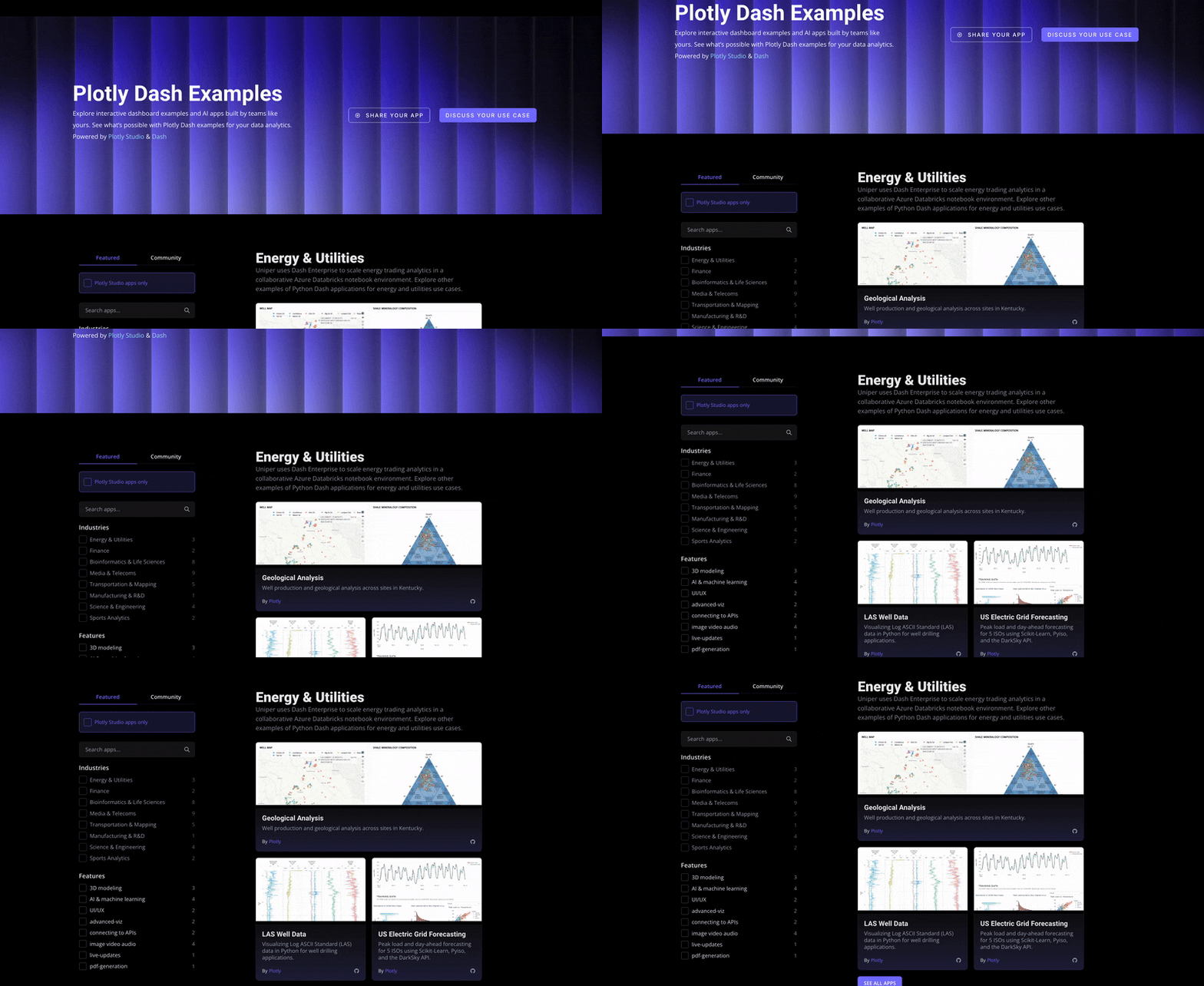
We’ve redesigned our examples page with a cleaner look and easier navigation. Browse real-world data apps from organizations like S&P Global, Berkeley Materials Project, and the Kansas City Chiefs, filtered by industry or analytics use cases.
See what’s possible with Plotly across finance, healthcare, sports, machine learning, geospatial analysis, and more. Plus, check out our new Plotly Studio section for AI-powered apps built in under a minute.
Plotly University
We’re building Plotly University to teach data visualization and dashboard development best practices to the global community.
We’re creating learning resources across three categories: Plotly Studio tutorials, data visualization best practices, and industry-specific dashboard building.
Last Friday, our community kicked off this initiative by brainstorming and drafting initial content, including:
- How to build an NBA dashboard
- Migration-based dashboard analysis
- Market crash analysis
- Connecting DuckDB to Plotly
- Publishing Python data apps to the web
We’re looking for contributors to help shape Plotly University. This is a great opportunity to join the Plotly community, become a Plotly Ambassador, gain blog-writing experience, and enhance your dashboard skills. Interested? Email adam@plotly.com
📚 Resources
Catch up on blog posts and user stories, deep diving into key topics for data science teams:
- AI-Native Analytics Built for Production
- 9 Advanced Data Science Techniques with One Financial Dataset
- Plotly Achieves “Triple Crown” ISO Certification for Security, Privacy, and AI Governance
- Plotly Studio Data Sources: Connect to Anything
- Plotly Challenges Legacy BI Tools with the New AI-Powered Plotly Studio
👋 Thanks for reading!
Thanks for joining us for this month’s round-up. Stay tuned for more exciting updates from Plotly next month. Looking forward to a great 2026 with everyone!
메타데이터
- post_id
- 0cd2d95035bb
- slug
- plotly-newsletter-january-2026-0cd2d95035bb
- url
- https://medium.com/plotly/plotly-newsletter-january-2026-0cd2d95035bb
- canonical_url
- https://medium.com/plotly/plotly-newsletter-january-2026-0cd2d95035bb
- author_url
- https://medium.com/@plotlygraphs
- status
- ok
- fetched_at
- 2026-06-10 08:17:25