Plotting a correlation analysis network graph with Python
Correlation analysis network graph
Plotting a correlation analysis network graph with Python
Result
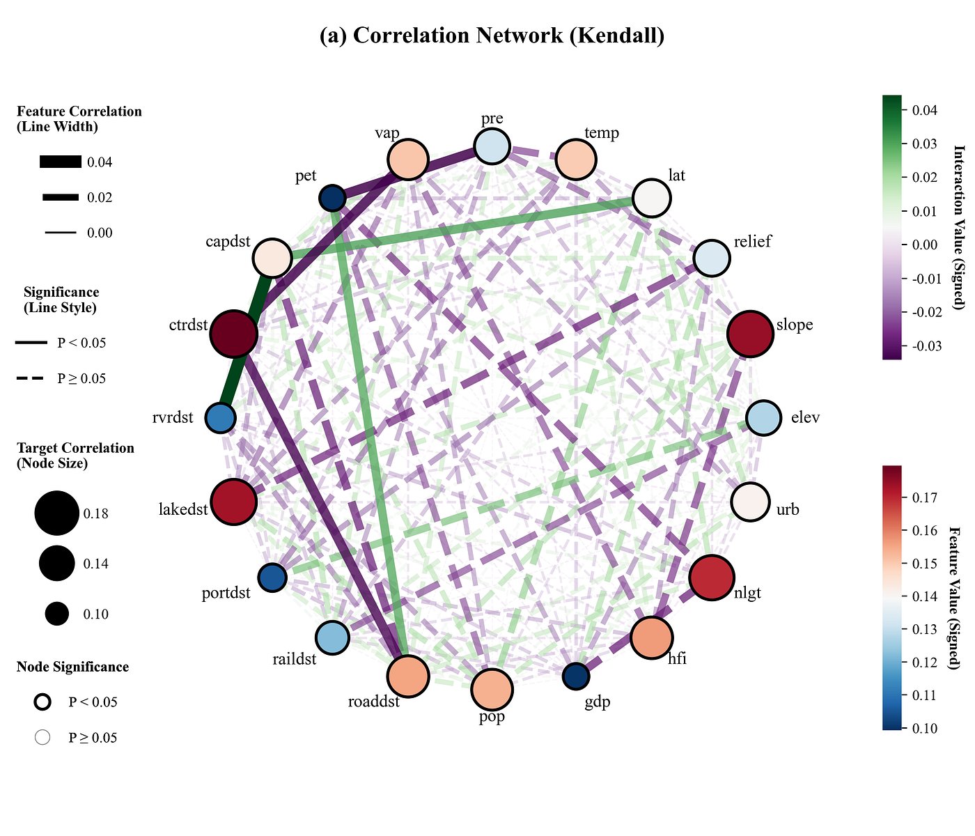
Kendall Analysis:
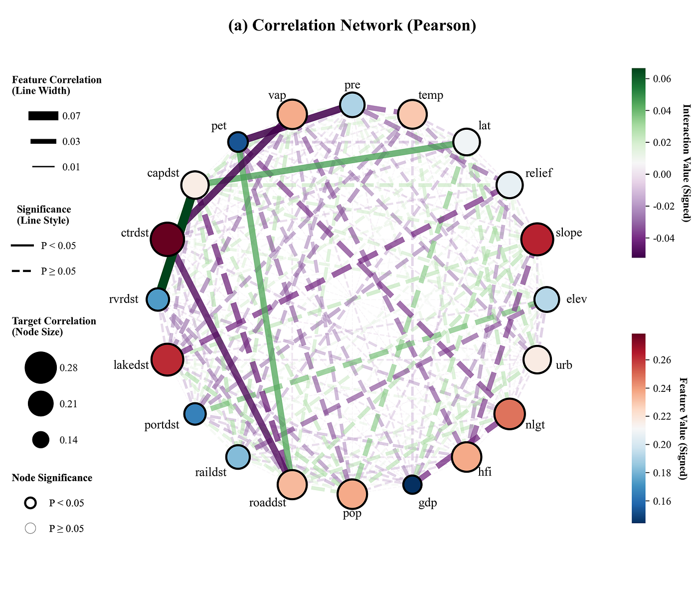
Pearson Analysis:
Spearman Analysis:
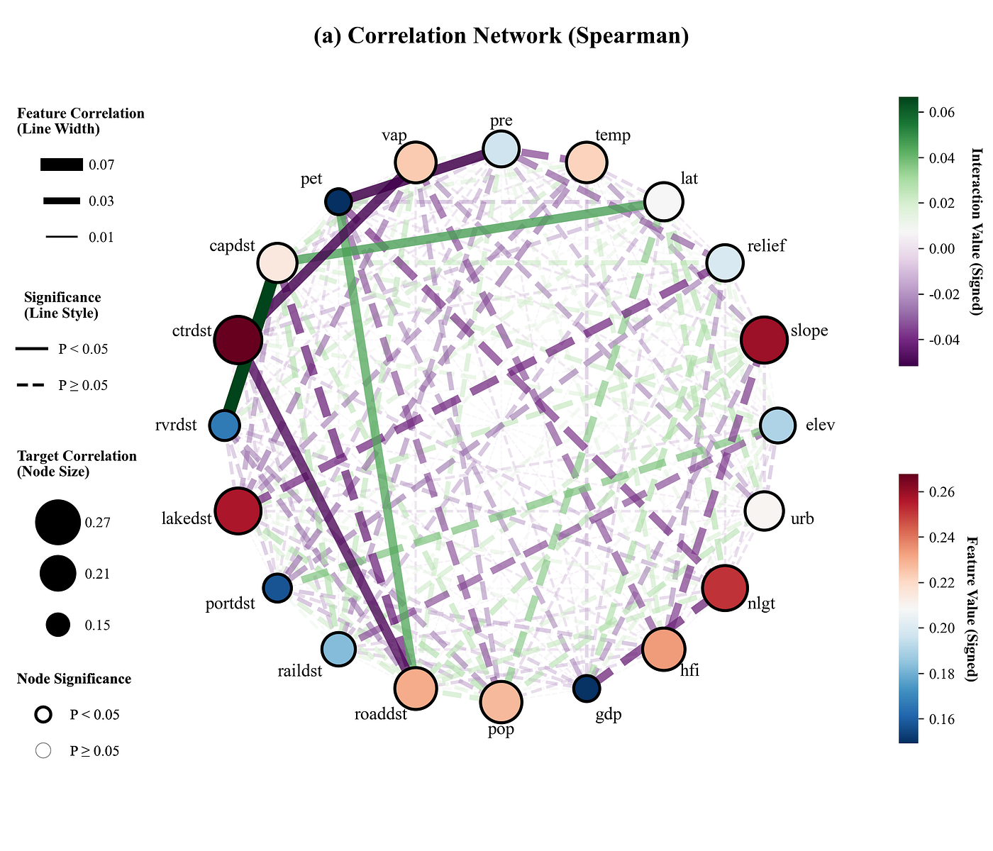
This graph illustrates the linear correlation between the feature variables and the target, as well as the correlations among the features themselves. In the circular network, the size of each node visually reflects the strength of its correlation with the target variable; the color of the nodes reflects the value of the correlation coefficient. Meanwhile, the thickness and color of the node borders represent the results of the significance analysis, where nodes with thick black borders indicate statistical significance with the target, and nodes with thin gray borders fail to reach significance levels. The line style of the connections indicates whether a significant relationship exists between the two elements, the thickness of the lines reflects the strength of the correlation, and the color of the network connections represents the actual correlation value.
Code Explanation
- Importing libraries and setting fonts
import numpy as np
import pandas as pd
import matplotlib.pyplot as plt
import matplotlib.colors as mcolors
import networkx as nx
import warnings
from matplotlib.lines import Line2D
from scipy.stats import pearsonr, spearmanr, kendalltau
import matplotlib
matplotlib.rcParams['pdf.fonttype'] = 42
matplotlib.rcParams['ps.fonttype'] = 42
plt.rcParams['font.family'] = 'serif'
plt.rcParams['font.serif'] = ['Times New Roman']
plt.rcParams['axes.unicode_minus'] = False- Setting up color libraries and choosing color schemes
COLOR_SCHEMES = {
    1: {'nodes': plt.cm.RdBu_r, 'edges': plt.cm.PRGn},
}
scheme_index =1

current_color_scheme = COLOR_SCHEMES.get(scheme_index, COLOR_SCHEMES[1])- Setting up shape marker libraries and choosing color schemes
STYLE_SCHEMES = {
    1: {'marker': 'o'},
}
style_index = 1

current_style_scheme = STYLE_SCHEMES.get(style_index, STYLE_SCHEMES[1])- Reading data and separating the target variable from feature variables
# Raw data path
file_path = r'mock_data.xlsx'

# Read data
df = pd.read_excel(file_path)

# Target variable
y = df.iloc[:, -1]

# Feature variables
X = df.iloc[:, :-1]

# Get the names of the feature columns and convert them to a list
features = X.columns.tolist()

print(f"Features: {features}")
print(f"Data shape: {X.shape}")- Setting up correlation analysis method libraries and choosing a correlation method
# Correlation analysis methods
CORRELATION_METHODS = {
    1: 'pearson',  # Pearson
    2: 'spearman',  # Spearman
    3: 'kendall'  # Kendall
}

# Set the analysis method to be used
method_index = 3
selected_method_name = CORRELATION_METHODS.get(method_index, 'pearson')  # Get the chosen analysis method

print(f"Currently used correlation analysis method: {selected_method_name.capitalize()}")- Calculate the correlation coefficients and P-values between features and the target, as well as between features themselves
def calculate_corr_p(x, y, method):
    if method == 'pearson':  # Determine which method is being used
        return pearsonr(x, y)  # Compute and return the correlation coefficient and p-value for x and y using the corresponding method
    elif method == 'spearman':
        return spearmanr(x, y)
    elif method == 'kendall':
        return kendalltau(x, y)
    else:
        return pearsonr(x, y)

correlations_target_list = []  # List to store the correlation coefficient between each feature and the target variable
p_target_list = []  # List to store the p-value between each feature and the target variable

for col in features:  # Iterate through each feature column name in the features list
    r, p = calculate_corr_p(X[col], y, selected_method_name)  # Call the function to compute the correlation coefficient and p-value between the current feature and the target variable
    correlations_target_list.append(r)  # Append to the correlation coefficients list
    p_target_list.append(p)  # Append to the p-values list

correlations_target_array = np.array(correlations_target_list)  # Convert the list to a NumPy array for subsequent numerical computations and plotting
p_target_array = np.array(p_target_list)  # Convert the p-values list to a NumPy array

# Absolute correlation (used for node size)
feature_importance_abs = np.abs(correlations_target_array)

# Raw correlation values (used for node color)
feature_importance_signed = correlations_target_array

# Compute pairwise correlations and p-values among features
n_feat = len(features)
corr_matrix_values = np.zeros((n_feat, n_feat))  # Array to store the correlation coefficients between features

# Absolute correlation between features; stronger multicollinearity results in thicker lines
mean_interaction_matrix_abs = np.abs(corr_matrix_values)
np.fill_diagonal(mean_interaction_matrix_abs, 0)  # Ignore self-correlation

# Raw correlation between features, used to control line colors
mean_interaction_matrix_signed = corr_matrix_values
np.fill_diagonal(mean_interaction_matrix_signed, 0) # Ignore self-correlation- Function definitions and basic settings: obtaining color schemes, shape marker schemes, and creating the canvas
def plot_circular_interaction(features, importance_abs, importance_signed, p_target, interaction_matrix_abs, interaction_matrix_signed, p_matrix):
    # Get color schemes
    cmap_nodes = current_color_scheme['nodes']
    cmap_edges = current_color_scheme['edges']

    # Get node shape markers
    node_marker = current_style_scheme['marker']

    # Create the canvas
    fig, ax = plt.subplots(figsize=(12, 10), subplot_kw={'aspect': 'equal'})

    # Get the number of features
n_features = len(features)- Building the network graph and layout
    # Create a NetworkX graph object
    G = nx.Graph()

    # Add nodes to the graph
    G.add_nodes_from(features)

    # Generate circular layout coordinates for the nodes
    pos = nx.circular_layout(G)

    # Coordinates for the labels
label_pos = {k: (v * 1.1) for k, v in pos.items()}- Get correlation coefficients and significance between features, set up color normalization, and prepare to draw network edges
    # Color normalization
    norm_edges = mcolors.Normalize(vmin=interaction_matrix_signed.min(),
                                   vmax=interaction_matrix_signed.max())

    # Base baseline for width/size normalization
    max_interaction_abs = np.max(interaction_matrix_abs)
    max_importance_abs = np.max(importance_abs)

    # Initialize the interaction list
    interactions = []

    # Iterate through features
    for i in range(n_features):
        for j in range(i + 1, n_features):
            # If the absolute strength is greater than 0 (display threshold)
            if strength_abs > 0:
                # Add the interaction pair, absolute strength, raw strength, and p-value to the list
                interactions.append((features[i], features[j], strength_abs, strength_signed, p_val))

    # Sort the interaction list based on absolute strength
interactions.sort(key=lambda x: x[2])- Draw the network edges between feature variables, setting the line thickness based on the correlation coefficient and the line style based on the results of the significance analysis
    # Iterate through the sorted interaction list
    for u, v, strength_abs, strength_signed, p_val in interactions:
        # Get the line color based on the raw value and the current edge color scheme
        color = cmap_edges(norm_edges(strength_signed))

        # Calculate line thickness based on the absolute value
        width = 0.5 + (strength_abs / max_interaction_abs) * 8

        # Line transparency
        alpha = 0.3 + (strength_abs / max_interaction_abs) * 0.7

        # Draw the edge
        nx.draw_networkx_edges(G,
                               pos,
                               edgelist=[(u, v)],
                               width=width,
                               edge_color=[color],
                               style=current_linestyle,
alpha=alpha, ax=ax)- Setting up the mapping logic for node sizes
    # --- Node Processing ---
    # Node color normalization
    norm_nodes = mcolors.Normalize(vmin=importance_signed.min(),
                                   vmax=importance_signed.max())

    # Define the range for node area size
    NODE_SIZE_MIN = 300  # Minimum value, corresponding to the lowest correlation
    NODE_SIZE_MAX = 1000  # Maximum value, corresponding to the highest correlation

    def map_size(value):  # Define a mapping function to linearly convert correlation values to the specified node size range
        if data_max == data_min: return NODE_SIZE_MAX  # If the maximum value equals the minimum value, directly return the preset maximum size
        # Use a linear interpolation formula to map the value into the [NODE_SIZE_MIN, NODE_SIZE_MAX] interval
return NODE_SIZE_MIN + (value - data_min) / (data_max - data_min) * (NODE_SIZE_MAX - NODE_SIZE_MIN)- Draw nodes, set node size based on the magnitude of the correlation coefficient, set node color, and set node border thickness based on significance
    # Initialize the node colors list
    node_colors = []
    # Initialize the node sizes list
    node_sizes = []

    node_edge_colors = []  # List to store the border color for each node
    node_line_widths = []  # List to store the line width of the border for each node

    # Iterate through each feature
    for i, feat in enumerate(features):
        # Get the raw value for this feature
        if p_val_target < 0.05:
            node_edge_colors.append('black')  # Black border
            node_line_widths.append(2.0)  # Thicken border
        else:
            node_edge_colors.append('grey')  # Grey border
            node_line_widths.append(0.5)  # Thin border

    # Draw nodes
    nx.draw_networkx_nodes(G,  # Draw nodes in graph G
                           pos,  # Coordinate positions
                           node_size=node_sizes,  # Sizes
                           node_color=node_colors,  # Fill colors
                           edgecolors=node_edge_colors,  # Border colors
                           linewidths=node_line_widths,  # Border thicknesses
                           node_shape=node_marker,  # Shape marker
ax=ax)- Draw the feature name labels at node positions, and draw the title
    # Iterate through the label positions dictionary
    for node, (x, y) in label_pos.items():
        ha = 'center'  # Horizontal alignment

        # If the x-coordinate is on the right side
        if x > 0.1:
            ha = 'left'  # Set alignment to left

        # If the x-coordinate is on the left side
        elif x < -0.1:
            ha = 'right'  # Set alignment to right

        # Draw the label text
        plt.text(x,
                 y,
                 node,
                 size=12,
                 horizontalalignment=ha,
                 verticalalignment='center')

    # Hide the axes
    ax.axis('off')

    # x-axis limit
    ax.set_xlim(-1.5, 1.5)

    # y-axis limit
    ax.set_ylim(-1.5, 1.5)

    # Title
plt.title(f'(a) Correlation Network ({selected_method_name.capitalize()})', y=0.95, fontsize=16, weight='bold')- Adding Legends
    # Define the scale values for the line thickness legend
    line_levels = [max_interaction_abs, max_interaction_abs * 0.5, max_interaction_abs * 0.1]

    # Convert values to string labels rounded to two decimal places for the legend display
    line_labels = [f"{val:.2f}" for val in line_levels]
    legend1 = ax.legend(legend_lines,
                        line_labels,
                        loc='center left',
                        bbox_to_anchor=(-0.1, 0.8),
                        title="Feature Correlation\n(Line Width)",
                        title_fontproperties={'weight': 'bold'},
                        frameon=False,
                        labelspacing=1.5)

    # Manually add the first legend object back to the axes
ax.add_artist(legend1)- Plotting the colorbar and saving the plot results
    # Create a scalar mappable object for edge colors
    sm_edge = plt.cm.ScalarMappable(cmap=cmap_edges, norm=norm_edges)

    # Set an empty array
    sm_edge.set_array([])

    # Draw the colorbar for lines (edges)
    cbar_edge = plt.colorbar(sm_edge, cax=cax_edge)

    # Set the label for the edge colorbar
    cbar_edge.set_label('Interaction Value (Signed)', rotation=270, labelpad=15, fontsize=10, weight='bold')

    # Hide the outline border of the edge colorbar
    cbar_edge.outline.set_visible(False)

    # --- Colorbars ---
    # Position for the node colorbar
    cbar_node_pos = [0.82, 0.20, 0.015, 0.25]

    # Add axes for the node colorbar
    cax_node = fig.add_axes(cbar_node_pos)

    # Create a scalar mappable object for node colors
    sm_node = plt.cm.ScalarMappable(cmap=cmap_nodes, norm=norm_nodes)

    extra_artists = [legend1, legend2, legend3, legend4, cax_edge, cax_node]

    # Save the figures
    save_path_png = fr"{style_index}_scheme{scheme_index}_corr_sig_{selected_method_name}.png"
    save_path_pdf = fr"{style_index}_scheme{scheme_index}_corr_sig_{selected_method_name}.pdf"

    plt.savefig(save_path_png, dpi=300, bbox_inches='tight', bbox_extra_artists=extra_artists)
plt.savefig(save_path_pdf, bbox_inches='tight', bbox_extra_artists=extra_artists)- Execution section: printing the analysis results and calling the plotting function to generate the figures
if __name__ == "__main__":
    print("-" * 30)
    print("Feature & Target Variable Correlation Ranking")
    print("-" * 30)

    # Create DataFrame object to display analysis results
    df_importance = pd.DataFrame({
        'Feature': features,  # Feature column
        'Correlation (Abs)': feature_importance_abs,  # Importance
        'Correlation (Raw)': feature_importance_signed,  # Direction of influence
        'P-value': p_target_array,  # P-value data
        'Significance': ['**' if p < 0.01 else '*' if p < 0.05 else '-' for p in p_target_array]  # Significance markers
    })

    # Sort in descending order based on importance
    df_importance = df_importance.sort_values(by='Correlation (Abs)', ascending=False)
    print(df_importance.to_string(index=False))
    print("-" * 30)

    print("Inter-feature Multicollinearity / Correlation Strength Ranking")
    print("-" * 30)

    # Initialize an empty list
    interaction_list = []

    # Get the total number of features
    n_features = len(features)

    # Start outer loop
    for i in range(n_features):
        # Start inner loop
        for j in range(i + 1, n_features):
            # Fetch data
            strength = mean_interaction_matrix_abs[i, j]
            direction = mean_interaction_matrix_signed[i, j]
            p_val = p_value_matrix[i, j]  # Get P-value

            # Conditional check
            if strength > 0:
                interaction_list.append({
                    'Feature 1': features[i],
                    'Feature 2': features[j],
                    'Correlation (Abs)': strength,
                    'Correlation (Raw)': direction,
                    'P-value': p_val,  # Record P-value
                    'Significant': 'Yes' if p_val < 0.05 else 'No'
                })

    # Convert to DataFrame
    df_interactions = pd.DataFrame(interaction_list)

    # If not empty
    if not df_interactions.empty:
        # Sort based on correlation strength
        df_interactions = df_interactions.sort_values(by='Correlation (Abs)', ascending=False)
        print(df_interactions.head(15).to_string(index=False))
    else:
        print("No significant correlations found.")

    # Call the plotting function, passing the calculated P-value matrix
    plot_circular_interaction(features,
                              feature_importance_abs,  # Basis for node size
                              feature_importance_signed,  # Basis for node color
                              p_target_array,  # Target significance determines node border thickness
                              mean_interaction_matrix_abs,  # Basis for line thickness
                              mean_interaction_matrix_signed,  # Basis for line color
                              p_value_matrix)  # P-value matrix, used to control line style
Data
Complete Code
# =========================================================================================
# ====================================== 1. Environment =======================================
# =========================================================================================
import numpy as np
import pandas as pd
import matplotlib.pyplot as plt
import matplotlib.colors as mcolors
import networkx as nx
import warnings
from matplotlib.lines import Line2D
from scipy.stats import pearsonr, spearmanr, kendalltau
warnings.filterwarnings("ignore", category=DeprecationWarning)
warnings.filterwarnings("ignore", category=UserWarning)
import matplotlib
matplotlib.rcParams['pdf.fonttype'] = 42
matplotlib.rcParams['ps.fonttype'] = 42
plt.rcParams['font.family'] = 'serif'
plt.rcParams['font.serif'] = ['Times New Roman']
plt.rcParams['axes.unicode_minus'] = False

# =========================================================================================
# ======================================2.Color library =======================================
# =========================================================================================
COLOR_SCHEMES = {
    1: {'nodes': plt.cm.RdBu_r, 'edges': plt.cm.PRGn},
    2: {'nodes': plt.cm.PiYG, 'edges': plt.cm.PuOr},
    3: {'nodes': plt.cm.BrBG, 'edges': plt.cm.RdBu_r},
    4: {'nodes': plt.cm.PuOr, 'edges': plt.cm.coolwarm},
    5: {'nodes': plt.cm.RdGy, 'edges': plt.cm.RdYlBu_r},
    6: {'nodes': plt.cm.coolwarm, 'edges': plt.cm.BrBG},
    7: {'nodes': plt.cm.seismic, 'edges': plt.cm.PiYG},
    8: {'nodes': plt.cm.bwr, 'edges': plt.cm.Spectral},
    9: {'nodes': plt.cm.RdYlGn, 'edges': plt.cm.RdBu},
    10: {'nodes': plt.cm.Spectral, 'edges': plt.cm.RdGy},
    11: {'nodes': plt.cm.PRGn, 'edges': plt.cm.RdYlGn},
    12: {'nodes': plt.cm.RdYlBu_r, 'edges': plt.cm.PiYG_r},
    13: {'nodes': plt.cm.PuOr_r, 'edges': plt.cm.bwr},
    14: {'nodes': plt.cm.BrBG_r, 'edges': plt.cm.seismic},
    15: {'nodes': plt.cm.RdBu, 'edges': plt.cm.PuOr},
    16: {'nodes': plt.cm.pink, 'edges': plt.cm.coolwarm},
    17: {'nodes': plt.cm.PiYG, 'edges': plt.cm.BrBG},
    18: {'nodes': plt.cm.RdGy_r, 'edges': plt.cm.GnBu},
    19: {'nodes': plt.cm.Spectral_r, 'edges': plt.cm.RdBu_r},
    20: {'nodes': plt.cm.RdYlGn_r, 'edges': plt.cm.PRGn_r},
}
scheme_index =1

current_color_scheme = COLOR_SCHEMES.get(scheme_index, COLOR_SCHEMES[1])

# =========================================================================================
# ======================================3.Marker library =======================================
# =========================================================================================
STYLE_SCHEMES = {
    1: {'marker': 'o'},
    2: {'marker': r'$\oplus$'},
    3: {'marker': '*'},
    4: {'marker': r'$\odot$'},
    5: {'marker': 'p'},
    6: {'marker': 'h'},
    7: {'marker': r'$\spadesuit$'},
    8: {'marker': r'$\clubsuit$'},
    9: {'marker': r'$\otimes$'},
    10: {'marker': 'X'}
}
style_index = 1

current_style_scheme = STYLE_SCHEMES.get(style_index, STYLE_SCHEMES[1])

# =========================================================================================
# ====================================== 4. Data Loading ==================================
# =========================================================================================
# Raw data path
file_path = r'D:\folder\mock_data.xlsx'

# Read the dataset
df = pd.read_excel(file_path)

# Target variable (last column)
y = df.iloc[:, -1]

# Feature variables (all columns except the last one)
X = df.iloc[:, :-1]

# Get the names of the feature columns and convert them to a list
features = X.columns.tolist()

print(f"Features: {features}")
print(f"Data shape: {X.shape}")

# =========================================================================================
# ================================== 5. Correlation Analysis Setup ========================
# =========================================================================================
# Correlation analysis methods
CORRELATION_METHODS = {
    1: 'pearson',   # Pearson
    2: 'spearman',  # Spearman
    3: 'kendall'    # Kendall
}

# Set the analysis method to be used
method_index = 3
selected_method_name = CORRELATION_METHODS.get(method_index, 'pearson')  # Get the chosen analysis method

print(f"Currently used correlation analysis method: {selected_method_name.capitalize()}")

# =========================================================================================
# ======================= 6. Correlation and P-value Calculation ==========================
# =========================================================================================
def calculate_corr_p(x, y, method):
    if method == 'pearson':  # Check which method is being used
        return pearsonr(x, y)  # Calculate and return the correlation coefficient and p-value for x and y using the corresponding method
    elif method == 'spearman':
        return spearmanr(x, y)
    elif method == 'kendall':
        return kendalltau(x, y)
    else:
        return pearsonr(x, y)

correlations_target_list = []  # List to store the correlation coefficients between each feature and the target variable
p_target_list = []  # List to store the P-values between each feature and the target variable

for col in features:  # Iterate through each feature column name in the feature list
    r, p = calculate_corr_p(X[col], y, selected_method_name)  # Call the function to calculate the correlation coefficient and P-value between the current feature and target variable
    correlations_target_list.append(r)  # Append to the correlation coefficient list
    p_target_list.append(p)  # Append to the P-value list

correlations_target_array = np.array(correlations_target_list)  # Convert the list to a NumPy array for subsequent numerical computations and plotting
p_target_array = np.array(p_target_list)  # Convert the P-value list to a NumPy array

# Absolute correlation (used for node sizes)
feature_importance_abs = np.abs(correlations_target_array)

# Raw correlation values (used for node colors)
feature_importance_signed = correlations_target_array

# Calculate pairwise correlations and P-values between features
n_feat = len(features)
corr_matrix_values = np.zeros((n_feat, n_feat))  # Matrix to store the inter-feature correlation coefficients
p_value_matrix = np.ones((n_feat, n_feat))  # Initialize the P-value matrix, defaulting to 1

for i in range(n_feat):  # Iterate through the number of features as the row index of the correlation matrix
    for j in range(n_feat):  # Iterate through the number of features as the column index of the correlation matrix
        if i == j:  # Check if it is a diagonal element
            corr_matrix_values[i, j] = 1.0  # Correlation coefficient of a feature with itself
            p_value_matrix[i, j] = 0.0  # P-value of a feature with itself
        else:  # If it is not a diagonal element
            r, p = calculate_corr_p(X.iloc[:, i], X.iloc[:, j], selected_method_name)  # Calculate the correlation coefficient and P-value between the i-th and j-th features
            corr_matrix_values[i, j] = r  # Fill the calculated correlation coefficient into the corresponding position in the matrix
            p_value_matrix[i, j] = p  # Fill the calculated P-value into the corresponding position in the matrix

# Absolute values of inter-feature correlations; stronger multicollinearity results in thicker lines
mean_interaction_matrix_abs = np.abs(corr_matrix_values)
np.fill_diagonal(mean_interaction_matrix_abs, 0)  # Ignore self-correlation

# Inter-feature correlations, used to control line colors
mean_interaction_matrix_signed = corr_matrix_values
np.fill_diagonal(mean_interaction_matrix_signed, 0)  # Ignore self-correlation

# =========================================================================================
# ====================================== 7. Plot Function =================================
# =========================================================================================
def plot_circular_interaction(features, importance_abs, importance_signed, p_target, interaction_matrix_abs, interaction_matrix_signed, p_matrix):
    # Get color schemes
    cmap_nodes = current_color_scheme['nodes']
    cmap_edges = current_color_scheme['edges']

    # Get node shape markers
    node_marker = current_style_scheme['marker']

    # Create canvas
    fig, ax = plt.subplots(figsize=(12, 10), subplot_kw={'aspect': 'equal'})

    # Get the number of features
    n_features = len(features)

    # Create a NetworkX graph object
    G = nx.Graph()

    # Add nodes to the graph
    G.add_nodes_from(features)

    # Generate circular layout coordinates for nodes
    pos = nx.circular_layout(G)

    # Coordinates for labels
    label_pos = {k: (v * 1.1) for k, v in pos.items()}

    # Color normalization
    norm_edges = mcolors.Normalize(vmin=interaction_matrix_signed.min(),
                                   vmax=interaction_matrix_signed.max())

    # Normalization baseline for width/size
    max_interaction_abs = np.max(interaction_matrix_abs)
    max_importance_abs = np.max(importance_abs)

    # Initialize the interaction list
    interactions = []

    # Iterate through features
    for i in range(n_features):
        for j in range(i + 1, n_features):
            # Interaction strength between two features
            strength_abs = interaction_matrix_abs[i, j]
            # Interaction direction between two features
            strength_signed = interaction_matrix_signed[i, j]
            # Get P-value
            p_val = p_matrix[i, j]
            # If absolute strength is greater than 0 (display threshold)
            if strength_abs > 0:
                # Add the interaction pair, absolute strength, raw strength, and P-value to the list
                interactions.append((features[i], features[j], strength_abs, strength_signed, p_val))

    # Sort the interaction list based on absolute strength
    interactions.sort(key=lambda x: x[2])

    # Iterate through the sorted interaction list
    for u, v, strength_abs, strength_signed, p_val in interactions:
        # Get the line color based on the raw value and the current edge color scheme
        color = cmap_edges(norm_edges(strength_signed))
        # Calculate line thickness based on the absolute value
        width = 0.5 + (strength_abs / max_interaction_abs) * 8
        # Line transparency
        alpha = 0.3 + (strength_abs / max_interaction_abs) * 0.7
        # Set line style based on P-value
        if p_val < 0.05:
            current_linestyle = '-'  # Significant: Solid line
        else:
            current_linestyle = '--'  # Not Significant: Dashed line

        # Draw the edge
        nx.draw_networkx_edges(G,
                               pos,
                               edgelist=[(u, v)],
                               width=width,
                               edge_color=[color],
                               style=current_linestyle,
                               alpha=alpha, ax=ax)

    # --- Node Processing ---
    # Node color normalization
    norm_nodes = mcolors.Normalize(vmin=importance_signed.min(),
                                   vmax=importance_signed.max())

    # Define the range for node area size
    NODE_SIZE_MIN = 300  # Minimum value, corresponding to the lowest correlation
    NODE_SIZE_MAX = 1000  # Maximum value, corresponding to the highest correlation

    data_min = np.min(importance_abs)  # Minimum value of absolute correlation data, used as lower bound of mapping interval
    data_max = np.max(importance_abs)  # Maximum value of absolute correlation data, used as upper bound of mapping interval

    def map_size(value):  # Define a mapping function to linearly convert correlation values to the specified node size range
        if data_max == data_min: return NODE_SIZE_MAX  # If the maximum value equals the minimum value, directly return the preset maximum size
        # Use a linear interpolation formula to map the value into the [NODE_SIZE_MIN, NODE_SIZE_MAX] interval
        return NODE_SIZE_MIN + (value - data_min) / (data_max - data_min) * (NODE_SIZE_MAX - NODE_SIZE_MIN)

    # Initialize the node colors list
    node_colors = []
    # Initialize the node sizes list
    node_sizes = []

    node_edge_colors = []  # List to store the border color for each node
    node_line_widths = []  # List to store the line width of the border for each node

    # Iterate through each feature
    for i, feat in enumerate(features):
        # Get the raw value for this feature
        imp_sign = importance_signed[i]
        # Get the absolute importance for this feature
        imp_abs = importance_abs[i]
        p_val_target = p_target[i]  # Correlation P-value between the current feature and target variable

        # Determine border style based on P-value
        if p_val_target < 0.05:
            node_edge_colors.append('black')  # Black border
            node_line_widths.append(2.0)  # Thicken border
        else:
            node_edge_colors.append('grey')  # Grey border
            node_line_widths.append(0.5)  # Thin border

        # Compute and add node color
        node_colors.append(cmap_nodes(norm_nodes(imp_sign)))
        # Compute and add node size
        node_sizes.append(map_size(imp_abs))

    # Draw nodes
    nx.draw_networkx_nodes(G,  # Draw nodes in graph G
                           pos,  # Coordinate positions
                           node_size=node_sizes,  # Sizes
                           node_color=node_colors,  # Fill colors
                           edgecolors=node_edge_colors,  # Border colors
                           linewidths=node_line_widths,  # Border thicknesses
                           node_shape=node_marker,  # Shape marker
                           ax=ax)

    # Iterate through the label positions dictionary
    for node, (x, y) in label_pos.items():
        ha = 'center'  # Horizontal alignment
        # If the x-coordinate is on the right side
        if x > 0.1:
            ha = 'left'  # Set alignment to left
        # If the x-coordinate is on the left side
        elif x < -0.1:
            ha = 'right'  # Set alignment to right

        # Draw the label text
        plt.text(x,
                 y,
                 node,
                 size=12,
                 horizontalalignment=ha,
                 verticalalignment='center')

    # Hide the axes
    ax.axis('off')

    # x-axis limit
    ax.set_xlim(-1.5, 1.5)

    # y-axis limit
    ax.set_ylim(-1.5, 1.5)

    # Title
    plt.title(f'(a) Correlation Network ({selected_method_name.capitalize()})', y=0.95, fontsize=16, weight='bold')

    # Define the scale values for the line thickness legend
    line_levels = [max_interaction_abs, max_interaction_abs * 0.5, max_interaction_abs * 0.1]
    # Convert values to string labels rounded to two decimal places for the legend display
    line_labels = [f"{val:.2f}" for val in line_levels]

    # Initialize an empty list to store custom line legend handle objects
    legend_lines = []
    # Iterate through each scale value to generate corresponding legend lines
    for val in line_levels:
        # Calculate line width based on the current value
        w = 0.5 + (val / max_interaction_abs) * 8
        legend_lines.append(Line2D([0], [0], color='black', linewidth=w, linestyle='-'))  # Legend solid line displays thickness

    # First legend object: line thickness legend
    legend1 = ax.legend(legend_lines,
                        line_labels,
                        loc='center left',
                        bbox_to_anchor=(-0.1, 0.8),
                        title="Feature Correlation\n(Line Width)",
                        title_fontproperties={'weight': 'bold'},
                        frameon=False,
                        labelspacing=1.5)
    # Manually add the first legend object back to the axes
    ax.add_artist(legend1)

    # Significance line legend
    # Define the handle list for the significance legend
    legend_sig_lines = [
        # Create a solid line handle representing significance
        Line2D([0], [0], color='black', linewidth=2, linestyle='-', label='P < 0.05'),
        # Create a dashed line handle representing non-significance
        Line2D([0], [0], color='black', linewidth=2, linestyle='--', label='P ≥ 0.05')
    ]
    # Create the significance legend
    legend2 = ax.legend(handles=legend_sig_lines,
                        loc='center left',  # Centered left
                        bbox_to_anchor=(-0.1, 0.6),  # Legend position
                        title="Significance\n(Line Style)",  # Legend title
                        title_fontproperties={'weight': 'bold'},  # Legend title font
                        frameon=False,  # Remove legend border
                        labelspacing=1.5)  # Vertical spacing
    # Manually add to the axes
    ax.add_artist(legend2)

    # --- Node Size Legend ---
    legend_vals = [data_max, (data_max + data_min) / 2, data_min]  # Select maximum, middle, and minimum data values as three reference points for the legend
    node_labels = [f"{val:.2f}" for val in legend_vals]  # Format values as strings rounded to two decimal places
    legend_nodes = []  # List to store custom legend handles
    for val in legend_vals:  # Iterate through reference values
        area_size = map_size(val)  # Calculate the corresponding node area based on the mapping function
        diameter_size = np.sqrt(area_size)  # Convert area square root to diameter, because Line2D's markersize parameter uses diameter/width
        # Create Line2D object
        legend_nodes.append(
            Line2D([0], [0],
                   marker=node_marker,  # Node shape
                   color='w',  # Line color
                   markerfacecolor='black',  # Fill color
                   markersize=diameter_size,  # Size
                   linestyle='None')  # Do not display connection line
        )
    legend3 = ax.legend(legend_nodes,  # Pass custom icon list
                        node_labels,  # Pass corresponding label text list
                        loc='center left',  # Centered left
                        bbox_to_anchor=(-0.1, 0.36),  # Precise position
                        title="Target Correlation\n(Node Size)",  # Legend title
                        title_fontproperties={'weight': 'bold'},  # Title font
                        frameon=False,  # Remove legend border
                        labelspacing=2.5)  # Vertical spacing
    ax.add_artist(legend3)  # Manually add this legend object to the axes

    # --- Node Significance Legend ---
    legend_sig_nodes = [
        # Legend icon representing significance
        Line2D([0], [0], marker=node_marker, color='w', markerfacecolor='white', markeredgecolor='black', markeredgewidth=2, markersize=10, label='P < 0.05'),
        # Legend icon representing non-significance
        Line2D([0], [0], marker=node_marker, color='w', markerfacecolor='white', markeredgecolor='grey', markeredgewidth=0.5, markersize=10, label='P ≥ 0.05')
    ]
    legend4 = ax.legend(handles=legend_sig_nodes,  # Pass the predefined custom handle list above
                        loc='center left',  # Centered left
                        bbox_to_anchor=(-0.1, 0.15),  # Precise position
                        title="Node Significance",  # Legend title
                        title_fontproperties={'weight': 'bold'},  # Title font
                        frameon=False,  # Remove border
                        labelspacing=1.5)  # Vertical spacing
    ax.add_artist(legend4)  # Manually add the legend object to the axes

    # --- Colorbars ---
    # Define edge colorbar position: left, bottom, width, height
    cbar_edge_pos = [0.82, 0.55, 0.015, 0.25]
    # Create a new axis explicitly for the colorbar
    cax_edge = fig.add_axes(cbar_edge_pos)
    # Create a scalar mappable object for edge colors
    sm_edge = plt.cm.ScalarMappable(cmap=cmap_edges, norm=norm_edges)
    # Set an empty array
    sm_edge.set_array([])
    # Draw the colorbar for lines (edges)
    cbar_edge = plt.colorbar(sm_edge, cax=cax_edge)
    # Set the label for the edge colorbar
    cbar_edge.set_label('Interaction Value (Signed)', rotation=270, labelpad=15, fontsize=10, weight='bold')
    # Hide the outline border of the edge colorbar
    cbar_edge.outline.set_visible(False)

    # --- Colorbars ---
    # Position for the node colorbar
    cbar_node_pos = [0.82, 0.20, 0.015, 0.25]
    # Add axes for the node colorbar
    cax_node = fig.add_axes(cbar_node_pos)
    # Create a scalar mappable object for node colors
    sm_node = plt.cm.ScalarMappable(cmap=cmap_nodes, norm=norm_nodes)
    # Set an empty array
    sm_node.set_array([])
    # Draw the node colorbar
    cbar_node = plt.colorbar(sm_node, cax=cax_node)
    # Set the label for the node colorbar
    cbar_node.set_label('Feature Value (Signed)', rotation=270, labelpad=15, fontsize=10, weight='bold')
    # Hide the outline border of the node colorbar
    cbar_node.outline.set_visible(False)

    extra_artists = [legend1, legend2, legend3, legend4, cax_edge, cax_node]

    # Save the figures
    save_path_png = fr"D:\folder\{style_index}_scheme{scheme_index}_corr_sig_{selected_method_name}.png"
    save_path_pdf = fr"D:\folder\{style_index}_scheme{scheme_index}_corr_sig_{selected_method_name}.pdf"
    plt.savefig(save_path_png, dpi=300, bbox_inches='tight', bbox_extra_artists=extra_artists)
    plt.savefig(save_path_pdf, bbox_inches='tight', bbox_extra_artists=extra_artists)

if __name__ == "__main__":
    print("-" * 30)
    print("Feature & Target Variable Correlation Ranking")
    print("-" * 30)

    # Create DataFrame object to display analysis results
    df_importance = pd.DataFrame({
        'Feature': features,  # Feature column
        'Correlation (Abs)': feature_importance_abs,  # Importance
        'Correlation (Raw)': feature_importance_signed,  # Direction of influence
        'P-value': p_target_array,  # P-value data
        'Significance': ['**' if p < 0.01 else '*' if p < 0.05 else '-' for p in p_target_array]  # Significance markers
    })

    # Sort in descending order based on importance
    df_importance = df_importance.sort_values(by='Correlation (Abs)', ascending=False)
    print(df_importance.to_string(index=False))
    print("-" * 30)

    print("Inter-feature Multicollinearity / Correlation Strength Ranking")
    print("-" * 30)

    # Initialize an empty list
    interaction_list = []

    # Get the total number of features
    n_features = len(features)

    # Start outer loop
    for i in range(n_features):
        # Start inner loop
        for j in range(i + 1, n_features):
            # Fetch data
            strength = mean_interaction_matrix_abs[i, j]
            direction = mean_interaction_matrix_signed[i, j]
            p_val = p_value_matrix[i, j]  # Get P-value

            # Conditional check
            if strength > 0:
                interaction_list.append({
                    'Feature 1': features[i],
                    'Feature 2': features[j],
                    'Correlation (Abs)': strength,
                    'Correlation (Raw)': direction,
                    'P-value': p_val,  # Record P-value
                    'Significant': 'Yes' if p_val < 0.05 else 'No'
                })

    # Convert to DataFrame
    df_interactions = pd.DataFrame(interaction_list)

    # If not empty
    if not df_interactions.empty:
        # Sort based on correlation strength
        df_interactions = df_interactions.sort_values(by='Correlation (Abs)', ascending=False)
        print(df_interactions.head(15).to_string(index=False))
    else:
        print("No significant correlations found.")

    # Call the plotting function, passing the calculated P-value matrix
    plot_circular_interaction(features,
                              feature_importance_abs,  # Basis for node size
                              feature_importance_signed,  # Basis for node color
                              p_target_array,  # Target significance determines node border thickness
                              mean_interaction_matrix_abs,  # Basis for line thickness
                              mean_interaction_matrix_signed,  # Basis for line color
                              p_value_matrix)  # P-value matrix, used to control line style
Thank you for reading.
메타데이터
- post_id
- 3c2faa854ce7
- slug
- plotting-a-correlation-analysis-network-graph-with-python-3c2faa854ce7
- url
- https://medium.com/top-python-libraries/plotting-a-correlation-analysis-network-graph-with-python-3c2faa854ce7
- canonical_url
- https://medium.com/top-python-libraries/plotting-a-correlation-analysis-network-graph-with-python-3c2faa854ce7
- author_url
- https://medium.com/@benjamin_hui
- status
- ok
- fetched_at
- 2026-07-09 15:12:33