How to Make a Bubble Chart More Aesthetic
I made messy bubble charts look clean and meaningful
How to Make a Bubble Chart More Aesthetic
I made messy bubble charts look clean and meaningful
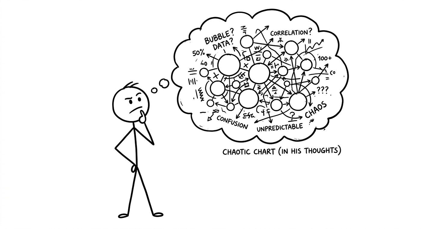
Image by Author Using the Nano Banana 2
Giving an aesthetic look to a bubble chart is a bit challenging. Bubble charts are naturally chaotic, with different sizes, overlaps, and colors all fighting for attention. So bringing beauty and order into a single chart is actually a fascinating task.
Let’s do it.
First, take a look at how a typical bubble chart looks.
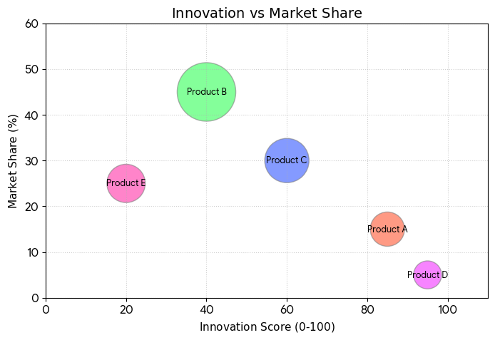
Though in this diagram the examples look small, things start getting messy when the data becomes large. That’s when a bubble chart turns really chaotic.
So if we are building a dashboard with an aesthetic idea, we first need a proper dataset. Then we can try different styles and looks. And not just focus on beauty, the chart should still be meaningful.
Let’s move to the dataset.
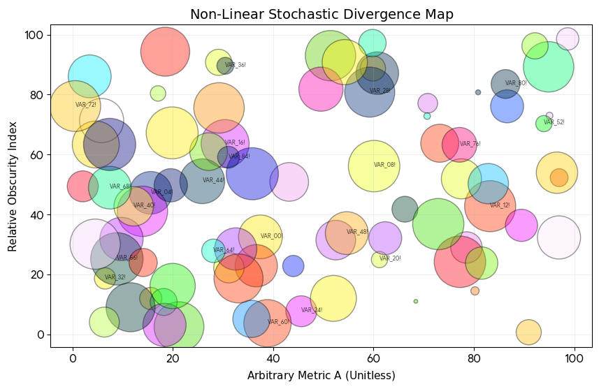
So this is a countries dataset with different categories. I also have another example to show how a bubble chart can actually look messy and ugly when it’s not used properly.
You can see the chaos, too many overlaps. This usually happens when the data is too big and not grouped properly.
In such cases, it’s much better to break it down and create multiple bubble charts from the same data in your report.
1. Geography Dataset Bubbles
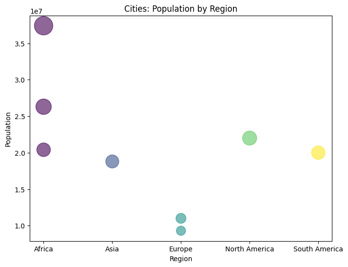
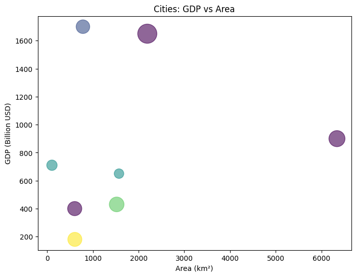
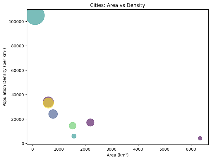
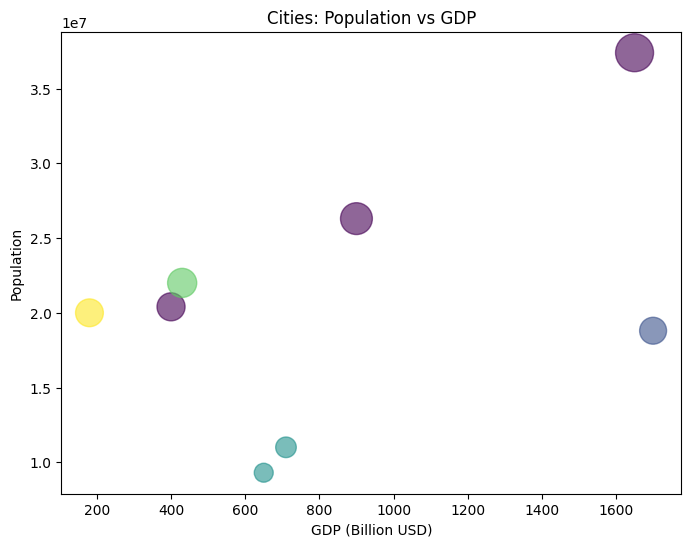
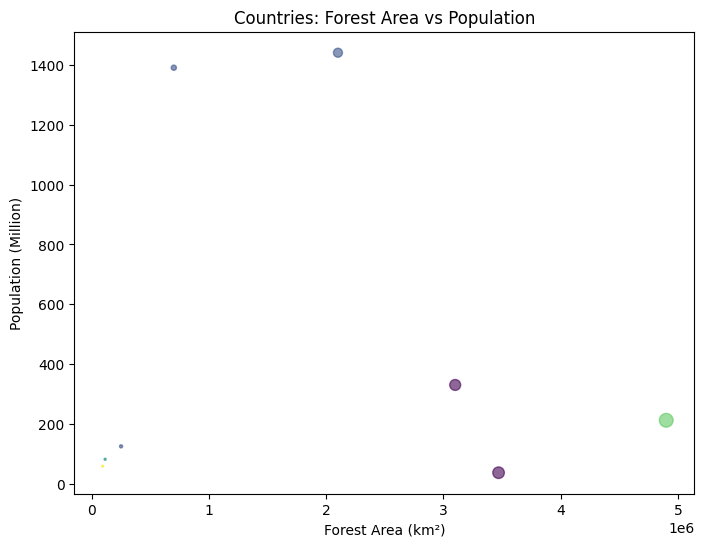
Now coming to the geographical dataset, let me tell you this kind of data, especially related to geography and demography, is a bit complex to work with. It usually has dense population data and large values, which makes it hard to plot cleanly.
If you try to put everything into one bubble chart, it quickly becomes messy. So a better approach is to split the data neatly and use multiple bubble charts.
In this way, you can keep the aesthetic feel, and a chart that could have been chaotic becomes more structured and easier to study, especially in a research paper.
2. Movies Dataset Bubbles
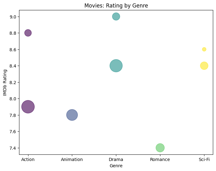
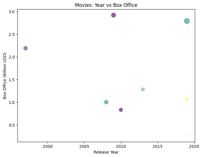
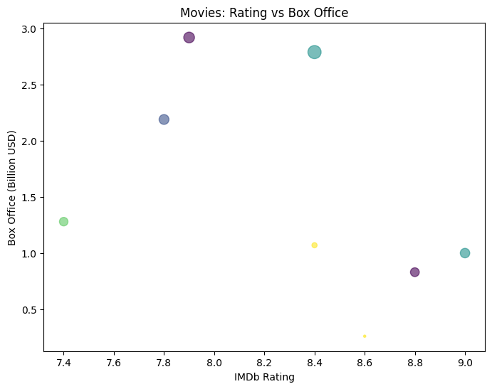
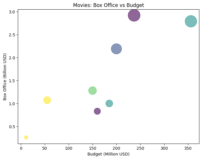
Here I’ve taken a slightly different example, not a scientific one. This is a movies dataset.
We have different categories, and for each chart we choose variables that can fit well on the x and y axis, like IMDb rating, genre, box office collection, year, etc.
Each movie is represented with different bubble sizes in its respective chart. The bigger the bubble means a higher share or impact in that particular area.
You can see how clean and organized it looks compared to a single crowded chart. Hope you can relate this idea to your own project.
3. Environmental Dataset
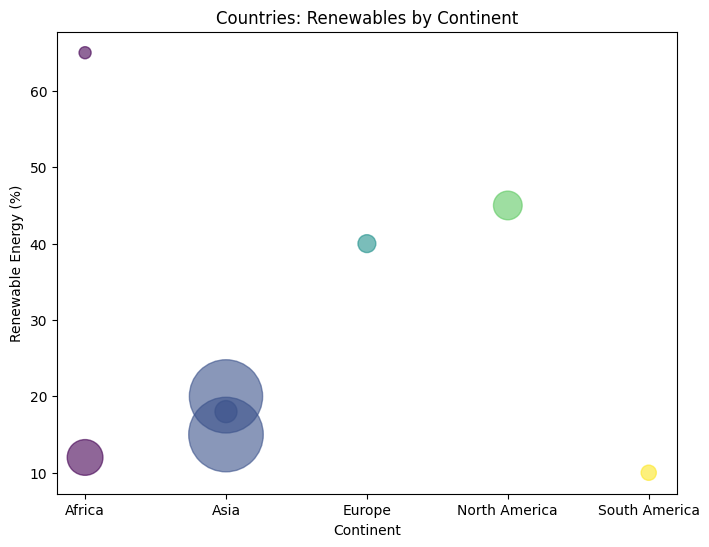
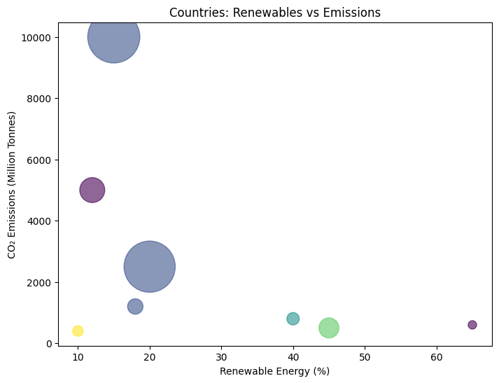
Environmental datasets are another type of scientific data where we need to look at things in a well organized way, so we can study depth and different layers.
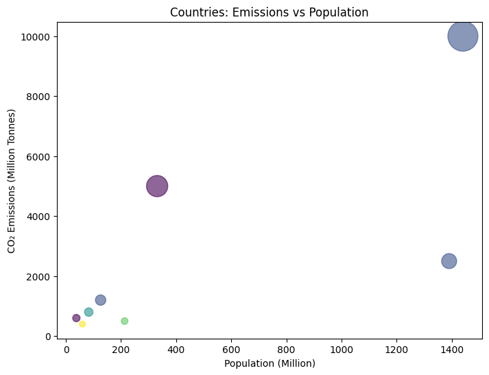
For example, when I broke down the environmental data, I could see patterns more clearly. Like places with higher population tend to have higher carbon emissions.
This is just an imaginary dataset, but it helps to show how bubble charts can be used to study such patterns in a simple and visual way.
Conclusion:
In the end, what I found is that a bubble chart starts to look chaotic when the data becomes too large. But when you break it down into smaller categories, it becomes much more aesthetic and easy to understand.
It’s a great chart, but it only works well when used in the right way. In our case, the data was more geographical, where normally you might expect a more scientific or complex approach. But a simple bubble chart, when broken down properly, can tell the story in a much clearer and simpler way.
So to make it more aesthetic, the key is to break the data into meaningful groups and treat each part carefully. That’s really the only way to bring both clarity and beauty into a bubble chart like this.
메타데이터
- post_id
- 01ee5120693f
- slug
- how-to-make-a-bubble-chart-more-aesthetic-01ee5120693f
- url
- https://medium.com/the-visual-analyst/how-to-make-a-bubble-chart-more-aesthetic-01ee5120693f
- canonical_url
- https://medium.com/the-visual-analyst/how-to-make-a-bubble-chart-more-aesthetic-01ee5120693f
- author_url
- https://medium.com/@ajayparmar7058
- status
- ok
- fetched_at
- 2026-06-09 15:37:30