IronHack Case Study: Wicked Problems-Public Healthcare System
“How Might We transform the end-to-end experience in public hospitals?”
IronHack Case Study: Wicked Problems-Public Healthcare System
“How Might We transform the end-to-end experience in public hospitals?”
Our goal is to find a solution for a wicked problem that is the Public Healthcare System for the project. Wicked problems are problems with many interdependent factors making them seem impossible to solve. Because of that, our problem is too general for us to solve.
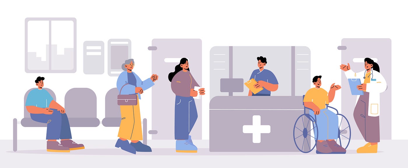
Source Freepik
Step 1 | Empathize
Before dipping into problems we started with secondary research which is research using information that has already been gathered and formatted by a different person or entity. After spending enough time on secondary research we had a lot of information about the problems. However, these are very big problems so we need to group some of the topics and prepare interview questions.
We had 6 interviews which are separated into two parts. One interview is with the patients who are local people who generally use the hospitals and the other interview is done with doctors. We went through the interview process not only through the prepared script but also by examining it in more depth where necessary. What was important was not only the answers they gave but also the feelings they felt while giving those answers. “How did they feel during the problems they experienced in the hospital?” was the main question for us when interviewing.
After the interviews, we tried to develop the affinity diagram. We gathered the important data from the interviews and put them on the wall, and then we grouped all of the sticky notes with common themes. This gives us collected and organized data. We start with the empathy map with these data, which includes most of the time feelings and thoughts. This map is a chart that explains everything designers have learned about a type of user because it asks us questions like what they say, think, do, and feel. With this map, we understand more easily their mental and emotional experiences.

Affinity Diagram
After finishing the empathy map personas started to form in our minds. We have two personas one of them is a patient and the other is a doctor. There are two point views so we need to look at each view.
We decided the best way to solve this problem was from the patient’s perspective and we created a user persona named Patrick. He is a young professional and lives in a major city. He doesn’t frequently need to visit the hospital, but sometimes he needs to have a prescription filled or has become ill and requires medical attention. He enhances the idea of accessible and affordable care. However, he has encountered some difficult situations, such as waiting for hours without knowing when he would receive care. He has had conflicting experiences with the public healthcare system, similar to his family and friends.
After deciding on the persona we developed a user journey map based on our patient persona. The user journey is like an illustration of what the user goes through to achieve their goals. The journey covered his experience in the Emergency Room and focused particularly on the experience in the waiting room. This journey starts with the decision to call the healthcare system to get seen by a doctor. Overall we saw this was a pretty stressful experience for the user. At many points, he felt alone, afraid and frustrated. And throughout this journey, there were many possibilities to use fresh approaches. These difficulties depended on a need for more information. This led us to the “how we search for solutions” part.

User Journey
Step 2 | Define
This part is about “problem” and “how-might-we” statements. An effective problem statement helps the designer establish goals by telling what the user really needs, which defines the goal clearly. From 4 different problem statements, after the dot voting we chose this problem statement: “When a patient is checking in at the Emergency Room, they need to easily understand the intake system because they get confused, scared, and frustrated with the lack of information about the process.” We go through the how-might-we statement and again with the dot voting we chose “How might we have more information in the waiting rooms?”
Step 3 | Ideate
After all, we have a problem and a way to think for a solution. Now it is time to ideate! To understand the problem more we use the “worst idea” brainstorming method.
With a framework to investigate ways to develop points of knowledge, we want to help patients learn more about their experiences. We have two solutions which are non-digital and digital. Our solution for non-digital is someone we are calling a “Patient Advocate.” For the digital solution, we tried to focus on the “kiosk”. We have created two storyboards, and with the guidance of storyboards, we created user flow to understand to create an intuitive interface. With these intermediaries, we understood the journey's flow better and started focusing on the solution.
After the storyboards, we go through the concept testing part. Testing is the primary objective in the early stages of the design process is to validate concepts and product objectives. Its aim is to determine whether what we are about to construct is relevant before allocating more funds to the project.
When we received all the feedback from the tests, we saw that the user journey we established was progressing correctly and that the solutions were applicable to people.

Storyboards for Non-Digital and Digital Solution
Step 4 | Prototype
For the non-digital part, there will always be at least one “Patient Advocate” in the waiting area. This person assists patients by acting as a resource for information and as a source of empathy. If anyone has any general questions regarding the experience or feels terrified or alone, they will be available to talk with. As an additional component of this non-digital solution, we will include an icon on the wristband patients receive during triage that signifies if they desire more assistance from the advocate. The advocate will be aware to look out for the icon.
For the digital part, with the kiosk, every patient can check information about themselves, e.g. what place they are in the queue. They will be able to get the answers they were wondering about but couldn’t get answers to while waiting in the waiting room. We tried to answer the question: “How might we have more information in the waiting rooms?”. We want to give information at the right time and in the right way. Patients also can go through with their phone after giving their phone number, but we want to focus on the kiosk part.

Low-fi of Solution
As in every project, we had limited time in this project, and if I had to think about the “what could we improve” part, we could add many steps that could be improved on the kiosk. I’d like to add a few more features that we can show off. In this way, the kiosk solution was more understandable and we could see what information it could provide.
The goal is to match the right solution to the right problem at the right time.
Thank you for reading!
메타데이터
- post_id
- 04e5d43a377d
- slug
- ironhack-case-study-wicked-problems-public-healthcare-system-04e5d43a377d
- url
- https://medium.com/@dsehnaz/ironhack-case-study-wicked-problems-public-healthcare-system-04e5d43a377d
- canonical_url
- https://medium.com/@dsehnaz/ironhack-case-study-wicked-problems-public-healthcare-system-04e5d43a377d
- author_url
- https://medium.com/@dsehnaz
- status
- ok
- fetched_at
- 2026-08-09 19:09:49