2026 F1 Car Liveries Review
This year’s grid brings a fresh mix of ideas and bold visual choices right from the start. While liveries usually stay consistent through…

2026 F1 Car Liveries Review
This year’s grid brings a fresh mix of ideas and bold visual choices right from the start. While liveries usually stay consistent through the season and rarely evolve, each team has still brought something new and exciting this year. As Box Box Club designers, Sarath and Ranjith are reviewing and rating every livery purely through a design lens, focusing on colour combinations, graphic details, and overall visual impact.
These reviews are based on our personal design preferences. Design is subjective, and that’s the whole point. If something works for you or feels off, jump into the comments and share your take.

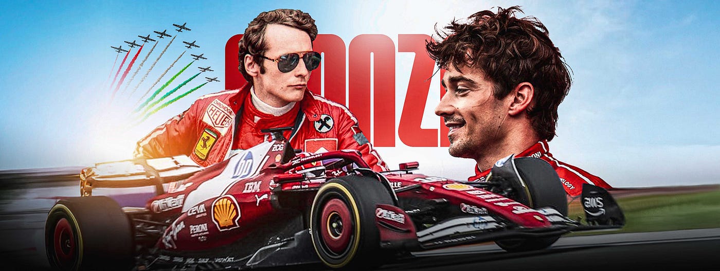
Ferrari 2/5
Positive
Red and white colour scheme: The palette works really well. It carries a strong retro vibe and immediately connects to classic racing heritage without feeling dated.
Negative
Blue HP logo: The blue stands out in the wrong way. It breaks the red and white harmony and feels visually disconnected from the rest of the livery.
Feels slightly empty: Large sections lack detail or visual rhythm. The minimalism tips toward underdone, which makes the car feel less complete than it could be.
➡️ View the livery here
The foundation is solid and nostalgic, but a bit more cohesion and a few carefully placed accents would elevate it without losing the retro charm.

McLaren 2/5
Positive
Gemini logo colour on the alloy: This is a smart detail. It ties the wheels back to the brand in a subtle way and adds a small moment of surprise without becoming distracting.
Negative
Too similar to last year’s livery: The overall look doesn’t signal enough change. It feels more like a continuation than a new chapter, which makes it harder to get excited about the update.
Excessive use of black: Black dominates the car to the point where individual elements start blending. A bit more contrast or breathing space would help define forms and improve visual balance.
Sidepod sponsor clustering: The Mastercard, OKX, and Velo logos feel awkwardly grouped on the sidepod. The spacing and alignment break the flow of the surface and make that area look visually heavy compared to the rest of the car.
➡️ View the livery here
The livery has good details, but the bigger picture lacks freshness and clarity. A stronger contrast strategy and cleaner sponsor integration would go a long way.

Aston Martin 2/5
Positive
Clean use of colour and logo placement: The palette is controlled, and the logos are placed thoughtfully. Nothing fights for attention, which gives the car a tidy, well-resolved look.
Negative
Too similar to last year: There isn’t enough visible change to signal a new season. It feels more like a refinement than a fresh take.
Feels empty: Large areas lack visual interest. The restraint goes a bit too far here, making the car feel unfinished rather than minimal.
➡️ View the livery here
The balance tipped too much toward safety. Adding a few intentional graphic moments or subtle accents could inject character without sacrificing the clean aesthetic.

Alpine 2/5
Positive
Blue and pink combination: The colour pairing is bold and instantly recognisable. The contrast works well and gives the car a playful yet confident identity that stands out on track.
Logo placements: The logos feel well-balanced and intentional. Nothing looks forced, and the hierarchy reads clearly from most angles.
Negative
Overuse of pink on the rear wing, end plates, and halo: Pink appears in too many high-visibility areas. This reduces its impact and makes the overall look feel busier than it needs to be. Holding it back in one or two key zones would have made it more effective.
Eni logo repetition from the side view: From a side profile, the Eni branding feels repetitive and slightly heavy. It draws attention away from the car’s form and breaks visual flow.
Lack of evolution from last year: The overall design feels very familiar. While consistency helps brand recognition, there’s not enough visible progression to signal a new season or a fresh design direction.
➡️ View the livery here
A stronger sense of evolution and more disciplined color restraint would have pushed it further without losing what already works.

Haas 2/5
Positive
Continuity from last year: The design stays consistent with the previous season, which helps with brand recognition and familiarity.
Negative
Logos feel overpowering: The scale and density of the logos dominate the livery. Instead of supporting the design, they become the main visual element.
Feels empty overall: Despite the heavy branding, large areas lack structure or graphic intent. This creates an odd contrast between cluttered and empty zones.
Rear wing logo placement: The logo on the rear wing feels awkwardly positioned. It doesn’t align well with the wing’s proportions and disrupts the visual balance.
➡️ View the livery here
The design lacks cohesion. Either the graphics need more structure, or the branding needs more restraint to bring everything into balance.

Red Bull 3.5/5
Positive
Clear improvement over last year: This feels like a genuine step forward. The changes are visible and meaningful, not just surface-level tweaks.
Glossy paint finish: The gloss works in its favour. It adds richness and helps the surfaces catch light better, making the car feel more premium.
Colour combination: The palette is well balanced. Nothing overpowers anything else, and the colours complement the car’s form nicely.
Logo placement: The logos are placed thoughtfully with good hierarchy. They feel integrated into the design rather than added as an afterthought.
➡️ View the livery here
Overall, it comes across as more confident and polished, without trying too hard.

Cadialic 3.5/5
Positive
Dual-tone treatment: The two-tone execution looks sharp and intentional. It gives the car a strong visual identity without relying on loud colours, which makes it feel mature and premium.
Black and white gradient: The gradient is handled really well. It adds depth and motion instead of feeling flat, and it helps transition surfaces smoothly across the body.
Sidepod logo integration: The logo feels properly embedded into the design rather than pasted on. It follows the form of the car nicely and strengthens brand presence without stealing focus.
Monochrome approach overall: The all-monochrome look works in its favour. It feels cohesive, clean, and confident, letting shape and proportion do the heavy lifting instead of colour.
➡️ View the livery here
This is one of those liveries that doesn’t shout, but still commands attention. The restraint is the strength here.

Audi 4.5/5
Positive
Red, gunmetal and black colour combination: The palette feels bold and premium. Black and gunmetal give it a serious, performance-driven base, while red adds tension and energy. It’s not a safe combo, which is why it feels distinctive.
Brand logo colour placement: The logo colours are used with restraint, which helps maintain brand recall without overpowering the overall design. It feels considered rather than decorative.
Minimalistic approach: The lack of visual noise works in its favour. Fewer elements mean the form and proportions get more attention, and that’s where the design feels confident.
Airbox and sidepod red colour standout: This is a strong focal choice. The red highlights guide the eye naturally and break the monotony of darker tones, adding character without clutter.
Negative
Battery-like perception: The large, clean, rectangular colour blocks combined with muted metallic tones can unintentionally evoke consumer electronics or battery packs. It might need either sharper aggression, texture, or contrast cues to push it more clearly into motorsport territory.
➡️ View the livery here
The concept is strong and mature, but a few details may be over-designed. Dialing back secondary color accents and introducing more mechanical or aggressive cues could fix the disconnect without losing the core identity.

Williams 4.5/5
Positive
Shades of blue with white and black: The colour mix feels balanced and confident. Blue leads without overpowering, while white and black ground the design and keep it sharp.
Duracell-style airbox: This works really well. It’s distinctive, easy to recognise, and adds a strong visual signature without feeling gimmicky.
Jackpot-style alloy: The wheels add personality. It’s a small detail, but it gives the car character and breaks the predictability you usually see here.
Brand logo placement: The logos are placed extremely well. Good hierarchy, good spacing, and they follow the car’s form naturally instead of fighting it.
Negative
Rear wing white paint: The white on the rear wing feels slightly out of place. It pulls attention in a way that doesn’t fully connect with the rest of the car, making that section feel disconnected rather than intentional.
➡️ View the livery here
The core design is strong and memorable, but the rear wing needs better integration to feel like part of the same visual story.

Mercedes 4.5/5
Positive
AMG stripes on the sidepod: The stripes work really well. They add motion and identity, and give the side profile more character without overwhelming the surface. The stripe is actually an AMG cue, but it ends up working for both brands. It subtly echoes the Adidas partnership too, making it feel like a smart crossover rather than a forced branding move.
Overall colour combination: The palette feels balanced and well-judged. Nothing clashes, and the colours support the form rather than competing with it.
Introduction of new design elements: There’s a clear effort to evolve the livery. The added elements bring freshness and help it feel less predictable compared to previous versions.
Brand logo placement: The logo placement is spot on. Good hierarchy, good spacing, and strong alignment with the car’s lines.
Negative
Microsoft logo on the airbox: The placement feels slightly off. The scale and position don’t sit naturally with the airbox shape, making it feel added on rather than integrated into the design.
➡️ View the livery here
The livery has strong direction and evolution, but that one logo breaks the flow. A small adjustment in placement or scale could fix it without touching the rest of the concept.

Racing Bulls 4.5/5
Positive
Colour combination: The palette works really well together. It feels balanced and intentional, with nothing fighting for attention.
Cleaner look with defined lines: The added lines bring structure and flow. They help the car feel more composed and visually sharper compared to flatter treatments.
White alloy: This really stands out. It adds contrast, feels bold, and gives the car a distinctive edge without looking forced.
Red Bull logo on the airbox: The placement is strong and confident. It sits naturally in that position and reinforces brand presence without disrupting the overall design.
➡️ View the livery here
Overall, this feels cleaner, more controlled, and visually confident. The details are doing just enough to elevate the whole package.

Download Box Box Club App
Experience the F1® app everyone’s talking about, download it, and see why! iOS / Android
If you have any questions or want to chat or connect:
메타데이터
- post_id
- 0549883c61dd
- slug
- 2026-f1-car-liveries-review-0549883c61dd
- url
- https://blog.boxbox.club/2026-f1-car-liveries-review-0549883c61dd
- canonical_url
- https://blog.boxbox.club/2026-f1-car-liveries-review-0549883c61dd
- author_url
- https://medium.com/@boxboxclub
- status
- ok
- fetched_at
- 2026-07-14 11:36:08