Mastering Custom Drag Previews & UnifiedDataChannel
Introduction
Mastering Custom Drag Previews & UnifiedDataChannel
Generated with AI
Introduction
When building for wearables, screen real estate is the most expensive asset we have. You can’t clutter the UI with buttons; you need intuitive gestures. That’s where Drag and Drop shines.
However, the default drag interactions often feel a bit… stock. Today, we’re going to push the boundaries on HarmonyOS. We will implement a drag interaction that uses a Custom UI Preview (instead of a generic shadow) and transfers data securely using the UnifiedDataChannel standard.
The goal: A snappy interaction where a user drags a button, sees a custom “badge” following their finger, and drops it into a target zone that visually reacts to the hovering event.
Why UnifiedDataChannel?
You might be tempted to just use global variables to move data around, but on HarmonyOS, the @kit.ArkData Unified Data Channel is the gold standard. It creates a standardized container (UnifiedData) that the system understands. Whether you are moving PlainText, images, or files, this ensures your data transfer is secure and compatible with the OS drag controller.
Coupled with ArkUI’s dragController, we can orchestrate the entire lifecycle: from the moment the finger touches the screen to the final drop.
The Implementation Strategy
We can break this down into three logical phases:
- State & UI Prep: Setting up reactive variables and the custom visual builder.
- The Drag Source: Initiating the drag and packing the PlainText.
- The Drop Target: Handling visual feedback (onDragEnter) and unpacking the data (onDrop).
1. The Setup: Custom Preview
Standard drag shadows are boring. We want context. We’ll use a @Builder function to define a specific UI—in this case, a rounded blue badge with an emoji—that will follow the user's finger.
2. The Trigger: Making it Snappy
UX Tip: Don’t wait for a long press if you don’t have to. We trigger the drag inside the onTouch event specifically on TouchType.down. This makes the interaction feel instant.
We wrap our string data into a PlainText object, then wrap that into UnifiedData, and pass it to executeDrag.
3. The Landing: Visual Feedback
A drop zone must communicate availability. When the user drags over our target box (onDragEnter), we scale it up and change the border color. We also attempt to animate the drag preview itself (changing its color to green) to signal "You can drop this here."
Code Example
Here is the complete, working implementation. I’ve included hilog for proper debugging because, let’s be honest, drag operations can be tricky to debug without logs.
import { dragController, curves, UIContext } from '@kit.ArkUI';
import { unifiedDataChannel } from '@kit.ArkData';
import { hilog } from '@kit.PerformanceAnalysisKit';
import type { BusinessError } from '@kit.BasicServicesKit';

@Entry
@Component
struct Index {
  // Reactive UI State
  @State private dropText: string = 'Drop here';
  @State private dragLabel: string = 'Hello from drag!';
  @State private isDragging: boolean = false;
  @State private dropScale: number = 1.0;
  @State private dropBorder: ResourceColor = '#111827';

  private readonly watchSize: string = '100%';

  // Custom Preview: The UI that follows your finger
  @Builder DragPreviewBuilder() {
    Column() {
      Text('📦').fontSize(22).textAlign(TextAlign.Center).margin({ bottom: 4 })
      Text(this.dragLabel)
        .fontColor(Color.White).fontSize(16).fontWeight(FontWeight.Bold)
        .textAlign(TextAlign.Center).maxLines(2).lineHeight(20)
    }
    .width(150).height(90).borderRadius(16).backgroundColor('#2563EB')
    .justifyContent(FlexAlign.Center).alignItems(HorizontalAlign.Center)
    .padding({ left: 10, right: 10 })
    .shadow({ radius: 16, color: '#33000000', offsetX: 0, offsetY: 2 })
  }

  // Logic to kick off the drag event
  private startDrag(pointerId: number = 0): void {
    // 1. Pack the data (PlainText)
    const txt = new unifiedDataChannel.PlainText();
    txt.textContent = this.dragLabel;
    txt.abstract = 'demo';

    // 2. Wrap it in UnifiedData
    const unified = new unifiedDataChannel.UnifiedData(txt);

    const info: dragController.DragInfo = { pointerId, data: unified, extraParams: '' };
    this.isDragging = true;

    try {
      // 3. Execute drag with the custom builder
      this.getUIContext().getDragController().executeDrag(
        () => { this.DragPreviewBuilder(); },
        info,
        (err: BusinessError | undefined, res) => {
          this.isDragging = false; // Reset state
          if (err) {
            hilog.error(0x0000, 'drag', `executeDrag error: ${err.message}`);
            return;
          }
          if (res?.event) {
            const ok = res.event.getResult() === DragResult.DRAG_SUCCESSFUL;
            hilog.info(0x0000, 'drag', ok ? 'SUCCESS' : 'FAILED');
          }
        }
      );
    } catch (e) {
      this.isDragging = false;
      hilog.error(0x0000, 'drag', `executeDrag threw: ${String(e)}`);
    }
  }

  build() {
    Stack() {
      // Background (Watch style)
      Column() {}
        .width(this.watchSize).height(this.watchSize)
        .clip(Circle({ width: '100%', height: '100%' }))
        .backgroundColor('#0B1220')

      Column() {
        // DRAG SOURCE
        Button('Drag Me')
          .type(ButtonType.Capsule).fontSize(12).height(36)
          .margin({ top: 8, bottom: 8 }).backgroundColor('#2563EB')
          .fontColor(Color.White).opacity(this.isDragging ? 0.9 : 1)
          .shadow({ radius: 12, color: '#26000000', offsetX: 0, offsetY: 2 })
          .onClick(() => { this.dragLabel = 'Hello from drag!'; })
          .onTouch((ev?: TouchEvent) => {
            if (!ev) return;
            // Trigger on 'Down' for instant response
            if (ev.type === TouchType.Down) this.startDrag(0);
          })

        // DROP TARGET
        Column() {
          Text(this.dropText)
            .fontSize(14).textAlign(TextAlign.Center).fontColor(Color.White)
            .width('100%').maxLines(2).lineHeight(18)
            .padding({ left: 6, right: 6 })
        }
        .width(180).height(92).borderRadius(20).backgroundColor('#111827')
        .border({ color: this.dropBorder, width: 1 })
        .scale({ x: this.dropScale, y: this.dropScale }) // Visual feedback
        .justifyContent(FlexAlign.Center).alignItems(HorizontalAlign.Center)
        // Hover Enter
        .onDragEnter(() => {
          this.dropScale = 1.05;
          this.dropBorder = '#22C55E'; // Green border

          // Optional: Animate the preview itself
          try {
            const ui: UIContext = this.getUIContext();
            const preview = ui.getDragController().getDragPreview();
            const anim: dragController.AnimationOptions = {
              duration: 250,
              curve: curves.cubicBezierCurve(0.2, 0, 0, 1)
            };
            preview.animate(anim, () => { preview.setForegroundColor(Color.Green); });
          } catch (err) {
            const e = err as BusinessError;
            hilog.error(0x0000, 'preview', `animate error: ${e?.code}`);
          }
        })
        // Hover Leave
        .onDragLeave(() => {
          this.dropScale = 1.0;
          this.dropBorder = '#111827';
        })
        // Drop
        .onDrop((dragEvent?: DragEvent) => {
          this.dropScale = 1.0;
          this.dropBorder = '#111827';

          if (!dragEvent) return;
          const records = dragEvent.getData().getRecords();
          if (records.length > 0) {
            // Extract the PlainText
            const first = records[0] as unifiedDataChannel.PlainText;
            this.dropText = first.textContent ?? 'dropped';
          }
        })

        Text('Tip: Press “Drag”, move the 📦 preview, and drop it into the box.')
          .fontSize(10).fontColor('#94A3B8').margin({ top: 8 }).opacity(0.9)
      }
      .width('70%').height('100%')
      .justifyContent(FlexAlign.Center).alignItems(HorizontalAlign.Center)
      .padding(8)
    }
    .width('100%').height('100%').align(Alignment.Center)
  }
}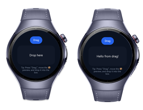
Wearable Screenshot Mockup
Developer Notes
A few things I learned while implementing this that might save you some headaches:
- Safety First: In the code above, I’m casting records[0] as PlainText because I know what I'm sending. In a production app, especially if receiving drags from other apps, use instance of checks to avoid runtime crashes.
- Performance on Wearables: Shadows and blurs are expensive. Keep the DragPreviewBuilder layout simple. Complex rendering during a drag event can cause dropped frames, which ruins the "feel" of the gesture.
- Animation Quirks: The preview.animate() method is powerful, but behavior can vary slightly across device versions. Always wrap it in a try/catch block so your app doesn't crash if the animation service is busy or unsupported.
- Reentrancy: I used an isDragging state to dim the button. This isn't just for looks; it helps you manage logic if you want to prevent multiple drag events from firing simultaneously.
Conclusion
Mastering the dragController on HarmonyOS allows us to break free from static interfaces. By leveraging UnifiedDataChannel, we aren't just moving pixels; we are moving data securely and efficiently across the system.
On a 1.5-inch screen, every pixel and every gesture counts. Implementing custom previews and reactive drop zones turns a standard system behavior into a delightful user experience. The code provided here is your starting point now go build something that feels great to use.
Happy coding! 🚀
References
[embed]Document The OpenCms demo, brought to you by Alkacon Software.developer.huawei.com
메타데이터
- post_id
- 05ab6a6b3220
- slug
- mastering-custom-drag-previews-unifieddatachannel-05ab6a6b3220
- url
- https://medium.com/huawei-developers/mastering-custom-drag-previews-unifieddatachannel-05ab6a6b3220
- canonical_url
- https://medium.com/huawei-developers/mastering-custom-drag-previews-unifieddatachannel-05ab6a6b3220
- author_url
- https://medium.com/@baristuzemenn
- status
- ok
- fetched_at
- 2026-07-13 22:58:47