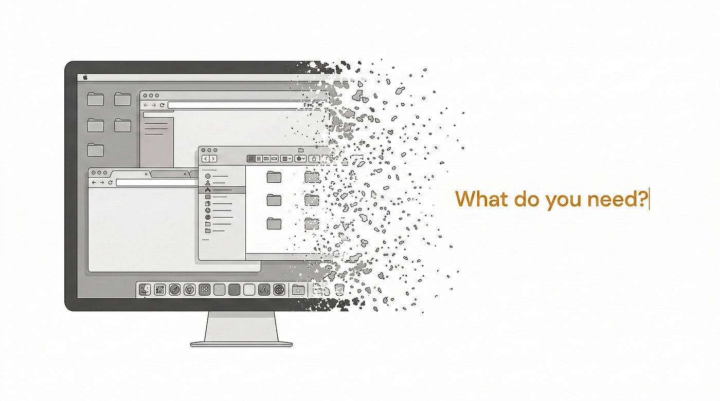
Your Desk Looks Productive. Your Workflow Architecture Is Quietly Destroying Focus.
Most attention problems at work are not failures of discipline. They are failures of environment design disguised as productivity.
Your Desk Looks Productive. Your Workflow Architecture Is Quietly Destroying Focus.
Most attention problems at work are not failures of discipline. They are failures of environment design disguised as productivity.

There is a version of productivity advice that keeps surviving because it is flattering.
It tells people the real issue is discipline. Focus harder. Turn off notifications. Time-block better. Use smarter apps. Protect deep work. Build routines. Stop multitasking. Be more intentional.
Some of that helps.
None of it explains why so many serious, capable people can sit down in front of an expensive, beautifully arranged workspace and feel mentally fragmented within minutes.
That problem is usually not a character flaw.
It is architecture.
A growing number of digital workers now operate inside setups that look optimized from the outside and behave chaotically from the inside. The desk is clean. The devices are premium. The monitors are impressive. The software stack is modern. The windows are arranged. The task manager is full. The calendar is color-coded. Everything signals readiness.
And yet the actual experience of working inside that environment feels fractured, noisy, and strangely effortful.
That is not a mystery. It is not even rare.
It is what happens when a workspace is optimized for visible capability instead of cognitive coherence.
One of the most expensive lies in modern work culture is that visual organization and operational clarity are basically the same thing. They are not. A desk can look sharp while constantly interrupting thought. A workflow can appear sophisticated while repeatedly forcing context collisions. A setup can feel “high-performance” while quietly training the mind into partial attention.
That is the hidden pressure now.
People keep trying to solve attention with tactics while the environment keeps manufacturing distraction faster than tactics can absorb it.
The next productivity divide will not be between people who care and people who do not. It will be between people whose environments reduce cognitive friction and people whose environments keep generating it in respectable forms.
That is where the real separation is opening.
Most workspaces are built for access, not for clarity
A lot of modern desks are designed as though productivity were mainly a matter of immediate reach.
More screens. More open windows. More always-visible channels. More dashboards. More references. More tabs. More simultaneous access. More ability to “see everything.”
That looks efficient until you spend enough time inside it.
Then another pattern emerges.
The user is not flowing through a system. The user is being pulled through collisions.
One surface holds the active task. Another holds messages threatening to become the active task. Another holds research. Another holds metrics. Another holds planning residue. Another holds some low-priority but still open loop that has not earned current attention and is still quietly demanding it.
The whole arrangement feels available, yet the mind keeps paying for that availability.
This is one reason so many contemporary desks feel mentally loud even when they are visually clean. They have been optimized for exposure, not for sequence. The operator can reach everything, but nothing in the environment is making hard decisions about what deserves to stay alive at this moment.
That is not a minor inefficiency.
That is a design failure hiding inside productivity theater.
When a setup privileges simultaneous visibility over controlled cognitive flow, it may create the appearance of capability while steadily weakening attention quality.
And because the weakness shows up as fog rather than failure, people usually blame themselves instead of the architecture.
The Visibility Load Problem
The first framework is the Visibility Load Problem.
People assume that making more things visible helps them feel more in control. Sometimes it does. Past a certain threshold, it stops functioning like clarity and starts functioning like pressure.
Every visible surface asks for interpretation.
Every open panel is making a claim on attention, even if silently. Every unread badge is a hanging thread. Every idle window is unresolved context. Every side display carrying a low-priority task is still competing for recognition.
This is the hidden cost of modern digital abundance: what stays visible keeps staying cognitively alive.
That does not mean every multi-surface setup is harmful. It means visibility has to be earned. A surface should remain present because it is actively reducing uncertainty, not because the user has developed a generalized fear of hiding things.
Once visibility exceeds what the brain can process cleanly, the workspace begins producing a paradox: more access, less attentional stability.
That is why some people can work for hours on modest setups with remarkable calm, while others sit in front of expensive hardware arrangements and feel continuously nicked by their own environment.
The difference is not always horsepower.
It is whether the setup has learned the discipline of not showing what does not need to be seen.
A good workspace does not merely present information.
It edits reality.
Friction is not always the enemy
A surprising amount of productivity advice treats friction as a universal defect.
Remove steps. Reduce clicks. Speed up access. Make everything easier to reach.
That is too simple.
Some friction is waste. Some friction is protective architecture. It forces sequence. It delays impulsive switching. It prevents low-value surfaces from entering the working field too easily. It makes certain self-interruptions slightly more expensive, which is sometimes exactly what a serious workflow needs.
This is where many setups quietly fail.
They remove so much friction from everything that the environment stops distinguishing between what is urgent, what is useful, what is active, and what is merely available. Everything becomes equally reachable. Nothing is meaningfully filtered. The desk turns into a beautifully efficient machine for self-interruption.
That is not optimization.
That is indiscriminate accessibility.
The strongest work systems do not eliminate friction blindly. They allocate it intelligently. They lower it around the active task and raise it around distractions, context-switch temptations, and surfaces that would otherwise leak into the session without earning their way in.
A good workflow does not ask, “How do I access everything faster?”
It asks, “What deserves effortless access, and what deserves resistance?”
That is a more serious design question.
It is also the one most setups avoid.
The Context Collision Model
The second framework is the Context Collision Model.
A context collision happens when two or more modes of work are forced into simultaneous presence in a way that makes each weaker.
The modern desk is full of them.
Strategic planning beside reactive messaging. Deep writing beside live analytics. Research beside social channels. Creative work beside administrative maintenance. High-value thinking beside operational residue. Priority work beside reminders of every non-priority task still waiting.
None of these collisions are dramatic in isolation. That is what makes them dangerous. They rarely feel catastrophic. They simply make clear attention harder to stabilize.
The brain keeps doing invisible sorting labor. It keeps deciding what to suppress, what to ignore, what to postpone, what to re-enter, what to protect from contamination. The user experiences this as fatigue, drifting focus, restless checking, or the sensation that work never fully “lands.”
That sensation gets misdiagnosed constantly.
People say they are distracted. Often they are structurally overexposed.
They say they need more discipline. Often they need a better division of cognitive territory.
They say they are bad at focus. Often their environment keeps staging simultaneous claims on the mind that focus was never meant to hold at once.
This is where workflow architecture becomes much more serious than desk aesthetics or hardware preference. The real question is not simply what tools are present. The real question is which cognitive worlds are being made to touch each other all day.
Because once the environment keeps forcing context collisions, self-control starts doing the work architecture should have done earlier.
That is an expensive way to operate.
More screen space often becomes more unresolved work
The internet has spent years casually equating more screen space with more productivity.
That relationship is real in some cases. It is far less stable than people pretend.
Additional display area only helps when the added surface improves task clarity, role separation, or decision speed. If it simply expands the field of unresolved inputs, it can make work feel broader without making it cleaner. The user sees more, but also carries more unfinished loops inside the same session.
This is where a lot of setup decisions go subtly wrong.
People add another display, another permanently visible reference zone, another communication surface, another analytics panel, another live feed of something that feels relevant enough to justify presence but not relevant enough to deserve the center. They gain access. They lose selectivity.
That tradeoff is often worse than advertised.
A good multi-screen environment is not one with more visible content. It is one where each surface has a disciplined job. One screen holds the active work. Another holds the narrow support layer genuinely required by that work. Everything else either disappears or gets quarantined until it earns re-entry.
That is a very different philosophy from the usual “more room means more productivity” assumption.
And it is why serious hardware evaluation matters more than the average productivity conversation admits. The difference between a setup that supports focus and one that merely performs productivity often comes down to whether the system is built around function or around the aesthetic of optionality. Even a practical guide to portable monitor and extended-screen workflow decisions becomes useful precisely because the hardware question is never just about hardware. It is about what kinds of cognitive behavior the hardware makes easier to sustain.
More screens do not automatically create more clarity.
Sometimes they just give unresolved work better real estate.
Clean desks can hide dirty workflows
One of the stranger distortions of digital work culture is how easily visible neatness gets mistaken for operational integrity.
A clean desk is satisfying. It photographs well. It creates the feeling of control. But visual tidiness can conceal extraordinary amounts of workflow confusion.
The windows may be neatly aligned. The task manager may be categorized. The cables may disappear. The wallpaper may be calm. The productivity system may even look elegant enough to make the user feel ahead of the curve.
And yet the underlying logic may still be weak.
What is the active task? What support information is genuinely required right now? What reactive channels have been fenced off? What remains visible even though it does not deserve current cognitive life? What in this environment is asking to be noticed without having earned that right?
These are workflow questions, not aesthetic ones.
A desk can be beautifully arranged and cognitively permissive in all the wrong places. It can encourage the user to live inside a constant state of low-grade readiness rather than clean sequence. It can reward switching, checking, grazing, and hovering while punishing immersion.
That is why some of the most “productive-looking” environments are quietly built to produce partial attention.
They are clean on camera and messy at the level that matters.
The Workflow Integrity Framework
The third framework is the Workflow Integrity Framework.
Workflow integrity is the degree to which a work system preserves the logic of the active task without allowing lower-value inputs to contaminate it.
A workspace with high workflow integrity does several things well.
It defines where the task lives. It defines what support material may sit near the task. It separates strategic work from reactive work. It limits what remains visible when it is not directly useful. It reduces leakage from tools that are always tempting because they are always present.
A workspace with low workflow integrity does the opposite. It keeps too many priorities visible. It allows channels to overlap casually. It confuses accessibility with relevance. It slowly trains the user to live inside partial attention while calling that modern work.
That is the quiet danger.
Once partial attention becomes normalized, the operator can remain busy for long stretches without ever feeling fully inside the work. The day becomes a chain of near-engagements. A lot gets touched. Very little gets held deeply enough to create momentum.
That is not sustainable clarity.
That is operational static.
High-performing environments usually look calmer than people expect. Not because they do less, but because they are built to protect the sequence of doing.
That protection is what most productivity rhetoric leaves out.
The strongest objection: maybe people are just using architecture as an excuse
A serious argument should survive a serious objection.
So here it is.
Maybe this whole analysis overstates setup design. Maybe most productivity problems are still behavioral. Weak prioritization. Weak discomfort tolerance. Too much reactive checking. Too much phone use. Too little discipline. Maybe people are turning desks, displays, and workflow layouts into an elegant excuse for what is fundamentally a self-management deficit.
There is truth in that.
A bad operator can absolutely sabotage a strong environment. Plenty of people do use hardware, apps, and desk redesign as a sophisticated form of procrastination. Plenty of attention problems are partly behavioral. No setup on earth can compensate for someone unwilling to choose priorities clearly.
But that objection gets weaker the more universally it is applied.
Because once enough capable, ambitious, reasonably disciplined people keep reporting the same forms of fragmentation inside modern digital environments, the explanation cannot remain purely moral. At some point, architecture enters the story.
The point is not that discipline does not matter.
It is that discipline should not be doing all the work alone.
A well-designed workflow reduces the amount of self-control needed to maintain coherent focus. A badly designed one keeps taxing self-control unnecessarily. That difference compounds, especially in work that depends on writing, synthesis, design judgment, strategic reasoning, or any task where quality degrades after repeated mental nicking.
So yes, behavior matters.
But architecture decides whether behavior is being supported or constantly made to fight uphill.
That is not an excuse.
That is a systems fact.
Over the next 24–36 months, workflow architecture will become a sharper advantage
The coming two to three years will make this issue more visible, not less.
First, digital work will continue fragmenting across more tools, AI layers, channels, dashboards, reference surfaces, and ambient inputs. That means the penalty for poor workflow architecture will rise, because the environment will keep generating more possible interruptions than the average person can suppress cleanly.
Second, the market will continue producing more hardware and software that promises productivity while often increasing optionality more than clarity. Users will gain more ways to “build a setup,” but that will not mean more people have built one that protects attention well.
Third, AI content saturation will increase the value of human concentration quality. When generic output becomes cheaper, the premium shifts toward people who can hold clear thought long enough to produce judgment, synthesis, and originality rather than just formatted motion.
Fourth, workspaces will become more psychologically stratified. Some people will keep living in environments that feel permanently open, reactive, and mentally crowded. Others will learn to build systems that stage information with much harsher discipline. That difference will show up not only in comfort, but in quality of work.
Fifth, setup literacy will improve in serious circles. The conversation will move slowly away from “What gear do you use?” and toward “What kinds of cognitive behavior does your environment reward?”
That is the better question.
Because over time, environments train behavior more quietly than advice does.
Strategic implications for founders, operators, and knowledge workers
If you are building a business, producing high-value creative work, managing complex digital operations, or running assets that depend on judgment quality, the implications are practical.
Audit your visibility load. What remains open in your field of work that does not deserve to remain cognitively alive?
Identify your recurring context collisions. Which modes of work are being forced to coexist in ways that make each weaker?
Stop asking whether your setup looks productive. Ask whether it protects workflow integrity.
Become more selective about friction. Where should access become easier? Where should it become slightly harder so the wrong thing stops entering the session by default?
Evaluate your environment by the quality of thinking it permits, not by the quantity of surfaces it can host.
That is a harsher standard than most modern setups are built to pass.
It is also the only one that really matters.
Because the future of knowledge work will not be won by the people who can access the most information the fastest.
It will be won by the people whose environments help them keep the right information alive at the right time, and kill the rest quickly.
Final argument
Most people think their workspace is helping them because it looks ready.
That is often the illusion.
A workspace can look efficient while constantly manufacturing distraction in respectable forms. It can feel modern while degrading depth. It can expose the user to more tools, more channels, and more surfaces while quietly weakening the exact thing serious work depends on most: sustained cognitive coherence.
That is why so much productivity advice keeps underperforming.
It keeps treating attention as a willpower problem after architecture has already made attention expensive.
The next durable advantage will not belong to the people with the busiest setups, the most visible information, or the greatest quantity of digital access. It will belong to the people who understand something harder and more valuable:
a good workflow does not merely help you work.
It stops your environment from working against you.
메타데이터
- post_id
- 081667bde6f2
- slug
- your-desk-looks-productive-your-workflow-architecture-is-quietly-destroying-focus-081667bde6f2
- url
- https://medium.com/@PrimeScaleAnalytics/your-desk-looks-productive-your-workflow-architecture-is-quietly-destroying-focus-081667bde6f2
- canonical_url
- https://medium.com/@PrimeScaleAnalytics/your-desk-looks-productive-your-workflow-architecture-is-quietly-destroying-focus-081667bde6f2
- author_url
- https://medium.com/@PrimeScaleAnalytics
- status
- ok
- fetched_at
- 2026-08-11 03:27:41