Creating a Soft Shadow Map Effect with QGIS and Tableau Map Layers
Would you like to create a map with a soft shadow, glowing edge, or raised-paper effect in Tableau? It may look complex at first, but the…
Creating a Soft Shadow Map Effect with QGIS and Tableau Map Layers
Would you like to create a map with a soft shadow, glowing edge, or raised-paper effect in Tableau? It may look complex at first, but the core technique is easier than you might think. The trick is to prepare a few extra spatial layers in QGIS first, then bring them into Tableau and stack them with map layers.
I first noticed this effect in Dennis Kao’s map, **Japan Water Lines**, and really liked its 3D effect. Dennis consistently shares his expertise with the DataFam community, and in one Tableau Analytics User Group session, he walked through the technique behind the effect: creating several slightly transformed copies of the map boundary in QGIS, exporting them as separate spatial files, and layering them in Tableau.
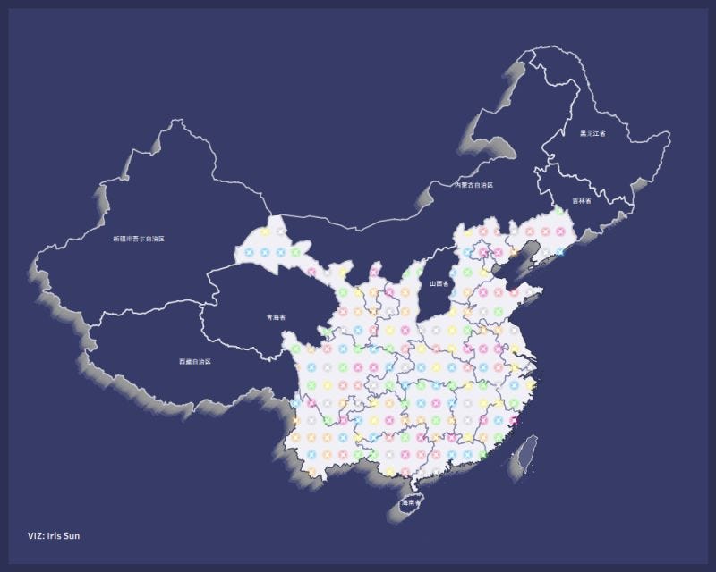
Using his technique, I created a map of China with a similar soft shadow effect. Here are the steps I followed.
1. Prepare the base map in QGIS
The first step was to bring the China spatial file into QGIS. This could be a national boundary file, province-level file, or another administrative boundary file depending on the level of detail needed.

The normal map layer becomes the foundation. All shadow layers are created from this original geometry.
2. Create multiple transformed layers for the shadow effect
To create the soft shaded edge, I duplicated the China boundary several times in QGIS.
Starting from the normal map, I created seven additional layers. Each layer was slightly adjusted using QGIS’s Geodesic Transformation tool. You may play around the settings, such as distance and angle.

By clicking “Run”, I created another layer slightly shifted.

Duplicating the same process, I got transformed copies shifted outward in small increments.

The layer structure looked something like this:
- Normal China map
- Transformed layer 50 km
- Transformed layer 75 km
- Transformed layer 100 km
- Transformed layer 125 km
- Transformed layer 150 km
- Additional frame/border layers as needed
Each transformed layer was offset slightly more than the previous one. When stacked together later in Tableau, these layers create a gradual shaded edge instead of a single hard outline.
This is the key design trick: the shadow is not a built-in Tableau map effect. It is created manually by preparing multiple spatial layers in QGIS.
3. Create additional map layers as needed
Besides the transformed boundary layers for the shadow effect, I also created a few supporting layers in QGIS for the final map design.
For my China map, I created:
- a province boundary layer
- a grid dot layer

The styling in QGIS does not matter too much at this stage. The colours, line weights, opacity, and dot shapes can all be adjusted later in Tableau. The main purpose of this step is to prepare the geometries as separate spatial layers so they can be brought into Tableau and styled independently.

4. Export each layer as a separate spatial file
After creating the transformed shadow layers and any supporting layers, export each one as its own spatial file.
4. Bring the spatial files into Tableau
Once the spatial files were exported, I connected to them in Tableau.
In Tableau, each exported spatial file can be added as a separate map layer. This is where the QGIS preparation starts to pay off. Instead of having only one map layer, I could stack the map almost like a design file.
The general Tableau layer order was:
- Outer transformed shadow layers at the bottom
- Main China map above the shadows
- Province borders above the main map. To make the borders visible across both dark and light areas, I added two province-border layers: one with light lines for the dark areas, and another with black lines for the white areas.
- Grid shapes and grid dots above the filled map
- Labels and final annotation layers on top
The shadow layers should sit behind the main map. The farther-out layers can use lighter or more transparent colours, while the layers closer to the map can be slightly darker or more visible. This creates a soft glow or raised-map effect.
5. Style the layers in Tableau
The final visual effect depends heavily on styling.
For the shadow/frame layers, I used muted grey or semi-transparent tones. The goal was not to make each layer obvious, but to let them blend together into a soft edge.
For the main China map, I used a dark background colour to contrast with the bright central pattern. Province borders were kept subtle so they supported the geography without competing with the design.
The grid dots and small symbols added texture and visual interest inside the map. Because these layers sit above the base geography, they help turn the map from a simple boundary map into a more decorative map-art style visualization.
Final thoughts
This project was a useful reminder that Tableau and QGIS can work beautifully together. QGIS gives us control over the geometry, while Tableau gives us flexibility in presentation and storytelling.
**The Tableau workbook is also available for download, so feel free to explore the map layers, re-engineer the workflow, and adapt the technique for your own map design.**
메타데이터
- post_id
- 098cd85f55d5
- slug
- creating-a-soft-shadow-map-effect-with-qgis-and-tableau-map-layers-098cd85f55d5
- url
- https://medium.com/@missun88/creating-a-soft-shadow-map-effect-with-qgis-and-tableau-map-layers-098cd85f55d5
- canonical_url
- https://medium.com/@missun88/creating-a-soft-shadow-map-effect-with-qgis-and-tableau-map-layers-098cd85f55d5
- author_url
- https://medium.com/@missun88
- status
- ok
- fetched_at
- 2026-06-20 20:29:01
