Are You Being Bullied By Your Smart Watch?
Health data won’t set you free, but the right mindset might.
Are You Being Bullied By Your Smart Watch?
Health data won’t set you free, but the right mindset might.
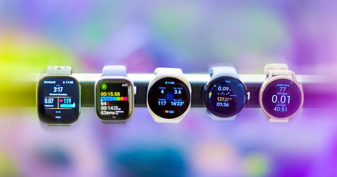
A few weeks ago, Business Insider published a piece about people becoming anxious and obsessive about their health wearables. One woman checked her Garmin’s “Body Battery” metric so religiously that when it showed low energy before an important meeting, it triggered anticipatory dread. Her family eventually suggested she take the watch off. A researcher quoted in the piece has a name for the sleep-tracking version of this phenomenon: orthosomnia, the sleep equivalent of orthorexia. You obsess over your sleep data until the anxiety ruins your sleep.
I loved the article, because I have been saying this for years. But the piece, understandably, frames it as a consumer psychology problem. It’s not. It’s a design problem.
The Data Delusion
Here’s something that will not surprise a behavioral scientist but might surprise a product manager: data doesn’t change behavior. Pleasure changes behavior.

Can you really act on this data?
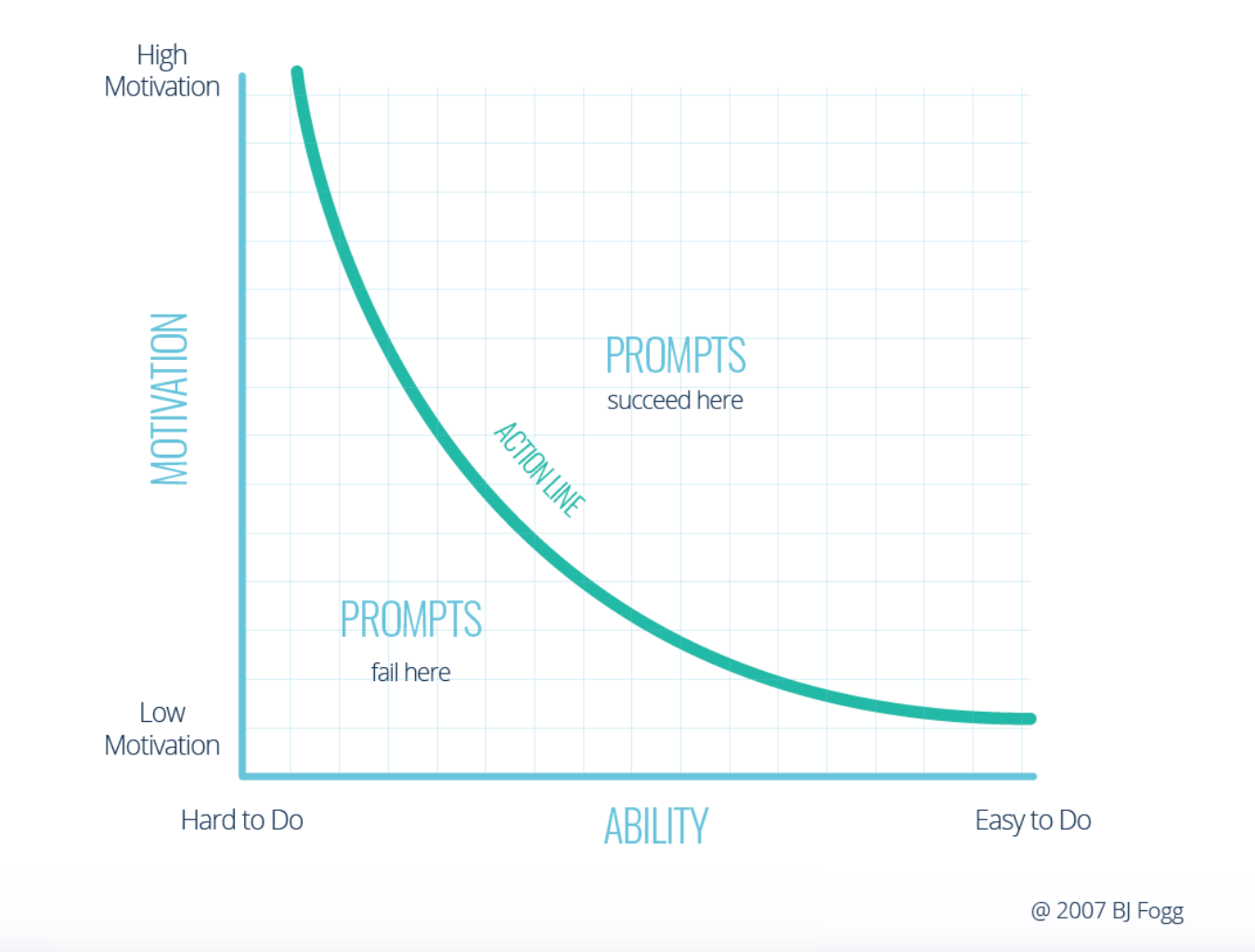
BJ Fogg’s Behavior Model, one of the most important frameworks in behavioral design, tells us that behavior happens when motivation, ability, and a prompt converge at the same moment. Make the task as easy as possible, then celebrate its completion to wire the behavior in. That’s the whole model. Data hits exactly none of those levers by itself.
And yet, the entire wearables industry, and much of the digital health industry, is organized around the premise that if we give people more precise information about themselves, they will act on it. Research scientists toil to build better sensors. Designers build dashboards. Product teams debate whether the closing circle should be green or blue. Everyone assumes that the data, elegantly visualized, will do the motivational work.
It won’t.
This is a seductive trap, and I want to be clear that it’s easy to fall into. The data is right there. It is fascinating. A good designer looks at a rich stream of biometric information and thinks: I can build a reward system around this. When the numbers are good, give the user an attaboy. When they’re bad, prompt them to do better. Close the ring. Fill the bar.
The problem is that this isn’t a habit loop; it’s a report card. And report cards make people anxious, not motivated, especially when the data contradicts what a person believes about themselves.
The Fallibility Problem
Wearables are, frequently, wrong. Or at least, they’re telling a story that doesn’t match a user’s lived experience.
You sleep eight hours, feel great, follow every piece of advice you’ve ever read about sleep hygiene, and wake up to an Oura ring telling you your sleep score is 61. You feel scolded. You feel confused. Worse, you start to distrust yourself. “Do I actually feel fine, or am I just not noticing that I feel bad?” The device has inserted itself between you and your own subjective experience, and it has no bedside manner whatsoever.
This is a trust problem that no amount of sensor improvement will fully solve, because the issue isn’t just accuracy. It’s that the user’s lived experience and the app’s interpretation of the data are two different things, and the app presents its version with complete confidence. A doctor who told you that you felt bad when you felt good would, at minimum, have a conversation with you about it. Your fitness tracker does not.
David Shaywitz, writing for the Timmerman Report, recently assembled a remarkable body of research that explains exactly why. In one study, participants wearing Apple Watches were given deliberately manipulated step counts: one group saw their count deflated by 40%, another saw it inflated by the same amount. After four weeks, the group who received deflated counts ate worse, felt worse, and had measurably higher blood pressure and heart rates. The group with inflated counts were indistinguishable from the control group.

Seeing a step count like this one might make you a healthier person, even if the cout intself is a lie.
Here’s the part that should stop every health product designer cold: the walking didn’t change. The belief changed. The body responded to the belief.
The promise underneath all of this is that with enough data, we can optimize ourselves toward something like perfection. This is compelling, and it isn’t entirely wrong. Patterns in data can reveal real things. But perfection is not a real destination, and an app that tells you you’re failing every morning is not a health tool. It’s a stressor.
What Data Actually Does (When It Works)
Before I get to what good health design looks like, I want to be precise about something, because the research Shaywitz cites is genuinely fascinating and deserves more attention from designers.
Wearables do sometimes improve health outcomes. Several large reviews found solid evidence that they increase physical activity, at least modestly. A CVS/Aetna analysis of members enrolled in a wearable-and-incentive program found roughly $10 less per month in medical spending compared to non-enrollees. But the savings came almost entirely from fewer non-emergency ER visits and reduced specialist visits. That doesn’t sound like bodies that got healthier. It sounds like people who felt better about themselves and made calmer decisions about when to seek care.
The mechanism, in other words, isn’t data. It’s mindset.
Shaywitz cites a remarkable 2007 Harvard study on hotel workers who believed they got very little exercise. One group was simply told (accurately) that their daily work already met the criteria for an active lifestyle. Four weeks later, that group had significantly reduced body weight, body fat, and blood pressure compared to the control group. Their actual activity hadn’t changed. Their belief about themselves had.

This is the real job of a health product: not to inform users, but to make them feel like the kind of person who takes care of themselves. Data can do that, but only when it’s designed to. A step count that validates effort (“you walked more than yesterday”) does something very different from a step count that surfaces inadequacy (“you’re 3,200 steps short of your goal”). Both are data. One is design.
The Designer’s Actual Job
None of this is an argument against data in health products. Trends over time matter. A user who can see that their resting heart rate has dropped fifteen points over three months of exercise has been given something real and motivating. Data is dandy, but it’s not a substitute for design.
If a designer is asking “how do I display this metric?” they’re already so stuck in the weeds it’s too late. Really, they should be asking “what do I want the user to do, and how do I make that action feel easy and good, and how does it make them feel about themselves afterward?” Data can serve those questions. A single encouraging signal, abstracted from the raw numbers and framed around progress, can be a powerful prompt. A dashboard of seventeen biometric readings at eight in the morning is a different thing entirely.
Shaywitz makes the point that even Peter Attia, whose detailed health protocols have motivated more people than perhaps any other popular writer on the subject, works not because readers follow his prescriptions precisely but because those prescriptions give people something to grip, a place to start, a sense that they are now the kind of person who takes prevention seriously. The specificity is scaffolding for identity, not a literal instruction set.
That is exactly what good health design does. It builds the scaffold. It gives the user evidence, however small and however often, that they are the person they want to be. The data is in service of that. When it’s designed the other way around, when the data is the product and the user is just the substrate it runs on, you get what we have now: the most sophisticated anxiety machines ever built, worn on the wrists of millions of people who are trying, sincerely, to feel better.
They deserve better design than that. And we know how to do it.
*Sam Liberty is a gamification expert, professor of game design at Northeastern University, and former Lead Game Designer at Sidekick Health. His clients include The World Bank, Click Therapeutics, and DARPA.*
메타데이터
- post_id
- 09e9c376b10c
- slug
- are-you-being-bullied-by-your-smart-watch-09e9c376b10c
- url
- https://medium.com/@sa-liberty/are-you-being-bullied-by-your-smart-watch-09e9c376b10c
- canonical_url
- https://medium.com/@sa-liberty/are-you-being-bullied-by-your-smart-watch-09e9c376b10c
- author_url
- https://medium.com/@sa-liberty
- status
- ok
- fetched_at
- 2026-06-20 20:29:01