How Police Crime Data Becomes Maps in 2026 — and Why It Often Fails Users
A comparative analysis of New York, London, Berlin, and Paris
How Police Crime Data Becomes Maps in 2026 — and Why It Often Fails Users
A comparative analysis of New York, London, Berlin, and Paris
Introduction
Across major global cities, access to crime data has become a cornerstone of public transparency. Governments publish police-recorded incidents, and interactive maps are often presented as tools for understanding safety.
Yet, despite the availability of data, most existing crime maps remain poorly suited for real-world decision-making — particularly for residents, renters, and travellers trying to evaluate specific locations.
This article examines how crime data is currently visualised in four major cities — New York, London, Berlin, and Paris — and why prevailing methodologies often mislead. It concludes with an alternative approach designed around actual user needs.
Legal Foundation: The Right to Crime Data
In all four countries — the United States, the United Kingdom, Germany, and France — access to crime data is grounded in law.
- In the United States, datasets such as NYPD Complaint Data are published under open data frameworks (NYC Open Data).
- In the United Kingdom, crime data publication is mandated under transparency and public safety policies.
- In Germany and France, statistical crime reporting is governed by federal and national legal frameworks ensuring public access.
While the legal mechanisms differ, the principle is consistent: Access to crime data is treated as part of the broader right to personal safety and informed decision-making. This reflects a shared assumption across Western societies: citizens must be able to understand risks in their environment.
The Raw Material: Police Incident Data
At the core of all crime maps lies the same source: police-recorded incidents, including: type of crime, date and time, approximate location.
Geolocation specifics
In New York and London, police typically assign coordinates: to the nearest intersection, to a point along a street segment, or to a landmark (e.g. building, subway entrance).
But, there are important inconsistencies: In New York, certain categories — notably sexual offences — are not mapped to actual locations. Instead, they are tied to the police precinct where the report was filed.
In London, such incidents are generally assigned approximate street-level locations. But they are hidden — merged together with violent crimes.
Berlin and Paris do not publish point-level incident maps - instead, they rely entirely on aggregated statistical visualisations only.
Official police maps
Examples of publicly available maps include:
- NYPD — https://compstat.nypdonline.org/
- NYC Office of Technology and Innovation (OTI) — https://maps.nyc.gov/crime/
- UK Metropolitan Police (London) — https://police.uk/pu/your-area/metropolitan-police-service/st-jamess/
- Kriminalitätsatlas (Berlin) — https://www.kriminalitaetsatlas.berlin.de/K-Atlas/atlas.html
- Service statistique ministériel de la sécurité intérieure (SSMSI — Paris) — https://ssmsi.shinyapps.io/donneesterritoriales/
The Problem with Points
At first glance, point-based maps appear precise and informative. In practice, they quickly become unusable.
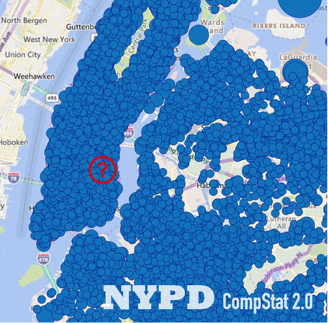
Visual overload
When viewing a large area: incident points saturate the map, overlapping events obscure each other, patterns become unreadable.
Multiple incidents per location
If several incidents occur at the same location:
- NYPD maps represent them as larger circles
- NYC OTI maps do the same, but also introduce clustering when zooming out

This creates further distortions: clustered circles may cover areas unrelated to the underlying incidents — visual boundaries no longer correspond to real geography.
London’s approach
The Metropolitan Police map uses:
- grey circular markers
- each representing multiple incidents

However, empty space between circles still contains incidents. This creates a misleading impression of “safe gaps” — where none exist.
Aggregation: From Points to Zones
To address the limitations of point maps, authorities introduce aggregation. And each city does so differently — with significant trade-offs.
New York (NYC OTI)
- Aggregation by police precincts
- Colour-coded zones (pink → brown)
- Crime counts are normalised by population, and then further simplified: instead of using the continuous values, the data are divided into five categories (Binning). As a result, most precincts appear to have the same crime level (On NYC maps from ten years ago, all precincts looked different).

Limitation: precincts are large and heterogeneous, population-based normalisation introduces distortion (see below).
London
- No unified city-wide aggregated crime map — users must select a specific local area at first
- Only point-level data is shown
Berlin
- Crime aggregated across 138 districts
- Values normalised per 1,000 residents and binned into five categories
- Displayed as colour intensity on a map

Limitations: districts are large, map is not aligned with street-level geography. Unsuitable for evaluating specific addresses.
Paris
- Crime aggregated by 20 arrondissements

Limitations: extremely coarse granularity - major variation within each arrondissement is ignored. Effectively unusable for location-level decisions.
Notably, earlier (2005–2010) Paris maps used finer subdivisions (e.g. electoral districts), which were significantly more informative.
Why These Methods Fail
Across all four cities, common issues emerge:
- Administrative boundaries ≠ real risk — Crime does not follow precincts, boroughs, or districts.
- Population-based normalisation is misleading
This breaks down in: tourist areas, transit hubs, commercial districts.
An example: Central Park (NYC, US) appears “dangerous” in per-capita metrics simply because no one lives there.

Clustering distorts geography: incidents are visually reassigned, spatial accuracy is lost/
Lack of severity differentiation
Most maps treat all incidents equally. In reality: 10 minor thefts ≠ 10 violent assaults
A User-Oriented Alternative
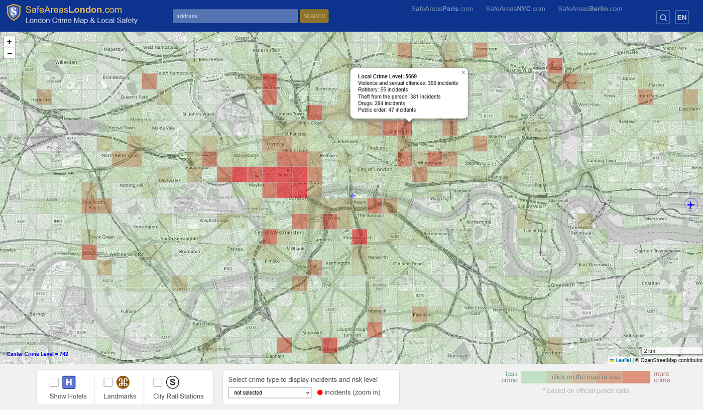
The methodology implemented in the SafeAreas projects is built around a different premise: users are not interested in administrative statistics — they want to understand real-world exposure.
Core principles
1. Grid-based aggregation (500 × 500 metres): reflects walkable distance — approximates “same street / nearby area” perception, removes dependence on arbitrary administrative borders.
2. Density normalisation (per area, not population): measures spatial concentration of incidents — better reflects probability of encountering crime.
3. Severity weighting (scale 1–10)
Each incident contributes based on impact: minor offences → low weight, violent crimes → high weight.
This reflects real human perception: ten pickpocketing incidents are not equivalent to ten violent assaults.
Result: Local Crime Level
The output is a comparative indicator, not a label. It allows users to: compare nearby areas, identify local variations, make informed decisions.

Important Limitations
All crime maps — including improved models — share a fundamental constraint: they rely on police-reported data. This introduces biases:
Underreporting: some communities report fewer incidents — maps may show artificially low crime levels.
Social dynamics: certain areas may be stable for locals, but risk increases for outsiders (e.g. tourists).
Conclusion
Across New York, London, Berlin, and Paris, crime data is widely available — but often poorly translated into meaningful tools.
And this is a deliberate choice by city administrations: in the next publication I will show how, in earlier years, publicly accessible crime maps were far more detailed and useful for residents and tourists.
Ultimately, the goal is not to label areas as “safe” or “unsafe”, but to provide a framework for comparison and informed decision-making.
Thank you for reading. And visit my sites:

메타데이터
- post_id
- 0a2bfbafa916
- slug
- how-police-crime-data-becomes-maps-and-why-it-often-fails-users-0a2bfbafa916
- url
- https://medium.com/@SafeAreasMaps/how-police-crime-data-becomes-maps-and-why-it-often-fails-users-0a2bfbafa916
- canonical_url
- https://medium.com/@SafeAreasMaps/how-police-crime-data-becomes-maps-and-why-it-often-fails-users-0a2bfbafa916
- author_url
- https://medium.com/@SafeAreasMaps
- status
- ok
- fetched_at
- 2026-07-24 13:42:39