Your Users Are Only Using 20% of Your Product. Here’s Why That’s Your Problem, Not Theirs.
A moment of panic at lunch taught me more about human behaviour than any UX research report I’ve ever read.
Your Users Are Only Using 20% of Your Product. Here’s Why That’s Your Problem, Not Theirs.
A moment of panic at lunch taught me more about human behaviour than any UX research report I’ve ever read.
Yesterday I panicked for about fifteen seconds while trying to pay for my lunch.
Not because my card got declined, not because the app crashed. I panicked because I opened Opay a fintech app I use almost every day, looked down at my screen, and didn’t recognise what I was looking at.
The transfer buttons I always tap weren’t there. The layout felt completely foreign. My first thought was “did they ship a new UI without any kind of heads-up?” I was already mentally composing an annoyed tweet.
Then I realised what actually happened. My hand had wandered when I first opened the app. I’d drifted completely unaware into a section of Opay I had never once visited. The Finance section. A part of the product that exists, functions, and has presumably been there the entire time I’ve had the app installed.
I went back to the home screen. Made my payment, ate my lunch.
I couldn’t stop thinking about what had just happened, because that small, embarrassing, fifteen-second moment cracked something open.
We don’t explore products. We colonise a corner of them.
Here is the uncomfortable truth that most product teams don’t like to sit with: users are not curious about your product. They are goal-oriented, they are busy, they are slightly impatient, and the moment they find a path that gets them from A to B reliably, they will walk that same path every single time until something forces them off it.
This isn’t a flaw. It’s just how human beings are wired, psychologists call it cognitive load minimisation our brains are constantly looking for shortcuts, patterns, and routines that let us accomplish things without having to think too hard. When we find a digital path that works, we encode it, we stop seeing the rest of the interface, it fades into peripheral noise.
I have had Opay on my phone for over a year. In that time I have used it to send money, receive money, and occasionally check my balance. That’s the entire extent of my relationship with the product. The Finance section? Invisible to me, not because it’s bad I still don’t know if it’s good or bad but because I never needed it for the one thing I came to the app to do.
“The product you shipped and the product your users actually experience are two completely different things. The gap between them is where most products quietly fail.”
And I am someone who thinks about product design for a living. Someone who notices UX decisions, someone who reads app release notes for fun. If I’m not exploring the full surface area of an app I use daily, what does that say about the average user who just wants to send ₦5,000 to their mum?
The metric that’s lying to you right now
Most product teams measure feature success by adoption. Did users use the thing we built? And when the numbers come back low, the default interpretation is one of two things: the feature isn’t good enough, or users don’t want it.
Both of those conclusions might be wrong.
Sometimes low adoption is a discovery problem. The feature is fine, the users would use it if they knew it existed, but nobody thought hard enough about the journey from “user opens app” to “user finds and understands this thing we built.”
THE THREE QUESTIONS WORTH ASKING BEFORE YOU BLAME THE FEATURE
- Does the user’s primary flow ever naturally lead them here?
- Would a user know what this feature does from the label alone?
- Is there any moment in the user’s journey where this feature feels like the obvious next step?
If the answer to all three is no, you don’t have a feature problem. You have a design problem, and it’s one that no amount of iteration on the feature itself will solve.
Onboarding is not a tour, it’s a slow introduction to value.
The way most apps think about onboarding is fundamentally broken. There’s a brief walkthrough on first launch a few tooltips, maybe an empty state with a helpful illustration and then users are dropped into the product and expected to figure the rest out.
That approach treats onboarding like a single event. A handshake at the door, but onboarding should be a relationship that develops over time, surfacing the right capability at the exact moment a user is ready to receive it.
Think about what that would have looked like for me with Opay. Imagine after my fifteenth transfer, the app surfaces something like: “Looks like you send money regularly. Did you know you can set up scheduled transfers from the Finance section?” In context at a moment where it’s relevant not as a notification I’ll swipe away, but woven into the experience.
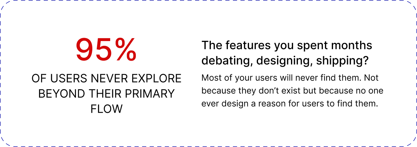
That’s not a feature, that’s behaviour design and it’s the difference between a product that grows with its users and one that stays permanently stuck at 20% adoption for 80% of its functionality.
Navigation that rewards habit punishes discovery
There’s a quiet tension in app architecture that doesn’t get talked about enough. Good navigation should make the frequent path frictionless and make new paths discoverable. Most apps optimise hard for the first and nearly forget the second.
When everything is buried under a bottom tab labelled “More” or tucked into a hamburger menu nobody opens the implicit message to the user is: the important stuff is already in front of you, the rest isn’t worth your time.
The products that break this pattern are the ones that treat navigation as an editorial decision, not just an organisational one.
They ask: what should a user be curious about next? What would genuinely make their life easier that they haven’t discovered yet? And then they design intentional moments not pop-ups, not badges, but contextual, earned moments where users naturally brush up against something new.
The best products don’t just build features. They design the conditions under which features get discovered.”
What this means for the people building things
If you’re a product manager, the question to ask isn’t only “what should we build next?” It’s “how will anyone know this exists?” Ship a feature without a discovery strategy and you’ve done half the job.
If you’re a designer, the work doesn’t end at the edge of the primary flow. Designing for behaviour means mapping the full picture not just how users accomplish their main task, but how they might one day expand beyond it.
If you’re an engineer, you already know how to build things, but understanding why users don’t use what you build is equally worth your attention. The code is rarely the bottleneck.
And if you’re a founder or product lead staring at a dashboard wondering why engagement is plateauing before you greenlight a new feature, audit the ones you already have. Talk to your users. Watch session recordings. Find out what they’re ignoring, and ask yourself whether they were ever actually given a reason to notice it.
THE REAL QUESTION
If your most loyal user opened a random section of your product tomorrow a section they’ve never visited would they panic? Or would they feel like they’d discovered something made for them?
Design for the second response. Always.
My jollof rice was fine, by the way. Really spicy, but fine.
And somewhere in that fifteen seconds of confused scrolling, I was reminded that the hardest design problem isn’t making something that works. It’s making something that gets used fully, intentionally, and by people who might never once think about the craft that went into making it feel easy.
That’s the job. All of it.
If this made you think differently about how you build follow for more writing on product design, user behaviour, and the space between what gets built and what actually gets used.
메타데이터
- post_id
- 0b3bbf0bcb82
- slug
- your-users-are-only-using-20-of-your-product-heres-why-that-s-your-problem-not-theirs-0b3bbf0bcb82
- url
- https://medium.com/@ololadegrace.ot/your-users-are-only-using-20-of-your-product-heres-why-that-s-your-problem-not-theirs-0b3bbf0bcb82
- canonical_url
- https://medium.com/@ololadegrace.ot/your-users-are-only-using-20-of-your-product-heres-why-that-s-your-problem-not-theirs-0b3bbf0bcb82
- author_url
- https://medium.com/@ololadegrace.ot
- status
- ok
- fetched_at
- 2026-06-09 15:37:30