Five Native HTML Features I Reach for Before JavaScript
Small interface behaviors have a habit of growing into larger pieces of code. An accordion needs keyboard handling. A modal needs focus…
Five Native HTML Features I Reach for Before JavaScript
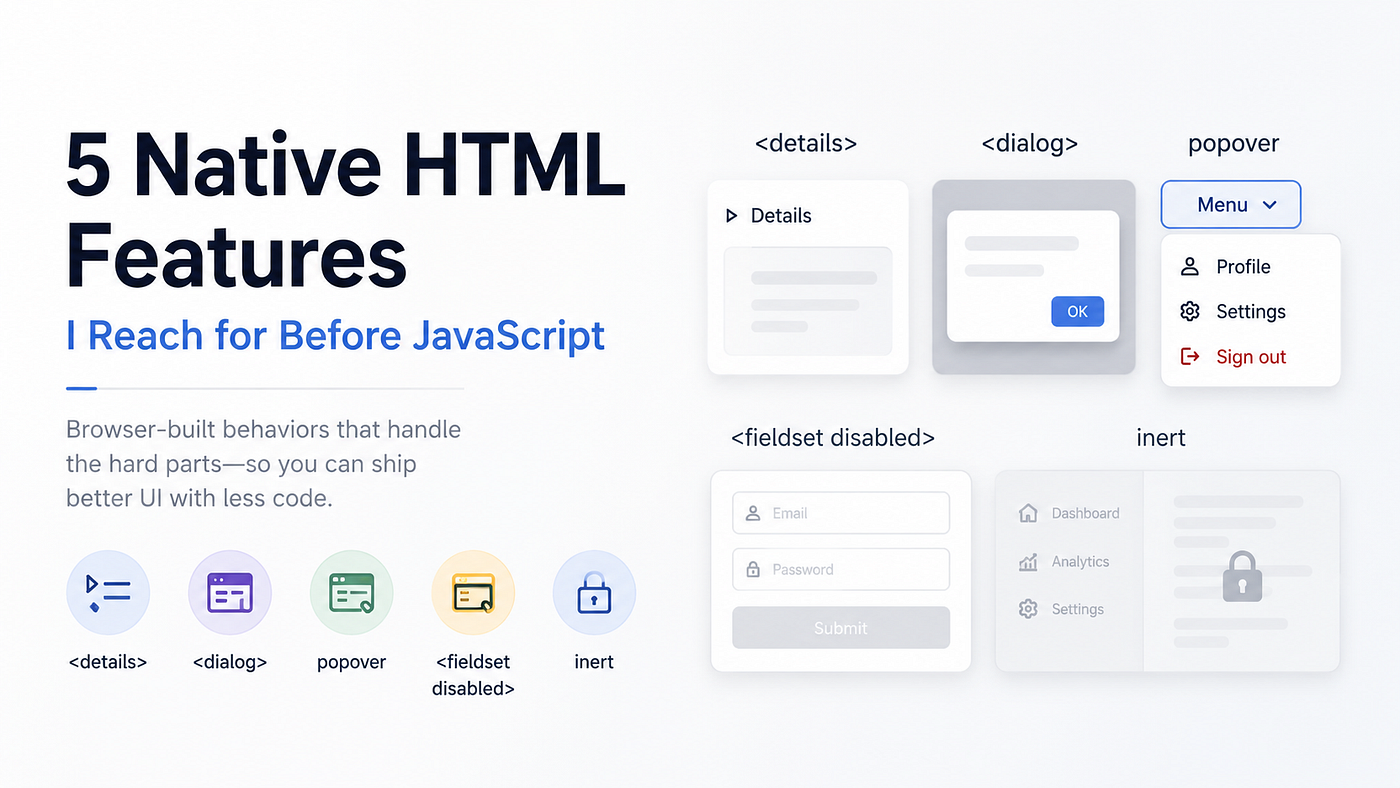
Small interface behaviors have a habit of growing into larger pieces of code. An accordion needs keyboard handling. A modal needs focus management. A floating menu needs dismissal logic. None of these problems is difficult on its own, but each one adds state, event listeners, and edge cases.
Before building those interactions from scratch, it is worth checking what the browser already provides. The five features below cover patterns I run into regularly. They do not replace JavaScript altogether; they give it a better starting point.
1. <details> and <summary> for disclosure controls
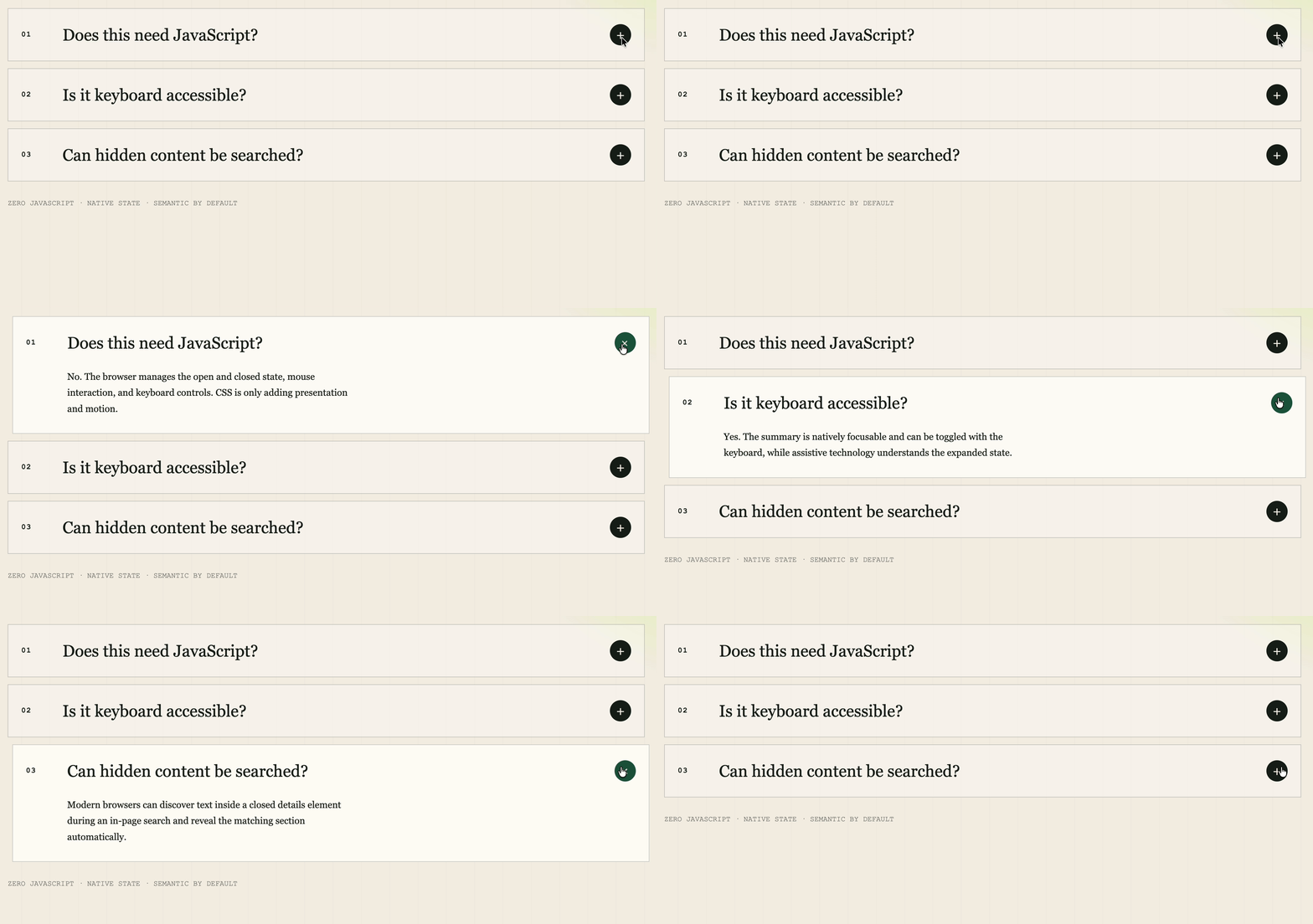
<details> owns its open state, and <summary> provides the interactive label. The browser supplies mouse and keyboard behavior without a click handler.
Here is the core markup from the working example:
<section class="stack" aria-label="Frequently asked questions">
  <details open>
    <summary>
      <span class="number">01</span>
      <span>Does this need JavaScript?</span>
      <span class="marker" aria-hidden="true">+</span>
    </summary>
    <div class="content">
      <div class="content-inner">
        <p>
          No. The browser manages the open and closed state, mouse
          interaction, and keyboard controls.
        </p>
      </div>
    </div>
  </details>
</section>
The interaction does not require JavaScript. CSS can still control the presentation and transition:
.content {
  display: grid;
  grid-template-rows: 0fr;
  opacity: 0;
  transition: grid-template-rows 420ms cubic-bezier(.2, .7, .1, 1),
              opacity 260ms ease;
}

details[open] .content {
  grid-template-rows: 1fr;
  opacity: 1;
}

.content-inner {
  overflow: hidden;
}
This pattern works well for FAQs, release notes, and secondary settings. In-page search behavior for collapsed content varies by browser, so test that detail if it matters to the product.
2. <dialog> for modal UI

A modal is more than a box with a large z-index. It also needs to sit above the rest of the page, receive focus, and respond to Escape. <dialog> handles those browser-level concerns when it is opened with showModal().
The example uses a form with method="dialog", so its close button dismisses the modal without a separate submit handler:
<button class="open-button" type="button" id="openDialog">
  Launch dialog ↗
</button>

<dialog id="nativeDialog" aria-labelledby="dialogTitle">
  <form method="dialog" class="dialog-body">
    <h2 id="dialogTitle">You are inside a native dialog.</h2>
    <p>
      Focus stays here while the modal is open. Press Escape or use the
      button below to return to the page.
    </p>
    <button class="close-button" value="closed">Close dialog</button>
  </form>
</dialog>
Opening the dialog still takes one line of JavaScript. The demo also adds optional backdrop-click dismissal:
const dialog = document.getElementById('nativeDialog');
const openButton = document.getElementById('openDialog');

openButton.addEventListener('click', () => dialog.showModal());

dialog.addEventListener('click', (event) => {
  if (event.target === dialog) dialog.close('backdrop');
});
The backdrop is directly styleable:
dialog::backdrop {
  background: rgba(5, 6, 7, 0.76);
  backdrop-filter: blur(6px) grayscale(0.6);
}
This is a good default for confirmations, short forms, and focused tasks. Complex application modals may still need product-specific behavior, but the browser can handle the modal mechanics.
3. popover for lightweight floating UI
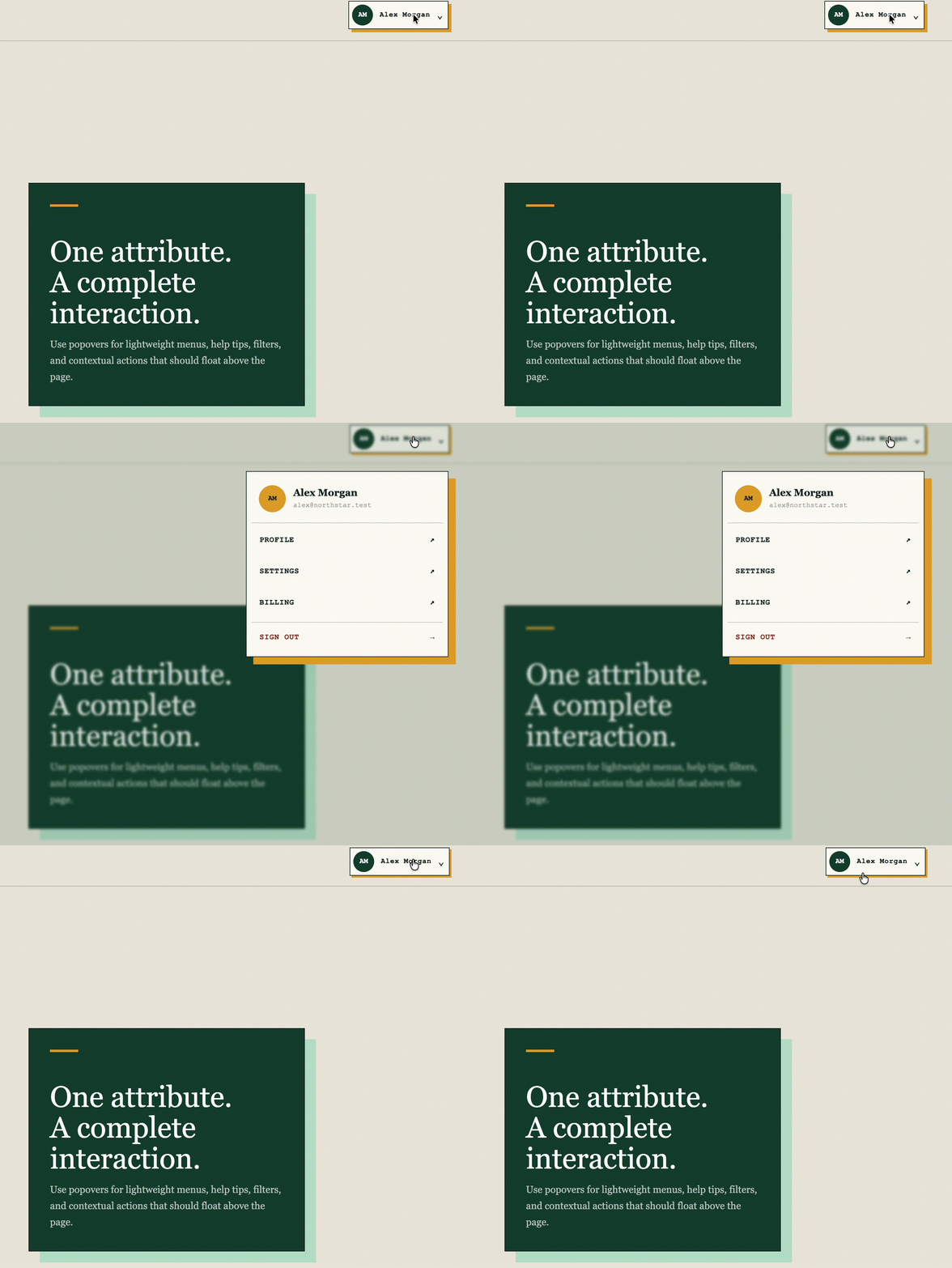
Menus, help cards, and small filter panels often need to escape clipping and close when the user clicks elsewhere. The Popover API provides both behaviors without a visibility variable or document-level click listener.
The relationship between the trigger and the floating panel is declarative:
<button
  class="profile-trigger"
  type="button"
  popovertarget="user-menu"
  aria-label="Open account menu"
>
  <span class="avatar" aria-hidden="true">AM</span>
  <span class="trigger-copy">Alex Morgan</span>
  <span aria-hidden="true">⌄</span>
</button>

<div id="user-menu" popover aria-label="Account menu">
  <a class="menu-link" href="#profile">Profile</a>
  <a class="menu-link" href="#settings">Settings</a>
  <a class="menu-link" href="#billing">Billing</a>
  <button
    class="sign-out"
    type="button"
    popovertarget="user-menu"
    popovertargetaction="hide"
  >
    Sign out
  </button>
</div>
Unlike the native suggestion panel created by <datalist>, a popover is part of the document and can be styled normally. The open state also has its own selector:
#user-menu {
  position: fixed;
  width: min(330px, calc(100vw - 40px));
  padding: 8px;
  border: 1px solid #10251c;
  background: #fffdf7;
  box-shadow: 12px 12px 0 #e3a72f;
}

#user-menu:popover-open {
  display: grid;
  gap: 3px;
  animation: pop-in 190ms cubic-bezier(.2, .8, .2, 1) both;
}
An automatic popover joins the top layer and supports light dismissal: Escape and an outside click both close it. For nested application menus or positioning that must track a moving anchor, a dedicated component may still be easier to maintain.
4. <fieldset disabled> for form-wide state
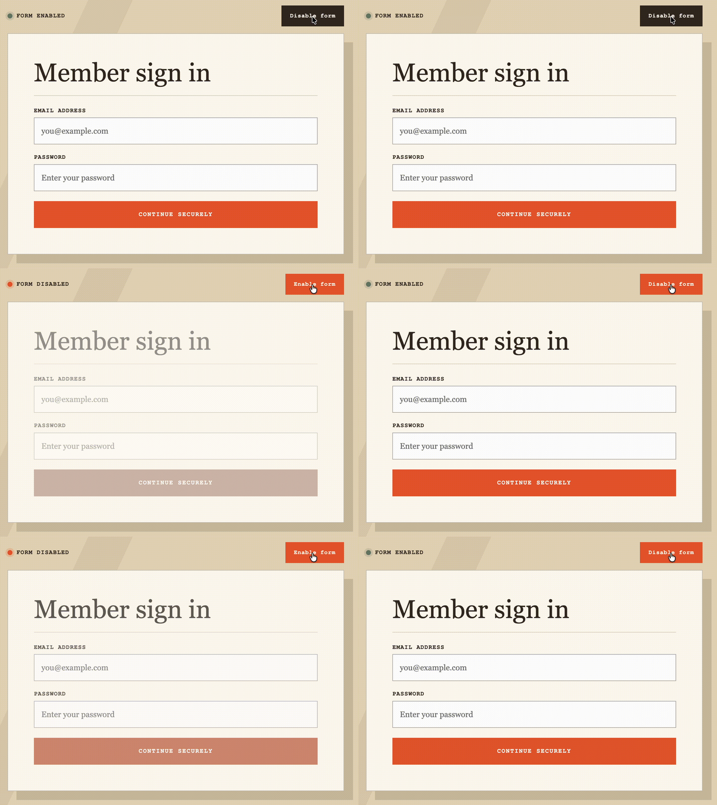
When a form is submitting, disabling each field individually creates unnecessary state and bookkeeping. A disabled <fieldset> applies the state to its descendant form controls as a group.
The form in the demo keeps that boundary explicit:
<form id="accountForm">
  <fieldset id="accountFields">
    <legend>Member sign in</legend>

    <label>
      Email address
      <input
        type="email"
        name="email"
        placeholder="you@example.com"
        autocomplete="email"
      >
    </label>

    <label>
      Password
      <input
        type="password"
        name="password"
        placeholder="Enter your password"
        autocomplete="current-password"
      >
    </label>

    <button class="submit" type="submit">Continue securely</button>
  </fieldset>
</form>
The entire interactive state changes through one property:
const fieldset = document.getElementById('accountFields');
const toggle = document.getElementById('toggleForm');
const status = document.getElementById('formStatus');

toggle.addEventListener('click', () => {
  fieldset.disabled = !fieldset.disabled;
  toggle.textContent = fieldset.disabled ? 'Enable form' : 'Disable form';
  toggle.setAttribute('aria-pressed', String(fieldset.disabled));
  status.textContent = fieldset.disabled ? 'Form disabled' : 'Form enabled';
});
This is useful during submission and for conditional form sections. It also keeps the HTML meaningful: the controls are disabled because their group is disabled, not because several unrelated flags happen to agree.
5. inert for disabling a page region

disabled belongs to form controls. inert works at the page-region level. When a container is inert, its descendants stop receiving pointer interaction and are removed from the tab order.
The demo separates the workspace from the drawer so the drawer remains interactive while the page behind it is inert:
<div id="workspace">
  <button
    type="button"
    id="openDrawer"
    aria-expanded="false"
    aria-controls="settingsDrawer"
  >
    Open settings
  </button>

  <button type="button" id="activityButton">Test activity</button>
</div>

<button
  id="drawerBackdrop"
  type="button"
  aria-label="Close settings"
  tabindex="-1"
  hidden
></button>

<aside id="settingsDrawer" aria-labelledby="drawerTitle" hidden>
  <h2 id="drawerTitle">The page behind is inert.</h2>
  <button type="button" id="closeDrawer">Restore workspace</button>
</aside>
The important line is workspace.inert = isOpen. The surrounding code displays the custom drawer and deliberately manages focus:
const workspace = document.getElementById('workspace');
const drawer = document.getElementById('settingsDrawer');
const backdrop = document.getElementById('drawerBackdrop');
const openButton = document.getElementById('openDrawer');
const closeButton = document.getElementById('closeDrawer');

function setDrawerOpen(isOpen) {
  drawer.hidden = !isOpen;
  backdrop.hidden = !isOpen;
  workspace.inert = isOpen;
  openButton.setAttribute('aria-expanded', String(isOpen));

  if (isOpen) {
    closeButton.focus();
  } else {
    openButton.focus();
  }
}

openButton.addEventListener('click', () => setDrawerOpen(true));
closeButton.addEventListener('click', () => setDrawerOpen(false));
backdrop.addEventListener('click', () => setDrawerOpen(false));
inert does not draw the overlay, open the drawer, or decide where focus should move. It handles the interaction boundary. That narrower responsibility is exactly what makes it useful.
A practical rule of thumb
The point is not to avoid JavaScript at all costs. It is to give the browser the work it already understands: disclosure state, modal behavior, top-layer rendering, grouped form state, and interaction boundaries.
Start with the semantic element. Add CSS for presentation and JavaScript for the product behavior that remains. The result is usually smaller, easier to test, and clearer to the next person who reads the code.
메타데이터
- post_id
- 0ebccdafdfe7
- slug
- five-native-html-features-i-reach-for-before-javascript-0ebccdafdfe7
- url
- https://medium.com/devmap/five-native-html-features-i-reach-for-before-javascript-0ebccdafdfe7
- canonical_url
- https://medium.com/devmap/five-native-html-features-i-reach-for-before-javascript-0ebccdafdfe7
- author_url
- https://medium.com/@kxming
- status
- ok
- fetched_at
- 2026-07-09 08:02:55