My Toughest User Is 2 Years Old – and She Made Me a Better Designer
Every designer talks about users. Personas, journeys, flows, edge cases.
My Toughest User Is 2 Years Old and She Made Me a Better Designer
Every designer talks about users. Personas, journeys, flows, edge cases.
But no one really prepares you for designing for your most honest user: a toddler.
In my case, that user is my 2-year-old.
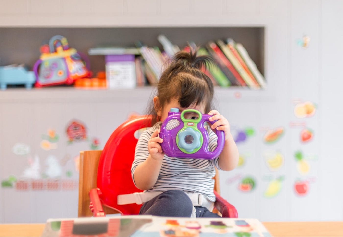
Photo by Tanaphong Toochinda on Unsplash
She doesn’t read instructions. She doesn’t follow intended flows. She doesn’t try to “figure things out” the way we expect users to. If something doesn’t make sense immediately, she disengages.
No hesitation. No second chances.
Just a quiet exit.
And over time, I started noticing something interesting: her behavior mirrors real user behavior more closely than most research methods ever capture.
If it’s not obvious, it doesn’t exist
I once gave her a toy with multiple buttons, sounds, and lights. On paper, it looked engaging. In reality, it was overwhelming.
She pressed one button, paused, looked confused, and walked away.
That moment stayed with me.
Users behave the same way. If an interface requires too much effort to understand, they won’t explore it. They won’t “learn” it. They’ll abandon it.
Clarity always wins over complexity.

Photo by Anton Polidovets on Unsplash
Feedback builds confidence
Toddlers expect immediate responses.
Tap something → something happens
Press a button → a reaction follows
When there’s no feedback, confusion sets in quickly.
It’s the same in digital products. Every interaction needs acknowledgment, whether it’s a loading indicator, a state change, or a subtle animation.
Feedback isn’t just visual polish. It reassures users that their action was registered.
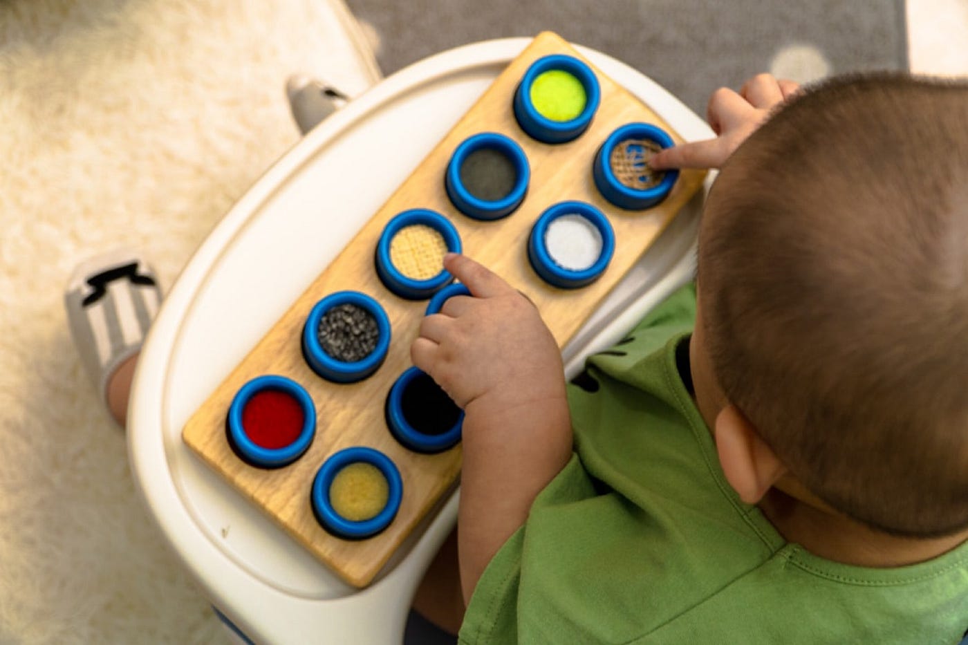
Photo by Benson Low on Unsplash
Emotion drives decisions more than logic
Children don’t separate logic from emotion. If something feels frustrating, they avoid it. If something feels enjoyable, they repeat it endlessly.
Users are no different.
We often assume decisions in UX are rational, but in reality, they are shaped heavily by emotion. A product that feels smooth, intuitive, and satisfying will always outperform one that is merely functional.
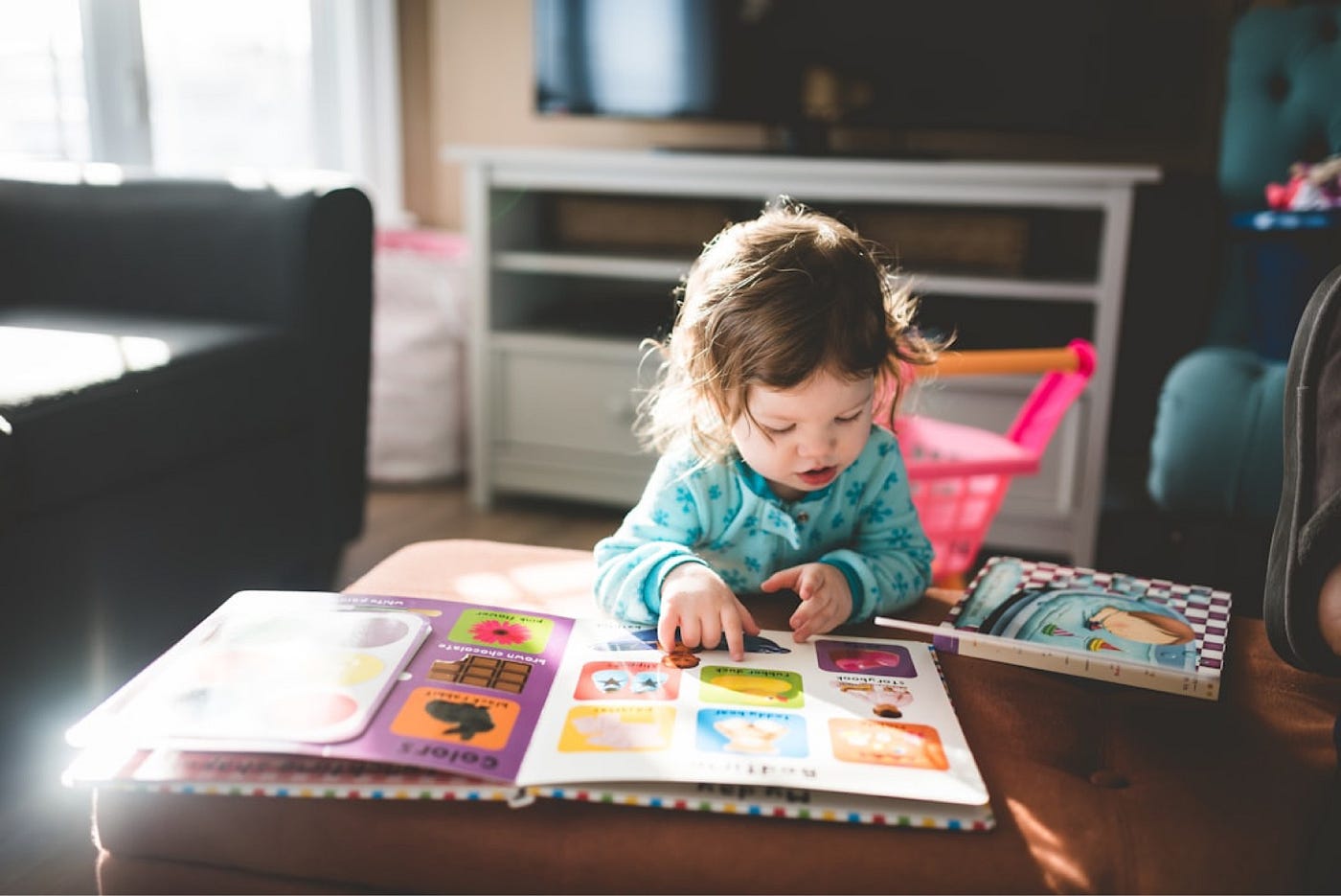
Photo by Stephen Andrews on Unsplash
Too many options create hesitation
Give a toddler too many choices, and they often freeze.
Reduce the options, and decisions become easier.
This reflects a core UX principle: cognitive load matters. Interfaces overloaded with choices slow users down and increase friction.
Simplicity is not minimalism for aesthetics. It’s a strategy to help users decide faster and with less effort.
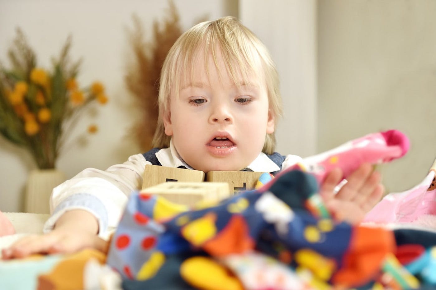
Photo by Veronika Plesníková on Unsplash
You can guide behavior, not control it
Parenting teaches something that translates directly into UX: you cannot force behavior.
You can guide, suggest, and design an environment that encourages certain actions, but ultimately, the user decides what to do next.
In UX, this means focusing less on controlling users and more on shaping experiences that naturally lead them in the right direction.
Being a parent didn’t take me away from UX. It made me see users more clearly.
Because real users are not always patient, rational, or predictable.
They are emotional, distracted, curious, and sometimes inconsistent.
Just like toddlers.
And designing for that reality is where good UX begins.

Photo by Shaylyn on Unsplash
메타데이터
- post_id
- 0ed17cbfc62b
- slug
- my-toughest-user-is-2-years-old-and-she-made-me-a-better-designer-0ed17cbfc62b
- url
- https://medium.com/@iknowicando/my-toughest-user-is-2-years-old-and-she-made-me-a-better-designer-0ed17cbfc62b
- canonical_url
- https://medium.com/@iknowicando/my-toughest-user-is-2-years-old-and-she-made-me-a-better-designer-0ed17cbfc62b
- author_url
- https://medium.com/@iknowicando
- status
- ok
- fetched_at
- 2026-06-09 14:34:10




