The Efficiency Mandate: Why Nature Prefers the Hexagon
At first glance, beauty in the natural world appears effortless — almost decorative. But look again, and a quieter question begins to…
Why Nature Hexes the Rest or The Case for Six Sides
At first glance, beauty in the natural world appears effortless — almost decorative. But look again, and a quieter question begins to surface: what if beauty is not surface at all, but consequence?
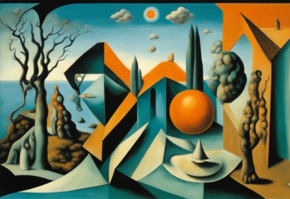
Artwork, ‘Drying Lakebed”, 2026. ELGNART
I’ve often wondered about this, almost instinctively, and over time it became clear why it feels so familiar. These patterns carry a quiet recognition — a sense that the idea isn’t imposed, but discovered. The feeling they give me is not surprise, but alignment, as if the logic was already there, waiting to be noticed rather than invented. What appears as graphical art is, in truth, optimization made visible. Nature operates under an unspoken rule, an efficiency mandate written into matter itself. As if the survival depends on doing the most with the absolute least. Nothing is wasted, because waste cannot endure.
Under constant strain, the forces of evolution and physics arrive at the same quiet solution: the hexagon. Not because it achieves perfection, but because it works. Even. Adaptive. A form that stays intact by sharing stress across its edges rather than fighting it.
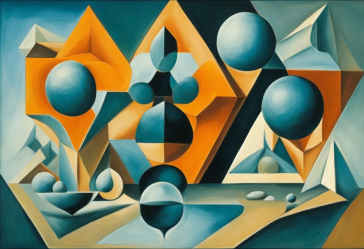
Artwork, ‘Drying Arrangement”, 2026. ELGNART
For the graphic artist, this realization changes everything. Pattern is no longer decoration; it is logic. Composition is no longer arrangement; it is alignment. Design becomes less about imposing form and more about listening for the shapes that have already solved the problem.
In this sense, visual creation is not an act of invention, but of recognition — a moment when human intention briefly harmonizes with a geometry the universe has been refining in silence since long before names, tools, or eyes existed to witness it.
The Geometry of Scarcity
“A drop falls thinking it is small, yet carries laws that shape us all. No ruler drawn, no line declared, yet curves emerge as if prepared.”
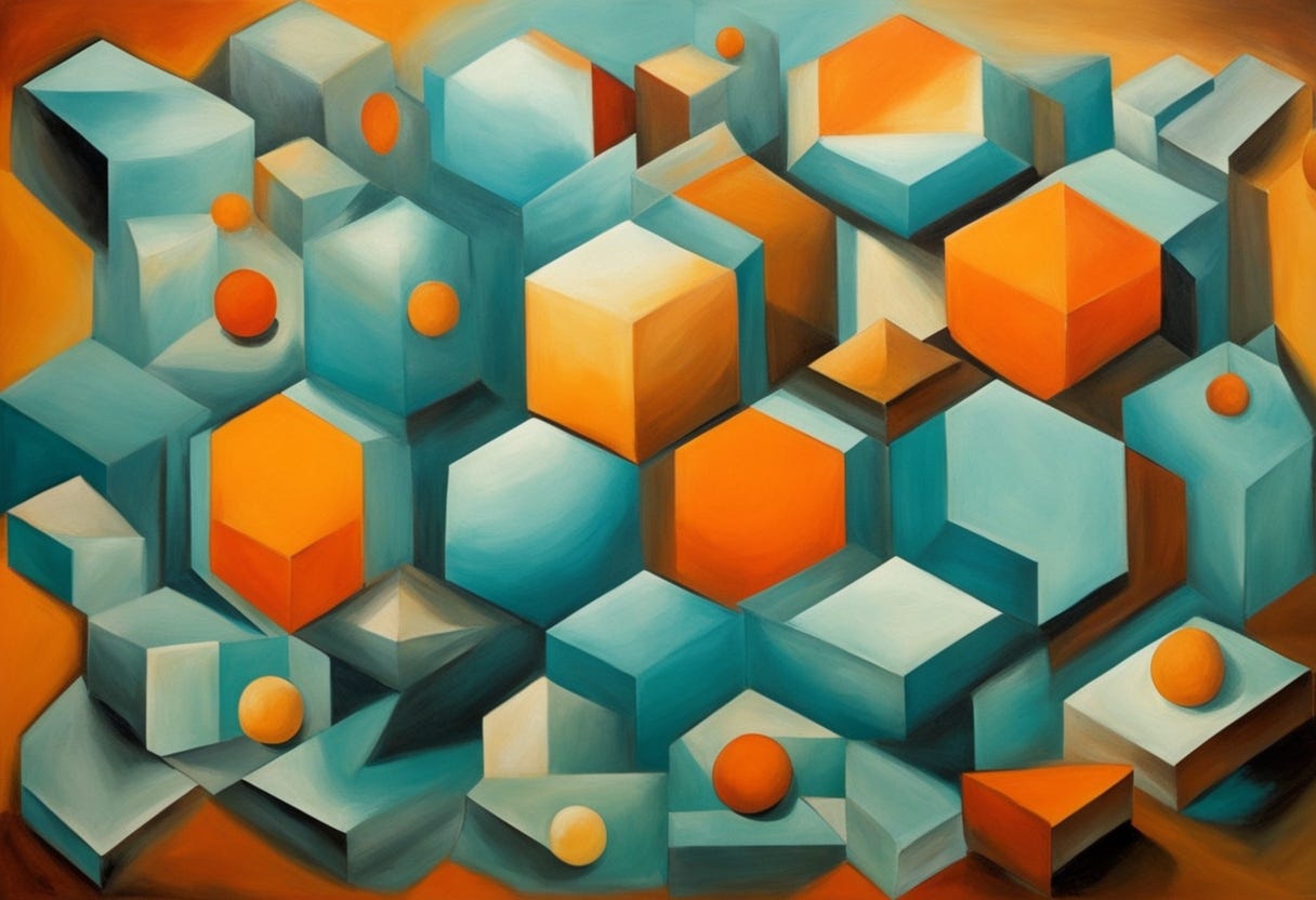
Digital art, ‘Cubistic Laws”, 2026. ELGNART
At its core, nature is remarkably consistent in how it solves problems. Again and again, it returns to what mathematicians call the Isoperimetric Problem — a deceptively simple question: how much space can be enclosed using the least possible boundary? When stripped of formulas, this problem feels less abstract and more instinctual, as though efficiency itself were a law quietly guiding matter.
From here, the logic becomes visible. When a flat surface must be filled completely, without gaps or overlaps, only three regular shapes are even capable of the task: the triangle, the square, and the hexagon. At first, this seems like a purely geometric constraint. But the moment these shapes are compared, their deeper differences begin to surface.
The triangle, while stable, demands too much. Its sharp angles require a disproportionate amount of boundary for the space it encloses. The square improves upon this, offering balance and order, yet it still wastes material at its corners. Then, almost unexpectedly, the hexagon emerges — quieter, more composed. For the same internal area, it requires less perimeter than either the triangle or the square. Mathematically, it is the most economical solution. Visually, it simply feels settled.
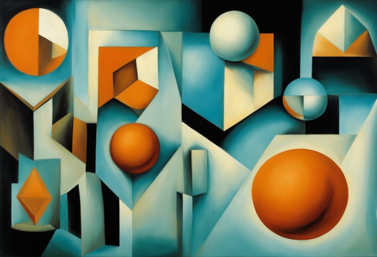
Digital art, ‘Honeybee Cubistic Laws”, 2026. ELGNART
At this point, abstraction gives way to consequence. For a honeybee, this efficiency is not theoretical; it is existential. Wax is metabolically expensive — nearly eight grams of honey must be consumed to produce a single gram of structure. Every unnecessary edge becomes lost energy. Every excess line shortens survival. The hexagon is not an aesthetic choice; it is the shape that makes life possible.
And it is here, almost without trying, that the connection reveals itself. This is the same question faced in graphic design. Every composition, every grid, every interface af quietly asks: how much meaning can be held with the fewest lines?
Excess borders confuse. Redundant shapes distract. The strongest designs, like honeycomb cells, maximize function while minimizing structure.
Seen this way, design stops feeling like invention and starts to resemble alignment. The moment a layout finally works, it no longer feels clever or forced. It feels inevitable — as if it has snapped into place along a logic that existed long before the designer arrived.
The hexagon does not persuade. It does not decorate. It simply solves the natural problem. And perhaps that is why the most effective visual systems don’t announce themselves. They simply endure.
Strength Through Distribution
Beyond simple material savings, the hexagon reveals itself as a true structural powerhouse. Its quiet strength begins with a single, unassuming detail: the 120° angle. This angle is not decorative, nor arbitrary. It is the precise point at which forces distribute evenly, without preference or tension.
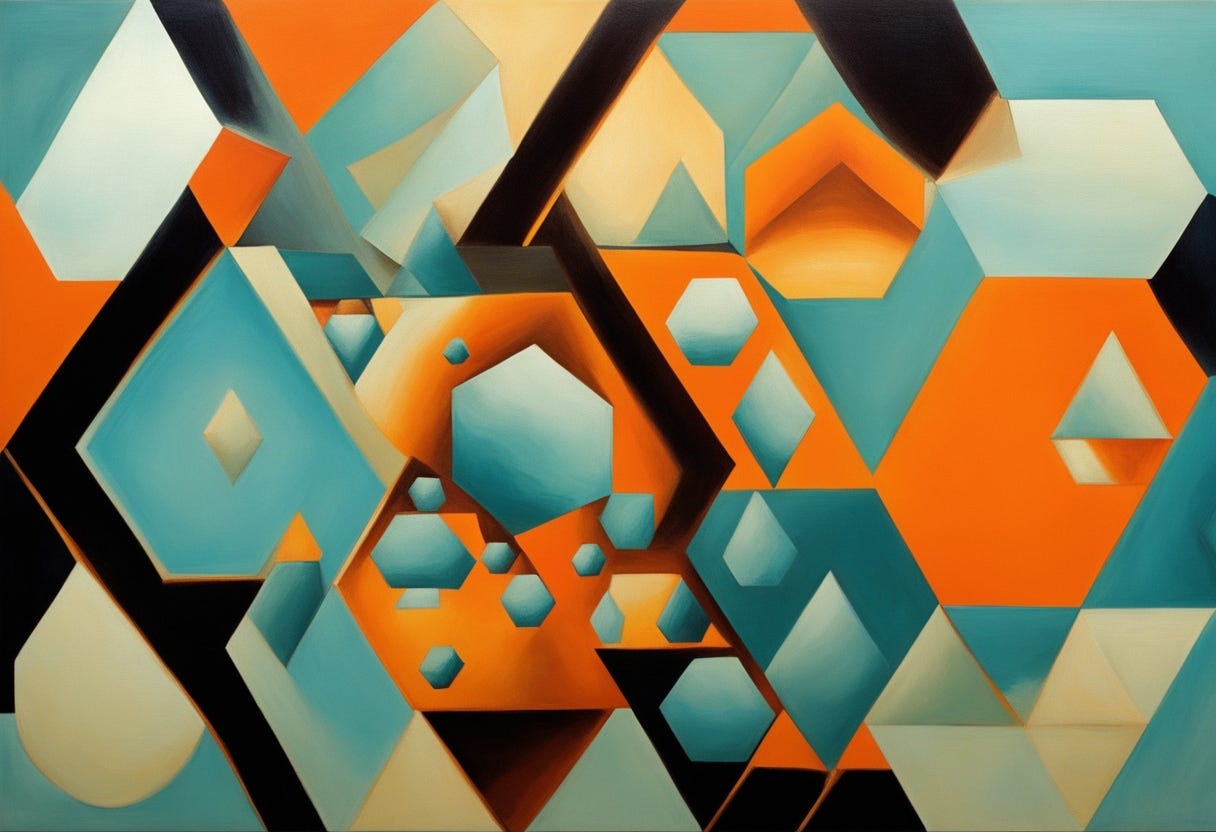
Digital art, ‘Shared Walls”, 2026. ELGNART
As hexagons lock together, a remarkable thing happens. Every wall is shared. No edge stands alone. At each vertex, three lines meet at equal angles, allowing stress to flow outward rather than accumulate. Instead of resisting force, the structure redirects it. I see it as if the vivid pressure doesn’t fight the form — but it travels through it.
Recent structural analyses show that systems built on hexagonal junctions do more than simply resist localized damage. Instead, they redistribute load paths when a component is stressed or fails, helping prevent damage from spreading through the entire structure. Because forces are shared evenly across neighboring cells, stress is absorbed and rerouted rather than concentrated in a single weak point.
In practical terms, the hexagon doesn’t merely hold weight — it manages it. Load is negotiated across the network, not imposed on any one element.
This behavior has only become fully understood in recent years, as researchers developed more accurate models at microstructural and lattice scales. These studies help explain why hexagonal geometries repeatedly appear in nature and technology alike: in biological tissues where flexibility and strength must coexist, in graphene where atomic bonds form a hexagonal lattice with exceptional strength-to-weight ratios, and in advanced lightweight engineering where damage tolerance is as critical as efficiency.
What once appeared as a visual preference is now understood as a structural strategy — one that balances strength, resilience, and economy in a single form.
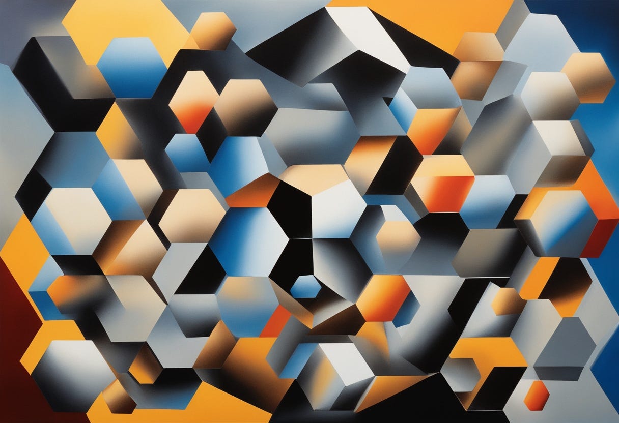
What’s especially striking me is that the hexagon’s 120° logic mirrors how the human visual system prefers to resolve intersections. Recent perceptual studies suggest that evenly spaced angular junctions reduce cognitive strain during visual parsing — meaning the hexagon isn’t just structurally efficient, but visually economical as well. The brain reads it with less effort, even if the viewer can’t explain why.
So, the hexagon’s power isn’t loud. It doesn’t demand attention. It graphically works through visual cooperation — between angles, between edges, between units. And that may be why, when a design finally feels balanced, nothing seems to stand out. Everything simply belongs. Since, the hexagon doesn’t insist on perfection. It distributes it.
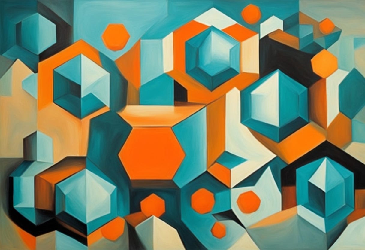
Digital art, ‘Quieter Laws”, 2026. ELGNART
How the World Learned to Draw Before We Did
To understand why the hexagon keeps returning — in eyes, in stone, in screens — it helps to look at places where nature had no intention of making beauty, only survival. What emerges instead is something far more instructive: design as consequence.
Dragonflies and bees do not see through a single lens, but through thousands of tiny optical units called ommatidia. Each unit captures a fragment of the world, and together they assemble perception itself. The crucial detail lies in how these units are packed. A hexagonal grid leaves no dead space. No gaps. No wasted surface. Every photon has a place to land.
This is not a stylistic choice. It is a biological constraint resolved with mathematical precision. A circular unit would leave voids. A square would fracture continuity. Only the hexagon allows maximum sensory coverage while maintaining seamless adjacency. Vision, here, is not about clarity alone — it is about efficiency under pressure. The compound eye functions like a distributed interface. No single ommatidium dominates. Resolution emerges from cooperation, not hierarchy. Each unit is modest, but together they form a field — a logic that feels strikingly modern to anyone working in modular layouts, pixel grids, or generative systems. Long before screens existed, perception itself was already tiled.
At the Giant’s Causeway in Ireland, thousands of basalt columns rise from the ground in near-perfect hexagonal stacks. There is no life here. No adaptation. No evolution. Only heat, cooling, and stress. As ancient lava slowly contracted, tension built. And just as with soap films or honeycomb, the system sought the most economical release.
The rock did not crack randomly. Random fractures would have required longer fault lines, more energy, more disruption. Instead, the stone resolved its internal pressure by minimizing total crack length — and once again, the math pointed to the hexagon. This is the same logic, expressed through an entirely different medium.

Digital art, ‘Cubistic Causeway”, 2026. ELGNART
Where the compound eye optimizes perception, the Giant’s Causeway optimizes fracture. One maximizes intake. The other minimizes damage. Yet both converge on the same geometry, not because it is beautiful, but because it is efficient under constraint. And this is where the connection deepens. Graphic design, at its most mature stage, faces the same pressures. Modern visual systems must scale, adapt, and survive fragmentation — across devices, resolutions, contexts, and cultures. Fixed compositions collapse. Rigid hierarchies fracture. What endures are systems that distribute meaning the way stress is distributed in stone.
Hexagonal logic appears again — not always visibly, but structurally. In responsive grids. In modular branding. In generative visuals where no single element carries the burden of the whole. The most resilient designs today behave less like monuments and more like ecosystems. Recent studies in materials science and perceptual psychology suggest that hexagonal arrangements are not only structurally efficient, but cognitively economical. The brain parses evenly distributed angular intersections with less strain. Attention flows. Load balances. Meaning survives interruption.
Seen this way, design history feels less like a march of styles and more like a gradual rediscovery of constraints the world has always obeyed.
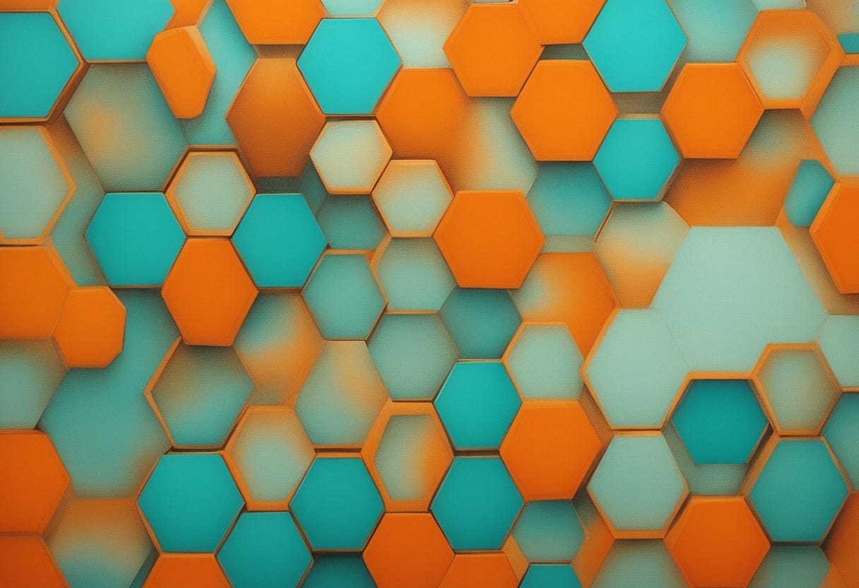
Digital art, ‘Cubistic Tubes”, 2026. ELGNART
So to say, old same lesson repeats: systems that endure do not fight tension — they resolve it. From the compound eyes of bees, where thousands of hexagonal ommatidia maximize light capture without wasted space, to the basalt columns of the Giant’s Causeway, which naturally fracture into hexagons to release stress most efficiently, the lesson is clear: systems that endure do not fight tension — they resolve it. Graphic design mirrors this logic in subtle but profound ways. Florence Nightingale’s coxcomb charts in the 1850s visualized soldier mortality during the Crimean War, revealing that infection — not battle wounds — was the real killer, and directly influencing sanitation reforms that saved countless lives. Edward Johnston’s London Transport typeface and roundel (1916) transformed urban navigation, reducing confusion and accidents by making complex systems legible and cognitively manageable.
And perhaps that is the quiet evolution of graphic design itself. Not toward novelty for its own sake, but toward structures that can absorb complexity without breaking. Toward forms that don’t dominate space, but cooperate with it.
The Mathematical “Proof”
For centuries, mathematicians suspected that the hexagon was the most efficient shape for tiling, but it remained a “conjecture.” It wasn’t until 1999 that mathematician **Thomas Hales provided the formal proof of the [Honeycomb Conjecture**.](https://en.wikipedia.org/wiki/Honeycomb_theorem)

Digital art, ‘We Felt It”, 2026. ELGNART
Hales proved that a regular hexagonal grid is the most efficient way to divide a surface into equal areas with the least total perimeter. It took humans thousands of years to formalize the mathematics, yet nature has been running the same solution for billions of years.
This gap between discovery and intuition matters. Long before we could prove efficiency, we felt it. The human attraction to grids, patterns, and repeating forms isn’t just aesthetic preference — it’s recognition.
Graphic expression emerges from this instinct. We organize space visually because our perception seeks systems that distribute tension, balance attention, and minimize cognitive load. Layouts, icons, and modular designs work when they echo the same efficiencies found in natural structures.
In this sense, graphic design is not about imposing order on chaos. It is a way for humans to align perception with systems that already know how to hold together.

Digital art, ‘Optimization for Forgiveness”, 2026. ELGNART
Nature Doesn’t Optimize for Perfection — It Optimizes for Forgiveness
The hexagon is often described as a perfect form, but that framing misses its true advantage. Rather than striving for flawlessness, nature designs systems that can fail locally without collapsing globally.
Because of this, the hexagonal grid is inherently forgiving. When one cell breaks, the structure endures. When one wall weakens, the load simply reroutes. That is why the hexagon appears again and again in systems that cannot afford catastrophic failure — beehives, biological tissues, crystalline lattices.
-“In contrast, perfection is brittle, while forgiveness is structural resilient.”
Human systems often pursue exact precision, rigid hierarchies, and single points of control. Nature, by contrast, favors redundancy, symmetry, and shared load. The hexagon, with its six corners and six 120° angles, distributes stress efficiently, and its size directly affects how load and space are balanced: smaller hexagons provide finer resolution and flexibility, while larger hexagons maximize coverage with fewer units. In modern web design, this principle translates to modular grids: the number and size of modules determine how content, interaction, and responsiveness share “load” across the interface. Like the hexagon, resilient layouts resolve tension through scalable structure rather than brittle perfection, adapting gracefully as each unit changes or grows.

Digital art, ‘Optimization for Forgiveness”, 2026. ELGNART
Is the designer a creator, or an interpreter standing between invisible laws and visible form?
From this perspective, a deeper question emerges for designers, architects, and engineers alike: if the most effective structures already exist, what remains to be designed?
The answer may lie not in invention, but in interpretation. Here for me design becomes the act of reading algorithms written into matter — into force, and individual perception — and translating them into systems humans can navigate. Hexagons, lattices, and spheres form spontaneously in crystals, plasma, and planetary patterns, resolving tension and distributing load with effortless efficiency. When design aligns with these hidden logics, it does more than communicate: it resonates, creating systems that are coherent, alive, and quietly inevitable.
메타데이터
- post_id
- 1317c1d05ca5
- slug
- the-efficiency-mandate-why-nature-prefers-the-hexagon-1317c1d05ca5
- url
- https://medium.com/@nirelpublishinghouse/the-efficiency-mandate-why-nature-prefers-the-hexagon-1317c1d05ca5
- canonical_url
- https://medium.com/@nirelpublishinghouse/the-efficiency-mandate-why-nature-prefers-the-hexagon-1317c1d05ca5
- author_url
- https://medium.com/@nirelpublishinghouse
- status
- ok
- fetched_at
- 2026-06-09 15:37:30