Pity: Medium’s Nice Hidden Drop Cap Trick Fails on Mobile
Image-based drop caps render beautifully on desktop. The Medium app, however, silently drops them — and it took a friend’s raised eyebrow…
Pity: Medium’s Nice Hidden Drop Cap Trick Fails on Mobile
Image-based drop caps render beautifully on desktop. The Medium app, however, silently drops them — and it took a friend’s raised eyebrow to find out.

A merger of two screenshots, showing the topic issue of the article
A while back, I published a few tips & tricks here on how to squeeze a more visually appealing look & feel out of your Medium articles. => Using nothing but Medium’s own built-in tools (article linked at the bottom).
One of those tricks: replacing a drop cap at the start of a paragraph with an image — so the paragraph opens with a visual, and the text wraps around it:

A — former — screenshot showing the drop cap trick-picture “at work” on front of a text paragraph
Used sparingly, this neatly sidesteps a classic journalism problem known as the “wall of text”. Works cleanly, without affecting text flow or depth.
So I sat down and created a set of custom graphic symbols — a “!” , a “?” , a lightbulb, a “kaboom” image, and a “wise Apache” figure — to visually flag anything important.
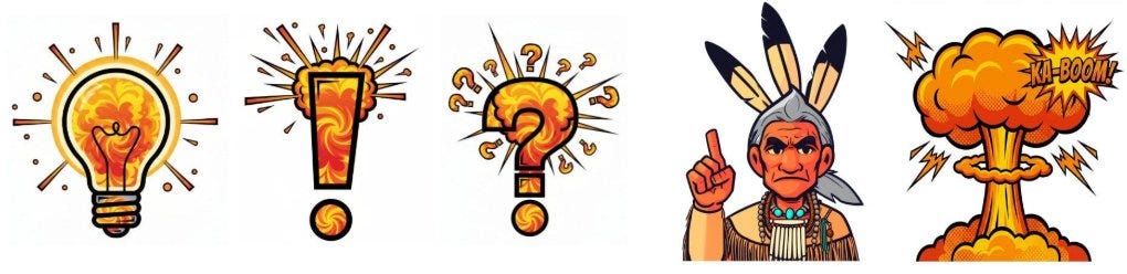
An overview showing my drop cap trick-pictures I made
It worked beautifully, exactly as intended. A little playful — because even highly technical articles can use some breathing room, as long as you don’t overdo it.
Then a friend mentioned, almost in passing, that my Medium texts had lately been starting paragraphs with “AA”, “WW”, or “OO” — and showed me one of my articles in the Medium app on his phone.
Not a trace of the carefully — if not painstakingly, but certainly deliberately — placed graphic replacements.
Medium doesn’t render these images on mobile!
Medium’s format is already so proprietary that I once built my own Markdown-to-Medium converter just to translate .md files into Medium's complex regex patterns.
On PC, desktop, or Mac, the images display without issue — it can’t take more than a few lines of CSS to also render them in a smaller version on mobile, can it?
I’m flagging this directly to Medium as well. Whether or when anything will change — and whether those images will eventually render on mobile too — is anybody’s guess.
In the meantime: a quick heads-up for anyone who likes to put a little care into how their articles look. Plain and generic is easy — and frankly, that’s how most texts end up reading, too.
Here’s the link to the arcticle concerning about some stylistic features Medium is offering out-of-the box — but nearly noone uses them — because noone knows about it!
Disclaimer
This text was written by hand completly as a draft in German.
Then the original German version was translated to English by Claude, with the only prompt-order to keep my style and flow consistent in the English version.
메타데이터
- post_id
- 13670c25749d
- slug
- pity-mediums-nice-hidden-drop-cap-trick-fails-on-mobile-13670c25749d
- url
- https://medium.com/rigel-computer-com/pity-mediums-nice-hidden-drop-cap-trick-fails-on-mobile-13670c25749d
- canonical_url
- https://medium.com/rigel-computer-com/pity-mediums-nice-hidden-drop-cap-trick-fails-on-mobile-13670c25749d
- author_url
- https://medium.com/@rigel-computer
- status
- ok
- fetched_at
- 2026-06-21 07:44:09