Data Preparation in Power BI: Cleaning, Transforming, and Loading Data.
Data Preparation in Power BI: Cleaning, Transforming, and Loading Data.
Introduction
Understanding Power Query: The Engine of Data Excellence
In the Microsoft Power BI architecture, Power Query serves as the critical foundation. While the visualizations capture the attention of stakeholders, Power Query is the “under-the-hood” powerhouse that ensures those visuals are built on a bedrock of clean, accurate data.
Part one of this series detailed how to integrate Power BI with diverse data sources like Excel, JSON, SQL, and SharePoint, etc. Since this article continues that technical walkthrough, I recommend starting with the first blog if you haven’t seen it. Click here.
What is Power Query?
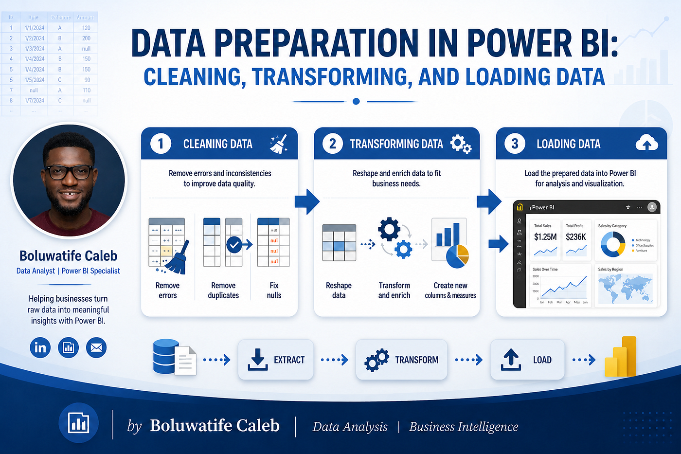
At its core, Power Query is a robust Data Transformation and Preparation engine. It functions as a sophisticated ETL (Extract, Transform, Load) tool, acting as the intermediary between raw data sources and your final data model. Whether your data lives in a cloud-based SQL database, a local Excel spreadsheet, or a complex Web API, Power Query provides a unified interface to connect and reshape that information.
From Manual Effort to Automated Pipelines
The true brilliance of Power Query lies in its ability to replace manual, error-prone tasks with reusable pipelines. Traditionally, analysts spent hours “cleaning” Excel sheets manually, deleting rows, fixing date formats, or splitting columns. Power Query digitizes these actions into a series of Applied Steps.
Once you define a transformation logic, it is saved as a script in the M functional language. When new data arrives next month, you don’t repeat the work; you hit Refresh. Power Query automatically executes your pipeline, ensuring that every transformation is applied with 100% consistency, eliminating the risk of human oversight.
What You Will Learn
- Data transformation in Microsoft Power BI (Power Query Editor, index, conditional column, logic, columns from examples).
- Data structuring (grouping, aggregation, pivot/unpivot, date & time transformations).
- Data integration (merging and appending queries).
- Data quality management (profiling, handling nulls, removing duplicates).
Power Query Editor
To effectively use the Power Query Editor, think of it as a flight recorder. It doesn’t just change your data; it records every “move” you make so it can play them back perfectly every time your data refreshes.
- Open Power BI Desktop
- On the Home tab, click Get Data.
- Select your source (e.g., Excel, SQL Server, or Web) and click Connect.

In this scenario, data is already loaded in the data pane.
- Right-Click on a data set in the data pane. Click on the Edit Query to display Power Query Editor.

By clicking on the Edit button, you will be taken to the Power Query Editor Interface.

This is what Power Query Editor looks like.
Creating Index Columns
An Index Column is a simple yet vital tool in your data preparation toolkit. It assigns a unique, sequential number to every row in your dataset, typically starting from 0 or 1. While it may seem like a minor addition, it acts as a mechanical anchor for your data model.
- In the Power Query Editor, Select Add Column.

- Under Add Column, Select Index Column.

- You will see a dropdown menu for Index Column. You have three choices:
- From 0: Standard for programmers and developers.
- From 1: Most common for general business reporting and row counting.
- Custom: Allows you to define your own starting number and the “increment” (e.g., start at 100 and jump by 10 for every row).
- Choose from 1 to create the Index Number

It also serves as an identification number
Importance of creating an Index Column
Index columns are incredibly effective for fixing ‘messy’ data patterns. For instance, if a file lists a Date, Product, and Sales Amount all in a single column, building a report becomes nearly impossible. By adding an index, you can use logical calculations to link related rows, allowing you to pivot that single list back into three distinct, organized columns.
Conditional Column
A Conditional Column is a logic-driven feature in Power Query that allows you to create new data based on specific rules or conditions. If you have ever used the “IF” function in Excel, you already understand the concept, but Power BI provides a much more intuitive, “no-code” interface to build these rules.
- Select any data set from the left pane ( in this, I am using the Sales data “ Quantity Sold” for our practical), and select Add Column.

- It will displace the logical operator of the conditional statement you want the data to display.

Here, we want to know if the quantity sold indicates that they need more clients or have closed the deal.
- After the final statement box, this is what the result looks like.

Logical Column
Logical Column is a calculated column created within the Power Query Editor that uses specific “If-Then-Else” rules to transform raw data into meaningful business categories. It is the bridge between quantitative data (numbers) and qualitative insights (labels). While the Power BI interface calls this a “Conditional Column,” it is fundamentally a logic-driven transformation that executes a decision tree for every row in your dataset.
- Open your Power BI Desktop file.
- On the Home tab of the ribbon, click the Transform Data button.

-
Select the Query (Table): On the left-hand side, you will see the Queries pane. Select the table you want to modify. Ensure the column you intend to base your logic on has the correct Data Type (e.g., Decimal for prices, Text for names).
-
Click on the Conditional Column icon. This will open the logic builder dialog box. Define Your First Logic Rule (The “If”)

- Click OK. Look at the far right of your table; your new logic column “Performance” is now populated.

Final view. The new column helps evaluate the Performance of the quantity sold.
Note: While both use “If” logic, they happen at completely different stages of the data journey. Conditional Column and Logic (Power Query) happens while the data is being prepared, whereas DAX Logic happens while the data is being analyzed.
Column From Examples
Column from Examples is a smart Power Query feature that lets you type a set of example values for a new column, and Power BI figures out the pattern and fills the rest for you, no need to write formulas. It shows what you want.
- Go to Add Column and Click on Column from Examples. From the dropdown option, click on From Section.

- A blank column will appear on the right side of the preview. Click into the first empty cell of this new column, and type exactly what you want the date format result to look like.

The Suggestion Dropdown
**Note: **Date format must be uniform, else it won’t separate the date from the time
- After clicking OK, the Power Query in-built AI will scan the date format you type and return it for all rows.

Column From Example Preview
Why Group and Aggregation are Important in Power Query
Think of Grouping and Aggregation as a funnel. You pour in a massive amount of raw, chaotic data at the top, and through grouping, you extract a refined, structured summary at the bottom that is ready for decision-making. When data is too detailed to glance at, the Group By tool acts as a cleanup crew. It takes multiple rows of similar information, like daily sales, and bundles them together into a single summary row based on the columns you choose.
- Go to Power Query Editor Ribbon Tabs, click on Transform

- Click Group By from the Transform tab to begin restructuring your table. Choose your grouping columns, then add your aggregate measures by defining the new column names and the mathematical operations to apply.

Sum of Quantity Sold

Group by preview by Year
Pivoting and Unpivoting Columns
Raw data often lacks the structure Power BI requires. This is a common issue with Excel exports, where data is laid out to be “eye-friendly” rather than “analysis-ready.” You can fix these layout inconsistencies using Pivot and Unpivot to reshape your tables for better performance.
Unpivoting is one of the most useful transformations in Power BI. It takes a “Wide” table (many columns) and turns it into a “Tall” table (fewer columns, more rows).
- Click Use the First Row as Headers. Select your anchor columns, the ones that should remain unchanged, such as Product sold and Profit.

- By right-clicking and choosing Unpivot Other Columns, you transform the remaining headers into rows, consolidating them into two primary columns: Attribute and Value.

Unpivot Attribute
Pivoting is the opposite of unpivoting: it takes unique values from one column and spreads them out as separate headers across the top. This is the best way to turn a long list into a side-by-side “grid” or “scorecard” view that is easy for humans to read.

Readable Value
Importance of Merging and Appending Queries
Merge and Append are crucial Power Query operations in Power BI for combining data from multiple sources.
Merging: Think of Merging as the “Search and Attach” tool of the data world. It’s what you do when you have two different lists that belong together, and you want to turn them into one master list.
Go to the Home tab, click on the Merge Queries dropdown, and select Merge Queries as New.


Appending Queries is a data integration tool that stacks multiple tables with the same structure into one long, continuous list. It simplifies a model by consolidating similar data, such as monthly reports, into a single master timeline.


Append Queries dialog box
Imagine you are a quality inspector at a factory. Data profiling is like turning on a high-powered scanner over your assembly line to catch mistakes before they are packed into boxes.
To enable these features, first navigate to the View tab in the Power Query Editor ribbon. Within the Data Preview section, locate the checkboxes for Column quality, Column profile, and Column distribution. Click each checkbox to display the visual health bars, value frequencies, and detailed statistics for your columns.
Column Quality
To identify errors in your data, look at the Column Quality bar, which categorizes your information into three color-coded segments: Green for Valid data, Red for Errors, and Grey for Empty or null values. For a Data Analyst, these icons serve as a primary health check to ensure every row is clean and correctly formatted before moving into the reporting phase.

Column Quality Bar

Spotting 20% Missing Data
**Note: **Never assume your data is perfect just because it looks clean on the first page; always use Column Quality to check for the Green (Valid), Red (Error), and Grey (Empty) icons across your entire dataset.
Column Profile
Column Profile is the most detailed diagnostic tool. When enabled, a bottom panel displays key statistics like total count, error count, empty count, and distinct count for any selected column. It identifies anomalies by showing the minimum and maximum values, along with a visual distribution chart. For specific data types, it automatically calculates the average for numbers and the earliest or latest values for dates.

Column Profiling
The preview highlights a high variety of information, showing 176 Distinct values and establishing a clear operational timeframe with delivery durations ranging from 10 to 99 days. While these statistics suggest the data is healthy, the “top 1000 rows” limit is a reminder that further anomalies could still be hidden deeper in the dataset.
Column Distribution
Below your quality bar, the Column Distribution visual shows how your data is spread using a simple histogram. The key point is the relationship between Distinct and Unique counts; when they align perfectly with your total row count, you can be certain your data is one-of-a-kind. This is the easiest way to verify that a column is clean enough to serve as a Primary Key without any hidden duplicates causing errors later.

Column Distribution.
In the preview above, duplicates are expected in most columns (like dates and keys) as multiple transactions happen on the same day or involve the same customer types. The only column confirmed to be duplicate-free is Invoice ID, making it the only valid Primary Key in this view.
Handling Missing Values, Nulls, and Duplicates
Once profiling is complete, the focus shifts to data cleaning. The most frequent hurdles I encounter in any project typically involve null values in critical fields, inconsistent entries, and redundant rows that clutter the dataset.
Replacing Null Values
To replace nulls with a default value, right-click any null cell in the preview and select Replace Values. Leave the Value to Find field empty and input your chosen value in Replace With. Your choice of replacement should align with the column’s function: use 0 for numeric columns to maintain calculation integrity, or labels like Unknown for text columns to prevent awkward empty gaps in your slicers. Also, there are two ways to Replace Values in Power Query, which shows how good it is.

Replacing Inconsistent Data Values
Removing Rows with Nulls
If a critical column contains a missing value, that entire record may lose its analytical value; in such cases, it is best to filter it out. By clicking the dropdown arrow on the column header and unchecking the null option, Power Query generates a permanent Filtered Rows step. This ensures that any nulls in that specific column are automatically excluded every time your data refreshes.

Before removing null rows

Replacing Inconsistent Text Values

Data Cleaning via Filtering
**Note: *When “ghost” blanks are not recognized as true nulls, you can force a conversion using the Replace Values tool. Simply leave the Value to Find box empty and type null (lowercase) into the Replace With* field. Power Query will recognize this keyword and transform those empty strings into functional Null values, ensuring your data profiling remains accurate.
Removing Duplicates
Duplicate rows in a dimension table act as relationship breakers. They block the one-to-many connections that Power BI needs, causing modeling errors. To protect your data integrity, you must purge these duplicates in Power Query.
To remove duplicates based on a specific key column, right-click that column header and select Remove Duplicates. Alternatively, to clear rows that are identical across all columns, navigate to the Home tab, click Remove Rows, and select Remove Duplicates.

Note: CRITICAL WARNING: Never remove duplicates column-by-column on descriptive categories (like Status or Date). Power Query deletes the entire horizontal row for any repeating value it finds, causing Collateral Data Loss and accidentally wiping out unique, valid records in your other columns.
Date and Time Transformations
One of the most common issues in Power BI reporting stems from insufficient data transformation during the early stages of a project. Without ensuring that your date columns are properly formatted and assigned the correct Date data type in Power Query, advanced time intelligence calculations will fail to produce reliable results.
First, check the tiny symbol directly to the left of your column’s name. If you see an ABC icon, Power BI thinks your dates are just regular words. Because of this, it will sort your data alphabetically (Apr, Aug, Dec, Jan) instead of chronologically (Jan, Feb, Mar, Apr).
To Fix: Click that ABC icon and select Date from the dropdown list. The icon will instantly change to a small calendar symbol. This tells Power BI to treat the column like a real calendar, ensuring your filters, charts, and timelines work flawlessly.

Converting Text-Based Dates to Date Types

Optimizing Data Schema for Analysis

Date Time Column Now has the Correct Data Type.
After completing your data transformations, the final stage is to transition your cleaned dataset into the Power BI data model. By selecting Close & Apply on the Home tab, Power Query sequentially executes every transformation step across all queries — from the initial source connection to the final cleaning operation — and loads the refined results into the model. Click Apply to save changes and keep working, or click Close to discard changes and exit.
Conclusion
Reflecting on my journey, I used to see data cleaning as the boring phase before the real work of visualization began. Today, my view is the exact opposite. I’ve learned that the success of every KPI and dashboard is dictated by the quality of the data transformation process.
메타데이터
- post_id
- 14e893f718c1
- slug
- data-preparation-in-power-bi-cleaning-transforming-and-loading-data-14e893f718c1
- url
- https://medium.com/@BoluwatifeCaleb/data-preparation-in-power-bi-cleaning-transforming-and-loading-data-14e893f718c1
- canonical_url
- https://medium.com/@BoluwatifeCaleb/data-preparation-in-power-bi-cleaning-transforming-and-loading-data-14e893f718c1
- author_url
- https://medium.com/@BoluwatifeCaleb
- status
- ok
- fetched_at
- 2026-06-09 15:37:30