How to Use Angular CLI to Create a Custom Theme in Angular Material 3
Creating a custom theme in Angular with Angular Material 3 is a powerful way to give your application a unique look and feel, all while…
How to Use Angular CLI to Create a Custom Theme in Angular Material 3
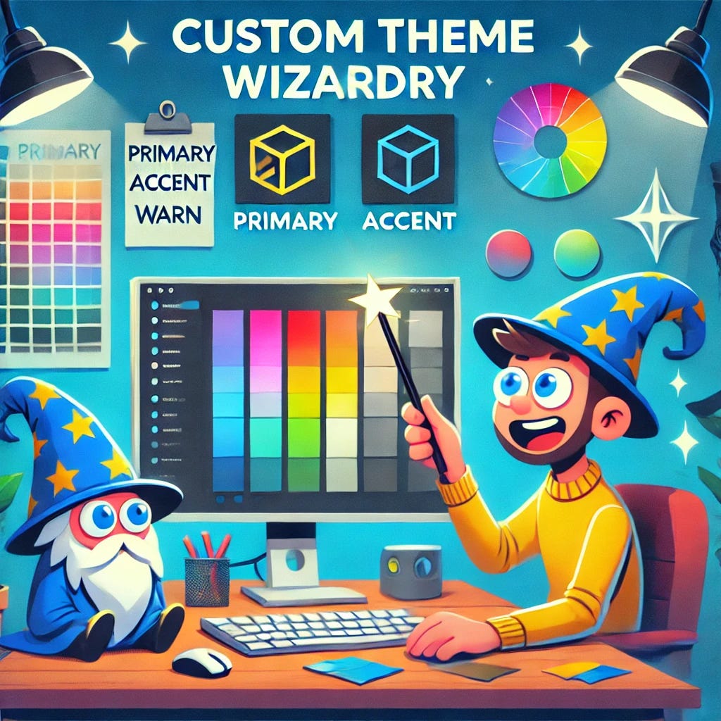
Creating a custom theme in Angular with Angular Material 3 is a powerful way to give your application a unique look and feel, all while leveraging the design consistency of Material Design. Thanks to Angular CLI, generating and managing custom themes is both quick and simple. In this blog, I’ll walk you through how to create and customize a theme using Angular CLI and Angular Material.
Why Create a Custom Theme?
Themes allow you to:
- Define primary, accent, and warn colors that apply across all Material components.
- Easily switch between light and dark modes.
- Customize Angular Material to better match your brand and design needs.
Without further ado, let’s get started!
Step 1: Install Angular Material
Before you can create a custom theme, you need to install Angular Material in your project. If you haven’t done that yet, don’t worry — it’s just a simple command away.
Run the following in your terminal:
ng add @angular/materialThis command will:
- Install Angular Material in your project.
- Optionally prompt you to include Material typography and animations.
- Set up a default theme (which you can customize or replace later).
You can select any default theme during this step (it doesn’t matter, because we will override it shortly).
Step 2: Generate a Custom Theme with Angular CLI
Now that Angular Material is installed, the next step is to generate a custom theme. With Angular CLI, it’s incredibly easy to do this. Run the following command:
ng generate @angular/material:m3-themeCLI Prompts
Once you run the command, you’ll be asked a few questions:
- Name for the custom theme: Give your theme a meaningful name (e.g.,
custom-theme). - Path for the theme: Choose a directory to store the theme file, usually
src/styles/. - Primary, accent, and warn colors: Select colors from the Material color palettes, or choose custom colors that suit your design.
After answering the prompts, Angular CLI will generate a new SCSS file (e.g., src/styles/custom-theme.scss) containing your custom theme configuration.
Step 3: Customize Your Theme
Now, let’s open the generated custom-theme.scss file. It will contain something like this:
// Import Angular Material theming API
@use '@angular/material' as mat;
// Define the primary, accent, and warn palettes
$primary-palette: mat.define-palette(mat.$indigo-palette);
$accent-palette: mat.define-palette(mat.$pink-palette, A200, A100, A400);
$warn-palette: mat.define-palette(mat.$red-palette);

// Create the light theme using the palettes
$light-theme: mat.define-light-theme((
  color: (
    primary: $primary-palette,
    accent: $accent-palette,
    warn: $warn-palette,
  )
));
// Include all Angular Material components with this theme
@include mat.all-component-themes($light-theme);
Here’s what’s going on:
- Palette Definitions: We define the primary, accent, and warn colors using Material’s built-in palettes (you can change these or define custom palettes).
- Theme Creation: The theme is created using the
define-light-theme()function. - Apply the Theme: The
@includestatement applies the theme to all Material components.
Want to add a dark mode? Just define a dark theme in the same file:
// Dark theme palettes
$dark-primary-palette: mat.define-palette(mat.$blue-grey-palette);
$dark-accent-palette: mat.define-palette(mat.$amber-palette);
$dark-warn-palette: mat.define-palette(mat.$red-palette);

// Create the dark theme
$dark-theme: mat.define-dark-theme((
  color: (
    primary: $dark-primary-palette,
    accent: $dark-accent-palette,
    warn: $dark-warn-palette,
  )
));
// Apply the dark theme with a CSS class
.dark-theme {
  @include mat.all-component-themes($dark-theme);
}
This adds a dark mode that can be applied by simply adding the dark-theme class to the <body> element.
Step 4: Add the Custom Theme to Angular
Once you’ve customized your theme, you need to include it in your project.
Go to your angular.json file, and under the styles array, add the path to your new theme file:
"styles": [
  "src/styles.scss",
  "src/styles/custom-theme.scss"
],
This ensures that your custom theme is bundled with the application and applied globally.
Step 5: Switch Between Light and Dark Themes (Optional)
Want to give your users the ability to toggle between light and dark modes? Here’s a simple way to do it.
HTML
Add a toggle button to your app:
<button (click)="toggleTheme()">Toggle Theme</button>TypeScript
In your app.component.ts, add a function that toggles the theme by adding/removing the dark-theme class from the body:
import { Component } from '@angular/core';

@Component({
  selector: 'app-root',
  templateUrl: './app.component.html',
  styleUrls: ['./app.component.scss']
})
export class AppComponent {
  isDarkTheme = false;
  toggleTheme() {
    this.isDarkTheme = !this.isDarkTheme;
    const body = document.body;
    if (this.isDarkTheme) {
      body.classList.add('dark-theme');
    } else {
      body.classList.remove('dark-theme');
    }
  }
}
This function toggles the dark-theme class, which applies the dark theme we defined earlier.
Step 6: Test Your Custom Theme
Now that everything is set up, start your application:
ng serveWhen you open your app in the browser, you’ll see your custom theme applied. If you’ve implemented theme toggling, you can now switch between light and dark modes!
Wrapping It Up
Creating a custom theme in Angular Material using the CLI is super simple! With just a few commands, you can generate, customize, and apply themes to your Angular application, and even switch between light and dark modes.
Key Takeaways:
- Use
ng generate @angular/material:m3-themeto scaffold a custom theme. - Customize your theme by defining color palettes for primary, accent, and warn colors.
- Apply the theme globally in your
angular.json. - Optionally, toggle between light and dark modes by using CSS classes.
And there you have it — your app is now themable and ready to shine! 🌟
Bonus Tip: Make It Your Own!
Remember, you don’t have to stick with Material’s built-in palettes. You can create custom color palettes or experiment with different combinations to make your app truly stand out!
Happy Theming! 🎨
If you found this blog helpful, please give it a clap 👏 and follow 🔔 for more insights and updates! Your support keeps the knowledge flowing!
In Plain English 🚀
Thank you for being a part of the **In Plain English** community! Before you go:
- Be sure to clap and follow the writer ️👏️️
- Follow us: **X | [LinkedIn](https://www.linkedin.com/company/inplainenglish/) | [YouTube](https://www.youtube.com/channel/UCtipWUghju290NWcn8jhyAw) | [Discord](https://discord.gg/in-plain-english-709094664682340443) | [Newsletter](https://newsletter.plainenglish.io/) | [Podcast](https://open.spotify.com/show/7qxylRWKhvZwMz2WuEoua0)**
- **Create a free AI-powered blog on Differ.**
- More content at **PlainEnglish.io**
메타데이터
- post_id
- 18abccdc2bc1
- slug
- how-to-use-angular-cli-to-create-a-custom-theme-in-angular-material-3-18abccdc2bc1
- url
- https://javascript.plainenglish.io/how-to-use-angular-cli-to-create-a-custom-theme-in-angular-material-3-18abccdc2bc1
- canonical_url
- https://javascript.plainenglish.io/how-to-use-angular-cli-to-create-a-custom-theme-in-angular-material-3-18abccdc2bc1
- author_url
- https://medium.com/@mbusinesssolutions
- status
- ok
- fetched_at
- 2026-08-08 19:08:33