An AI-Orchestrated UX Redesign: How I Fixed Three Critical Failures in a Voice Bot Interview…
The hardest part of a job interview shouldn’t be figuring out how to start it. Yet that’s exactly what was happening at Ambition Hire…
An AI-Orchestrated UX Redesign: How I Fixed Three Critical Failures in a Voice Bot Interview Experience
The hardest part of a job interview shouldn’t be figuring out how to start it. Yet that’s exactly what was happening at Ambition Hire. Candidates landing on our AI voice bot virtual interview were either freezing on the start screen, or others who got in accidentally submitted their responses halfway through.
Some had to be re-invited and asked to start over, adding confusion and anxiety to what was already a high-pressure moment. Recruiters kept reaching out. Our team and our third-party vendor went back and forth over the same question: why are candidates abandoning the interview? The answer wasn’t a bug. It was the design.
This is the story of how I took ownership of that failure, rebuilt the voice-bot interview experience, and used an AI-orchestrated design workflow to turn a broken third-party screen into something candidates could actually use.
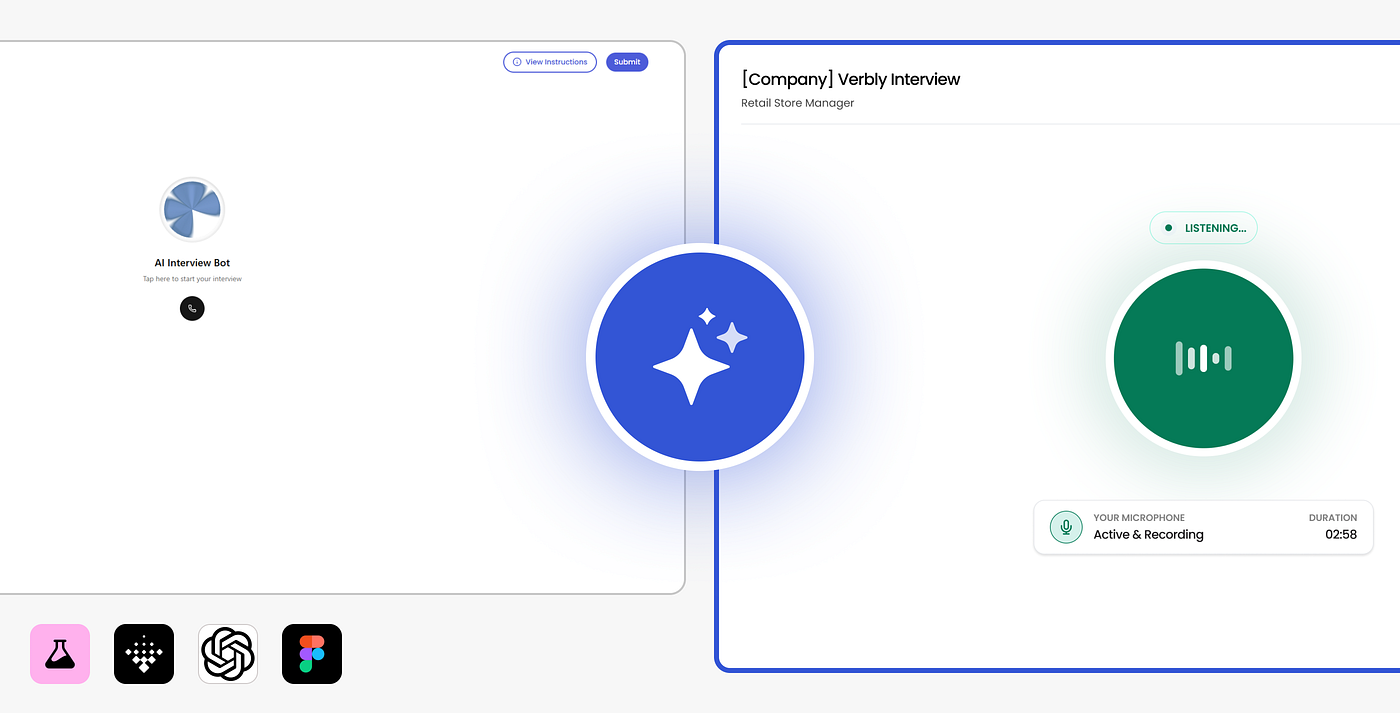
Before vs After redesign
The Platform, The Flow, and The Constraint
The Platform
Ambition Hire is an HR-Tech SaaS platform built to give companies a complete candidate evaluation suite in one place. Recruiters can create jobs, invite candidates, and run them through a library of assessments covering everything from soft skills, like language proficiency and behavioural profiling, to hard skills like coding challenges and typing performance.
The Candidate Journey
When a company builds a job on Ambition Hire, they attach a set of assessments to it. The candidate works through each one in sequence, moving from one module to the next until the full evaluation is complete. Verbly, our AI-powered voice-bot interview assessment, is one of those steps in that journey.

Candidate Journey Flow
It was this step that everything broke.
My Role and the Constraints
I’ve been a UI/UX Designer at Ambition Hire since December 2023. Responsible for the recruiter dashboard, candidate platform, internal admin dashboard, and company website. When the Verbly complaints surfaced, I took ownership of the redesign end-to-end.
Two constraints shaped every decision I made.
First, the user: the majority of candidates encountering Verbly are blue-collar workers in logistics, manufacturing, and retail, many of whom had never interacted with an AI voice interface before. The design had to be genuinely intuitive for someone with limited technical familiarity, with zero room for ambiguity.
Second, the timeline: clients were actively waiting. This wasn’t a long-horizon project. It needed to ship as quickly as possible.
The complaints weren’t abstract. Here’s what the conversation between our team and the third-party vendor actually looked like.

WhatsApp conversations between our team and the third-party vendor
What Was Actually Wrong?
After the complaints surfaced, I audited the original Verbly screen against everything stakeholders were describing. The two matched almost exactly. The failures weren’t subtle. They were threaded through every stage of the interview flow: entry, mid-interview, and exit.

Failure #1 — Entry
Failure Point 1 — The invisible entry point
The start screen presented candidates with a single call icon centred on the page, accompanied by a small line of text reading “Tap to start your interview.” No prominent CTA. No context.
The text itself failed WCAG contrast guidelines with a 2.8:1 contrast ratio vs the required 4.5:1, making it near-invisible on certain screens and particularly difficult for candidates with any degree of visual sensitivity.
For a blue-collar candidate opening a voice-bot interview for the first time, often on a mobile screen, often in less-than-ideal lighting, this wasn’t even a satisfactory starting point. They literally didn’t know what to do next.

Failure Point #2 — Mid interview
Failure 2 — Mid-Interview
Once the interview started, the same central icon transformed into a hang-up symbol. No label. No explanation of what tapping it would do. It ended the interview. Immediately. Permanently.
No confirmation prompt. No “Are you sure you want to end your interview?” modal. No undo. One tap on an icon button, and the assessment was over with no way back in without a recruiter manually re-inviting the candidate from scratch.
This was the anti-pattern behind most of the drop-off complaints. Candidates weren’t giving up. They were accidentally finishing.

Failure Point #3 — Exit
Failure 3 — The exit
When the interview genuinely ended, a success message appeared instructing candidates that they could now safely close the browser window. Reasonable assumption for the candidate: you’re done and can close the browser tab. Except they weren’t just done yet.
Closing the window at that point bypassed Ambition Hire’s own Submit button. It is still required to save the interview and fetch the results correctly. The third-party screen had no awareness of this step, and no communication with it. Candidates who followed the on-screen instructions correctly invalidated their own assessment without realizing it.
The constraint was clear. The deadline was real. What I did next was far from a conventional design workflow.

Why Was This Problem the Right Fit for AI?
The failures were specific and already documented: a broken entry point, an unguarded destructive action button, and a misleading exit instruction. The goal was also clear. What I didn’t have was time. Clients were actively waiting, and every additional day of drop-offs meant more candidates lost and more recruiter trust took a hit.
I needed to explore a large number of design directions quickly, filter them, and validate fast. That’s precisely the kind of problem an AI-assisted workflow is built for.
Generating multiple layouts cheaply in time and effort, evaluating them against the brief, taking the strongest directions into stakeholder review, then leveraging AI again for heuristic analysis and iterative refinement. This is what a true AI-assisted design workflow looks like.
The design decisions, including exploration, filtering, iteration, and validation, took one working day. The Figma execution took an additional hour on top of that. What would conventionally take around a week is broken down into a single-day focused session, without compromising on quality.
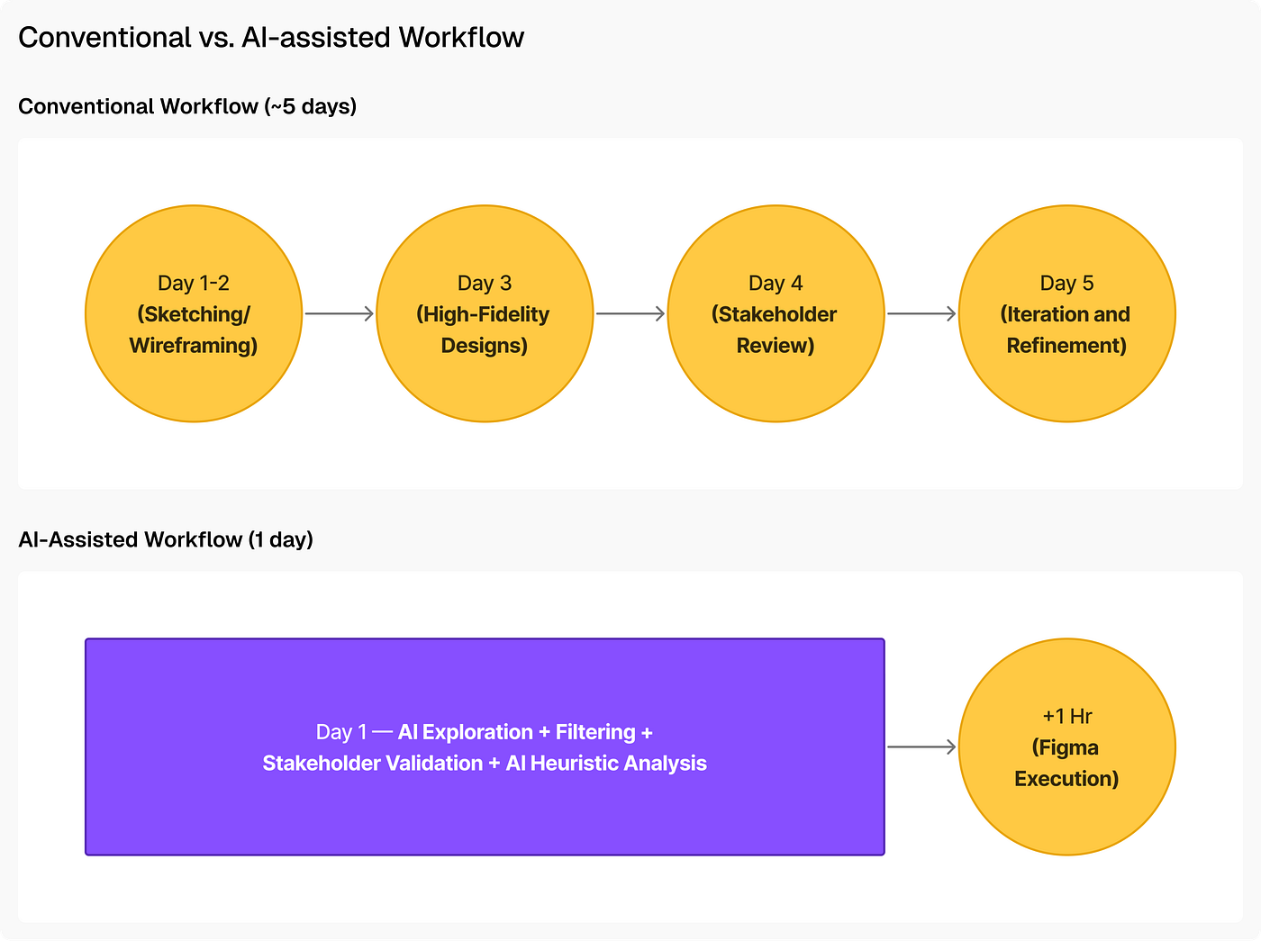
Conventional vs. AI-assisted Workflow
Six Stages. One Day. Here’s Exactly How It Went
Stage 1: Starting with the brief
Firstly, I translated the three failure points into a clear design brief: fix the ambiguous entry, eliminate the unguarded exit, and resolve the misleading completion state. Every prompt I wrote from that point forward was built around these three constraints.
Stage 2: Generating directions with Google Stitch and Variants
I ran both tools in parallel, each given the same core context: a voice-bot interview assessment screen for candidates with limited technical literacy, with specific instructions to address the unclear start CTA, the accidental submission risk, and the misleading exit instruction.
I attached the original third-party Verbly screen to both tools for visual context, then gave them the following brief:
“This is an AI voice bot interview screen where an AI voice bot conducts an interview of a candidate verbally. The candidate starts the interview by clicking on a button, the bot introduces itself, asks questions, and the candidate answers accordingly. Redesign this experience to make it intuitive and pleasant for the candidate. The system should show the system status at all times, i.e. when the bot is speaking and when the candidate is speaking. The interview must have a button to end the call while the interview is taking place.”
Notice what prompt I specified and what was deliberately left open.
System status visibility was explicit because it is the one thing users must be aware of when interacting with any user interface, and it was missing in the third-party one.
The end call button was required because the original had just an icon with no clear label or safeguards.
But the completion state and the submission flow were intentionally left unconstrained. This was because they didn’t require any such designs to be made. These were simpler solutions that could be solved simply by instructing the candidate the right thing, the right way.
Initially, Stitch produced two screens, and although Variant produced five to six screens, only one was relevant; the others included assessment states, which are already handled by Ambition Hire, such as mic/camera permissions and so on. Across both tools, the generation process took a fraction of what manual wireframing would have required, giving me different layout directions to evaluate almost immediately.
First output generated by Google Stitch:

Google Stitch — first output
First output generated by Variant:

Variant — First output
The initial outputs from both tools were decent, but not quite there yet. They still needed some improvements before either could serve as a reliable foundation to build upon. Rather than starting over with a new prompt entirely, I went back to each tool with targeted instructions, describing the specific issues in the output and asking them to revise with those fixes in mind. The updated outputs from both tools are shown below.

Google Stitch — first output

Stage 3: Filtering down
Not every variation was viable. I evaluated each output against the brief with one question above everything else: does this design make it impossible for a low-tech-literacy candidate to make a mistake?
Several variations were eliminated quickly. Some carried the same CTA button centring problem as the original screen. Others overcrowded the layout with instructions or transcriptions, leading to excessive cognitive load rather than reducing it.
I filtered down to one strong direction from each tool. Both addressed the core failures. Both were defensible. But they made different choices about how to communicate the interview state to the user, which made it worth putting them ahead of stakeholders rather than deciding alone.

Selected outputs
Stage 4: Stakeholder validation
I shared both screens as static images over Zoho Cliq and asked for a straightforward preference. The feedback was quick, and it matched my own instinct. The Variant direction was preferred, and the reasoning was clear: it kept the microphone status visible at all times + the audio visualizer + a label, giving candidates a real-time signal of whether the bot was actively listening. This was Nielsen’s first heuristic at work: Visibility of system status, applied to a context where the user’s anxiety is high and the feedback they need most is simply: it’s working.

Vairant output approved by stakeholders
With the base design approved, the next step was to extend it across the full candidate journey through the assessment. I went back to Variant with the approved base design as a reference and prompted it to generate the remaining views: the start interview screen, the active state while the candidate is speaking, the bot speaking state, and the interview completion screen. The outputs are shown below.

Stage 5: Heuristic evaluation with ChatGPT
With a direction validated, I ran the design through ChatGPT using a structured heuristic evaluation prompt covering Nielsen’s 10 heuristics, cognitive load, accessibility, error prevention, and interaction design patterns. The output flagged several issues worth acting on, but it also surfaced some suggestions I rejected outright, and the reasons why matter as much as the rejections themselves.
It is very important to validate the research done by AI and not just take in whatever suggestions or improvements it asks you to do.
Treat AI as your design companion rather than a decision maker.
Suggestions by AI that were rejected:
- It recommended displaying assessment instructions on the screen and prompting users to grant microphone permissions within the interface. Both are reasonable UX suggestions in isolation. But in the context of Ambition Hire’s full candidate flow, both were already handled elsewhere. Instructions are shown before every assessment begins. Microphone permissions are taken care of on a dedicated screen before the candidate ever reaches Verbly. Adding either here would have introduced redundant information.
- The other rejection was more interesting. ChatGPT suggested adding a timer interface showing how many questions remained and how much time was left. On the surface, this is textbook UX thinking. Progress indicators reduce anxiety, help users estimate effort, and keep them engaged. But Verbly is not a static interview with a fixed question set. It is powered by an adaptive AI that evaluates each answer in real time and decides how deeply to probe before moving forward. There is no predetermined number of questions. Hence, there can be no predictable duration.
ChatGPT was correct by every general UX principle, but what it didn’t have was access to the product. That context lives with the designer, and no prompt can fully substitute for it.
The issues I did accept, I treated as a working checklist. Each point was independently verified before implementation and reviewed again after, to confirm it had been properly addressed rather than just ticked off. These were divided into three sub-groups: Low impact, Medium impact, and High impact, based on the degree of violations.

Heuristic evaluation checklist
Stage 6: Building in Figma
The validated direction gave me a strong layout foundation. Beyond refining the approved direction and the checklist, I built some more screens from scratch that the AI output hadn’t accounted for. The most critical was a dedicated thinking-state screen, representing that the bot is processing the answer given by the candidate and that it is getting ready to ask the next question.
It is truly critical to show thinking and processing states in designs involving AI agents to:
- Reduce uncertainty — When an AI takes time to process or generate a response, showing active processing states reassures users that the system is working, preventing them from getting frustrated or thinking it’s broken.
- Improve user comprehension — It helps users learn how the system works over time, without having them do the guesswork.
I also designed the exit confirmation modal and the submitting state. These were the screens the original experience had been missing all along.
Below are the responsive Figma designs showing different states of the interview flow:
- AI bot speaking state -

Redesigned AI bot speaking state screen
- AI bot listening/candidate speaking state -

Redesigned AI bot listening/candidate speaking state screen
- AI bot thinking state -

Bot thinking state screen
What Shipped, and What Comes Next
The redesign shipped and is currently live. All three core failures were addressed by specific design decisions.
- The invisible entry point was replaced with a dedicated ready screen, giving candidates an unambiguous starting point before the bot speaks.

Redesigned interview entry screen
- The unguarded hang-up button was replaced with a properly labelled leave interview button, protected by a confirmation modal that prevents accidental exits.

Interview end modal
- The misleading completion message was replaced with an explicit final state that walks candidates through the submission step before closing the window.

Interview end state screen

Interview submitting state screen
The design was signed off, but the team was clear that real validation would come from post-launch behavior, not from the design review itself. The redesign solves the problem as it was diagnosed. Whether it eliminates complaints entirely is a question only candidate behavior over time can answer. The launch is recent. Hard data on drop-off rates and complaint volume is not yet available. Internally, the reception was strong.
The next step is straightforward: monitor complaint volume and candidate completion rates as the new experience accumulates usage, and let the data validate or challenge the design.
Honest Limitations
The heuristic evaluation in this project was conducted by AI, not by real candidates sitting down with the interface. In an ideal process, usability testing with actual users would have preceded any design decision. But reaching candidates in this context is genuinely difficult. Recruiters are reachable on a daily basis. Candidates, by the nature of how the product works, are not.
Given that, AI heuristic evaluation was not a shortcut taken out of convenience. It was the most rigorous validation available within the time constraint. AI has matured significantly over the past few months, and when applied with a structured prompt against defined heuristics, it surfaces real issues that would otherwise go unchecked. It is not a substitute for user testing. It is, however, considerably better than skipping evaluation entirely.
What I would do differently
Two things would have improved this process if the timeline had allowed for them.
- Involving candidates earlier, specifically in the problem definition phase, rather than relying solely on recruiter-reported complaints. Second-hand accounts of user frustration are useful, but direct observation of where candidates hesitate, misread, or abandon is a different quality of signal.
- Setting up analytics tracking before launch rather than after. Measuring from the first day of the new experience would have produced a clean before-and-after comparison.
A known gap the current design does not yet address:
The happy path is fully resolved. All three original failures have direct design responses now live in production. But one scenario the current design does not yet handle is a sudden loss of internet connection mid-interview. If a candidate’s connection drops while the bot is speaking or while they are answering, there is no visual signal informing them of what has happened. For a candidate already in a high-pressure situation, a silent screen with no feedback is indistinguishable from a crash. This is the next design problem to solve.
What I’d Tell a Designer Considering This Workflow
Google Stitch is a starting point, not a solution:
Stitch is a new tool, and the output reflects that. The designs it produces are not very eye-pleasing and should not be considered as a proposal. I would not use Stitch output as a final direction, at least not right now. What it is useful for is generating a quick visual field of possibilities at the very beginning of exploration. Think of it as a rapid first draft.
Variant earns its place in the workflow:
Variant is a meaningfully different experience. The output quality is noticeably higher, and generating six designs simultaneously is the real advantage. In a single pass, you get a range of layout approaches, color schemes, and typographic choices to evaluate side by side. With focused refinement, a Variant output can move from generated concept to final design with considerably less rework than you would expect.
ChatGPT is only as useful as the prompt you give it:
ChatGPT is capable of a thorough heuristic evaluation, but only if you approach it like briefing a senior design critic rather than asking a general assistant for feedback. A vague prompt produces generic observations that could apply to any interface. A structured prompt that specifies the evaluation framework, the user context, the severity scale, and the expected output format produces something genuinely actionable.
The quality of the critique is almost entirely determined by the quality of the brief.
Give AI a reference when you have a direction in mind:
One of the most consistent things I noticed working with these tools is that reference-guided prompts outperform open-ended ones when you already have a result in mind. Without a reference, the AI can produce interesting results but is often unpredictable. Save the open-ended prompts for genuine creative exploration.
When you have a direction, give AI something to look at. Attaching a UI screenshot, a mood board, or a link to a specific design style gives the tool a concrete target to orient toward.
Design intelligence guides the outcome. AI accelerates it:
The most important thing this project reinforced is that your judgment should act like a filter through which everything else passes. AI explored directions faster than I could have manually. It flagged issues I might have caught later. It compressed a week of work into a day. But it did not know the product. It did not know the candidate. It did not know that a progress timer would create false expectations in a dynamic interview, or that microphone permissions were already handled two screens earlier. Every suggestion I accepted in this workflow was accepted because I independently verified it made sense in context. Every suggestion I rejected was rejected for a reason the AI had no way of knowing. That is the right relationship to have with these tools.
Orchestrate them. Do not outsource to them.
Closing Thoughts
I think new generations of design that AI will produce will be much higher fidelity outputs, handling more edge cases, and requiring less correction. What will not change is the underlying requirement: a designer who can frame the problem clearly, evaluate outputs honestly, and make decisions based on their own design and product knowledge.
I am curious to know where an AI suggestion conflicted with your product knowledge and how you handled it.
Drop your experience in the comments.
Tools used in this project: Google Stitch, Variant, ChatGPT, and Figma
Portfolio: https://aviral.framer.website
LinkedIn: https://www.linkedin.com/in/aviral-lakhanpaul
💡 Stay inspired every day with Muzli!
Follow us for a daily stream of design, creativity, and innovation. ***Linkedin | [Instagram](https://www.instagram.com/usemuzli/) | [Twitter](https://x.com/usemuzli)***
메타데이터
- post_id
- 18cd1cb0ae0f
- slug
- an-ai-orchestrated-ux-redesign-how-i-fixed-three-critical-failures-in-a-voice-bot-interview-18cd1cb0ae0f
- url
- https://medium.muz.li/an-ai-orchestrated-ux-redesign-how-i-fixed-three-critical-failures-in-a-voice-bot-interview-18cd1cb0ae0f
- canonical_url
- https://medium.muz.li/an-ai-orchestrated-ux-redesign-how-i-fixed-three-critical-failures-in-a-voice-bot-interview-18cd1cb0ae0f
- author_url
- https://medium.com/@avirallakhanpaul
- status
- ok
- fetched_at
- 2026-07-09 05:53:33






