Flex Box Properties
What is flexbox properties
Flex Box Properties
What is flexbox properties
Flex Properties are CSS layout model used to arranged the item row or column. Use the flex property easily arrange the item horizontal and vertical and change the direction .
Main property are used :-
- display-flex :- It used make the flex container.
- Flex-direction :- It used arrange the item in row or column.
- Justify-content :- It used the align the item in horizontal
- align-item :- It used the align the item vertically.
- flex-wrap:- It is allow the item to move in next line.
- gap: It used space between item.
- Algin-content :- Aligns multiple rows when wrapping occurs.
Why do we use flexbox ?
Easy alignment — Center items horizontally and vertically.
Responsive layouts — Items adjust automatically on different screen sizes.
Arrange items — Place items in a row or column.
Equal spacing — Add equal space between items using justify-content.
Flexible sizing — Items can grow or shrink to fit available space.
Less code — No need for floats or complex positioning.
Easy navigation bars — Perfect for menus and headers.
Flexbox Properties
Display-flex
Display-flex property are used to make a container flex it is important for arranged the item layout. It is used inside the parent class. example fig 1.2 , container is the parent class and box is the child class.
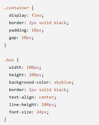
fig 1.2
flex-direction:-
Flex-direction is used to arrange the elements in row or column. It used mostly four value row, column, row-reverse, column reverse row is use elements are arrange the horizontally, reverse is use reverse the row element

fig 1.3
Justify-content
Justify-content are use arrange the elements in horizontally . Its used some values like space-around, space-between, space evenly, flex-end ,flex-start, center baseline .

fig 1.4
Align-item
Align-item :- It is used arrange the elements are vertically. It use some values like stretch, flex-end, flex-start, baseline. Align-item are use easly to arrange the vertically layout.

fig 1.5
Flex-wrap
flex wrap is a Flexbox property that controls whether flex items stay on one line or move to the next line when there is not enough space. it use three value like wrap, nowrap, wrap-reverse.

fig 1.5
Algin-content
Align-content is a Flexbox property that aligns multiple rows of flex items along the cross axis. It works only when flex-wrap :wrap is used and there are multiple rows.

fig 1.6
Gap
Gap is a CSS property used to add space between flex items (or grid items). It creates consistent spacing without using margins.

fig 1.7
Conclusion:-
Flexbox is a powerful CSS layout system used to create flexible and responsive web layouts. It makes it easy to align, arrange, and distribute space between elements without using floats or complex positioning. With properties like justify-content, align-items, flex-wrap, flex-grow, flex-shrink, and flex-basis, developers can build clean, modern, and responsive user interfaces.
메타데이터
- post_id
- 195518971ede
- slug
- flex-box-properties-195518971ede
- url
- https://medium.com/@bharatnetsquare/flex-box-properties-195518971ede
- canonical_url
- https://medium.com/@bharatnetsquare/flex-box-properties-195518971ede
- author_url
- https://medium.com/@bharatnetsquare
- status
- ok
- fetched_at
- 2026-07-30 17:47:54