My portfolio lost its identity — here’s how I got it back
My old portfolio on the left vs my new one on the right
My portfolio lost its identity — here’s how I got it back
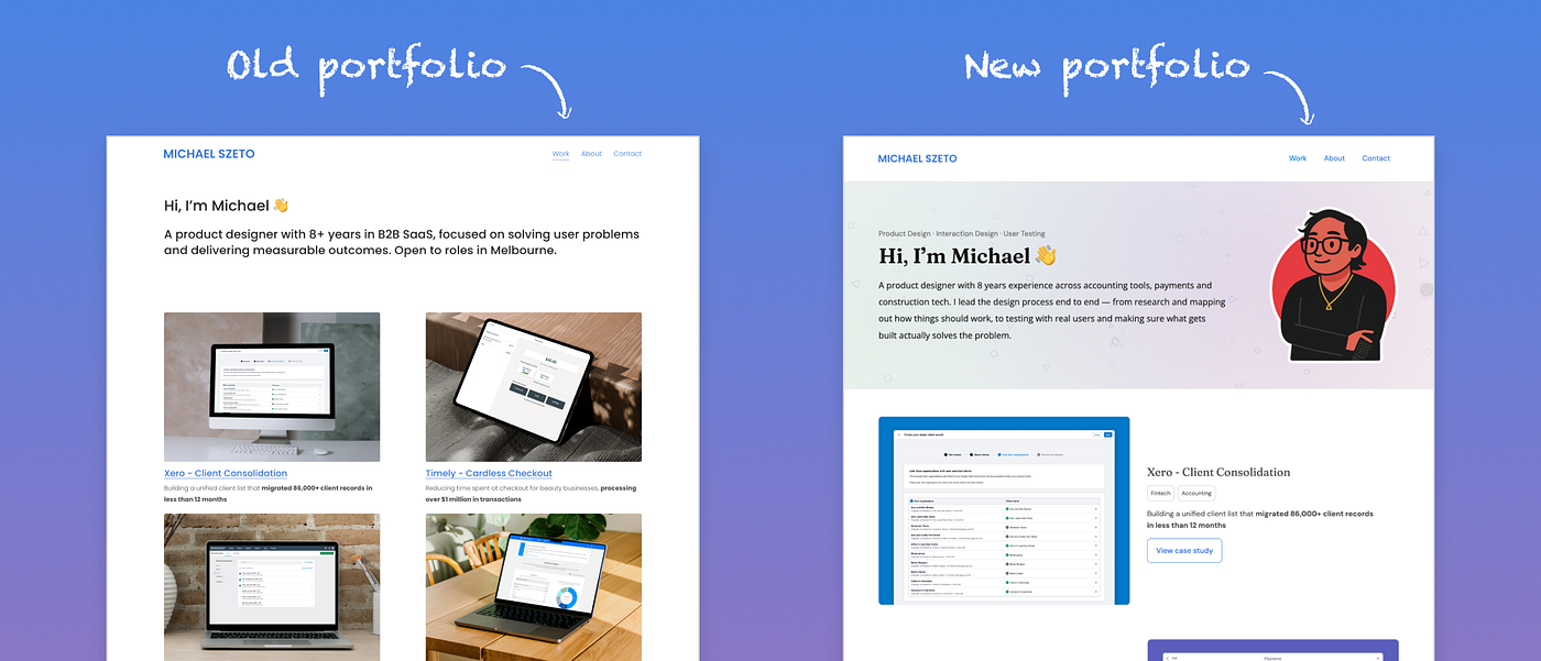
My old portfolio on the left vs my new one on the right
I had been using Squarespace to host my website since mid 2018.
As I looked at various portfolios online, I realised that mine wasn’t representing me and my skills anymore and its visual design came across as “templated”. My personal belief is that a design portfolio should be selling your identity and that you have experience and abilities that are relevant to the market, so keeping my site’s design in an early “2000s” look was hurting this first impression.
I started exploring new platforms to host and re-design my website. I ended up choosing Webflow for its custom codeoptions, its lively support community and responsive capabilities.
I had 3 key big changes that I applied to my site that I have listed out below.
Adding personalisation
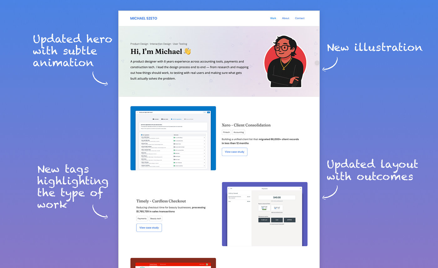
In my new portfolio I updated a lot of the IA and visual design to be more personable
My original portfolio was really bare from personality — Static, one font, hover states and animations that didn’t load well and nothing unique to say its “Michael Szeto”. With AI making it more accessible to add micro animations and moments of delight, static home pages now stand out as flat and lifeless and can impact first impressions.
I came across a custom illustration my former colleague made of me as an appreciation of our time working together. Most people add photos to their home page hero of themselves, but I decided to try using the illustration instead of a photo on my home page. I also added some geometric shapes with an easy to look at animated gradient that I made in AI to stop my site feeling so flat and generic.
The end result felt like a great uplift visually and felt like me — a professional designer who likes to keep things simple and has a warm personality. I also sent my portfolio to a UX consultant in the USA who shared how the illustration was unique, memorable and that it was easy to see what each project is about on the home page.
Interaction design wasn’t present at all in my site’s appearance
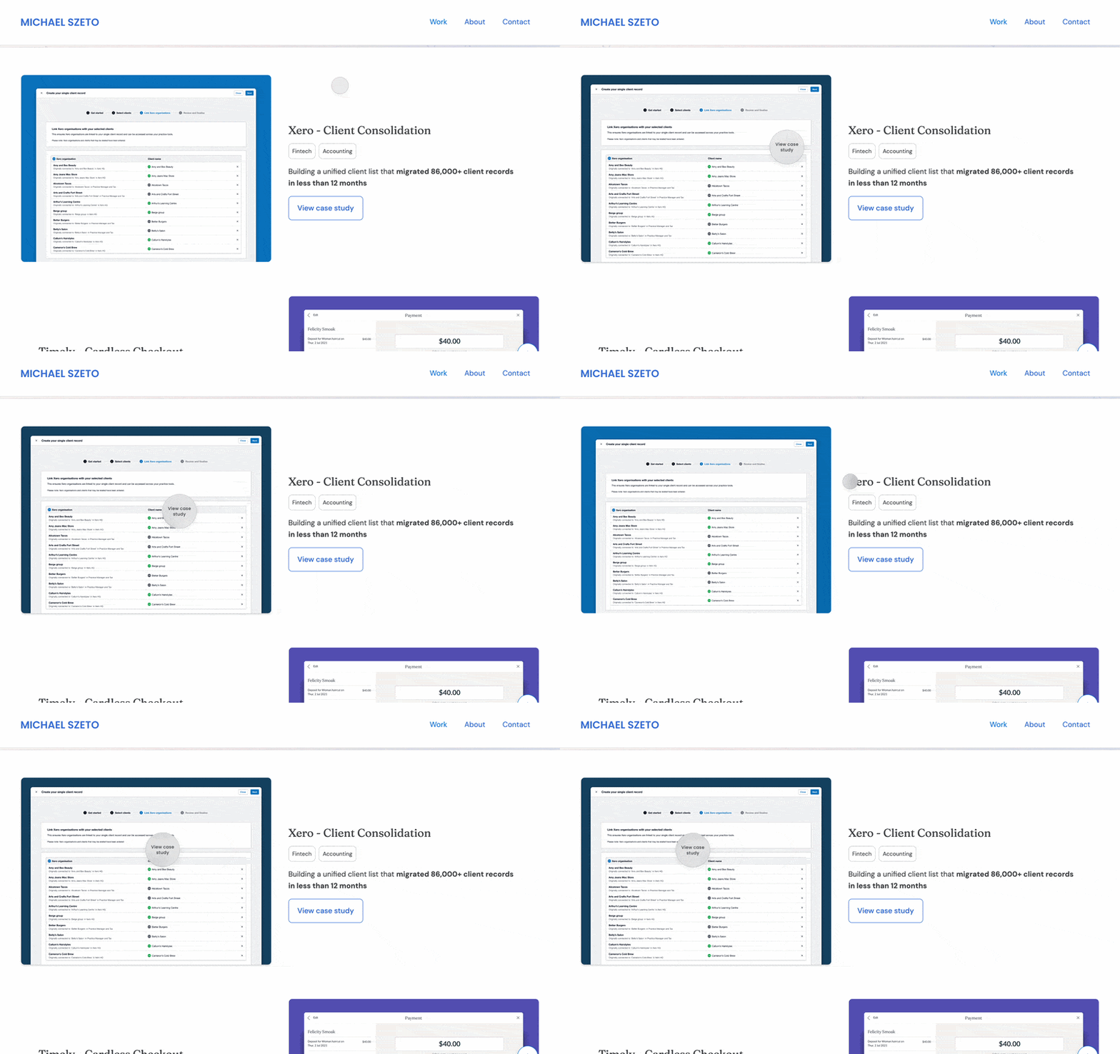
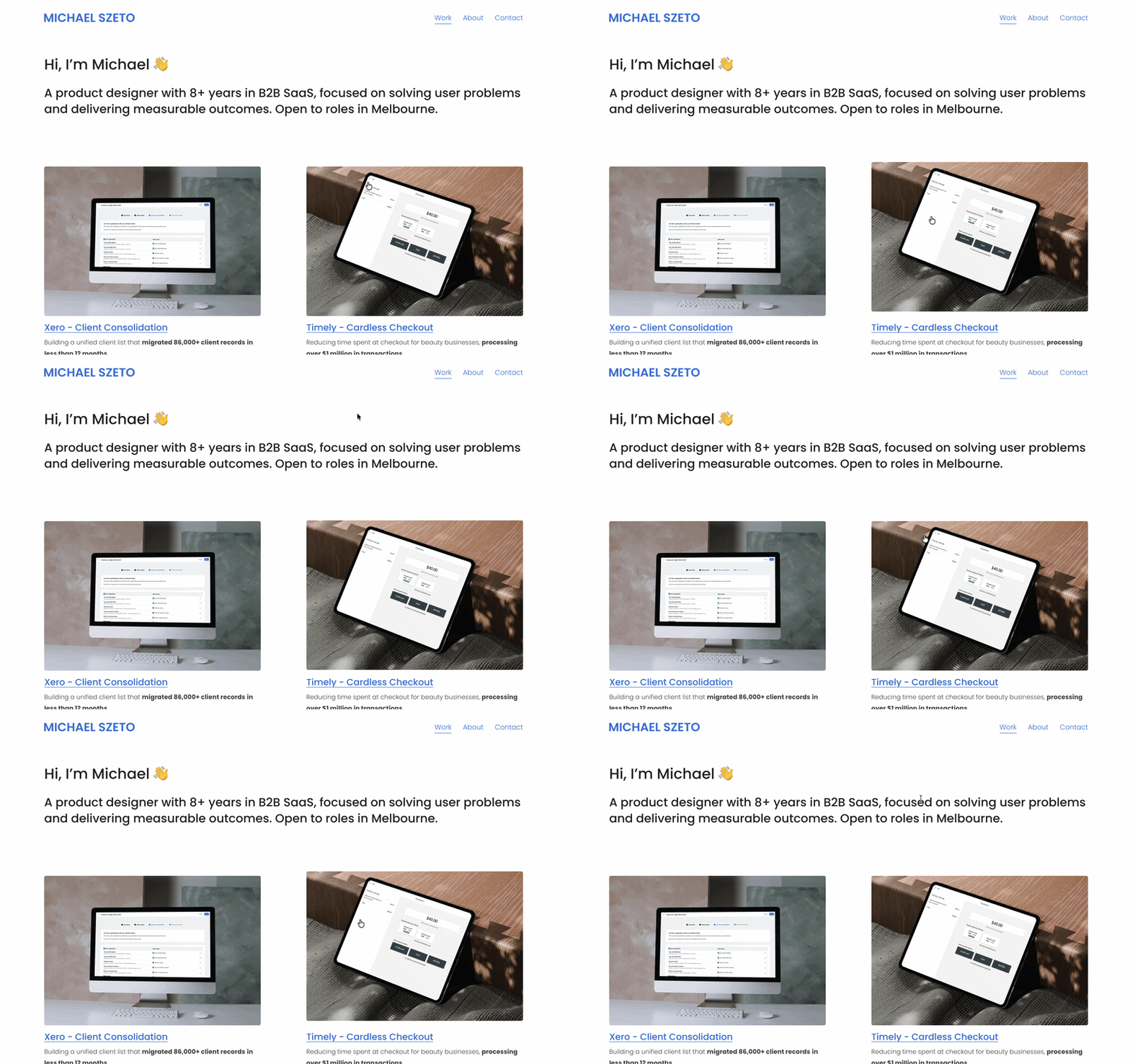
New and old cursors and hover states
In the world of UX, my key strengths are in Interaction Design and User-Testing. In each of my case studies I highlighted where I applied user-testing and improved flows and where I added micro animations, but none of this came forward on my own site. Without any hints of interaction design on my site, it felt like a contradiction.
I brainstormed a few ideas and thought about how Figma’s prototyping tool has its own custom cursor and if I could apply it to my site. After using AI to help me generate the CSS and JavaScript, I injected it into Webflow and this helped bring in a design pattern people would recognise from a well known tool in the industry. I also applied some custom hover states with the cursor on my thumbnails and added some common but impactful interactions and animations such as a back to top CTA and a tally up animation for success metrics.
All together, the animations stopped the site from feeling completely static without overdoing it, the custom cursor and its hover states make the site feel more intentional and brings the interaction designer side of me forward more as key areas of my skillset.
Case study structure was too long and giving the “real estate tour”

I reduced my portfolio case study structure by almost a 3rd!
I always wrote my case studies like a structured story — Start with the background and problem, lead into what I applied, the final result and what I learned. Nowadays, hiring managers get so many portfolios they don’t have time anymore to read an entire case study. This meant my case studies were well structured but not selling the key things that I wanted hiring managers to know about my contributions to a project.
After revising my content 6 times, I sought out feedback on my case study structure from designer friends, outsiders of tech and a couple consultants. One of the key things that stood out for me was being told my case studies were “giving the real estate tour” — When they go over everything in detail, but means it takes too long to get to the highlights that showcase your strengths.
Hearing this, I took on the feedback and suggestion to cut down the length to the parts that you want to be heard most, rather than trying to include everything I did that is a given in work. The result was immediate — Each case study’s length had dropped by almost a third and it was clearer what the key contributions and design decisions were.
After a solid 2 to 3 weeks working on the re-design and learning how to use Webflow, I walked away with a portfolio that I am more proud of to apply for roles with and feel represents me better in the industry.
Looking back here is what I would have considered if I started again:
- Explore Framer — Even though my goal was to avoid templates and inject my own personality into my site, some of Framer’s templates come across as quite powerful and worth a try
- Claude Code — I used Claude to help me on copy, feedback and to generate code. Exploring how to make a custom portfolio would have been a powerful way to build something custom without too many 3rd party tools
- Unmoderated testing — I learned a lot of unmoderated testing in my past role and applying it here would have helped get more immediate feedback from fresh eyes faster than awaiting responses
If I had to narrow down the biggest lesson, it’s that personality can get lost on design portfolios due to templates being the easy way forward, AI recommendations taking over and a lack of intentional identity being recommended as the norm.
Checkout my final result at www.michaelszeto.design if you want to see the live version.
메타데이터
- post_id
- 196fa53b119d
- slug
- my-portfolio-lost-its-identity-heres-how-i-got-it-back-196fa53b119d
- url
- https://medium.com/@xyzeto/my-portfolio-lost-its-identity-heres-how-i-got-it-back-196fa53b119d
- canonical_url
- https://medium.com/@xyzeto/my-portfolio-lost-its-identity-heres-how-i-got-it-back-196fa53b119d
- author_url
- https://medium.com/@xyzeto
- status
- ok
- fetched_at
- 2026-06-09 15:37:30