When did the interface become the most interesting thing on screen?
Fictional interfaces are becoming full characters on screen. What that reveals about the products we design every day.
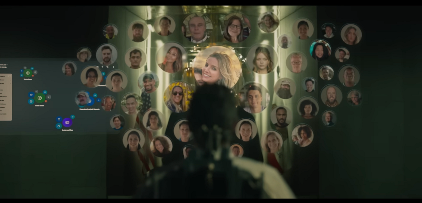
Source: Mercy Trailer Youtube
When did the interface become the most interesting thing on screen?
Fictional interfaces are becoming full characters on screen. What that reveals about the products we design every day.
We spend more time looking at interfaces than we do looking at other people. Our phones, our apps, our feeds, our AI assistants. Most of our day is spent interacting with software someone designed, and yet we rarely stop to think about how much that shapes how we feel.
So when films started treating UI as a character, they weren’t making some bold creative statement. They were just catching up to how we already live.
What I’ve noticed across recent films, both Hindi and English, is that the interface on screen isn’t background anymore. It has scenes. It has behavior that develops. It affects how you feel about what’s happening.
Watch CTRL, Mercy, or LOGOUT and at some point you’ll catch yourself watching the screen within the screen more closely than the person holding it. That’s not a coincidence.

Source: Mercy Trailer Youtube
The UI is no longer just there
There’s a kind of moment I keep seeing where a character and an interface are basically going back and forth with each other. The character does something, the interface responds, the character reacts. What’s changed is how much the UI side of that is carrying. It’s not just confirming inputs or displaying information. It has a personality. It behaves in a way that feels specific to what kind of system it is.

Source: CTRL Trailer Youtube
In CTRL, a Hindi Netflix thriller where a woman uses an AI app to erase her ex from her digital life, the AI has no face, no physical presence, no dialogue in the traditional sense. The only way it exists in the film is through the interface. And the film gives that interface real screen time. Not a quick flash of context. Actual scenes where the camera holds on it, because that’s where the story is.
Mercy takes it even further. In that film, the AI judge, Judge Maddox, is the entire courtroom. A detective accused of murder has 90 minutes to prove his innocence, and the only thing he’s arguing against is an interface. There’s no human judge to appeal to emotionally, no jury to read the room. Just a system processing evidence and displaying a guilt probability ticking toward execution.
The UI isn’t supporting the tension. It is the tension.
Every time that percentage shifts on screen, the audience feels it because they already understand, instinctively, what it means when a system makes a decision about you.

Shot from Logout Trailer Youtube
LOGOUT shows the same thing happening outside the AI context. The social media interfaces in that film carry emotional weight not because of how they’re designed visually, but because the audience already has a lived relationship with that kind of system. You don’t need the film to explain what a notification at the wrong moment feels like. That context arrives with every viewer who owns a phone. The film just points at it.
What makes it work is that the interface feels specific. It has a way of responding that tells you something about what kind of system it is, what it’s capable of, maybe what it wants. Someone thought carefully about every state, every response, every small moment of interaction. That specificity is what makes it feel like a presence rather than a prop.
The interface on screen doesn’t need to explain itself. It borrows feelings that real apps have already created in us.
Why this works now with audience
A scene built around an interface couldn’t have hit the same way ten years ago. Not because films weren’t trying, but because we hadn’t yet built up that kind of personal history with software.
Now we have. We know what it feels like when an app genuinely helps us versus when it’s nudging us somewhere we didn’t choose to go. We’ve all used a system that felt slightly off in a way we couldn’t name. We’ve had an AI respond in a way that was helpful but also a little unsettling. These experiences leave something behind. A sense that software has its own agenda.
Films are reaching into that and using it as emotional material. That’s why these scenes land without any setup. The audience brings the feeling with them.
This is also why it’s happening in Hindi cinema alongside Hollywood. It’s not about budget. Indian audiences are among the most active smartphone and social media users in the world, and they bring the same complicated relationship with technology into the cinema as anyone else. CTRL works not because it explains AI, but because it shows an AI behaving in ways people already recognize.
What this should make us think about
Here’s the part that sat with me as a designer.
A filmmaker, with no users to test with and no engineering constraints, can make an audience feel something about an interface they’ve never touched. Just by thinking carefully about how it behaves. Meanwhile a lot of real products, designed by actual designers with actual research, create no emotional response at all. They work fine. People just feel nothing about them.
The interfaces that feel like characters in these films aren’t the ones with the most polished visual design. They’re the ones where someone thought hard about behavior. How does the system respond when something unexpected happens? What does it show when it’s processing? What does it do in a moment of tension? Those decisions, the ones that usually live in a spec doc and never get discussed in a design review, are what make the difference between a UI that feels alive and one that just functions.
We spend most of our time designing for clarity and efficiency. These films are a reminder that people also have feelings about every interface they use, whether we designed for that or not.
Three things worth taking back to your work
1. Your loading states are communicating something. Not just “wait.” They communicate confidence, uncertainty, or indifference depending on how they’re designed. Most of us treat them as afterthoughts. They’re not.
2. Consistency across every state is what builds trust. The fictional interfaces that feel like characters behave the same way whether the moment is routine or critical. That’s what makes users feel like they understand the system. Inconsistency, even in edge cases nobody is supposed to hit, erodes that.
3. Users form relationships with interfaces, not just opinions. They come back to some products and avoid others for reasons that go well beyond functionality. Designing only for usability is designing for half the experience. The other half is harder to measure but it’s just as real.
Films don’t have to ship to production or pass an accessibility audit. But they’re doing something honest that a lot of product work doesn’t: treating the interface as something people will have feelings about, and designing accordingly.
That seems worth thinking about.
메타데이터
- post_id
- 19987ca0b889
- slug
- when-did-the-interface-become-the-most-interesting-thing-on-screen-19987ca0b889
- url
- https://medium.com/design-bootcamp/when-did-the-interface-become-the-most-interesting-thing-on-screen-19987ca0b889
- canonical_url
- https://medium.com/design-bootcamp/when-did-the-interface-become-the-most-interesting-thing-on-screen-19987ca0b889
- author_url
- https://medium.com/@tanvi-kulkarni
- status
- ok
- fetched_at
- 2026-06-22 17:31:34







