Introducing the Carbon Simulator
Carbon Simulator on simulator.carbondefi.xyz
Introducing the Carbon Simulator
**Carbon Simulator on simulator.carbondefi.xyz**
After the Carbon Simulator library has been live on PyPi for a while now, we are glad that we can now announce that we have published it in an easily usable format, as Jupyter Notebook directly in your browser, no installation needed.
Introduction to Carbon
Carbon has been described at length elsewhere, notably in the Whitepaper, the Litepaper, and in the other resources on carbondefi.xyz. The Carbon Simulator is a python library that provides Carbon functionality very close — albeit not fully equivalent — to what we will have in the smart contracts and the SDK. The library is open-sourced on Github and it is available as a pip install [pip install carbon-simulator] on PyPi. So here I’ll just give a very short intro, based on this presentation.
In a nutshell, the Carbon invariant curve is a concentrated liquidity hyperbolic (x*y=k) curve, parameterized by its start price Pa, end price Pb, and the curve capacity yint.
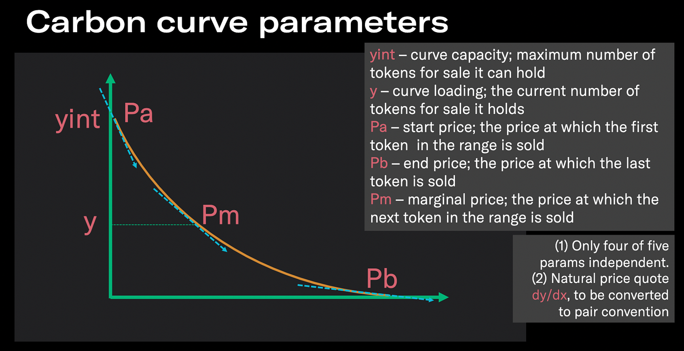
Carbon curve parameter Pa, Pb, yint
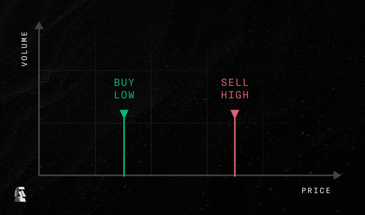
Carbon’s major innovation is that the curves are asymmetric, ie they do only allow for trading in one direction, as opposed to traditional AMM curves that trade back and forth.

Carbon asymmetric curve
Carbon still allow recurrent, bi-directional trading, using the concept of linked curves where liquidity is moved back and forth between those two curves.

Carbon linked curves
In other words, Carbon implements an on-chain order book with two distinct bid and ask and ranges. This is shown in the chart below:

Carbon bid and ask order book
It is worth looking at the chart above in more detail to understand how Carbon works: the orange line is the BTC/ETH exchange rates from July 2021 to now. The green shaded area is the Carbon “buy [BTC for ETH]” bid range, from 12.1–13.3 [ETH per BTC]. The red shaded area is the “sell” ask range, from 14.6–16.1. The initial portfolio is 50/50 [by value] BTC and ETH. When ever prices dip into the green bid area, the Carbon position sells ETH for BTC, and in the red ask are Carbon sells BTC for ETH. In other words: Carbon buys-low/sells-high whenever markets move in a crab fashion. Above the red ask area, the position is 100% ETH, and below the green bid area it is 100% BTC. In other words: the position is flat on the upside and long on the downside. Option aficionados will recognize the usual trade-off here, albeit on a macroscopic scale: an unadjusted Carbon position is outperforming in sidewards trending “crab” markets, but underperforms in trending markets.
[Note: if the above is confusing think about ETH as USD “cash”, and about BTC as some TKN “risk asset” that is worth between 10–20 USD per TKN].
To see what happens to the Carbon position we can look at the chart below, which adds position data to the above chart (right hand side axis):

Carbon position
The thick grey line is the total value of the Carbon position in ETH (starting at 1,000 ETH), and the thin dashed grey line is the value of the ETH position (starting at 50%, ie 500ETH), both on the right hand side axis. We see it the portfolio starts 50/50 (dashed line half way up), moves a bit more into BTC when dipping into the green range (dashed line goes down), and then it moves 100% into ETH once the price is above the upper end of the ask range [16.1]. Once the top end of the range is broken we notice that the value is flat, because at this stage the portfolio is all ETH, so it no longer depends on the BTC/ETH price. In Sep ’21 the price then dips back into the green bid range, so the Carbon position sells some ETH for BTC. This is sold at a profit in Oct ’21, when again the value stabilizes, at a slightly higher level because of the profit taken. We have a few more buy-low/sell-high cycles like this, and the Carbon position ends up at about 1,629 ETH, ie 60%+ up, in sideways market.
The Carbon Simulator
In the following, when we refer to the Carbon Simulator we refer specifically to a number of Jupyter Notebooks that provide a user-friendly interface for specific types of analysis, rather than the all-singing-and-dancing Python library. We also note that there is a second simulator that runs a very similar analysis to the one described here, but that produces the output as a movies covering the whole timeline. We highly recommend to watch one or two of those animations before reading on, because the animation provides a very visceral understanding of how Carbon works that is hard to convey in a static chart.
The main distribution of the Carbon Simulator that we are covering here is on located at simulator.carbondefi.xyz which launches a JupyterLite instance running the Jupyter Notebooks directly in your browser, without the need for external resources hosting the kernel server. It works rather well, albeit there are a few gotchas. We have an alternative distribution at Binder, but this one is maintained less often, so it may be a bit behind. Please note that you are not obliged to run this simulation on the server — you can simply download the notebooks into a Conda installation and they should run out of the box. But this means you will be running our code on your local machine outside the browser-provided sandbox, with all risks that this entails.
The Carbon Simulator current consists of two similar Jupyter notebooks
- The interactive simulations book, Demo7–4 (named thus for historical reasons)
- The frozen simulations book, Scenarios
This post is already rather long, so here we will focus on how to use the Scenarios book. In the next post we will then look at how to run simulations interactively, and in the third post of this series we will look at how you can create your own scenarios.
So to launch the Scenario book, please open this link in an incognito Window (ideally on Chrome). This is how it should look like

Carbon Simulator initial view
The first step (and key recurring step) is to Run All Cells

The all-important Run All Cells command
This can take a few seconds whilst dependencies are installed but eventually you will see a screen as the one below

Carbon Simulator after initialisation
This mostly shows the version numbers, and the one to take note of particularly is the one that says Carbon Sim v1.1. If this one is lower in a regular window than in an incognito window than the regular window is stuck on an old version.
The book that greats you then looks like this

Notebook initialised view
It has three key segments
- The check boxes determining the display choices
- The drop downs determining the chart collection and the scenario choice within that collection
- The chart output area
- The description area (not shown above)
Starting with number (2), the top slider shows all xlsx and csv files in the scenarios directory. Those will be subject of the 3rd post of this series. The second drop down chooses amongst the scenarios in a collection (a single line in the xlsx or csv file).

We have chosen the initial Intro scenario that contains charts from all the other ones below in a single view. You need to Run All after changing the collection to see an updated choice of scenarios in the bottom drop-down, and Run All again after changing the scenario.
In area (1) we see the following choices

chart elements and option
Those indicate either elements to include in the chart (eg plotPrice for the spot price, or plotValueTotal for including the portfolio value) or display choices (eg plotDark to switch the charts to dark mode). In order for changes to take effect you need to Run All.
As an aside: you can customize all colors if you click on the three dots below the section headline (color choices are matplotlib colors)

Interpreting the charts
Finally, let’s discuss a few simulation result charts. Below is a theoretical show-and-tell example of a perfect sinoidal market dynamics. Whenever the price goes down through the green bid range, the Carbon position sells cash CSH against the token RSK, and whenever it goes up through the red ask range it sells RSK against CSH.

Theoretical example chart
The solid grey line shows the total portfolio value (in CSH), and the dashed line the value of the CSH component, going from zero (100% RSK) to the total value (100% CSH). If the portfolio is 100% in CSH the grey value line is flat as the portfolio is no longer sensitive to changes in the spot price. When spot moves below the red line the curve remains flat until the spot price moves into the green bid area, at which point the Carbon position get more and more converted in RSK and therefore starts moving more and more in line with spot prices.
Let’s finish on some real market data with the following ETH/BTC chart, here in a period of upwards trending prices ETH versus BTC:

BTC/ETH chart (upwards trending)
Here the strategy provider was bullish, so they set the strategy entirely above the current price, and started 100% in the risk asset, ETH (note the inverted scale here compared to the chart in the intro). When the spot hit the red ask range in June 2021, most of the ETH is sold at a price of around 0.08. The spot is then range trading between 0.06 and 0.08, and the Carbon position engages in a number of rounds of buy-low/sell-high. Overall this strategy made 5x+, in an environment where markets went up 70%.
Resources
- Carbon Simulator as JupyterLite distribution (beta branch; repo) and as Binder distribution (repo)
- Carbon Animated Simulator
- Whitepaper, the Litepaper, and the Carbon website carbondefi.xyz
- Carbon library on Github and on PyPi
- Carbon Simulator presentation

Cover Image
메타데이터
- post_id
- 1b8e7bc8b0c2
- slug
- introducing-the-carbon-simulator-1b8e7bc8b0c2
- url
- https://medium.com/carbondefi/introducing-the-carbon-simulator-1b8e7bc8b0c2
- canonical_url
- https://medium.com/carbondefi/introducing-the-carbon-simulator-1b8e7bc8b0c2
- author_url
- https://medium.com/@odtorson
- status
- ok
- fetched_at
- 2026-07-26 04:48:36