Better search, worse web
Every number says Google AI Search is better. None of them can see the cost.
Better search, worse web
Every number says Google AI Search is better. None of them can see the cost.

The answer takes the page
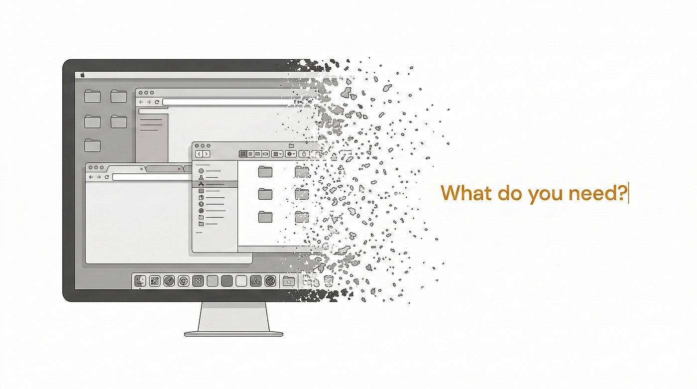
The better Google’s search gets, the more of the web it kills. That is not a glitch to be patched or a side effect to be managed. It is the improvement doing its job. When the answer is already there at the top of the page, before you reach a single link, you feel two things at once. The first is how good it is. The second is a half second of wrongness, the dim sense that you used to go somewhere to get this, and that the place which knew the answer never saw you come or go. The first feeling stays. The second you forget by the next query. Hold onto it anyway, because it is the only honest instrument in this whole story.
Google’s own numbers say the first feeling is winning. The company reports that people are happier with AI results and search more because of them, with AI in Search driving a double-digit rise in usage. AI Overviews, the summaries now sitting at the top of ordinary results, reach more than a billion people. By every metric a product team would pin to a wall, this is one of the most successful things Google has shipped in a decade.
And yet. In the weeks after Google’s 2026 I/O, installs of DuckDuckGo jumped about thirty percent, its users saying they were tired of being force-fed an AI they could not switch off. Critics said the AI-first page buries the useful links and overcomplicates simple things, and a search for the word “disregard” became a small viral case, the answer panel swollen while the dictionary sat far below. The contradiction was visible from the first rollout. Writing in IPG’s Media Lab, the analyst Richard Yao watched Google defend its AI answers as mostly accurate while users passed around guides on how to switch them off, and read it as the start of the web’s managed decline, the point where people quietly take the better answer and let the ecosystem behind it go.
So which is it. Both. That is not a paradox to shrug at. It is the mechanism, and it is worth taking apart, because the same split is coming to every product that decides a better experience is a self-evident good.
A better experience, imposed and chosen
Start with what Google did, because it is a design decision, and a defensible one. AI Overviews are served by default, no opt-in, at the top of the page. AI Mode, the fuller conversational version, you switch into on purpose, and for now it carries no ads at all. One is the better experience imposed on everyone. The other is the better experience you choose, a clean preview of where the first is heading, a page where the list of sources has quietly become a single answer and, more and more, an action taken on your behalf.

Google AI Overview (imposed), then Google AI Mode (chosen)
I want to be fair to it, because the easy move is to sneer, and the easy move is wrong. The old search was not a golden age. It was ten blue links over a swamp of pages built to rank rather than to inform, and you clicked through to find the answer three scrolls down past an ad and somebody’s life story. Removing that friction is a real gift. People are not imagining that the new way is easier. They are right.
The friction was load-bearing
The trouble is that the friction was holding something up.

The citation no one crosses
The click you no longer make was not waste. It was the toll. For most of the web’s life the arrangement was simple. A publisher let Google read its pages, and Google sent readers back to those pages, where the publisher could earn enough to make the next ones. Indexing in, visitors out. The click was the friction, and the click was the business model. When an AI summary sits on top, Pew found people click through to a site about eight percent of the time, against fifteen without one, and follow a cited source about one percent of the time. Remove the friction and you remove the toll in the same motion. Nobody decided to defund the source. The interface just stopped sending anyone to it.
This is the part a UX practice is built not to see. The whole apparatus of the discipline points at the moment: time on task, satisfaction, did the user get what they came for, did they come back. Every one of those can climb while the system the moment depends on comes apart, because none of them is pointed at the system. The dashboard measures the experience. It does not measure the web the experience is standing on. So the number goes up, the press release writes itself, and the thing underneath gets quietly thinner with nothing on the screen to flag it.
Three ways it misses the business
Better UX, it turns out, is misaligned with the business underneath in three directions at once, and the third is the one nobody wants to say.

The hollowed source
The first is the publisher, and it is plain by now. The click was their living, and the answer took it. That is the fight everyone is already having, in lawsuits and licensing deals.
The second is stranger. Google is misaligned with its own business. The empire was built on the click, on sending you onward to a result, sometimes a paid one. Now Google is testing ads inside the AI answer itself, because the old ad surface is the very thing it is burying, while AI Mode runs clean and unmonetized. Google is cannibalizing the machine that made it, on purpose, betting that owning the AI experience matters more than protecting the model that pays for everything. The better UX does not even spare its maker.
The third is the user, the supposed winner, and this one takes a beat to feel. The answer you love is borrowed. A model’s sense of what is true today is only as fresh as the human reporting feeding it, and that reporting is a flow somebody has to keep producing: the hearing attended, the record pried open, the fact forced into existence that was not going to arrive on its own. No single newsroom is irreplaceable, which is exactly why the market underpays all of them. The aggregate is a public good that everyone draws on and no one can be made to fund. Strip the visit that paid for it, and you are spending down the supply of the thing that makes tomorrow’s answers worth having. The perfect answer now is drawn against a worse one later. The user is not exempt from the bill. The user is just last to get it.
The number that never warned me
I notice all of this because of where I sit. I run data and metrics in a newsroom, and building the dashboards is the job. I have watched an experience number climb, the one that says people are getting what they came for, while the thing that made the experience possible got quietly cheaper to abandon. The number never once dipped to warn me. It was not built to.

Green, with one cell blank
Here is the honest objection, and I want it in the room rather than buried. The users are real. Google’s happier-and-searching-more data is real. The loud are louder than they are many, the unhappy posting about it while the satisfied just get on with their day. None of this proves AI search is bad UX. It is good UX. That is the entire problem. Good UX, measured only at the moment it happens, is not a safe guide to whether you are building something or burning it, and the better the experience, the more confidently you burn. The sentiment split is not noise around the success. It is people feeling the misalignment in their gut a year or two before any metric will consent to show it.
Not a north star
So no, better UX is not a north star. It is a local optimum, and a local optimum can eat the globe it sits on. Google’s AI search is the clearest case we have been handed: an experience that is, moment to moment, better than what came before, and that is draining the publishers it reads, the ad business that funds it, and the supply of fresh reality that keeps its answers true, all while the one dashboard anyone is watching glows green.
If you build experiences for a living, the question is not whether the moment got better. It almost always can. The question is what the moment is standing on, and whether any instrument you own can see that thing before it is gone. I build those instruments. I can show you that people are happier and searching more. I cannot show you what it is costing the system the searching runs on, because that number was never built, and building it is harder and less rewarded than shipping the next improvement. Until it exists, calling this better only means the part we measured improved. It says nothing about the part we left off the screen.
메타데이터
- post_id
- 1ed2c43fe38f
- slug
- better-search-worse-web-1ed2c43fe38f
- url
- https://uxdesign.cc/better-search-worse-web-1ed2c43fe38f
- canonical_url
- https://uxdesign.cc/better-search-worse-web-1ed2c43fe38f
- author_url
- https://medium.com/@wirawiri
- status
- ok
- fetched_at
- 2026-06-24 18:57:25