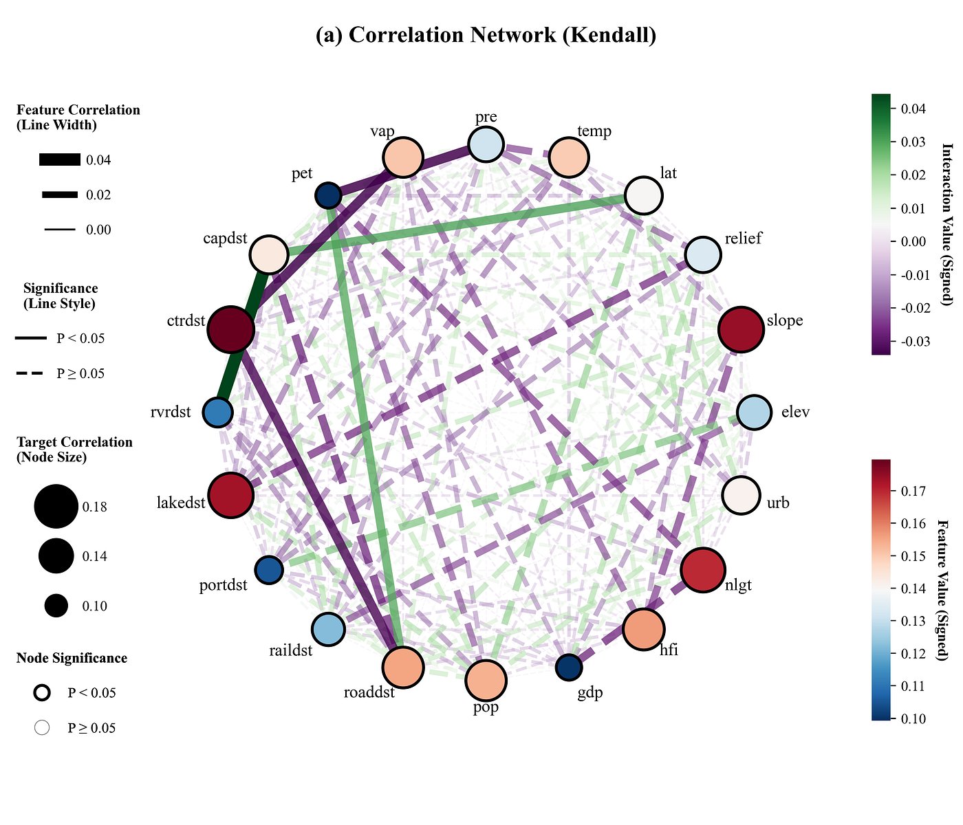
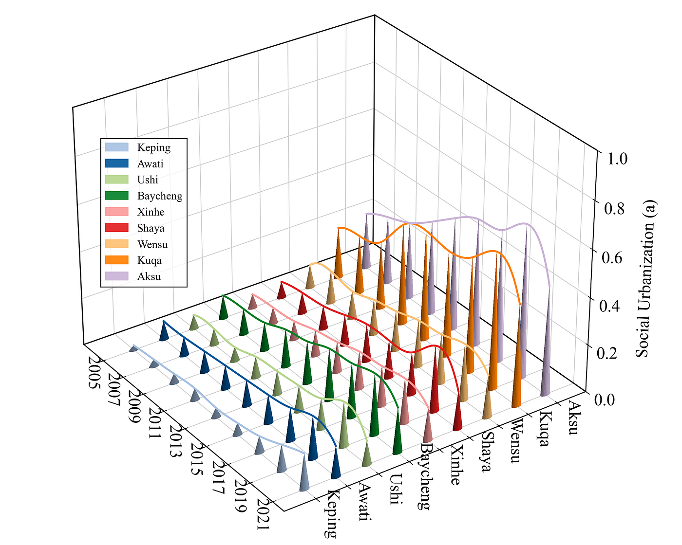
Journal Figure Replication | Plotting a Composite Correlation Network Heatmap with Python
Composite Correlation Network Heatmap
Journal Figure Replication | Plotting a Composite Correlation Network Heatmap with Python
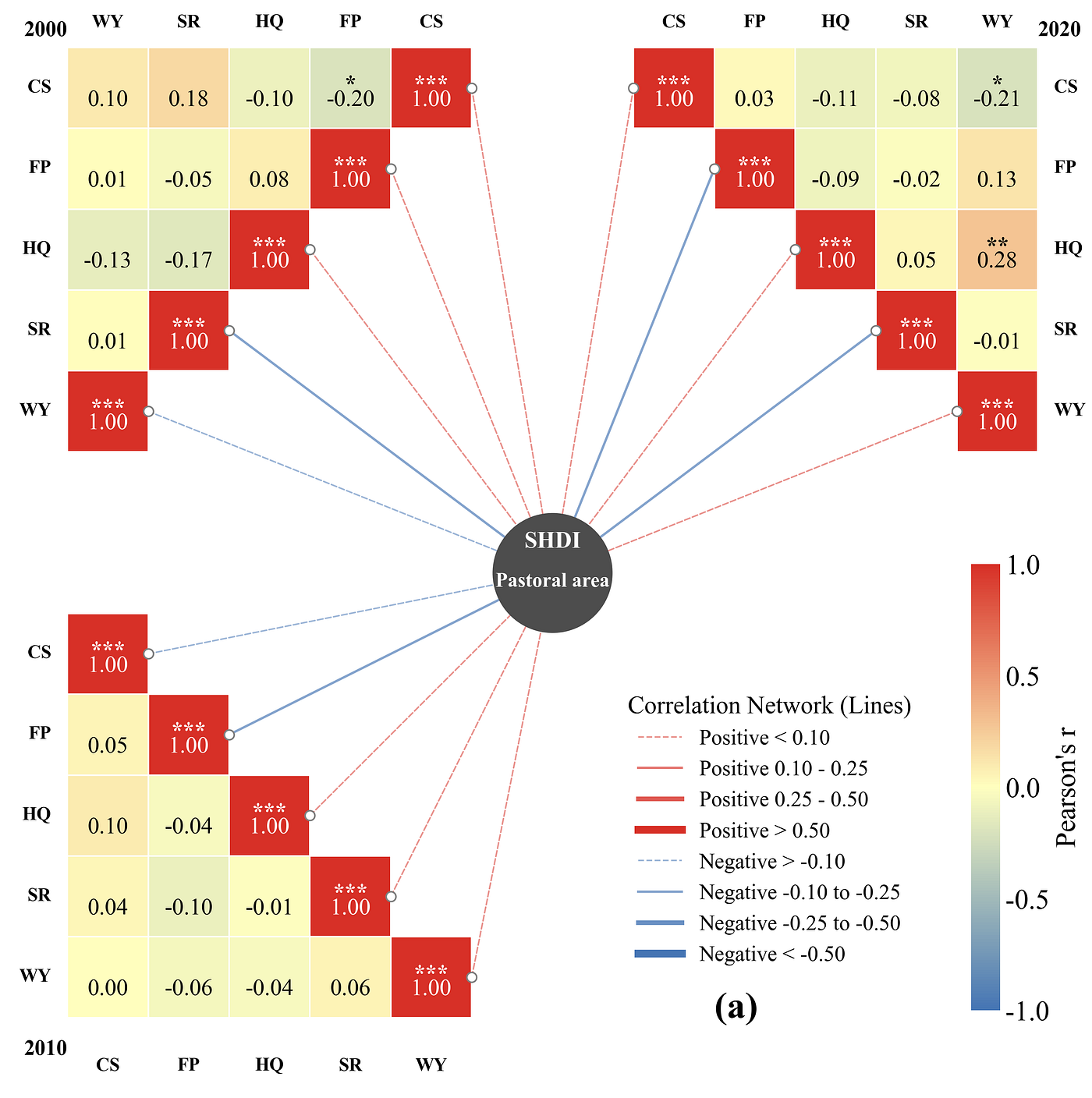
Result
Paper: Do ecosystem service gains promote human Well-being? Unpacking the ecosystem–human well-being link in fragile landscapes

Imitation:
Code Explanation
- Library imports and font configuration
import matplotlib.pyplot as plt
import matplotlib.patches as patches
import matplotlib.colorbar as colorbar
from matplotlib.lines import Line2D
import matplotlib.colors as mcolors
import matplotlib
import pandas as pd
from scipy.stats import pearsonr
import os
matplotlib.rcParams['pdf.fonttype'] = 42
matplotlib.rcParams['ps.fonttype'] = 42
plt.rcParams['font.family'] = 'serif'
plt.rcParams['font.serif'] = ['Times New Roman']
plt.rcParams['axes.unicode_minus'] = False- Color library configuration and color palette selection
color_library = {
    1: {
        'heatmap_negative': "#4575b4", 'heatmap_zero': "#ffffbf", 'heatmap_positive': "#d73027",
        'center_circle_face': "#4d4d4d", 'center_text': "#ffffff",
    },
}

COLOR_CHOICE = 5  # Select the color scheme configuration
selected_colors = color_library[COLOR_CHOICE]  # Get the chosen color configuration
def get_cmap_from_selection(colors):
    nodes = [0.0, 0.5, 1.0]  # Define the node positions for the color gradient: 0 for negative values, 0.5 for the midpoint, and 1 for positive values
    colors_list = [colors['heatmap_negative'], colors['heatmap_zero'], colors['heatmap_positive']]  # Extract color configurations to build a list
    cmap = mcolors.LinearSegmentedColormap.from_list("custom_corr_cmap", list(zip(nodes, colors_list)))  # Generate the custom Colormap
    return cmap  # Return the generated colormap object
current_cmap = get_cmap_from_selection(selected_colors)  # Generate the colormap based on the currently selected color scheme
norm = mcolors.Normalize(vmin=-1, vmax=1) # Set the normalization range for the colormap- Data analysis functions
Including feature data extraction, target data extraction, calculation of correlation and significance between features, calculation of correlation and significance between data and targets for each period, and saving of analysis results.
def analyze_raw_data(raw_data_path, output_analysis_path, years, vars_list):
    calculated_data = {}  # Used to store the calculation results
    with pd.ExcelWriter(output_analysis_path) as writer:  # Use pandas to create an Excel writer object, preparing to save the file
        for year in years:  # Iterate through each year
            df_all = pd.read_excel(raw_data_path, sheet_name=f'{year}_RawData', index_col=0)  # Read the Sheet corresponding to the current year
            df_vars = df_all[vars_list]  # Feature data
            center_series = df_all['SHDI']  # Target data

            # Perform correlation analysis between feature data
            corr_matrix = df_vars.corr(method='pearson')
            # Used to store P-values
            p_values = pd.DataFrame(index=vars_list, columns=vars_list, dtype=float)

            for c1 in vars_list:  # Rows
                for c2 in vars_list:  # Columns
                    if c1 == c2:  # If it is the same variable
                        p_values.loc[c1, c2] = 0.0
                    else:
                        _, p = pearsonr(df_vars[c1], df_vars[c2])  # Calculate the correlation coefficient and P-value for the two columns of data
                        p_values.loc[c1, c2] = p  # Fill the calculated P-value into the corresponding position in the matrix

            center_corrs = []  # Used to store the correlation between features and the target
            for var in vars_list:  # Iterate through each variable
                r, _ = pearsonr(df_vars[var], center_series)  # Calculate the correlation coefficient between the current variable and the target
                center_corrs.append(r)  # Add the correlation coefficient to the list

            # Convert the correlation list into a DataFrame format
            df_center_corr = pd.DataFrame(center_corrs,
                                          index=vars_list,
                                          columns=['Correlation_with_Center'])

            # Save the analysis results
            corr_matrix.to_excel(writer, sheet_name=f'{year}_Corr')  # Correlation matrix
            p_values.to_excel(writer, sheet_name=f'{year}_P_Value')  # P-values
            df_center_corr.to_excel(writer, sheet_name=f'{year}_Center_Corr')  # Center correlation data

            # Store the calculation results directly into the dictionary
            calculated_data[year] = {
                    'corr': corr_matrix.values,
                    'p': p_values.values,
                    'r': df_center_corr['Correlation_with_Center'].values
            }
return calculated_data # Directly return the calculated data for subsequent use- Network edge styling function
It sets the thickness and color of the network lines based on the analysis results.
def get_line_style(r_value):
    abs_r = abs(r_value)  # Calculate the absolute value of the correlation coefficient
    c_pos = selected_colors['heatmap_positive']  # Color used for positive correlation
    c_neg = selected_colors['heatmap_negative']  # Color used for negative correlation

    # Determine the color based on whether the r-value is positive or negative
    if r_value >= 0:
        line_color = c_pos
    else:
        line_color = c_neg

    # Determine linewidth, linestyle, and alpha transparency based on the absolute value threshold
    if abs_r < 0.10:
        return {'color': line_color, 'linestyle': '--', 'linewidth': 1.0, 'alpha': 0.5}
    elif 0.10 <= abs_r < 0.25:
        return {'color': line_color, 'linestyle': '-', 'linewidth': 1.5, 'alpha': 0.65}
    elif 0.25 <= abs_r < 0.50:
        return {'color': line_color, 'linestyle': '-', 'linewidth': 3.0, 'alpha': 0.8}
    else:
return {'color': line_color, 'linestyle': '-', 'linewidth': 5.0, 'alpha': 1.0}- Heatmap plotting function
It generates three triangular heatmaps for different ecoregions and adds anchor points for the network edges.
def draw_triangle_heatmap(ax, corr_mat, p_mat, variables, start_x, start_y, type='bottom-left', title_year=''):
    n = len(variables)  # Number of variables
    connection_points = []  # Used to store the anchor coordinates for the network lines

    # Left Triangle / Bottom-Left layout branch
    for i in range(n):  # Iterate through each row
        cols_to_draw = n - i  # Calculate the number of columns to draw for the current row (decreases row by row)
        for j_visual in range(cols_to_draw):  # Iterate through each column of the current row
            col_data_idx = n - 1 - j_visual  # Map the data column index (reverse order)
            row_data_idx = i  # Set the data row index
            val = corr_mat[row_data_idx, col_data_idx]  # Get the corresponding value from the correlation matrix
            p = p_mat[row_data_idx, col_data_idx]  # Get the corresponding value from the P-value matrix
            rect_x = start_x + j_visual  # Calculate the X-axis coordinate for the cell block
            rect_y = start_y - i  # Calculate the Y-axis coordinate for the cell block

            # Draw the cell block
            rect = patches.Rectangle((rect_x, rect_y),
                                     1,
                                     1,
                                     facecolor=current_cmap(norm(val)),
                                     edgecolor='white')
            ax.add_patch(rect)  # Add the rectangle patch to the axes

            # Label text configuration
            text_color = 'white' if abs(val) > 0.6 else 'black'  # Determine text color based on the darkness of the background
            # Plot the correlation coefficient values
            ax.text(rect_x + 0.5,
                    rect_y + 0.35,
                    f"{val:.2f}",
                    ha='center',
                    va='center',
                    fontsize=15,
                    color=text_color,
                    fontweight='normal')

            # Set significance symbols
            if p < 0.05:
                mark = '***' if p < 0.001 else ('**' if p < 0.01 else '*')  # Determine the number of asterisks based on the P-value threshold
                # Plot the significance asterisks
                ax.text(rect_x + 0.5,
                        rect_y + 0.52,
                        mark, ha='center',
                        va='center',
                        fontsize=15,
                        color=text_color,
                        fontweight='bold')

    # Left Y-axis labels
    for i in range(n):  # Iterate through rows to draw Y-axis labels
        label_y = start_y - i + 0.5  # Y-coordinate for the label
        # Plot the variable names on the left side
        ax.text(start_x - 0.2,
                label_y,
                variables[i],
                ha='right',
                va='center',
                fontsize=12,
                fontweight='bold')

    # Top labels for the X-axis
    top_labels = variables[::-1]  # Reverse the variable list for the top X-axis labels
    for i in range(n):  # Iterate through columns
        label_x = start_x + i + 0.5  # X-coordinate for the label
        # Plot the variable labels at the top
        ax.text(label_x,
                start_y + 1.2,
                top_labels[i],
                ha='center',
                va='bottom',
                fontsize=12,
                fontweight='bold')

    # Year annotation
    ax.text(start_x,
            start_y + 1.2,
            title_year,
            ha='right',
            va='center',
            fontsize=14,
            fontweight='bold')

    # Iterate through rows for alternative layout branch
    for i in range(n):
        cols_count = n - i  # Calculate the number of cell blocks for the current row
        offset = i  # Calculate the horizontal offset for each row
        for j_visual in range(cols_count):  # Iterate through columns
            rect_x = start_x + offset + j_visual  # X-axis coordinate for the cell block
            rect_y = start_y - i  # Y-axis coordinate for the cell block
            row_data_idx = i  # Data row index
            col_data_idx = i + j_visual  # Data column index
            val = corr_mat[row_data_idx, col_data_idx]  # Get the correlation coefficient value
            p = p_mat[row_data_idx, col_data_idx]  # Get the P-value

            # Create the cell block
            rect = patches.Rectangle((rect_x, rect_y),
                                     1,
                                     1,
                                     facecolor=current_cmap(norm(val)),
                                     edgecolor='white')
            ax.add_patch(rect)  # Add patch
            text_color = 'white' if abs(val) > 0.6 else 'black'  # Set text color

            # Plot values
            ax.text(rect_x + 0.5,
                    rect_y + 0.35,
                    f"{val:.2f}",
                    ha='center',
                    va='center',
                    fontsize=15,
                    color=text_color,
                    fontweight='normal')
            if p < 0.05:  # Determine significance
                mark = '***' if p < 0.001 else ('**' if p < 0.01 else '*')
                # Plot significance marks
                ax.text(rect_x + 0.5,
                        rect_y + 0.52,
                        mark,
                        ha='center',
                        va='center',
                        fontsize=15,
                        color=text_color,
                        fontweight='bold')

    # Right Y-axis labels
    for i in range(n):  # Iterate through rows
        label_y = start_y - i + 0.5  # Y-coordinate for the label
        # Plot right side labels
        ax.text(start_x + n + 0.2,
                label_y,
                variables[i],
                ha='left',
                va='center',
                fontsize=12,
                fontweight='bold')

    # Top labels for the X-axis (Alternative branch layout)
    for i in range(n):  # Iterate through columns
        label_x = start_x + i + 0.5  # X-coordinate
        # Plot variable names at the top
        ax.text(label_x,
                start_y + 1.2,
                variables[i],
                ha='center',
                va='bottom',
                fontsize=12,
                fontweight='bold')

    # Year label
    ax.text(start_x + n,
            start_y + 1.2,
            title_year,
            ha='left',
            va='center',
            fontsize=14,
            fontweight='bold')

    # Lower triangle layout loop configuration
    for i in range(n):  # Rows
        for j in range(i + 1):  # Columns
            rect_x = start_x + j  # X-coordinate for the cell block
            rect_y = start_y - i  # Y-coordinate for the cell block
            val = corr_mat[i, j]  # Correlation coefficient value
            p = p_mat[i, j]  # Get the P-value

            # Create the cell block
            rect = patches.Rectangle((rect_x, rect_y),
                                     1,
                                     1,
                                     facecolor=current_cmap(norm(val)),
                                     edgecolor='white')
            ax.add_patch(rect)  # Add patch

            text_color = 'white' if abs(val) > 0.6 else 'black'  # Text color
            # Plot correlation coefficients
            ax.text(rect_x + 0.5,
                    rect_y + 0.35,
                    f"{val:.2f}",
                    ha='center',
                    va='center',
                    fontsize=15,
                    color=text_color,
                    fontweight='normal')
            if p < 0.05:  # Significance
                mark = '***' if p < 0.001 else ('**' if p < 0.01 else '*')
                ax.text(rect_x + 0.5,
                        rect_y + 0.52,
                        mark,
                        ha='center',
                        va='center',
                        fontsize=15,
                        color=text_color,
                        fontweight='bold')

    # Left Y-axis labels (Alternative lower triangle section)
    for i in range(n):  # Rows
        label_y = start_y - i + 0.5  # Y-coordinate
        # Plot labels
        ax.text(start_x - 0.2,
                label_y,
                variables[i],
                ha='right',
                va='center',
                fontsize=12,
                fontweight='bold')
        ax.text(label_x,
                start_y - (n - 1) - 0.5,
                variables[i],
                ha='center',
                va='top',
                fontsize=12,
                fontweight='bold')

    # Plot Year text label
    ax.text(start_x,
            start_y - (n - 1) - 0.4,
            title_year,
            ha='right',
            va='center',
            fontsize=14,
            fontweight='bold')

return connection_points- Main plotting function
Including canvas setup, position layout for the three heatmaps, heatmap function execution, drawing of the central target circular pattern, generation of network edges, addition of colorbars and legends, and output save path configuration.
def create_complex_layout_plot(data, vars_list):
    fig, ax = plt.subplots(figsize=(20, 16))  # Create the canvas and coordinate axes
    ax.set_aspect('equal')  # Force equal aspect ratio to ensure cell blocks remain perfectly square
    n = len(vars_list)  # Number of variables
    gap_width = 2.0  # Set the middle gap width spacing

    start_x_2000 = -gap_width / 2 - n  # Starting X-coordinate for the top-left heatmap
    start_y_2000 = n + 2  # Starting Y-coordinate for the top-left heatmap

    start_x_2010 = -gap_width / 2 - n  # Starting X-coordinate for the bottom-right heatmap
    start_y_2010 = 0  # Starting Y-coordinate for the bottom-right heatmap

    start_x_2020 = gap_width / 2  # Starting X-coordinate for the top-right heatmap
    start_y_2020 = start_y_2000  # Starting Y-coordinate for the top-right heatmap

    # Plot the three triangular heatmaps
    pts_2000 = draw_triangle_heatmap(ax,
                                     data[2000]['corr'],
                                     data[2000]['p'],
                                     vars_list,
                                     start_x=start_x_2000,
                                     start_y=start_y_2000,
                                     type='top-left',
                                     title_year='2000')

    pts_2020 = draw_triangle_heatmap(ax,
                                     data[2020]['corr'],
                                     data[2020]['p'],
                                     vars_list,
                                     start_x=start_x_2020,
                                     start_y=start_y_2020,
                                     type='top-right',
                                     title_year='2020')

    pts_2010 = draw_triangle_heatmap(ax,
                                     data[2010]['corr'],
                                     data[2010]['p'],
                                     vars_list,
                                     start_x=start_x_2010,
                                     start_y=start_y_2010,
                                     type='bottom-left',
                                     title_year='2010')

    # Plot the central node
    center_y = ((start_y_2000 - n) + (start_y_2010 + 1)) / 2  # Y-coordinate for the central circle
    center_x = 0  # X-coordinate for the central circle

    c_face = selected_colors['center_circle_face']  # Fill color for the central circle
    c_text = selected_colors['center_text']  # Text color for the central circle

    # Draw the central large circle target
    ax.scatter(center_x,
               center_y,
               s=6000,
               marker='o',
               facecolor=c_face,
               edgecolor='none',
               zorder=100)

    # Plot the center node labels
    # Plot the first line of text inside the circle
    ax.text(center_x,
            center_y + 0.25,
            "SHDI",
            ha='center',
            va='bottom',
            fontsize=15,
            fontweight='bold',
            color=c_text,
            zorder=101)
    # Plot the second line of text inside the circle
    ax.text(center_x,
            center_y,
            "Pastoral area",
            ha='center',
            va='top',
            fontsize=13,
            fontweight='bold',
            color=c_text,
            zorder=101)

    ax.set_xlim(start_x_2000 - 3, start_x_2020 + n + 3)  # X-axis display limits
    ax.set_ylim(start_y_2010 - n - 2, start_y_2000 + 3)  # Y-axis display limits
    ax.axis('off')  # Hide borders, frames, and ticks

    # Colorbar configuration
    cbar_ax = fig.add_axes([0.7, 0.25, 0.013, 0.25])  # Add a new axes container into the figure layout for the colorbar
    # Create the colorbar object
    cb = colorbar.ColorbarBase(cbar_ax,
                               cmap=current_cmap,
                               norm=norm,
                               orientation='vertical')
    cb.set_label("Pearson's r", size=18)  # Set colorbar title label
    cb.set_ticks([-1, -0.5, 0, 0.5, 1])  # Colorbar tick positions
    cb.outline.set_visible(False)  # Remove colorbar outer border frame
    cb.ax.tick_params(size=0, labelsize=18)  # Configure tick parameters (hide marks, set label size)

    # Legend configuration
    c_pos = selected_colors['heatmap_positive']  # Positive correlation color
    c_neg = selected_colors['heatmap_negative']  # Negative correlation color

    # Define legend element list, separated into two correlation groups
    legend_elements = [
        # Positive correlation group
        Line2D([0], [0], color=c_pos, lw=1.0, linestyle='--', alpha=0.5, label='Positive < 0.10'),
        Line2D([0], [0], color=c_pos, lw=1.5, linestyle='-', alpha=0.65, label='Positive 0.10 - 0.25'),
        Line2D([0], [0], color=c_pos, lw=3.0, linestyle='-', alpha=0.8, label='Positive 0.25 - 0.50'),
        Line2D([0], [0], color=c_pos, lw=5.0, linestyle='-', alpha=1.0, label='Positive > 0.50'),
        # Negative correlation group
        Line2D([0], [0], color=c_neg, lw=1.0, linestyle='--', alpha=0.5, label='Negative > -0.10'),
        Line2D([0], [0], color=c_neg, lw=1.5, linestyle='-', alpha=0.65, label='Negative -0.10 to -0.25'),
        Line2D([0], [0], color=c_neg, lw=3.0, linestyle='-', alpha=0.8, label='Negative -0.25 to -0.50'),
        Line2D([0], [0], color=c_neg, lw=5.0, linestyle='-', alpha=1.0, label='Negative < -0.50')
    ]

    # Plot figure legend
    ax.legend(handles=legend_elements,
              loc='lower right',
              bbox_to_anchor=(0.76, 0.2),
              title="Correlation Network (Lines)",
              frameon=False,
              fontsize=14,
              title_fontsize=16,
              ncol=1)
    # Figure panel sub-label annotation
ax.text(start_x_2020 + n - 4, start_y_2010 - n + 1, "(a)", fontsize=24, fontweight='bold')- Execution block, including defining features to analyze, sheets, input/output file save paths, data analysis execution, and plotting function calls.
if __name__ == "__main__":
    vars_list = ['CS', 'FP', 'HQ', 'SR', 'WY']  # Features
    years = [2000, 2010, 2020]  # Sheets
    raw_data_file = r'D:\folder\raw_data.xlsx'  # Full path to the raw data file
    analysis_result_file = r'D:\folder\simulation_results.xlsx'  # Full path to the analysis results file

    # Call the data analysis function
    plot_data = analyze_raw_data(raw_data_file,
                                 analysis_result_file,
                                 years,
                                 vars_list)
    # Call the main plotting function
    create_complex_layout_plot(plot_data,
                               vars_list)
Data
Input data
Output data
Complete Code
# =========================================================================================
# ======================================1.Import libraries =========================================
# =========================================================================================
import matplotlib.pyplot as plt
import matplotlib.patches as patches
import matplotlib.colorbar as colorbar
from matplotlib.lines import Line2D
import matplotlib.colors as mcolors
import matplotlib
import pandas as pd
from scipy.stats import pearsonr
matplotlib.rcParams['pdf.fonttype'] = 42
matplotlib.rcParams['ps.fonttype'] = 42
plt.rcParams['font.family'] = 'serif'
plt.rcParams['font.serif'] = ['Times New Roman']
plt.rcParams['axes.unicode_minus'] = False
# =========================================================================================
# =====================================2.Color library =========================
# =========================================================================================
color_library = {
1: {
'heatmap_negative': "#4575b4",
'heatmap_zero': "#ffffbf",
'heatmap_positive': "#d73027",
'center_circle_face': "#4d4d4d",
'center_text': "#ffffff",
},
2: {
'heatmap_negative': "#2166ac", 'heatmap_zero': "#f7f7f7", 'heatmap_positive': "#b2182b",
'center_circle_face': "#333333", 'center_text': "#ffffff",
},
3: {
'heatmap_negative': "#762a83", 'heatmap_zero': "#f7f7f7", 'heatmap_positive': "#1b7837",
'center_circle_face': "#40004b", 'center_text': "#ffffff",
},
4: {
'heatmap_negative': "#8c510a", 'heatmap_zero': "#f5f5f5", 'heatmap_positive': "#01665e",
'center_circle_face': "#35978f", 'center_text': "#ffffff",
},
5: {
'heatmap_negative': "#c51b7d", 'heatmap_zero': "#fde0ef", 'heatmap_positive': "#4d9221",
'center_circle_face': "#276419", 'center_text': "#ffffff",
},
6: {
'heatmap_negative': "#542788", 'heatmap_zero': "#f7f7f7", 'heatmap_positive': "#b35806",
'center_circle_face': "#e08214", 'center_text': "#ffffff",
},
7: {
'heatmap_negative': "#4d4d4d", 'heatmap_zero': "#e0e0e0", 'heatmap_positive': "#ca0020",
'center_circle_face': "#000000", 'center_text': "#ffffff",
},
8: {
'heatmap_negative': "#d73027", 'heatmap_zero': "#ffffbf", 'heatmap_positive': "#1a9850",
'center_circle_face': "#006837", 'center_text': "#ffffff",
},
9: {
'heatmap_negative': "#6b7b8c", 'heatmap_zero': "#f2eee5", 'heatmap_positive': "#b05b53",
'center_circle_face': "#4a5866", 'center_text': "#ffffff",
},
10: {
'heatmap_negative': "#08519c", 'heatmap_zero': "#f7fbff", 'heatmap_positive': "#006d2c",
'center_circle_face': "#00441b", 'center_text': "#ffffff",
},
11: {
'heatmap_negative': "#2d004b", 'heatmap_zero': "#1a1a1a", 'heatmap_positive': "#ff00cc",
'center_circle_face': "#ffffff", 'center_text': "#000000",
},
12: {
'heatmap_negative': "#7f7f7f", 'heatmap_zero': "#ffffff", 'heatmap_positive': "#08519c",
'center_circle_face': "#252525", 'center_text': "#ffffff",
},
13: {
'heatmap_negative': "#313695", 'heatmap_zero': "#e0f3f8", 'heatmap_positive': "#a50026",
'center_circle_face': "#74add1", 'center_text': "#000000",
},
14: {
'heatmap_negative': "#2c7fb8", 'heatmap_zero': "#ffffd9", 'heatmap_positive': "#41b6c4",
'center_circle_face': "#253494", 'center_text': "#ffffff",
},
15: {
'heatmap_negative': "#762a83", 'heatmap_zero': "#ffffff", 'heatmap_positive': "#e08214",
'center_circle_face': "#542788", 'center_text': "#ffffff",
},
16: {
'heatmap_negative': "#2b83ba", 'heatmap_zero': "#ffffbf", 'heatmap_positive': "#d7191c",
'center_circle_face': "#2c7bb6", 'center_text': "#ffffff",
},
17: {
'heatmap_negative': "#cccccc", 'heatmap_zero': "#ffffff", 'heatmap_positive': "#000000",
'center_circle_face': "#666666", 'center_text': "#ffffff",
},
18: {
'heatmap_negative': "#8c510a", 'heatmap_zero': "#f6e8c3", 'heatmap_positive': "#01665e",
'center_circle_face': "#35978f", 'center_text': "#ffffff",
},
19: {
'heatmap_negative': "#018571", 'heatmap_zero': "#f5f5f5", 'heatmap_positive': "#a6611a",
'center_circle_face': "#80cdc1", 'center_text': "#000000",
},
20: {
'heatmap_negative': "#8dd3c7", 'heatmap_zero': "#ffffb3", 'heatmap_positive': "#fb8072",
'center_circle_face': "#80b1d3", 'center_text': "#ffffff",
}
}
COLOR_CHOICE = 5 # Select the color scheme configuration
selected_colors = color_library[COLOR_CHOICE] # Get the chosen color configuration
def get_cmap_from_selection(colors):
nodes = [0.0, 0.5, 1.0] # Define the node positions for the color gradient: 0 for negative values, 0.5 for the midpoint, and 1 for positive values
colors_list = [colors['heatmap_negative'], colors['heatmap_zero'], colors['heatmap_positive']] # Extract color configurations to build a list
cmap = mcolors.LinearSegmentedColormap.from_list("custom_corr_cmap", list(zip(nodes, colors_list))) # Generate the custom Colormap
return cmap # Return the generated colormap object
current_cmap = get_cmap_from_selection(selected_colors) # Generate the colormap based on the currently selected color scheme
norm = mcolors.Normalize(vmin=-1, vmax=1) # Set the normalization range for the colormap
# =========================================================================================
# ======================================3.Data analysis function ==============================
# =========================================================================================
def analyze_raw_data(raw_data_path, output_analysis_path, years, vars_list):
calculated_data = {} # Used to store the calculation results
with pd.ExcelWriter(output_analysis_path) as writer: # Use pandas to create an Excel writer object, preparing to save the file
for year in years: # Iterate through each year
df_all = pd.read_excel(raw_data_path, sheet_name=f'{year}_RawData', index_col=0) # Read the sheet corresponding to the current year
df_vars = df_all[vars_list] # Feature data
center_series = df_all['SHDI'] # Target data
# Perform correlation analysis between feature data
corr_matrix = df_vars.corr(method='pearson')
# Used to store P-values
p_values = pd.DataFrame(index=vars_list, columns=vars_list, dtype=float)
for c1 in vars_list: # Rows
for c2 in vars_list: # Columns
if c1 == c2: # If it is the same variable
p_values.loc[c1, c2] = 0.0
else:
_, p = pearsonr(df_vars[c1], df_vars[c2]) # Calculate the correlation coefficient and P-value for the two columns of data
p_values.loc[c1, c2] = p # Fill the calculated P-value into the corresponding position in the matrix
center_corrs = [] # Used to store the correlation between features and the target
for var in vars_list: # Iterate through each variable
r, _ = pearsonr(df_vars[var], center_series) # Calculate the correlation coefficient between the current variable and the target
center_corrs.append(r) # Add the correlation coefficient to the list
# Convert the correlation list into a DataFrame format
df_center_corr = pd.DataFrame(center_corrs,
index=vars_list,
columns=['Correlation_with_Center'])
# Save the analysis results
corr_matrix.to_excel(writer, sheet_name=f'{year}_Corr') # Correlation matrix
p_values.to_excel(writer, sheet_name=f'{year}_P_Value') # P-values
df_center_corr.to_excel(writer, sheet_name=f'{year}_Center_Corr') # Center correlation data
# Store the calculation results directly into the dictionary
calculated_data[year] = {
'corr': corr_matrix.values,
'p': p_values.values,
'r': df_center_corr['Correlation_with_Center'].values
}
return calculated_data # Directly return the calculated data for subsequent use
# =========================================================================================
# ================================== 4. Network Edge Styling Function ==================================
# =========================================================================================
def get_line_style(r_value):
abs_r = abs(r_value) # Calculate the absolute value of the correlation coefficient
c_pos = selected_colors['heatmap_positive'] # Color used for positive correlation
c_neg = selected_colors['heatmap_negative'] # Color used for negative correlation
# Determine the color based on whether the r-value is positive or negative
if r_value >= 0:
line_color = c_pos
else:
line_color = c_neg
# Determine linewidth, linestyle, and alpha transparency based on the absolute value threshold
if abs_r < 0.10:
return {'color': line_color, 'linestyle': '--', 'linewidth': 1.0, 'alpha': 0.5}
elif 0.10 <= abs_r < 0.25:
return {'color': line_color, 'linestyle': '-', 'linewidth': 1.5, 'alpha': 0.65}
elif 0.25 <= abs_r < 0.50:
return {'color': line_color, 'linestyle': '-', 'linewidth': 3.0, 'alpha': 0.8}
else:
return {'color': line_color, 'linestyle': '-', 'linewidth': 5.0, 'alpha': 1.0}
# =========================================================================================
# ===================================== 5. Heatmap Plotting Function =====================================
# =========================================================================================
def draw_triangle_heatmap(ax, corr_mat, p_mat, variables, start_x, start_y, type='bottom-left', title_year=''):
n = len(variables) # Number of variables
connection_points = [] # Used to store anchor coordinates for the connection lines
# Left triangle layout variants
if type == 'top-left': # Inverted triangle layout positioned at the top-left
for i in range(n): # Iterate through each row
cols_to_draw = n - i # Calculate columns to draw for the current row (decreases row by row)
for j_visual in range(cols_to_draw): # Iterate through each column in the current row
col_data_idx = n - 1 - j_visual # Map the data column index in reverse order
row_data_idx = i # Set data row index
val = corr_mat[row_data_idx, col_data_idx] # Get the corresponding value from the correlation matrix
p = p_mat[row_data_idx, col_data_idx] # Get the corresponding value from the P-value matrix
rect_x = start_x + j_visual # Calculate the X-axis coordinate for the cell block
rect_y = start_y - i # Calculate the Y-axis coordinate for the cell block
# Draw the cell block
rect = patches.Rectangle((rect_x, rect_y),
1,
1,
facecolor=current_cmap(norm(val)),
edgecolor='white')
ax.add_patch(rect) # Add the rectangle patch to the axes
# Text annotation
text_color = 'white' if abs(val) > 0.6 else 'black' # Determine text color based on background contrast brightness
# Draw correlation coefficient value text
ax.text(rect_x + 0.5,
rect_y + 0.35,
f"{val:.2f}",
ha='center',
va='center',
fontsize=15,
color=text_color,
fontweight='normal')
# Add significance markers
if p < 0.05:
mark = '***' if p < 0.001 else ('**' if p < 0.01 else '*') # Determine star count based on P-value thresholds
# Draw significance stars
ax.text(rect_x + 0.5,
rect_y + 0.52,
mark, ha='center',
va='center',
fontsize=15,
color=text_color,
fontweight='bold')
# Left Y-axis labels
for i in range(n): # Iterate through rows to draw Y-axis labels
label_y = start_y - i + 0.5 # Y-coordinate for the label
# Draw variable name on the left side
ax.text(start_x - 0.2,
label_y,
variables[i],
ha='right',
va='center',
fontsize=12,
fontweight='bold')
# Anchor mapping
conn_x = start_x + (n - 1 - i) + 1 # Calculate connection anchor X-coordinate for this row
conn_y = start_y - i + 0.5 # Calculate connection anchor Y-coordinate for this row
connection_points.append((conn_x, conn_y)) # Append anchor coordinates to the tracking list
# Top X-axis labels
top_labels = variables[::-1] # Reverse the variable list for top X-axis alignment
for i in range(n): # Iterate through columns
label_x = start_x + i + 0.5 # X-coordinate for the label
# Draw variable label on the top axis boundary
ax.text(label_x,
start_y + 1.2,
top_labels[i],
ha='center',
va='bottom',
fontsize=12,
fontweight='bold')
# Year annotation label
ax.text(start_x,
start_y + 1.2,
title_year,
ha='right',
va='center',
fontsize=14,
fontweight='bold')
# Right triangle layout variants
elif type == 'top-right':
# Iterate through rows
for i in range(n):
cols_count = n - i # Calculate cell blocks to draw for the current row
offset = i # Calculate horizontal shift offset for each row
for j_visual in range(cols_count): # Iterate through columns
rect_x = start_x + offset + j_visual # X-axis coordinate for the cell block
rect_y = start_y - i # Y-axis coordinate for the cell block
row_data_idx = i # Data row index reference
col_data_idx = i + j_visual # Data column index reference
val = corr_mat[row_data_idx, col_data_idx] # Extract correlation coefficient value
p = p_mat[row_data_idx, col_data_idx] # Extract P-value
# Instantiate cell patch
rect = patches.Rectangle((rect_x, rect_y),
1,
1,
facecolor=current_cmap(norm(val)),
edgecolor='white')
ax.add_patch(rect) # Add patch
text_color = 'white' if abs(val) > 0.6 else 'black' # Assign text color contract
# Draw values
ax.text(rect_x + 0.5,
rect_y + 0.35,
f"{val:.2f}",
ha='center',
va='center',
fontsize=15,
color=text_color,
fontweight='normal')
if p < 0.05: # Evaluate significance thresholds
mark = '***' if p < 0.001 else ('**' if p < 0.01 else '*')
# Draw stars
ax.text(rect_x + 0.5,
rect_y + 0.52,
mark,
ha='center',
va='center',
fontsize=15,
color=text_color,
fontweight='bold')
# Right Y-axis labels
for i in range(n): # Iterate through rows
label_y = start_y - i + 0.5 # Label Y-coordinate alignment
# Draw label
ax.text(start_x + n + 0.2,
label_y,
variables[i],
ha='left',
va='center',
fontsize=12,
fontweight='bold')
# Anchor mapping
conn_x = start_x + i + 0 # X-coordinate
conn_y = start_y - i + 0.5 # Y-coordinate
connection_points.append((conn_x, conn_y)) # Append anchor tracking
# Top X-axis labels
for i in range(n): # Iterate through columns
label_x = start_x + i + 0.5 # X-coordinate
# Draw top variable label text
ax.text(label_x,
start_y + 1.2,
variables[i],
ha='center',
va='bottom',
fontsize=12,
fontweight='bold')
# Year stamp annotation
ax.text(start_x + n,
start_y + 1.2,
title_year,
ha='left',
va='center',
fontsize=14,
fontweight='bold')
# Bottom-left corner layout variants
elif type == 'bottom-left':
for i in range(n): # Rows
for j in range(i + 1): # Columns
rect_x = start_x + j # Cell block X-coordinate
rect_y = start_y - i # Cell block Y-coordinate
val = corr_mat[i, j] # Correlation magnitude value
p = p_mat[i, j] # Extract P-value matrix location
# Instantiate cell patch
rect = patches.Rectangle((rect_x, rect_y),
1,
1,
facecolor=current_cmap(norm(val)),
edgecolor='white')
ax.add_patch(rect) # Add patch
text_color = 'white' if abs(val) > 0.6 else 'black' # Font contrast assignment
# Draw core value text strings
ax.text(rect_x + 0.5,
rect_y + 0.35,
f"{val:.2f}",
ha='center',
va='center',
fontsize=15,
color=text_color,
fontweight='normal')
if p < 0.05: # Significance evaluation
mark = '***' if p < 0.001 else ('**' if p < 0.01 else '*')
ax.text(rect_x + 0.5,
rect_y + 0.52,
mark,
ha='center',
va='center',
fontsize=15,
color=text_color,
fontweight='bold')
# Left Y-axis labels
for i in range(n): # Rows
label_y = start_y - i + 0.5 # Y-coordinate track alignment
# Draw text
ax.text(start_x - 0.2,
label_y,
variables[i],
ha='right',
va='center',
fontsize=12,
fontweight='bold')
# Anchor mapping
conn_x = start_x + i + 1 # X-coordinate
conn_y = start_y - i + 0.5 # Y-coordinate
connection_points.append((conn_x, conn_y)) # Append anchor tracking
# Bottom X-axis labels
for i in range(n): # Iterate through columns
label_x = start_x + i + 0.5 # Label X-coordinate allocation
# Draw variable text markers
ax.text(label_x,
start_y - (n - 1) - 0.5,
variables[i],
ha='center',
va='top',
fontsize=12,
fontweight='bold')
# Draw Year stamp annotation
ax.text(start_x,
start_y - (n - 1) - 0.4,
title_year,
ha='right',
va='center',
fontsize=14,
fontweight='bold')
return connection_points
# =========================================================================================
# ===================================== 6. Main Plotting Function =====================================
# =========================================================================================
def create_complex_layout_plot(data, vars_list):
fig, ax = plt.subplots(figsize=(20, 16)) # Create the canvas and coordinate axes
ax.set_aspect('equal') # Force equal aspect ratio to ensure cell blocks remain perfectly square
n = len(vars_list) # Number of variables
gap_width = 2.0 # Set the middle gap width spacing
start_x_2000 = -gap_width / 2 - n # Starting X-coordinate for the top-left heatmap
start_y_2000 = n + 2 # Starting Y-coordinate for the top-left heatmap
start_x_2010 = -gap_width / 2 - n # Starting X-coordinate for the bottom-left heatmap
start_y_2010 = 0 # Starting Y-coordinate for the bottom-left heatmap
start_x_2020 = gap_width / 2 # Starting X-coordinate for the top-right heatmap
start_y_2020 = start_y_2000 # Starting Y-coordinate for the top-right heatmap
# Plot the three triangular heatmaps
pts_2000 = draw_triangle_heatmap(ax,
data[2000]['corr'],
data[2000]['p'],
vars_list,
start_x=start_x_2000,
start_y=start_y_2000,
type='top-left',
title_year='2000')
pts_2020 = draw_triangle_heatmap(ax,
data[2020]['corr'],
data[2020]['p'],
vars_list,
start_x=start_x_2020,
start_y=start_y_2020,
type='top-right',
title_year='2020')
pts_2010 = draw_triangle_heatmap(ax,
data[2010]['corr'],
data[2010]['p'],
vars_list,
start_x=start_x_2010,
start_y=start_y_2010,
type='bottom-left',
title_year='2010')
# Plot the central node
center_y = ((start_y_2000 - n) + (start_y_2010 + 1)) / 2 # Y-coordinate for the central circle
center_x = 0 # X-coordinate for the central circle
c_face = selected_colors['center_circle_face'] # Fill color for the central circle
c_text = selected_colors['center_text'] # Text color for the central circle
# Draw the central large circle target
ax.scatter(center_x,
center_y,
s=6000,
marker='o',
facecolor=c_face,
edgecolor='none',
zorder=100)
# Plot the center node labels
# Plot the first line of text inside the circle
ax.text(center_x,
center_y + 0.25,
"SHDI",
ha='center',
va='bottom',
fontsize=15,
fontweight='bold',
color=c_text,
zorder=101)
# Plot the second line of text inside the circle
ax.text(center_x,
center_y,
"Pastoral area",
ha='center',
va='top',
fontsize=13,
fontweight='bold',
color=c_text,
zorder=101)
# Internal network connection plotting function
def draw_connections(points, year_data):
for i, pt in enumerate(points): # Iterate through each anchor point
r_val = year_data['r'][i] # Get the target correlation value corresponding to this variable
style = get_line_style(r_val) # Get the line style configuration based on correlation strength
con = patches.ConnectionPatch(
xyA=pt,
xyB=(center_x, center_y),
coordsA="data",
coordsB="data",
axesA=ax,
axesB=ax, # Configure coordinate systems
color=style['color'],
linewidth=style['linewidth'],
linestyle=style['linestyle'],
alpha=style.get('alpha', 1.0),
zorder=1
)
ax.add_patch(con) # Add the connection line to the layout
# Draw a small dot marker at the anchor point location as a decorative flourish
ax.scatter(pt[0], pt[1], s=40, facecolor='white', edgecolor='gray', zorder=20)
draw_connections(pts_2000, data[2000]) # Draw network edges for 2000
draw_connections(pts_2020, data[2020]) # Draw network edges for 2020
draw_connections(pts_2010, data[2010]) # Draw network edges for 2010
ax.set_xlim(start_x_2000 - 3, start_x_2020 + n + 3) # X-axis display limits
ax.set_ylim(start_y_2010 - n - 2, start_y_2000 + 3) # Y-axis display limits
ax.axis('off') # Hide borders, frames, and ticks
# Colorbar configuration
cbar_ax = fig.add_axes([0.7, 0.25, 0.013, 0.25]) # Add a new axes container into the figure layout for the colorbar
# Create the colorbar object
cb = colorbar.ColorbarBase(cbar_ax,
cmap=current_cmap,
norm=norm,
orientation='vertical')
cb.set_label("Pearson's r", size=18) # Set colorbar title label
cb.set_ticks([-1, -0.5, 0, 0.5, 1]) # Colorbar tick positions
cb.outline.set_visible(False) # Remove colorbar outer border frame
cb.ax.tick_params(size=0, labelsize=18) # Configure tick parameters (hide marks, set label size)
# Legend configuration
c_pos = selected_colors['heatmap_positive'] # Positive correlation color
c_neg = selected_colors['heatmap_negative'] # Negative correlation color
# Define legend element list, separated into two correlation groups
legend_elements = [
# Positive correlation group
Line2D([0], [0], color=c_pos, lw=1.0, linestyle='--', alpha=0.5, label='Positive < 0.10'),
Line2D([0], [0], color=c_pos, lw=1.5, linestyle='-', alpha=0.65, label='Positive 0.10 - 0.25'),
Line2D([0], [0], color=c_pos, lw=3.0, linestyle='-', alpha=0.8, label='Positive 0.25 - 0.50'),
Line2D([0], [0], color=c_pos, lw=5.0, linestyle='-', alpha=1.0, label='Positive > 0.50'),
# Negative correlation group
Line2D([0], [0], color=c_neg, lw=1.0, linestyle='--', alpha=0.5, label='Negative > -0.10'),
Line2D([0], [0], color=c_neg, lw=1.5, linestyle='-', alpha=0.65, label='Negative -0.10 to -0.25'),
Line2D([0], [0], color=c_neg, lw=3.0, linestyle='-', alpha=0.8, label='Negative -0.25 to -0.50'),
Line2D([0], [0], color=c_neg, lw=5.0, linestyle='-', alpha=1.0, label='Negative < -0.50')
]
# Plot figure legend
ax.legend(handles=legend_elements,
loc='lower right',
bbox_to_anchor=(0.76, 0.2),
title="Correlation Network (Lines)",
frameon=False,
fontsize=14,
title_fontsize=16,
ncol=1)
# Figure panel sub-label annotation
ax.text(start_x_2020 + n - 4, start_y_2010 - n + 1, "(a)", fontsize=24, fontweight='bold')
# Save outputs
plt.savefig(fr'D:\folder\combined_heatmap{COLOR_CHOICE}.png', dpi=300, bbox_inches='tight')
plt.savefig(fr'D:\folder\combined_heatmap{COLOR_CHOICE}.pdf', bbox_inches='tight')
# =========================================================================================
# ====================================== 7. Main Program =======================================
# =========================================================================================
if __name__ == "__main__":
vars_list = ['CS', 'FP', 'HQ', 'SR', 'WY'] # Features
years = [2000, 2010, 2020] # Sheets
raw_data_file = r'D:\folder\raw_data.xlsx' # Full path to the raw data file
analysis_result_file = r'D:\folder\simulation_results.xlsx' # Full path to the analysis results file
# Call the data analysis function
plot_data = analyze_raw_data(raw_data_file,
analysis_result_file,
years,
vars_list)
# Call the main plotting function
create_complex_layout_plot(plot_data,
vars_list)Thank you for reading.
메타데이터
- post_id
- 1f49409464f0
- slug
- journal-figure-replication-plotting-a-composite-correlation-network-heatmap-with-python-1f49409464f0
- url
- https://medium.com/top-python-libraries/journal-figure-replication-plotting-a-composite-correlation-network-heatmap-with-python-1f49409464f0
- canonical_url
- https://medium.com/top-python-libraries/journal-figure-replication-plotting-a-composite-correlation-network-heatmap-with-python-1f49409464f0
- author_url
- https://medium.com/@benjamin_hui
- status
- ok
- fetched_at
- 2026-06-14 16:15:44