Four Ways the Browser Renders Graphics, Four Costs
DOM, SVG, Canvas, and the GPU. Same pixels, very different machinery.
Four Ways the Browser Renders Graphics, Four Costs
DOM, SVG, Canvas, and the GPU. Same pixels, very different approaches.
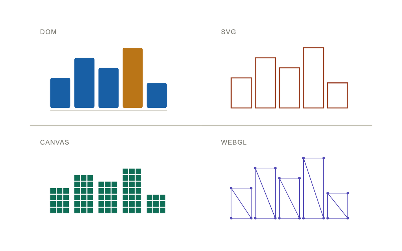
DOM, SVG, Canvas, and the GPU. Same pixels, very different approaches (Image by the author)
Introduction: the wrong approach
The chart looks fine. It is also unusable.
You scroll, and the page stutters. You hover a bar, and the tooltip lags a frame behind your cursor. You resize the window, and the whole dashboard freezes for half a second before catching up. You open DevTools, the flame chart fills with red bars marked Layout and Recalculate Style, and you finally see what is happening: every interaction is forcing the browser to re-measure four thousand DOM elements.
Nothing in your code is wrong. The data is fine. The math is fine. The styling is fine. You wrote a perfectly correct chart with the wrong rendering approach.
This is not a bug. It is a category of bug, and it has a name: you used the wrong approach.
The browser does not give us one way to draw. It gives us four. They share one job, putting pixels on the screen, and approach it from radically different angles. One treats every shape like a full HTML element with style, layout, and an event listener. One treats shapes as vector geometry in a tree. One forgets the shapes entirely and paints pixels into a buffer. One ships the data to the graphics card and asks thousands of parallel cores to color the screen at the same time.
All four exist, in every browser, right now. They have radically different costs.
Pick the wrong one, and a chart with a few thousand bars hangs the page on every hover. Pick the right one, and the same chart renders a million points at sixty frames per second. Same data, same screen, same developer. Different approach.
This article is the autopsy of that choice. We pretend we are building a chart library, starting from a goal we have all had at some point: render data, make it interactive, do not freeze the page. Then we try every approach the browser offers, on the same chart, with the same data, and we measure what each one actually costs us. We will be specific. We will admit when an approach is painful. We will not pick a winner, because there is no winner. There is only a curve, and we want you to know where on the curve you are choosing to stand.
Let us start by getting clear about what we are actually trying to build.
The goal: a chart library, concretely
“A chart library” is too vague to be useful. A sparkline in a dashboard, a live tick chart for an exchange, and a scatter plot of a million genes share the word “chart” and almost nothing else. They demand completely different things from the browser.
So we fix three concrete targets, and we hold every approach to them.
Here is what the three look like, side by side, before we describe each one.
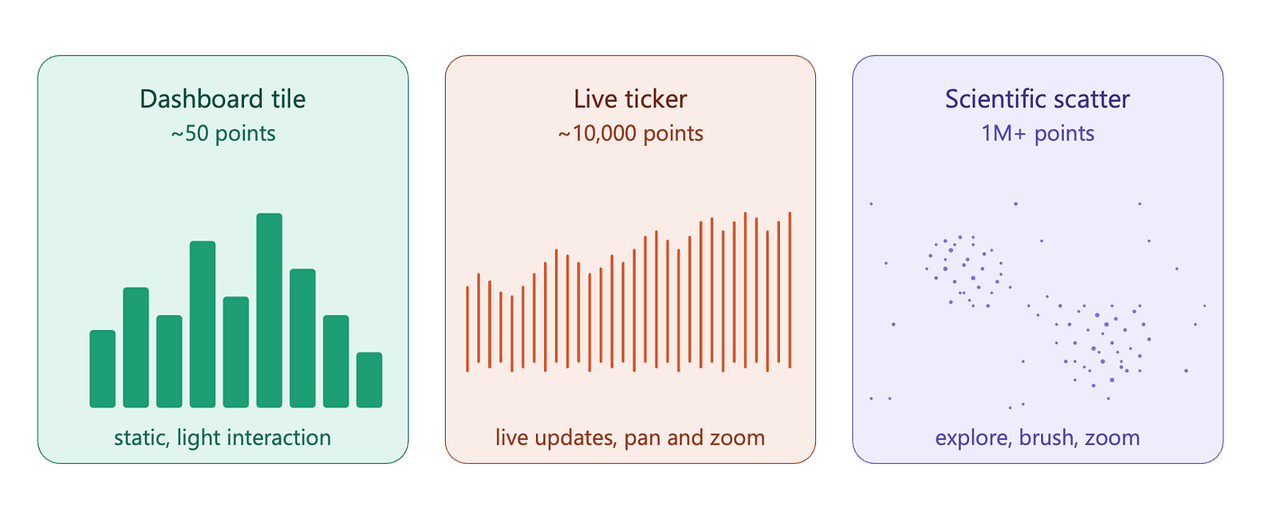
Three chart targets at three orders of magnitude (Image by the author)
The three targets
Each target sits roughly an order of magnitude above the one before it, and that gap matters more than it sounds. A factor of two in workload is something a faster CPU absorbs without breathing hard. A factor of a thousand is a different category of problem, and it is what forces us to change approaches entirely.
The dashboard tile is the small, mostly static chart we see embedded inside larger interfaces. Fifty points, maybe a hundred. A reader glances at it, perhaps hovers a bar, moves on. Admin panels, analytics pages, billing summaries.
The live ticker is the chart that updates while we watch it. Ten thousand points, redrawing several times per second as new data arrives. The reader pans, zooms, hovers individual marks, and any lag is felt immediately because the data is fresh and the decisions on it are time sensitive. Trading platforms, system monitors, real-time telemetry.
The scientific scatter is the chart at the limit of what a browser can hold. One million points, sometimes ten million. Genomics, astronomy, machine learning embeddings, sensor archives. The reader explores: pans, zooms, brushes regions, hunts outliers.
The ten questions
Throughout the article, we ask the same questions of every approach. How fast does it draw the first frame? How fast does it update when data changes? How much memory does it hold for a given chart? Can a reader click a specific shape, or do we have to compute hit testing ourselves? Does a screen reader understand what is on the page? Can we animate transitions without dropping frames? How does it handle text, which is harder than it looks? Can we export to PNG or SVG for a report? How much code do readers download to load our library? And honestly, how painful is it to develop with?
Ten questions. Not every approach has an interesting answer to all ten, but we track them across the article and gather the answers in a single decision framework at the end.
The benchmark protocol
For the questions that admit a number (first-frame render time, update speed, memory), we run the same harness against every approach. Declaring the conditions up front lets a reader reproduce, disagree, or extend the work.
🔹 Hardware. All measurements in this article were taken on a single machine: an Apple M3 with 8 cores and 17.2 GB of RAM, running macOS 14 (Darwin 24.6.0, arm64). Absolute numbers are tied to this configuration. Ratios between approaches are more portable than absolute timings, but we report both so a reader on different hardware can recalibrate.
🔹 Browser. Chromium 147.0.7727.15, driven by Playwright 1.59. Node.js v22.14.0. We measured against one browser engine. Firefox and WebKit may give different absolute numbers; we make no claim about them. The first three approaches (DOM, SVG, Canvas) were measured in headless Chromium. The GPU section runs windowed because headless routes WebGL through SwiftShader (software GL), which would not measure the actual GPU. The windowed run also re-measured the first three; DOM and SVG match the headless run within noise, while Canvas changes a little under hardware acceleration. We name the differences in the relevant sections.
🔹 Methodology. All timings come from the [Performance API](https://developer.mozilla.org/en-US/docs/Web/API/Performance_API) (performance.now()). Each measurement is repeated 10 times. The first run is discarded as cold-cache warmup. We report the median of the remaining 9 runs, with min and max as error bars.
🔹 Workload. The same bar chart shown in the code examples, scaled to the requested point count. Three operations are timed:
- Render: create the chart from an empty container, measure time to first painted frame.
- Full update: every bar’s height is replaced with a new random value in one batch.
- Partial update: a single bar’s height changes. (DOM, SVG, WebGL only; Canvas has no partial update concept.)
For the immediate-mode approaches (Canvas and WebGL), we add a fourth measurement: a one-second requestAnimationFrame loop that redraws every frame, returning the median frame interval. This captures whether the approach sustains 60 fps (frames per second) under continuous animation.
Render and full update stress the per-approach cost when N shapes are touched at once. Partial update isolates the "is this change cheap or expensive?" question. Sustained frame interval is the metric a developer actually cares about for an animated chart.
🔹 Sample sizes. N ∈ {50, 200, 1000, 5000, 20000} for retained-mode approaches. Larger upper bounds (up to 1,000,000) for Canvas and the GPU, where the cliff sits much further to the right.
🔹 Reported metrics. Render time and update times in milliseconds, DOM or object counts where meaningful, peak JS heap size where measurable.
The harness, the chart code, and the raw measurements are reproducible on any machine running Chromium. The harness is published alongside the article.
With the targets fixed, the questions named, and the protocol declared, we now look at how the browser actually puts pixels on a screen.
Foundation: how the browser actually draws anything
Before we judge any approach, we need to see the assembly line they all sit on. The four approaches in this article are not four parallel paths. They are four different points where we plug into the same stack.
That stack has two parts worth understanding: the rendering pipeline, which is the sequence of steps the browser runs every time something on the screen needs to change, and the question of who holds the shapes in memory, which is what separates retained mode from immediate mode. Once we have both, the rest of the article writes itself.
The rendering pipeline
Every browser, on every frame, does roughly five things in order.
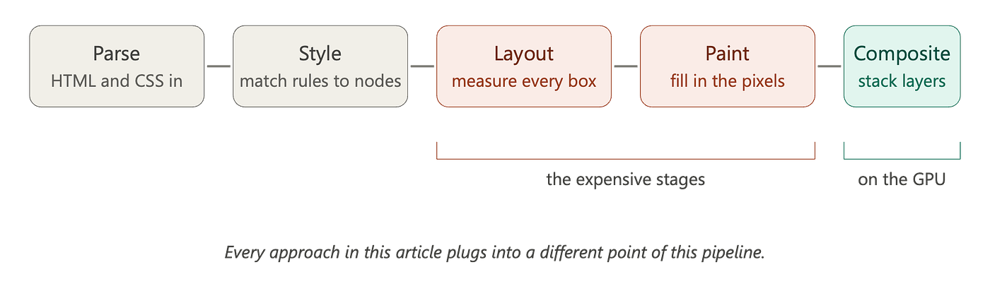
Browser rendering pipeline (Image by the author)
🔹 Parse turns the incoming markup (HTML, CSS) into the runtime structures the browser works with. The DOM tree, the CSSOM, the SVG document. Cheap, mostly.
🔹 Style (Style calculation) matches CSS rules to nodes. For every element, the browser decides what color, what font, what padding, what border. Cheaper than it sounds, but it scales with selector complexity and with the number of nodes.
🔹 Layout is where the browser asks the brutal question: where does every single box go, and how big is it? It walks the tree, runs the flexbox and grid algorithms, measures text, resolves percentages against parents, and produces a coordinate for every visible thing. Layout cost grows with the number of elements and with how many of them depend on each other. Layout is the stage that scales worst with element count, which is why retained-mode chart code spends most of its cost budget here.
🔹 Paint turns those boxes and shapes into pixels. Backgrounds, borders, text glyphs, SVG strokes, gradients: all of it gets rasterized into bitmaps. Paint scales with how much screen area changes, not with how many elements exist.
🔹 Composite stacks the painted layers and produces the final frame. This stage runs on the GPU in every modern browser, for every page, whether we asked for it or not. A transform: translate on an element that already has its own layer skips Layout and Paint entirely and only re-composites, which is why CSS animations on transform and opacity are smooth while animations on width are not.
The expensive stages are Layout and Paint. The cheap stage is Composite. Each approach in this article runs fewer of these initial steps than the one before it. The DOM runs all of them. SVG runs a thinner Layout. Canvas skips Layout entirely. WebGL skips Layout and Paint, drawing through a direct path to the GPU. The fewer initial steps executed in the pipeline, the greater the performance gains in terms of time and memory, and the more the browser stops doing for us in return.
Retained mode versus immediate mode
The pipeline tells us what work happens. The next question is who remembers the shapes.
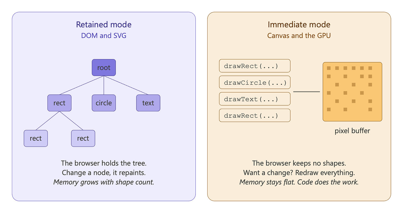
Retained vs immediate mode (Image by the author)
In **retained mode**, we describe a tree of shapes once, and the browser keeps it. We say “here is a circle at (100, 50) with radius 20”, and the browser stores that fact. When we later say “move it to (110, 50)”, we are mutating a node in a tree the browser owns. The browser figures out what to repaint, what to relayout, what to leave alone. We never write a redraw loop. The DOM works this way. SVG works this way.
In **immediate mode**, there is no tree. We call ctx.fillRect(100, 50, 40, 40), a few pixels turn yellow, and the browser forgets immediately. To move that rectangle one pixel to the right, we clear the canvas and draw all our shapes again, every single one of them, sixty times per second if we want smooth animation. Canvas works this way. WebGL and WebGPU work this way at the API level, with one twist: vertex data lives in GPU memory across frames, so the cost of "redrawing everything" collapses to a few cheap draw calls.
Each model has a price.
Retained mode gives us a free scene graph, free hit testing (the browser knows what we clicked), accessibility hooks on every shape, free animations through CSS, and free dev tools support. We pay for it in memory, because every shape is an object with style, layout, and event-listener slots, and in layout cost, because the browser must consider every node on every change.
Immediate mode gives us almost nothing for free, but it asks for almost nothing back. There is no per-shape memory because there are no shapes. There is no layout cost because there is no tree. We get a flat pixel buffer and a render loop, and everything else (hit testing, animation, accessibility, layering) is ours to build. By skipping the per-node cost of style and layout, an immediate-mode renderer’s bottleneck moves elsewhere: to the cost of redrawing the buffer each frame, or to the GPU. How much throughput that buys us in practice is exactly the kind of question the benchmark section ahead is designed to answer.
This single axis explains most of what is coming. The performance differences we will measure between SVG, Canvas, and the GPU are differences in how each approach handles the per-node cost: paying it in full (SVG), skipping it but paying for raster on the CPU (Canvas), or skipping it and offloading raster to the GPU (WebGL, WebGPU).
Where each approach plugs in
We can now place the four approaches on the same map:
🔹 DOM is fully retained. Every shape pays the full pipeline tax: parse, style, layout, paint, composite. Layout dominates.
🔹 SVG is fully retained, like the DOM, but with shape primitives that skip the heavier CSS box model. We pay layout, but a thinner version of it. Paint is more expensive because the browser must rasterize vectors.
🔹 Canvas 2D is immediate. We skip Layout entirely for our drawn content. We pay Paint, on every frame, for every shape we draw, and we pay it on the CPU.
🔹 The GPU (WebGL, WebGPU) is also immediate at the API level, but rasterization moves to the GPU and runs in parallel across thousands of cores. We skip Layout entirely, we skip CPU Paint entirely, and the GPU runs its own pipeline (vertex shader, fragment shader, rasterization) which produces a layer that the browser composites with everything else.
What is actually doing the drawing
In Chromium, all four approaches we just placed on the map share the same software stack underneath. The renderer process runs Blink, Chromium’s rendering engine. Blink owns the DOM, the layout algorithms (LayoutNG), the paint pipeline, and the JavaScript implementations of the DOM, SVG, and Canvas APIs.
When pixels need to actually be drawn, Blink hands off to Skia, an open-source 2D graphics library that does the rasterization. The Chromium graphics design notes confirm Chrome “uses Skia for nearly all graphics operations.”
Skia is also the rasterizer for Firefox, Android, and Flutter, so the per-approach observations in this article generalize beyond Chromium more than we might expect.
The approaches differ at the upper layers (style, layout, scene-graph management) and converge on Skia at the bottom. We name the specific path in each section ahead.
Four approaches, two axes, one stack. That is everything we need to start measuring. We start with the approach our chart could already use without any new APIs: the DOM.
Approach 1: DOM and CSS
The approach
The DOM is the first approach we reach for, because we already know it. A bar in a chart is a <div>. Its height is its value. A row of them is flexbox.
<div class="chart">
  <div class="bar" style="height: 40%"></div>
  <div class="bar" style="height: 75%"></div>
  <div class="bar" style="height: 60%"></div>
  <div class="bar" style="height: 90%"></div>
  <div class="bar" style="height: 35%"></div>
</div>

<style>
  .chart {
    display: flex;
    align-items: flex-end;
    gap: 4px;
    height: 200px;
  }
  .bar {
    flex: 1;
    background: steelblue;
    transition: background 0.2s;
  }
  .bar:hover {
    background: orange;
  }
</style>
Five bars. Hover. Smooth color transition. No dependencies. For a fifty-point chart, this is enough. Then we ask what it costs.
Underneath, this code runs the full Blink rendering pipeline: HTML parsing, CSS cascade, LayoutNG for box-model layout, then Blink hands off paint commands to Skia for rasterization.
Cost model and prediction
Per-frame cost in the DOM, for a chart with N elements:
T_frame = T_style(N) + T_layout(N) + T_paint(area) + T_compositeTwo of those scale with N:
🔸 **T_style(N)** is linear: every element matched against CSS rules.
🔸 **T_layout(N)** is linear in simple layouts, can be quadratic in deeply nested or interdependent ones.
T_paint scales with painted area, not directly with N. T_composite runs on the GPU and is roughly constant.
The frame budget is fixed:
T_frame ≤ 16.67 ms     (60 fps target)
T_frame ≤ 8 ms         (with headroom for JS and the rest of the page)
The cliff is what happens when a linear cost meets a fixed budget. Solving for the maximum element count:
N_max = budget / k_per_nodewhere k_per_node is the per-node cost of style and layout. We do not have a value for k_per_node from any first-party source, so we measure it.
🔵 Prediction before measurement: layout is the dominant stage in retained-mode rendering, and the DOM runs the full CSS layout algorithm including flexbox, grid, and the box model. We expect k_per_node to be on the order of single-digit microseconds per node on a modern CPU, and we expect render and update to scale linearly in N.
Measurement
We ran the benchmark harness on the configuration declared earlier (Apple M3, Chromium 147, headless). The chart is the same flexbox bar chart shown above, scaled to N bars with no axes or labels (so the node count and the bar count are essentially the same). Each cell is the median of 9 runs after one warmup.
The relevant excerpt of the harness, in spirit:
async function timeOp(page, opName, N) {
  return await page.evaluate(({ opName, N }) => {
    if (opName === 'render') {
      const t0 = performance.now();
      window.renderChart(N);
      return performance.now() - t0;
    }
    // fullUpdate, partialUpdate similar
  }, { opName, N });
}
Each operation forces a layout flush before returning, so the measured time covers style, layout, and paint, not just DOM mutation.
The results, in milliseconds (median of 9 post-warmup runs):
N      | nodes  | render | full update | partial update
-------+--------+--------+-------------+---------------
   50  |    58  |  0.10  |    0.10     |    0.00
  200  |   208  |  0.40  |    0.20     |    0.00
 1000  |  1008  |  1.70  |    0.80     |    0.20
 5000  |  5008  |  9.10  |    4.40     |    0.90
20000  | 20008  | 38.80  |   19.50     |    3.80
The same data on a log-log plot, with the 8 ms frame budget as a reference line:
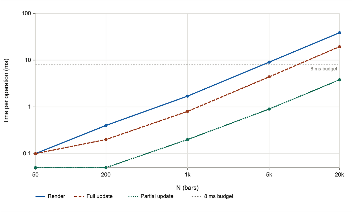
DOM render scaling (Image by the author)
Reconciliation
The cost model and the data agree on the structural claim: render and full-update times grow linearly with N. From N = 50to N = 20,000 (a 400× increase in element count), render time grows 388× and full update grows 195×. That is essentially linear scaling, with a small superlinear component visible at the largest N (likely the layout algorithm's interaction with sibling count).
Solving for k_per_node from the largest measurement:
k_per_node ≈ 19.5 ms / 20,000 nodes ≈ 1.0 µs per node   (full update)
N_max ≈ 8 ms / 1.0 µs ≈ 8,000 nodes per frame
The cliff for sustained 60 fps updates on this hardware sits at roughly 8,000 DOM nodes.
The data also reveals something the cost model did not predict: partial updates are nearly free, even at scale. Changing one bar at N = 20,000 takes 3.8 ms, an order of magnitude less than a full update. The browser correctly identifies that only one element has changed and limits the layout pass to its subtree. This is not free (3.8 ms is real), but it means a chart that updates locally (one new data point arriving, one bar growing) survives much further than the full-redraw cliff suggests.
One observation worth flagging: at N = 50, the timer reports 0.0 ms for partial update, with nine zero readings out of nine. Chromium's performance.now() has 0.1 ms resolution by default for security reasons, so anything under that floor reads as zero. The true value is small but not literally zero.
Synthesis
Plugging the three target sizes into the measured cost model directly:
🔹 Dashboard tile (≈50 bars): well below N_max. The DOM is the right approach. Hit testing, accessibility, native text, and CSS animations come at no extra cost, and we ship zero bytes of library code.
🔹 Live ticker (≈10,000 bars): above the full-update cliff by roughly 1.25×. The DOM cannot sustain 60 fps full redraws at this size. However, if the chart’s natural update pattern is “one new data point per tick” (which is what a live ticker actually does), partial-update behavior dominates and the DOM may still be viable. This is the most interesting result of the section, and it qualifies what we said earlier about retained-mode approaches.
🔹 Scientific scatter (≈1,000,000 bars): 125× above the cliff. Out of reach. The DOM was not built to lay out millions of elements at once.
Beyond raw speed, the DOM gives us hit testing on every element, an accessibility tree that screen readers understand, the full browser text engine for labels, CSS animations on transform and opacity that run on the compositor, dev tools inspection of every shape, and zero bundle size. No other approach in this article matches that list for small charts. The cost is paid in two places: high per-node memory (each element carries computed style, layout box, and accessibility data), and the layout pass that triggers on any change to size, position, or document structure.
The verdict, with measured constants:
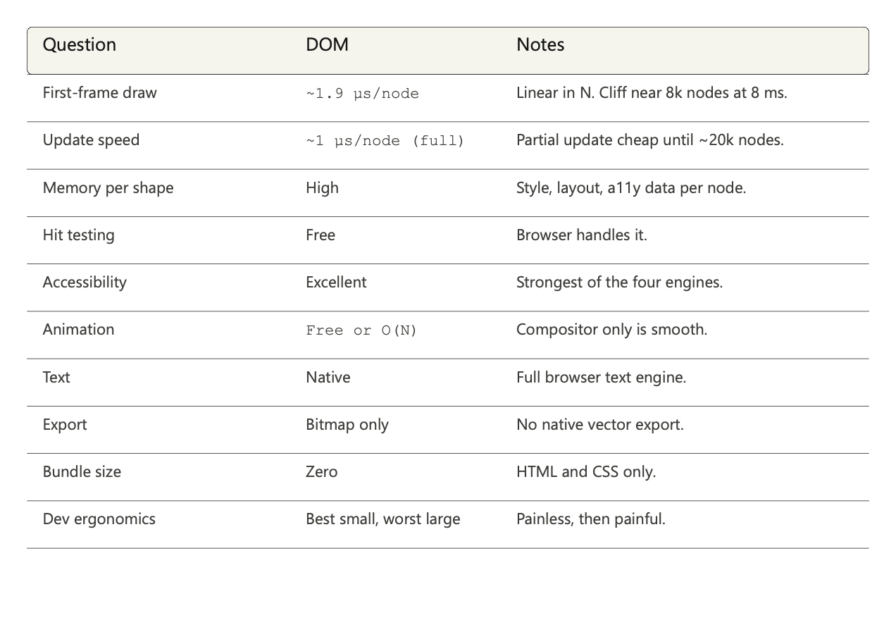
Verdict for DOM against the ten questions, with measured numbers (Image by the author)
The DOM is the right approach for one of our three targets and the wrong approach for the other two, with one important nuance: the live ticker is borderline rather than impossible, depending on whether updates are local or global. We come back to that question in the decision framework, when we ask whether updates touch one bar or all of them.
For now, we move one step along the retained-mode axis. SVG is also retained, also linear in N, also subject to the same kind of cliff. We expect it to be faster per node, because it skips the heavier parts of the CSS box model. Then we will measure.
Approach 2: SVG
The approach
When a <div> rectangle is no longer enough, the next step on the retained-mode path is SVG. Two widely used chart libraries take exactly that step: D3 describes itself as a way to bring "data to life with SVG, Canvas and HTML," and its getting-started example creates an <svg> container as the very first line. Highcharts' core rendering layer is an SVGRenderer class, a JavaScript wrapper around SVG primitives.
The same five-bar chart, in SVG:
<svg viewBox="0 0 200 100" width="200" height="100">
  <rect x="0"   y="60" width="36" height="40" fill="steelblue"/>
  <rect x="40"  y="25" width="36" height="75" fill="steelblue"/>
  <rect x="80"  y="40" width="36" height="60" fill="steelblue"/>
  <rect x="120" y="10" width="36" height="90" fill="steelblue"/>
  <rect x="160" y="65" width="36" height="35" fill="steelblue"/>
</svg>
No CSS gymnastics. No flexbox. We say “rectangle at (x, y) with width and height,” and the browser draws it. The shapes are vector primitives, so they scale to any resolution without blurring. Events work the same as on any HTML element: SVG elements inherit from EventTarget and accept addEventListener, and the W3C SVG specification states that all elements in the SVG namespace support the same event attributes as HTML, via the GlobalEventHandlers mixin.
This already feels different from the DOM approach. The question is what changes underneath.
The pipeline answer: SVG runs through Blink too, but along a different code path than HTML. Blink parses the SVG document into its own subtree, applies the SVG-restricted style cascade (presentation attributes), runs SVG-specific layout, and then hands off to Skia for vector rasterization. The same Skia paints the DOM, but it is invoked along a different path: SVG’s general path-and-curve geometry instead of HTML’s axis-aligned filled rectangles. As we will see when we measure, that difference in path matters.
Cost model and prediction
SVG sits on the same retained-mode axis as the DOM, so the formula is structurally identical:
T_frame = T_style(N) + T_layout(N) + T_paint(area) + T_compositeThe cliff equation is also the same: N_max = budget / k_per_node. What changes is the value of each term.
🔸 **T_style(N)** is smaller. SVG accepts a restricted set of CSS properties: the "presentation attributes" defined by the SVG specification, including fill, stroke, opacity, transform, and font-related properties. The browser does not match the full HTML cascade against every shape.
🔸 **T_layout(N)** is smaller. SVG does not participate in CSS flexbox or grid layout. Position is explicit through x, y, width, height attributes (or path data for <path> elements). The "layout" of a <rect> is trivial compared to a <div> that has to resolve flexbox or grid.
🔸 **T_paint(area)** is larger. The browser has to rasterize vector geometry: curves, strokes with miters and caps, antialiasing along edges, fill rules for self-intersecting paths.
🔵 Prediction before measurement: the first two stages are lighter per node than the DOM, the third is heavier. The naive expectation is that the lighter style and layout stages dominate, since they scale with N, while paint scales with painted area (which barely changes between the DOM and SVG versions of the same chart). On that reasoning, we expect SVG to be faster than the DOM at every N, and the cliff to sit further to the right.
Measurement
We ran the same harness against the SVG version of the chart, on the same hardware (Apple M3, Chromium 147). The chart is N <rect> elements inside a single <svg>, with no axes or labels.
Results:
N      | nodes  | render | full update | partial update
-------+--------+--------+-------------+---------------
   50  |    58  |  0.20  |    0.10     |    0.00
  200  |   208  |  0.40  |    0.30     |    0.00
 1000  |  1008  |  2.10  |    1.40     |    0.00
 5000  |  5008  | 12.10  |    8.30     |    0.10
20000  | 20008  | 54.40  |   39.20     |    0.50
The same data on a log-log plot:
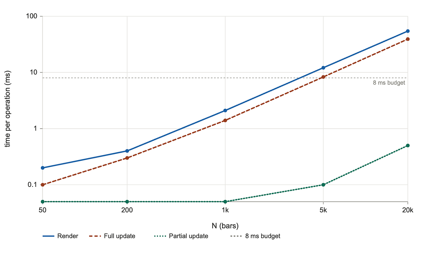
SVG render scaling (Image by the author)
Reconciliation
The structural prediction holds: render and update times grow linearly with N. The cost model's shape is correct.
The directional prediction is wrong.
We expected SVG to be faster than the DOM. SVG is slower, on every N we measured, on both render and full update. The two approaches side by side:
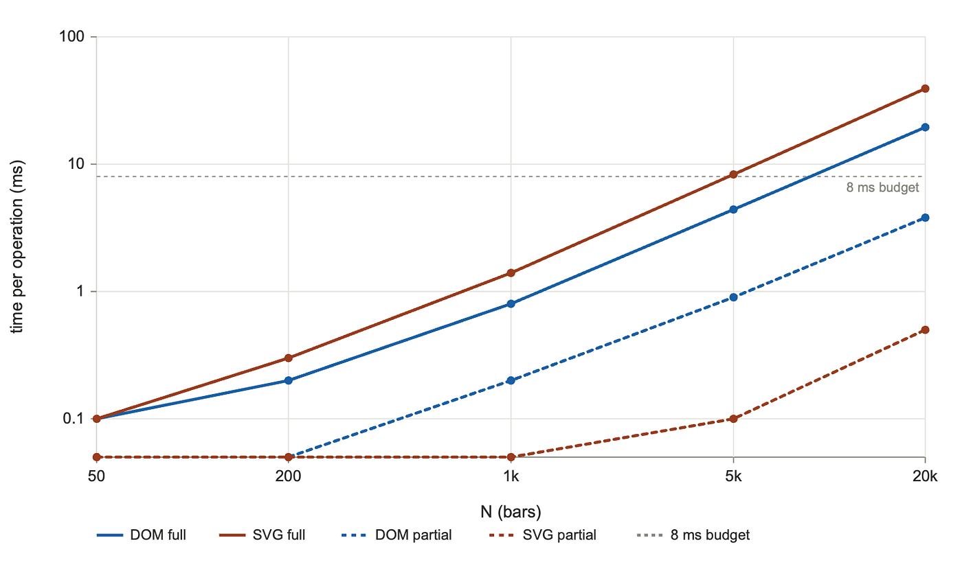
DOM vs SVG full partial (Image by the author)
For full updates, SVG is between 1.5× and 2× slower than the DOM. The cliff for full-frame updates at an 8 ms budget sits near 4,000 nodes for SVG, half as far out as the DOM’s roughly 8,000.
SVG: k_per_node ≈ 39.2 ms / 20,000 ≈ 2.0 µs per node   (full update)
     N_max ≈ 8 ms / 2.0 µs ≈ 4,000 nodes per frame
Why was our prediction wrong? The cost model has four terms, and we under-weighted one of them. T_paint is not just larger for SVG, it is a different shape.
The DOM and SVG both rasterize through Skia, but they reach Skia through different code paths. The DOM goes through a path tuned for axis-aligned filled rectangles, which is most of what HTML layout produces. SVG goes through a more general path that handles arbitrary geometry: curves, strokes with line caps, antialiasing along non-axis-aligned edges.
For our specific workload of axis-aligned rectangles, the SVG path’s generality is overhead the DOM does not pay. The savings on T_style and T_layout exist, but they are smaller than the cost of moving paint to the more general path.
Net effect: SVG loses on full-frame work, even when its theoretical advantages on style and layout would suggest otherwise.
The cost model is right about what scales and how it scales. It is silent on which approach has the smaller constant, because the constants depend on optimizations and code paths inside the browser that no published spec describes. We had to measure to know.
There is a second result the data surfaces, and this one runs in SVG’s favor. SVG beats the DOM on partial updates by a wide margin: At N = 20,000, changing one rect's y and height takes 0.5 ms in SVG, versus 3.8 ms in the DOM. SVG wins by roughly 7×. The reason is that SVG layout is local: a <rect> change does not invalidate sibling positions, because there are no siblings-affecting-each-other-via-flexbox in SVG. The DOM, even with a mostly-static flexbox layout, still does more work to confirm that the change does not propagate.
This second result matters more than the first for a chart library. Render and full update describe the worst case (rebuild the chart, replace all data). Partial update describes the steady state of an interactive chart (one bar growing, one tooltip shifting). For workloads dominated by partial updates, SVG is clearly preferable. For workloads dominated by full redraws, the DOM is.
Synthesis
Plugging the three target sizes into the measured cost model:
🔹 Dashboard tile (≈50 bars): comfortably within reach. We get crisp scaling at any zoom level, native vector export, hit testing, and animation. For a static or lightly animated chart, SVG is a better fit than the DOM despite being slower per node, because its features (vector export, resolution independence, mature ecosystem) outweigh raw speed at this scale. Below the cliff, raw speed is invisible.
🔹 Live ticker (≈10,000 bars): above the SVG cliff for full redraws (4,000 bars) by 2.5×. Below the partial-update cliff by a wide margin: at N = 10,000, partial updates would take well under a millisecond. So SVG is borderline for this target, with the same nuance as the DOM: viable if updates are localized, not viable for full redraws at 60 fps. The advantage over the DOM here is that SVG's partial-update story is much stronger.
🔹 Scientific scatter (≈1,000,000 bars): out of reach. 250× above the cliff. No tree-based approach handles this scale.
Beyond raw speed, SVG gives us hit testing on every shape (pointer-events works as expected), native vector export (the chart is already an SVG, copy it into a file or a report), resolution independence at any zoom, native text via <text> with the full browser text engine, and zero bundle size. What we do not get for free, despite being in the DOM tree: accessibility is not automatic. A <rect> does not produce a default accessibility node, so we have to add <title>, <desc>, aria-label, and structure the chart with role="img". Possible, not free.
The verdict, with measured constants:
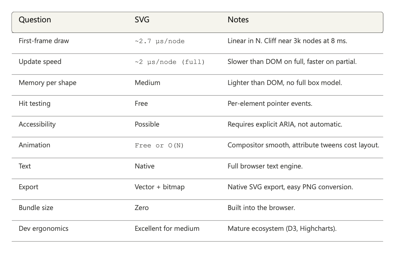
Verdict for SVG against the ten questions, with measured numbers (Image by the author)
The honest read of the SVG section: SVG is the right approach when crispness and exportability matter and when partial updates dominate the workload. It is the wrong approach when the workload is full redraws and the DOM-based alternative is available. This is a more nuanced conclusion than “SVG is the chart approach,” and it falls naturally out of two operations that the cost model alone could not have separated.
For now, we leave retained mode entirely. The next approach drops the tree. There are no shapes for the browser to remember, only pixels we paint into a buffer.
Approach 3: Canvas 2D
The approach
Canvas changes the rules. The DOM and SVG are retained-mode: we describe shapes, the browser keeps a tree, the tree drives layout and paint. Canvas is immediate-mode: we issue draw commands, pixels appear in a buffer, and the browser forgets. There is no tree, no <rect>, no <div>. There is one element on the page (a <canvas>) and a JavaScript API that paints into it.
The same chart, in Canvas:
<canvas id="chart" width="600" height="200"></canvas>
<script>
  const canvas = document.getElementById('chart');
  const ctx = canvas.getContext('2d');
  const heights = [40, 75, 60, 90, 35];

  ctx.fillStyle = 'steelblue';
  const barWidth = canvas.width / heights.length;
  for (let i = 0; i < heights.length; i++) {
    const h = (heights[i] / 100) * canvas.height;
    ctx.fillRect(i * barWidth, canvas.height - h, barWidth, h);
  }
</script>
Five lines of drawing code instead of five elements. To change a bar, we do not mutate a node. We clear the canvas and redraw all five rectangles. To animate, we call this loop sixty times per second.
This is a categorical break from the previous two approaches. Hit testing is gone (the browser does not know what a “bar” is, so it cannot tell us when the user clicks one). Accessibility is gone (a screen reader sees one image, not five bars). CSS is gone for the chart contents (we cannot style with selectors, because there are no elements to select). What we get in return is supposed to be speed.
The pipeline answer: Canvas 2D is the shortest path of the three. Blink exposes the getContext('2d') API as a thin JavaScript binding over Skia's SkCanvas. When we call ctx.fillRect(), we are calling Skia almost directly. There is no intermediate scene graph, no style cascade, no layout. The price of skipping all that is what the rest of this section measures.
Cost model and prediction
Per-frame cost in Canvas, for a chart with N bars:
T_frame = T_clear + T_draw(N) + T_compositeThe pipeline is shorter than for retained-mode approaches. There is no T_style(N) because there is no CSS cascade for the chart contents. There is no T_layout(N) because there is no tree. The only term that scales with N is T_draw, the cost of issuing N fillRect calls and rasterizing them to the bitmap.
There is also a fixed component, T_clear, the cost of clearing the canvas at the start of each frame. For DOM and SVG, the equivalent overhead was small enough to ignore; for Canvas, where per-bar work is much smaller, the constant matters.
🔵 Prediction before measurement: without layout, Canvas should be much faster than the retained-mode approaches. We expect the per-bar cost to be at least an order of magnitude smaller than DOM or SVG. The cliff for sustained 60 fps should sit somewhere around 100,000 to 1,000,000 bars rather than the few thousand of retained-mode approaches.
Measurement
We ran the same harness on the Canvas version of the chart, with two changes from the retained-mode setup:
🔸 No partial update. Canvas has no scene graph. There is nothing to update partially. Every change is a full redraw.
🔸 Sustained frame time. We added a measurement that runs a requestAnimationFrame loop for one second and reports the median frame interval. This captures what a developer actually wants to know about an animated chart: can it hold 60 fps?
We also extended the sweep. Where retained-mode approaches stopped at N = 20,000, we go up to N = 1,000,000.
Results:
N         | render | full update | frame interval
----------+--------+-------------+----------------
       50 |  0.00  |    0.10     |     16.65
     1000 |  0.10  |    0.10     |     16.70
    10000 |  0.70  |    0.60     |     16.70
   100000 | 36.20  |   35.90     |     49.45
  1000000 | 174.60 |  174.10     |    199.95
The same data on a log-log plot, with both the 8 ms budget and the 16.67 ms 60-fps cap as reference lines:
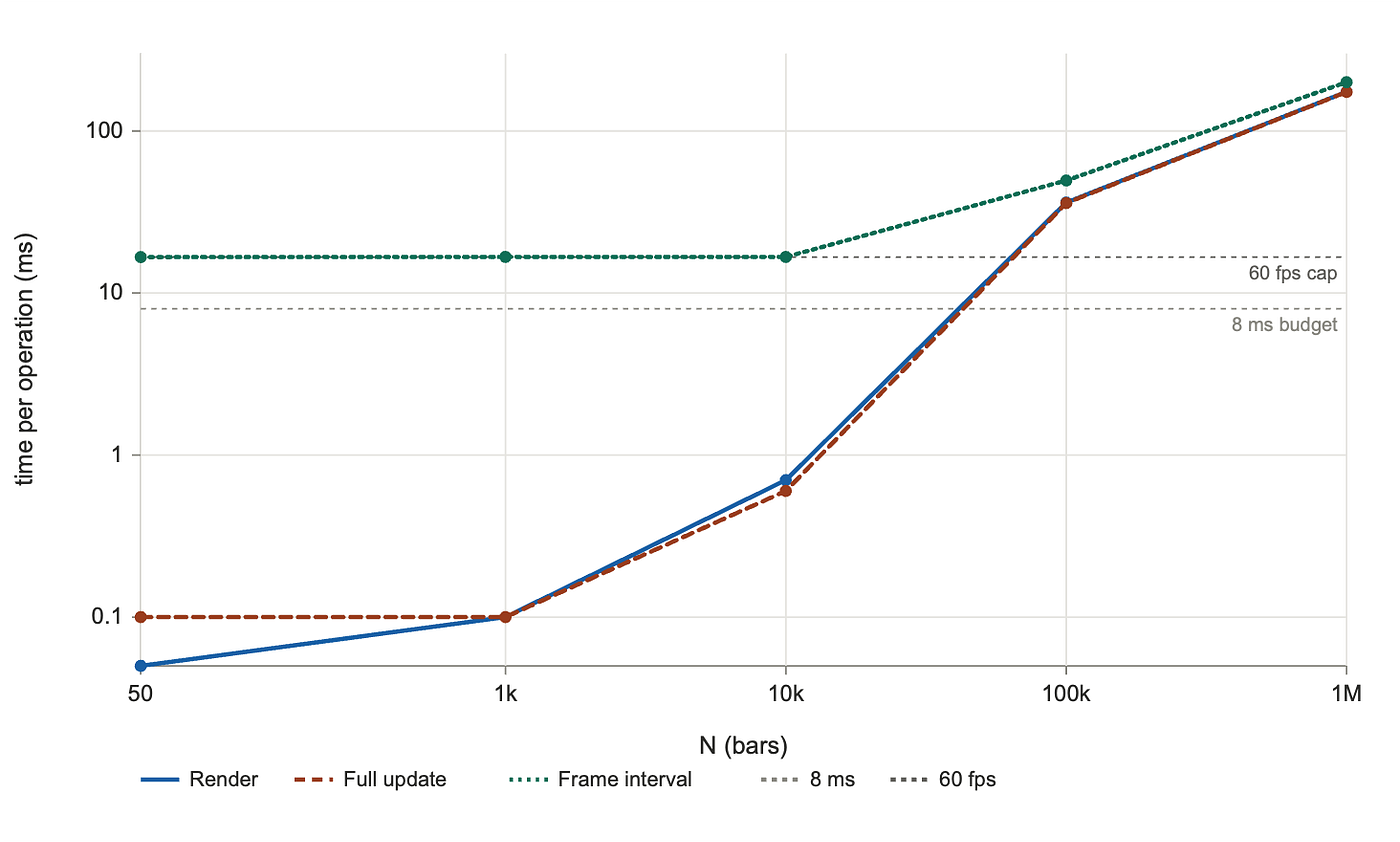
Canvas render scaling (Image by the author)
A frame interval of 16.67 ms means requestAnimationFrame is being called once per display refresh; the approach is keeping up. A frame interval above 16.67 ms means we have started dropping frames.
Reconciliation
The directional prediction holds: Canvas is much faster than the retained-mode approaches. At N = 1,000 (the only N we measured all three approaches at), Canvas full update is 0.1 ms, against 0.8 ms for DOM and 1.4 ms for SVG. Canvas is 8× faster than DOM and 14× faster than SVG at this point.
All three approaches on the same axes:
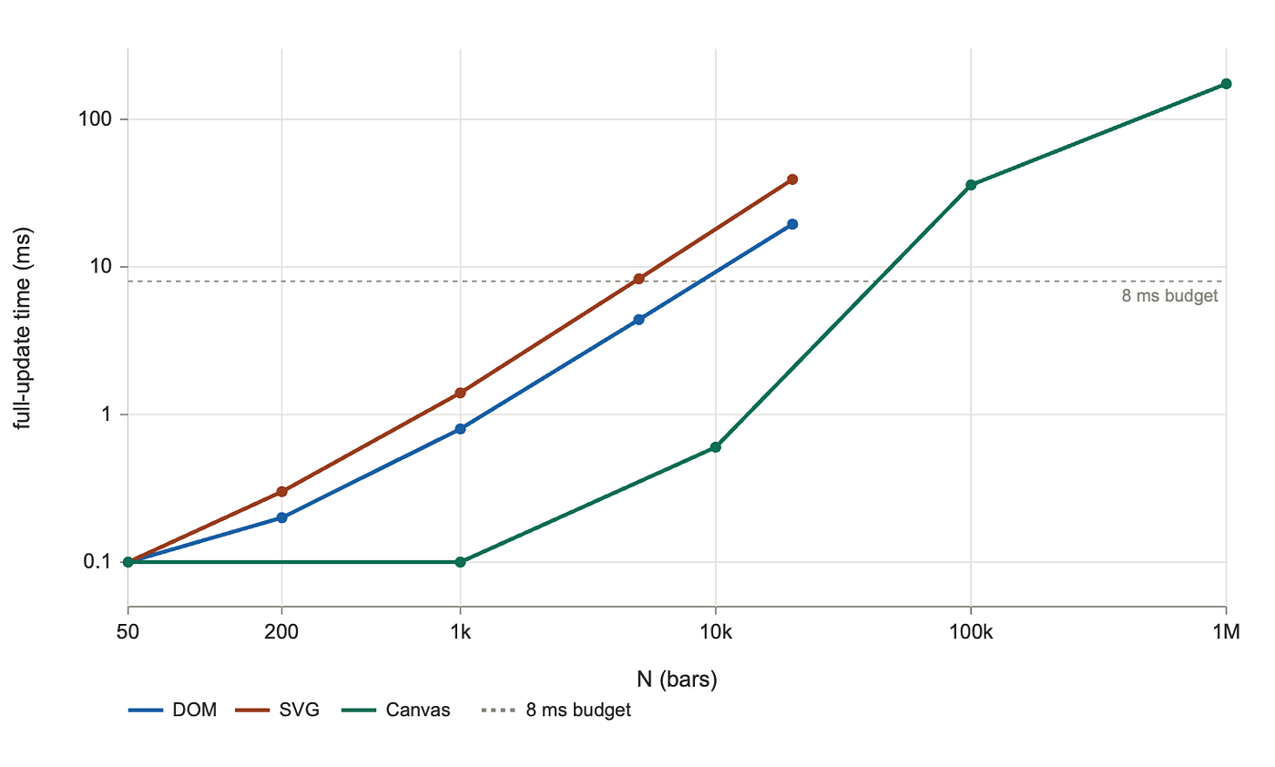
Three approaches, full update (Image by the author)
The cliff for sustained 60 fps in Canvas sits near N ≈ 40,000 on this hardware. The frame interval stays at the rAF cap (16.67 ms) up to N = 10,000, climbs to 49 ms at N = 100,000 (about 20 fps), and reaches 200 ms at N = 1,000,000 (5 fps). So Canvas extends the operating envelope by roughly 5× over DOM and 10× over SVG, in this configuration.
Two things the data revealed that the cost model did not predict.
🔳 The constant-time floor matters: look at the linearity check between adjacent rows of the table. From N = 1,000 to N = 10,000, full update grows from 0.10 ms to 0.60 ms, only 6× for a 10× increase in N. From N = 10,000 to N = 100,000, it grows from 0.60 ms to 35.9 ms, about 60× for a 10× increase. Canvas is not cleanly linear at small N. The reason is T_clear and the JavaScript loop overhead: there is a fixed cost per frame that swamps the per-bar drawing cost when N is small. Once N is large enough that T_draw(N) dominates T_clear, scaling becomes properly linear. For DOM and SVG, the per-node cost was large enough that constant-time overhead was a rounding error. For Canvas, where per-bar cost is so small, the constant is visible.
This refines the cost model:
T_frame ≈ T_constant + k_per_bar * Nwith T_constant on the order of 0.1 ms and k_per_bar on the order of 0.4 µs per bar in the linear regime (estimated from the slope between N = 10,000 and N = 100,000).
🔳 Headless Chromium uses software rendering: this is the honest caveat we owe the reader. Headless Chromium runs without a GPU compositor in our configuration. A real Chrome window with hardware acceleration would offload Canvas rasterization to the GPU, and the per-bar cost would shrink. Our Canvas numbers in this section are a lower bound on what hardware-accelerated Canvas can do; the cliff at 40,000 bars is pessimistic. (When we get to WebGL we re-run Canvas windowed for comparison, and the windowed numbers shift in the direction this caveat predicts.)
Synthesis
Plugging the three target sizes into the measured cost model:
🔹 Dashboard tile (≈50 points → ≈50 bars): trivially cheap. A 50-bar Canvas chart updates in 0.1 ms, well below any frame budget. But this is exactly where Canvas is least worth it. We have lost hit testing, accessibility, CSS, and dev tools, in exchange for a headroom we will never use. For a dashboard tile, Canvas is the wrong approach despite being the fastest.
🔹 Live ticker (≈10,000 bars): Canvas is the right approach for this target. Sustained 60 fps holds well past 10,000 bars, with room to spare. The retained-mode approaches were borderline at this scale; Canvas is comfortable.
🔹 Scientific scatter (≈1,000,000 points): in our headless configuration, Canvas at 1M points runs at 5 fps. Below interactive, but renderable. With hardware acceleration on a real desktop, this number would improve, possibly enough for interactive panning. The honest answer is “borderline, depends on GPU”. For interactive million-point exploration, the GPU section will give us a definitive answer.
What Canvas asks for in exchange for speed:
🔸 Hit testing is manual. The browser does not know what we drew. Click handling means storing a parallel list of bar positions and computing intersections ourselves. Quadtrees or simple bounding-box tests work; the cost is JavaScript code we did not have to write before.
🔸 Accessibility is not provided. The pixel buffer is opaque to screen readers. Best practice is to maintain an off-screen DOM tree as an accessibility shadow (role="img" on the canvas with aria-label, plus a hidden description list of values). This is what serious Canvas-based chart libraries do. It works, but it is not free.
🔸 Text is awkward. ctx.fillText exists, but text layout (wrapping, alignment, measuring) is something we do by hand. For axis labels and tooltips, this gets old fast. Most production Canvas charts use the DOM for surrounding text and Canvas only for the data layer.
🔸 Animation is a render loop. requestAnimationFrame and a redraw on every frame, with all the bookkeeping that implies. CSS animations do not apply.
🔸 No dev tools inspection of shapes. What we see in the DevTools elements panel is one <canvas>. The "shapes" inside are pixels.
🔸 Bundle size is still zero. The Canvas API is built into the browser.
The verdict, with measured constants:
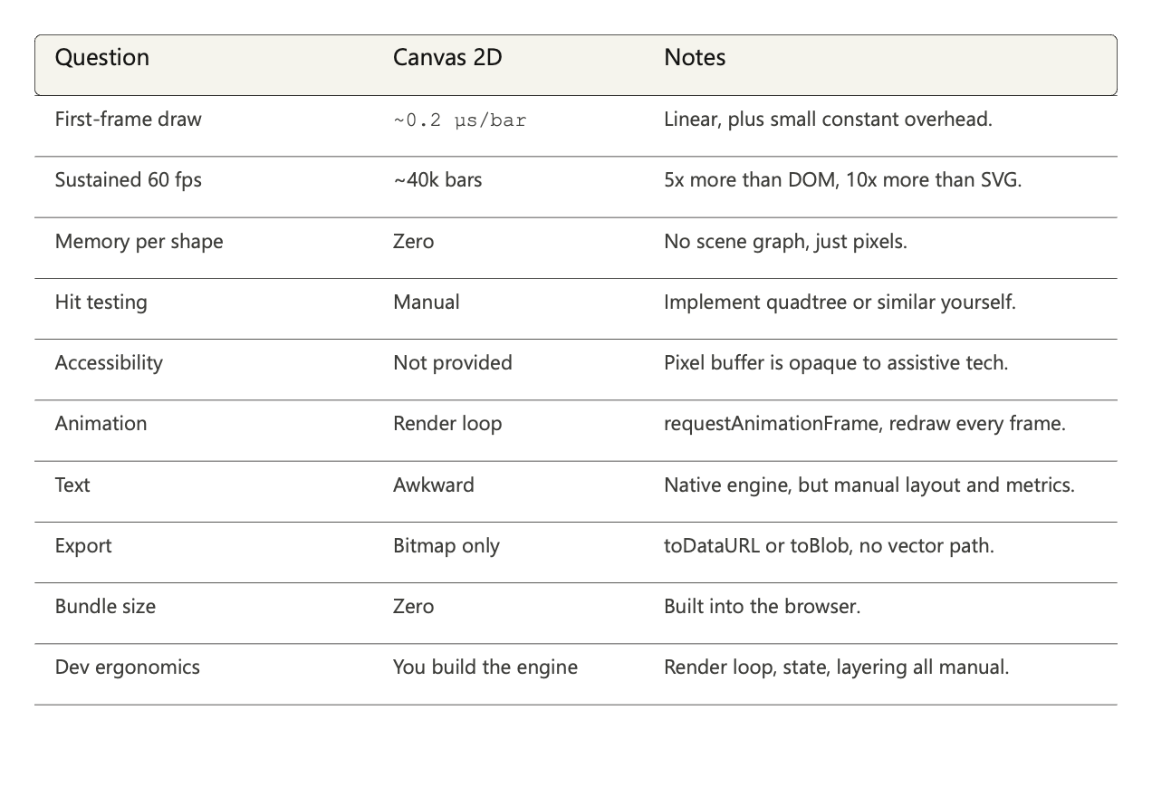
Verdict for Canvas against the ten questions, with measured numbers (Image by the author)
Canvas is the right approach when raw shape-drawing throughput matters more than browser-given features. The break-even point sits somewhere between the dashboard tile (where free DOM features dominate) and the live ticker (where 60 fps with thousands of moving bars dominates). For everything in between, the answer depends on what we value. For everything beyond the live ticker, especially toward the scientific scatter, Canvas is the lightest approach that still runs on the CPU.
The next approach takes the same immediate-mode model and pushes the work onto the GPU itself. There, the per-bar cost becomes nearly free, and the bottleneck moves to GPU memory and shader complexity.
Approach 4: the GPU (WebGL, WebGPU)
The approach
Canvas 2D moved per-shape work off the layout stage. WebGL moves per-shape work off the CPU entirely. We hand the GPU a description of what to draw (vertex positions, per-instance attributes, shader programs), and the GPU rasterizes thousands of shapes in parallel.
WebGL is the most foreign of the four approaches if you have only ever worked on web platforms. The mental model is different enough that it is worth a paragraph before any code.
The GPU is a parallel processor. Where a CPU runs one instruction at a time very fast, a GPU runs the same small program across thousands of data points simultaneously. To draw N bars on the GPU, we do not write a loop that issues N draw commands. We describe one bar, tell the GPU there are N of them, and hand it a list of per-bar values (positions, heights). The GPU runs its drawing program N times in parallel, once per bar, and produces the pixels.
The drawing program comes in two parts:
🔹 A vertex shader, which runs once for every corner of every bar. Its job is to compute where that corner ends up on the screen. For our chart, the corner positions depend on the bar’s index (which determines its x position) and the bar’s height.
🔹 A fragment shader, which runs once for every pixel inside every bar. Its job is to decide what color that pixel should be. For our chart, the answer is the same color for every pixel: steelblue.
Both shaders are written in GLSL, a C-like language designed to run on GPUs. We send them to the GPU once at startup. After that, every frame is just “run the shaders again with these new per-bar values.”
A bar chart in WebGL2, then, is three things wired together:
🔹 A shape description for one bar. WebGL draws everything from triangles, so a rectangle is two triangles sharing an edge: six vertex positions in total. Because every bar has the same shape (only the height differs), we describe it once at unit size and let the shaders scale it per bar.
🔹 Per-bar data, stored as buffers in GPU memory. We have two: one holding the x position of each bar, one holding the height. When data changes, we upload new values to these buffers.
🔹 The two shaders, compiled and uploaded once.
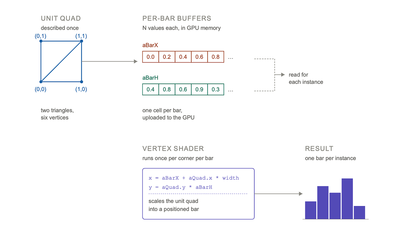
WebGL Instancing (Image by the author)
The full implementation is around 200 lines (in the harness file alongside the article). The two pieces worth showing inline are the vertex shader and the per-frame draw call, because they show how the parallelism works in practice.
The vertex shader, the program that runs for every corner of every bar:
#version 300 es
in vec2 aQuad;       // unit quad corner (per vertex)
in float aBarX;      // bar x position (per instance)
in float aBarH;      // bar height (per instance)
uniform float uBarWidth;

void main() {
  float x = aBarX + aQuad.x * uBarWidth;
  float y = aQuad.y * aBarH;
  gl_Position = vec4(x * 2.0 - 1.0, y * 2.0 - 1.0, 0.0, 1.0);
}
The per-frame full-update path on the JavaScript side:
// fill the heights array with new values
for (let i = 0; i < N; i++) hData[i] = rand();

// upload only the heights buffer
gl.bindBuffer(gl.ARRAY_BUFFER, hVbo);
gl.bufferSubData(gl.ARRAY_BUFFER, 0, hData);

// one draw call for N bars, regardless of N
gl.drawArraysInstanced(gl.TRIANGLES, 0, 6, N);
That is the whole story for full-frame updates. Whether N is 50 or 1,000,000, the JavaScript side issues one buffer upload and one draw call. The GPU then rasterizes all N bars in parallel.
The pipeline answer: WebGL bypasses Blink’s paint pipeline. The browser exposes the WebGL context as a direct binding to the system’s GPU API. On macOS, that goes through ANGLE which translates GL calls to Metal. The GPU vendor and renderer string in our results file confirms it: "ANGLE (Apple, ANGLE Metal Renderer: Apple M3, ...)". There is no Skia in this path.
Cost model and prediction
For the previous three approaches, the cost model decomposed by stage of the rendering pipeline. WebGL’s cost model decomposes by what crosses the CPU-GPU boundary:
T_frame = T_buffer_upload(bytes_changed) + D * T_drawcall + T_shader(pixels_covered)🔸 **T_buffer_upload** is the cost of writing changed data from CPU memory to GPU memory. For a full update of N bars where each bar is one float (4 bytes), this scales with N but is bandwidth-bound (typically gigabytes per second), so the constant is very small. For a partial update of one bar, it is essentially constant because we upload 4 bytes regardless of N.
🔸 **T_drawcall* is the fixed CPU-side cost per draw call to set up GPU state, where D in the formula is the number of draw calls per frame. A modern GL implementation puts T_drawcall in the tens of microseconds. Crucially, this does not *scale with N: drawing 1 instance and drawing 1,000,000 instances both cost one draw call, so D = 1 for our chart regardless of N.
🔸 **T_shader** is the parallel work the GPU does to actually rasterize. The vertex shader runs once per vertex (six per bar in our case), the fragment shader runs once per output pixel. With thousands of GPU cores running in parallel, this scales much better than N-style linear work.
The frame budget is the same as before: 16.67 ms per frame for 60 fps, with headroom for everything else.
🔵 Prediction before measurement: WebGL should make N much less relevant than for any previous approach. We expect the per-bar cost to drop by at least an order of magnitude compared to Canvas, and we expect sustained 60 fps to hold past 100,000 bars and possibly past 1,000,000. The interesting question is not whether WebGL is faster (it has to be), but where the new bottleneck moves: to upload bandwidth, to GPU parallelism limits, or somewhere we did not anticipate.
Measurement
For this section we changed two things in the harness:
🔸 Windowed Chromium instead of headless: Headless Chromium routes WebGL through SwiftShader, a software GL implementation. That would have measured a CPU implementation of the GPU API, not the actual GPU. To get hardware acceleration on the M3, we launch with headless: false. A real browser window opens during the run.
🔸 The [WEBGL_debug_renderer_info](https://developer.mozilla.org/en-US/docs/Web/API/WEBGL_debug_renderer_info) extension: records the GPU vendor and renderer string, which we report alongside the data so the configuration is reproducible.
The same windowed run also re-measured DOM, SVG, and Canvas. DOM and SVG numbers match the headless run within noise (their bottleneck is layout, not rasterization). Canvas numbers are different and we will note where it matters.
The measured GPU: **ANGLE (Apple, ANGLE Metal Renderer: Apple M3)**. WebGL2 is going through ANGLE to Metal, hardware-accelerated.
Results, in milliseconds:
N         | render | full update | partial update | frame interval
----------+--------+-------------+----------------+----------------
       50 |  0.10  |    0.00     |     0.10       |     16.70
     1000 |  0.00  |    0.00     |     0.00       |     16.60
    10000 |  0.20  |    0.10     |     0.00       |     16.70
   100000 |  1.40  |    0.90     |     0.00       |     16.70
  1000000 |  7.70  |    5.30     |     0.00       |     16.70
The same data on a log-log plot:
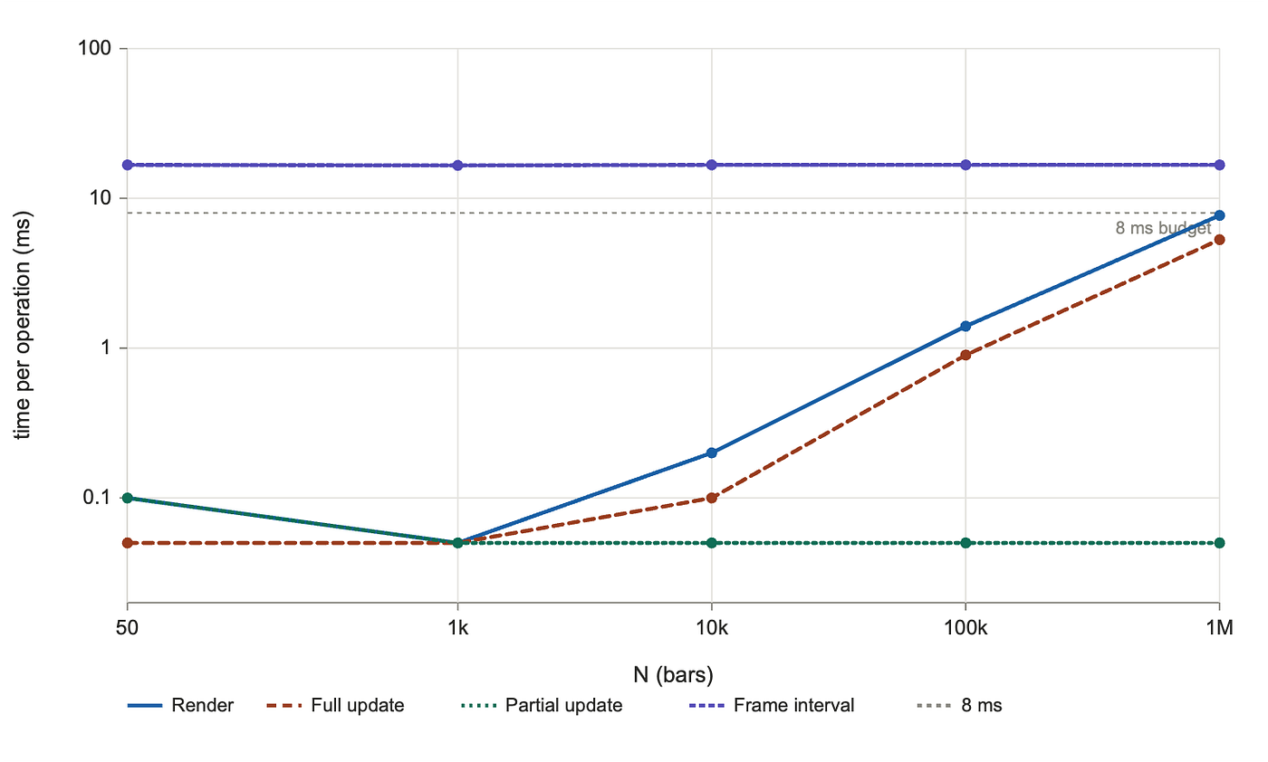
WebGL render scaling (Image by the author)
The most informative visual of the article is what happens when we put all four approaches on the same axes:
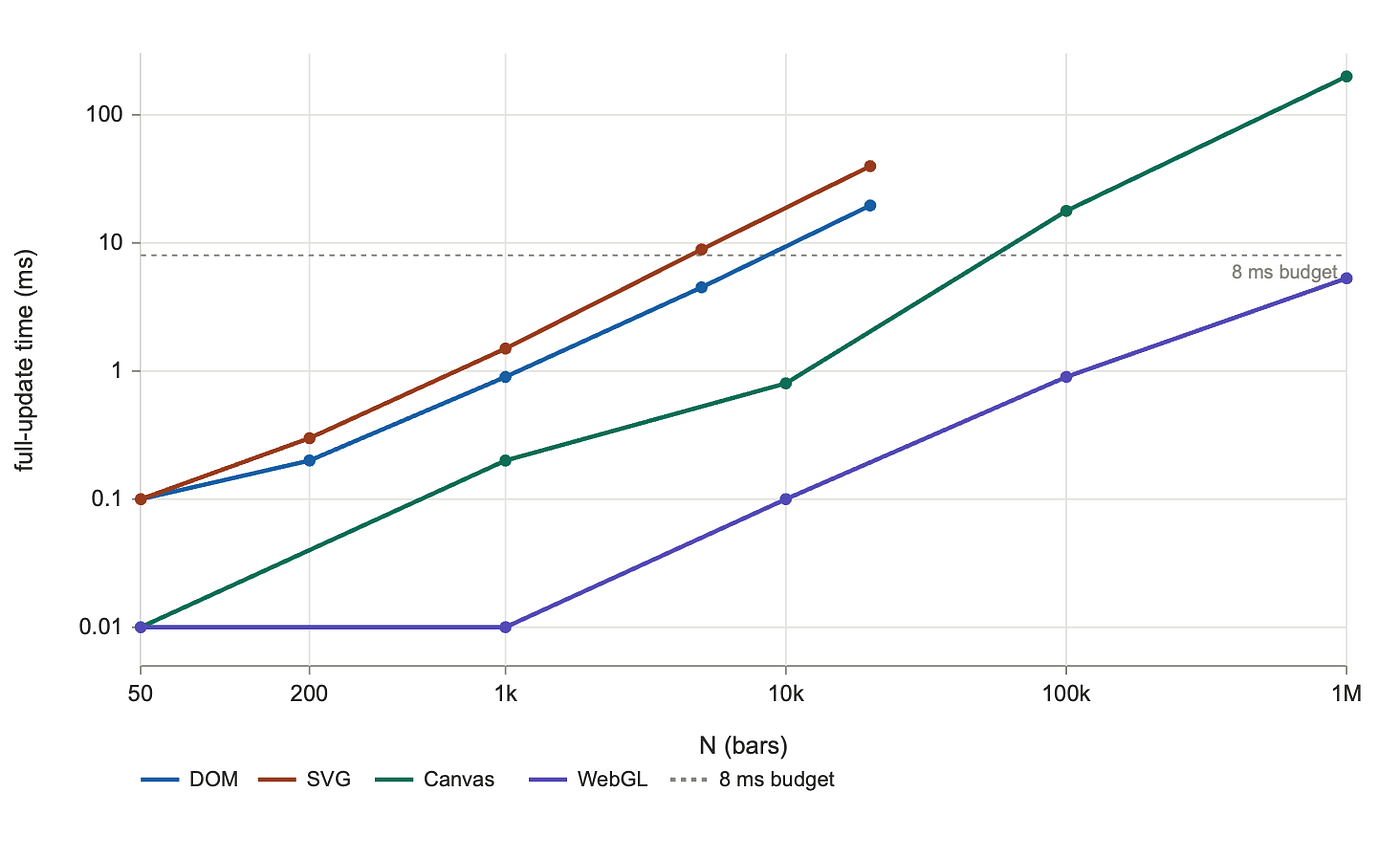
Four approaches, full update (Image by the author)
Reconciliation
The directional prediction holds with conviction. WebGL is faster than every other approach at every overlapping N, and the gap widens as N grows.
At N = 1,000,000, full update times line up like this:
DOM:    extrapolated >> 1000 ms (well past any frame budget)
SVG:    extrapolated >> 2000 ms (well past any frame budget)
Canvas: 199 ms  (5 fps, GPU-accelerated rasterization)
WebGL:    5.3 ms  (still under the 8 ms budget)
WebGL is roughly 38× faster than Canvas at 1 million bars, and several orders of magnitude faster than DOM or SVG (which we cannot even sensibly run at this scale).
But the data revealed three things the cost model did not predict:
🔳 We never found the cliff for sustained 60 fps: every cell in the frame interval column reads 16.6 to 16.7 ms, which is the rAF cap. WebGL holds 60 fps from 50 bars all the way through 1,000,000 bars. The GPU is keeping up at every scale we tested, including a million bars updated and redrawn every frame. We do not know where the cliff is in this configuration, only that it sits past one million bars on this hardware. That itself is worth naming: in the operating range that any chart library cares about, the GPU's frame budget is not the binding constraint.
🔳 Scaling is sublinear. From N = 10,000 to N = 100,000, full update grew 9× for a 10× increase. From N = 100,000 to N = 1,000,000, it grew only 5.9×. Every other approach scaled linearly or worse. The reason is parallelism: at small N, fixed costs (the JavaScript loop, the draw call, the buffer upload) dominate, and the GPU sits mostly idle. As N grows, the GPU's parallel cores absorb the extra work for free until they saturate. On the GPU, more bars cost proportionally less.
🔳 Partial update is essentially free: across the entire sweep, partial update reads 0.0 to 0.1 ms. At 1,000,000 bars, changing one bar costs the same as changing one bar at 50: the bufferSubData(offset, ...) call writes 4 bytes regardless of N, and the redraw is still one drawArraysInstanced. This is structurally similar to SVG's local-update behavior, but for a much larger scale. SVG could change one rect cheaply at 20,000 nodes; WebGL can do it at a million.
A side note worth being honest about: the windowed Canvas numbers differ from the headless Canvas numbers from the previous section. With GPU acceleration, Canvas at N = 100,000 improved (35.9 ms headless → 17.8 ms windowed). At N = 1,000,000, it slightly worsened (174 ms → 199 ms), likely because Canvas's GPU backend hits a different bottleneck at that scale (texture upload bandwidth, or batching limits). We mention this for completeness; the WebGL numbers are not affected.
Synthesis
Plugging the three target sizes into the measured cost model:
🔹 Dashboard tile (≈50 bars): trivially cheap, but absurdly over-engineered. We would write 200 lines of GPU code to draw 50 bars that the DOM does in 0.1 ms. WebGL is the wrong approach for this target by a wider margin than any other approach.
🔹 Live ticker (≈10,000 bars): WebGL handles this in 0.1 ms. Canvas handles it in 0.8 ms. Both are well below any frame budget. WebGL is overkill at this scale, and the development cost is hard to justify when Canvas works fine.
🔹 Scientific scatter (≈1,000,000 points): this is the target WebGL was built for. Sustained 60 fps with all 1 million points moving every frame, in 5.3 ms per frame, with headroom. Canvas at the same N runs at 5 fps. The gap between “viable” and “smooth” is exactly the GPU.
What WebGL asks for in exchange for that capacity is more than what any other approach in this article asks for:
🔸 Shader code. The GPU runs GLSL programs we write. They have their own debugging story, their own performance tuning, their own cross-platform quirks. ANGLE on macOS is not the same as direct GL on Linux.
🔸 Manual GPU state management. Buffers, vertex array objects, programs, uniform locations, texture units. Every call to the API mutates global state on the context, and forgetting to bind the right buffer before a draw call is a class of bug that does not exist anywhere else in the article.
🔸 No native text. WebGL does not draw text. We either build a glyph atlas on the CPU and render textured quads, or we overlay text in the DOM positioned absolutely above the canvas. Production WebGL chart libraries do the second.
🔸 No hit testing. Same as Canvas: maintain a CPU-side spatial index, or do a “color picking” pass that renders each shape with a unique color into an offscreen buffer and reads back the pixel under the cursor.
🔸 No accessibility. Same as Canvas. A parallel DOM tree as accessibility shadow is the accepted pattern.
🔸 Bundle size is rarely zero. Real WebGL chart libraries use helpers (regl, twgl.js, deck.gl) that do the boilerplate management we did manually in 200 lines. These are 50 to 500 KB.
The verdict, with measured constants:
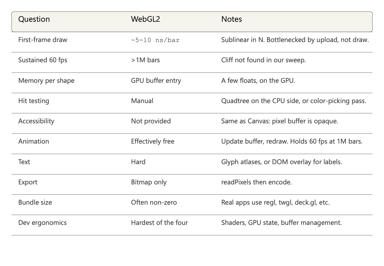
Verdict for WebGL against the ten questions, with measured numbers (Image by the author)
WebGL is the right approach when N is so large that no other approach can hold the frame budget, and when the cost of building a GPU-aware chart implementation is amortized over a use case that needs it. For everything else, the approaches we already covered do the job with less code, less bundle, and more browser-given features. The article's central claim is now visible: the four approaches are not a leaderboard. They are four specialized tools, and picking the right one is a function of N, of update pattern, and of what the chart needs to give the rest of the page (accessibility, hit testing, exportability).
We have measured all four. Next we put them in conversation: where does each approach sit on the spectrum, where do they overlap, and where does picking one over the others actually matter?
A decision framework
Four approaches, four cost models, four sets of measurements. The reader who reached this section has everything needed to decide which approach to use. What this section does is connect those decisions to the page’s actual constraints: the chart’s size, its update pattern, and what it owes the rest of the page.
Side by side
We have already seen the four approaches on one axis at the end of the WebGL reconciliation. The visual repays a second look here, because what it tells us when we step back is not the same as what we read out of any single section.
Four approaches, full update (Image by the author)
Three observations only become visible at this scale.
🔸 The cliff moves over five orders of magnitude. SVG’s full-update cliff sits near 4,000 bars. WebGL, in our sweep up to 1,000,000 bars, never showed one. The four approaches are not different points on the same curve. They are different curves entirely.
🔸 Three approaches are linear, one is not. DOM, SVG, and Canvas all show parallel slopes on log-log axes once N is large enough to dominate constants. They differ in the constant out front, not in the shape. WebGL's curve flattens at the top of the range because it leaves the linear regime entirely: as N grows, the GPU's parallel throughput absorbs more of the work for less proportional cost.
🔸 Update pattern shifts the choice as much as N does. SVG beat DOM on partial updates by 7× at N = 20,000. WebGL handles partial updates in microseconds at N = 1,000,000. A reader who picks an approach on full-redraw cost alone is choosing on the wrong axis for any chart that updates incrementally.
Hybrid strategies
The honest answer to “which approach should I use” is rarely one approach. Real chart libraries combine several, picking each one for the layer it serves best.
The pattern most production chart libraries follow:
🔹 DOM for the surrounding UI: Tooltips, legends, axis tick labels, range selectors, controls, modals. Anything that benefits from text rendering, hit testing, accessibility, and CSS positioning. The DOM is almost always the right approach here, regardless of what draws the data.
🔹 One of the other three for the data layer: whichever fits the N and update pattern. SVG for crisp small or medium charts where vector export and accessibility matter. Canvas for dense charts with simple shapes and full-redraw patterns. WebGL for anything past the Canvas cliff, or for animations that need to hold 60 fps with hundreds of thousands of moving elements.
A few examples worth naming, briefly:
🔹 Highcharts describes its SVGRenderer as the core, with hooks for canvas-based fast rendering of large datasets. Same library, different approach per chart.
🔹 D3 is engine-agnostic by design. The same data binding works whether you append SVG nodes or call ctx.fillRect(). Its docs explicitly cover SVG, Canvas, and HTML as parallel rendering options.
🔹 deck.gl uses WebGL for the data layer and the DOM for everything else. It is what people reach for when N is in the millions.
The choice is not “which approach.” It is “which approach for which layer,” with the DOM almost always handling the surrounding UI and one of the others doing the data.
To help you choose the right approach
Five questions, in order. Each one narrows the set of approaches still in scope. The answer at the end is rarely “this one approach.” It is “these are the approaches that fit, here is what differs between them.”
1. What is N?
🔸 N < ~1,000: every approach fits. The choice falls to the next questions.
🔸 N between 1,000 and 10,000: DOM and SVG are borderline (cliff at 4k to 8k). Canvas and WebGL are comfortable.
🔸 N between 10,000 and 100,000: DOM and SVG are over their cliffs for full-redraw patterns. Canvas works comfortably. WebGL is overkill.
🔸 N between 100,000 and 1,000,000: Canvas approaches its cliff. WebGL is the right answer.
🔸 N > 1,000,000: WebGL only. The other approaches were not designed for this scale.
2. Are updates global or local?
🔸 If most updates touch a small fraction of the data (one new tick, one selection highlight, one tooltip), partial-update behavior matters more than full-redraw behavior. SVG and DOM survive much further than the full-redraw cliff suggests. Canvas does not benefit at all (it has no partial updates). WebGL’s bufferSubData at offset is essentially free.
🔸 If most updates touch all the data (animation, filtering that changes everything, real-time streaming where every value moves), full-redraw cost is what binds you. The cliff numbers from the side-by-side apply directly.
3. Does the chart need accessibility?
🔸 Yes, default-quality: DOM is the only approach that gives accessibility for free. SVG is possible with explicit <title>, <desc>, and aria-label work. Canvas and WebGL require maintaining a parallel DOM tree as accessibility shadow.
🔸 No, or it lives in a context where accessibility is handled elsewhere: the choice is open.
4. Does the chart need vector export?
🔸 Yes, the chart goes into PDF, SVG-to-designer, print at any DPI: SVG is native. The DOM does not produce vector output natively; third-party libraries can convert it, but the result is awkward. Canvas and WebGL produce bitmaps only.
🔸 No, screen rendering is the only output: every approach works.
5. How much code complexity can you absorb?
🔸 Small: DOM is a handful of styled elements. SVG with a library like D3 is a few hundred lines for a real chart. Both are well-understood by anyone who knows the web platform.
🔸 Medium: Canvas needs a render loop, hit testing built on a quadtree or similar, and an accessibility shadow. Two to three thousand lines for a real chart.
🔸 Large: WebGL needs shader code, GPU state management, glyph atlases for text, and usually a helper library like regl or twgl.js. Five to ten thousand lines for a real chart, plus expertise that does not exist on every team.
The output of these five questions is rarely a single approach. More often: “Canvas for the data layer, DOM for the surrounding UI, accept that vector export will be lossy.” Or: “SVG for the data layer, accept the partial-update story limits us to charts under 4,000 bars unless we add virtualization.” The article’s central claim, again: speed is one axis. The decision lives on five.
For the three targets we declared back in section 2, the answers fall out of the questions cleanly:
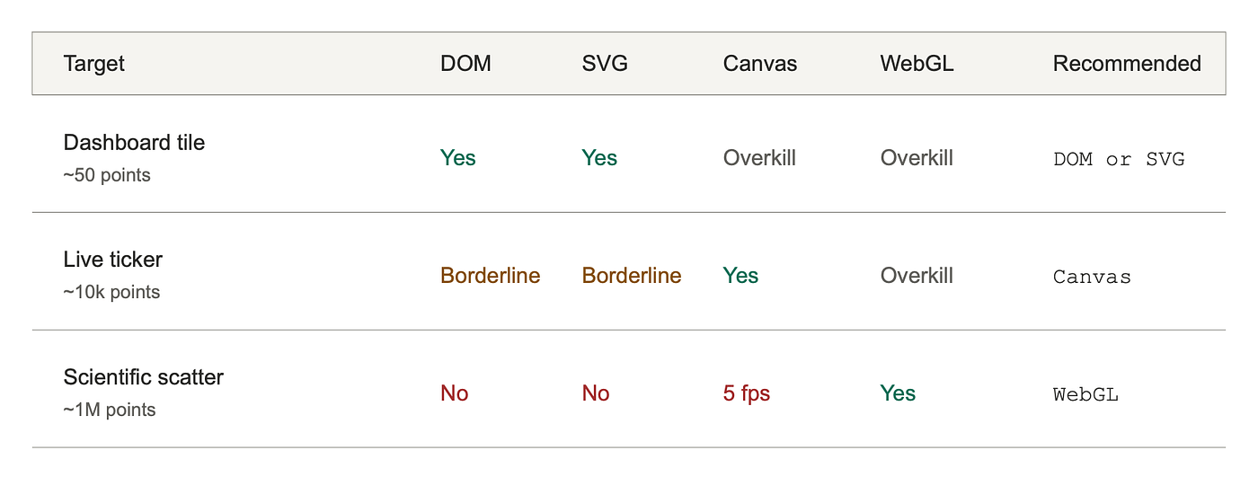
Target to approach mapping (Image by the author)
Conclusion
The chart looks fine. It is also fast.
The choice of rendering approach is conscious now, and the consequences are predictable. Speed is one axis. The decision lives on five.
Two findings the cost model alone did not predict are worth carrying away. SVG turned out slower than the DOM despite the lighter style and layout stages, because Skia rasterizes vector paths through a more general code path than the DOM’s axis-aligned rectangles. And WebGL never hit a cliff in our sweep, holding 60 fps through a million bars. We had to measure both to know.
What this article does not answer is also worth naming. We measured one browser on one machine. Cross-browser variance, mobile, WebGPU, and the production realities of axes and labels and tooltips are all out of scope. A reader who needs those answers has the harness, and the structure that runs through this article generalizes: pick the new approach, write the cost model, measure, see where the model and the data disagree, learn what the difference taught you.
The chart you are about to write will probably not be one of the three we chose. It will be its own shape, with its own N, its own update pattern, its own constraints around accessibility and exportability and bundle. The four approaches do not change. The questions do not change.
What changes is that next time the flame chart fills with red Layout bars, you will know what you picked, why it was wrong, and which approach the chart wanted in the first place.
Thank you for taking this journey with me through how the browser actually puts pixels on the screen. ❤️
If this article gave you a clearer mental model of the four approaches and what each one asks for in exchange for speed, consider sharing it with someone who has been fighting the wrong approach. And if you spot an inaccuracy, disagree with a measurement, or have a question, reach out; articles like this one get better through feedback, and the harness is reproducible so we can find out together.
Want to connect? You can find me on GitHub: helabenkhalfallah.
메타데이터
- post_id
- 206c4eec7452
- slug
- four-ways-the-browser-renders-graphics-four-costs-206c4eec7452
- url
- https://itnext.io/four-ways-the-browser-renders-graphics-four-costs-206c4eec7452
- canonical_url
- https://itnext.io/four-ways-the-browser-renders-graphics-four-costs-206c4eec7452
- author_url
- https://medium.com/@helabenkhalfallah
- status
- ok
- fetched_at
- 2026-06-09 15:37:30