Inside the Box — Part 2: Material Design and the Android Universe
In 2007, Apple introduced the iPhone and changed everything.
Inside the Box — Part 2: Material Design and the Android Universe

Image created with AI assistance.
In 2007, Apple introduced the iPhone and changed everything.
Every major electronics company scrambled to respond. HTC, Samsung, LG, Motorola, Nokia, Ericsson, Blackberry. All of them are suddenly facing the same existential question: how do you compete with this? A consortium of developers formed the Open Handset Alliance, commercially backed by Google, to build an open source operating system based on Linux that could rival Apple. Android was born.
But there was a problem.
Because Android was open source, each manufacturer did their own thing. They overlaid the codebase with their own UI, their own interactions, their own ideas about what a smartphone should feel and look like. The UX varied wildly from device to device and app to app. There was no unifying design language. No shared visual logic. No consistency.
It was the wild west.
In 2014, Google released Material Design, a new visual language built to bring order to the chaos. A system that could create consistent, meaningful experiences across applications and devices regardless of who made the hardware. That system is what designers mean today when we say, in shorthand: Material.
This is its story. And it’s a good one.
Material’s Philosophy: Ink, Paper, and the Physical World
If iOS is ethereal, a universe where physics bend and surfaces float like they’re underwater, Material is its philosophical opposite.
Material Design is grounded in the physical world. Specifically, in the tactile qualities of ink and paper. Google presents this explicitly as a metaphor, but one they take seriously enough that it shapes every surface, shadow, and motion behavior in the system.
In the physical world, objects can be stacked or attached to one another but cannot pass through each other. They cast shadows. They reflect light. Surfaces communicate how they move in three dimensions in ways that resemble how they move in the real world. Paper can change shape, change opacity, shrink and grow. It has weight. It has substance.
That’s Material. Every surface, every shadow, every motion behavior is rooted in that physical reality.
It’s also deeply influenced by print design. Typography, grids, space, scale, and color are used the way a skilled print designer uses them: to create hierarchy, meaning, and focus. If you came up in print before you came to digital, Material will feel familiar in a way that iOS never quite does. The logic is the same. The medium just moved.
Motion in Material is deliberate and physical in a way that reflects its ink and paper roots. Surfaces slide in from where they logically live. Paper rises when pressed. Elements travel along paths that make spatial sense. Where iOS motion feels like the interface is breathing, Material motion feels like the interface is obeying gravity. Both are intentional. Both are meaningful. They just speak different languages.
And with Liquid Glass, iOS is now pushing further into its own motion language, which makes understanding Material’s distinct approach more important than ever, not less.
The Android Universe: 24 Layers and a Lot Going On
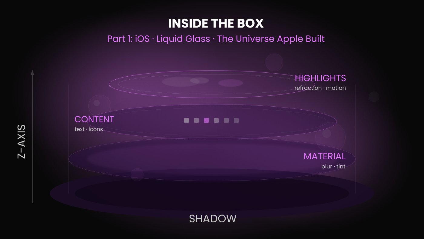
Remember the iOS universe, four clean layers, each with a specific purpose, everything in its place?
Material operates on twenty-four.
That number tells you almost everything you need to know about the philosophical difference between the two platforms. iOS gives you a spare, elegant stack and trusts you to work within it. Material gives you a full elevation system with specific layers for specific components, specific resting states, specific travel paths, and specific interaction behaviors. The app background sits at level 0. Cards rest at level 1 but travel at 8. Buttons sit at level 2 and rise to 8 when pressed. The top app bar sits at 4. Bottom navigation at 8. Bottom sheets at 16. Dialogs sit at the very top: level 24.
Every layer has a job. Every component knows where it lives and where it goes when you interact with it. Surfaces are solid and have weight to them. You can see it in how they move, where they’re placed, what level of the z-index they occupy. Think of it like paper stock. Primary content is 65lb cover stock: substantial, present, grounded. A menu hovering above is 20lb text weight: lighter, temporary, clearly secondary. The shadows tell you everything about the relationship between surfaces.
And then you open an Android app for the first time and think: there is a lot happening here.
Buttons that rise when pressed. New sheets of paper emanating from where you just tapped. Icons that open new layers sliding in over everything else. Quick press, long press, quick swipe, long swipe. Each component has its own recommended usage guidelines. What changes is how you pair them together. Components are the words of a sentence. You can arrange them in different ways to build your narrative, and that’s where the complexity lives. There’s just so much to work with.
It can feel like learning English as a second language. Anyone who has learned English knows: odd spelling rules, words that look alike but sound different, words that sound alike but look different, words that sound and look alike but mean completely different things depending on context. Fall is what happens if you don’t watch where you’re going. Fall is also my second favorite season. That’s how Android can feel at first.
But here’s what nobody tells you: once you learn the language, you become fluent fast. And fluency in Material is where the real creativity begins.
A Different Kind of Freedom
When I started designing for Android, I expected to feel limited. A system this structured, this documented, this exhaustive. I assumed it would box me in.
It didn’t.
What I discovered was that the more I understood the system, the more I could see how to push against it. The creativity wasn’t gone. It was just different. iOS gives you an open floor plan and says: do whatever you want with the space. Android gives you the floor plan, the load-bearing walls, the electrical, the plumbing, and says: now build your rooms. Decide how they connect. Choose how you move through them.
It’s a bit like ordering a house kit from Amazon. Everything you need is in the box. The heavy lifting, the surfaces, the shadows, the motion, the foundational structure, is already figured out. That frees you to focus on what matters most: the content itself. The experience. The story you’re telling inside the rooms you’re building.
The 24 layers aren’t a constraint. They’re the framework. And the framework is what makes the freedom possible.
I came to this realization partly because of where I came from. When I was studying design, programs were still steeped in print. I always knew I wanted to work in digital, but I never stopped loving the tactile world I was leaving behind. The weight of paper. The smell of it. The sound it makes. There’s something irreplaceable about that.
And then I started designing for Android, and there it was. A digital version of that tactile world. Surfaces with weight and substance. Shadows that behave like real shadows. Paper that slides and rises and responds. My degree in glassworking and furniture design had taught me to think about materials, about how things feel in the hand, about weight and form and function. Material Design spoke that language.
Different is not lesser. Different is just different. And sometimes something different feels like coming home.
Material You: Now the User Is the Star
Material Design has always been about giving designers a system to build within. Material You takes that philosophy one step further and hands some of that creative power directly to the user.
Introduced with Android 12, Material You is a dynamic personalization system. The UI adapts its color palette in real time based on the user’s wallpaper. Their chosen colors ripple through the entire interface, buttons, backgrounds, surfaces, icons, creating an experience that feels uniquely theirs. The system does the heavy lifting. The user brings the personality.
Think back to the choose your own adventure analogy. Material gave designers the story framework, the plot devices, the paths to choose from. Material You adds a new chapter: now the user gets to be the star of the adventure.
It’s a natural evolution of everything Material has always believed. A system rooted in the physical world, in the idea that surfaces and materials have personality and weight, now extending that logic to the person holding the device. Your phone doesn’t just run your apps. It reflects you.
In that way, Material You and Liquid Glass are doing something philosophically similar from opposite directions. Liquid Glass makes the interface feel alive and responsive to its environment. Material You makes the interface feel alive and responsive to its owner. One is about the platform. The other is about the person.
Both are saying the same thing: the experience should feel like it belongs to you.
The Craft Reality: Designing in the Material Universe
Understanding Material philosophically is one thing. Designing in it every day is another.
Here’s what working in Material actually looks like.
You have more choices than you think and that’s the challenge
Material gives you a component library: the building blocks to construct your experience. But unlike iOS where the component set is intentional and restrained, Material gives you options. Lots of them. The same task can be executed through multiple components, each creating a different pattern and a different feeling. Revealing a set of choices, for example, could be handled with a small contextual menu at the tap point, a bottom sheet, or a dialog. Each is valid. Each is Material. The decision shapes the entire experience pattern that follows. Both are valid. Both are Material. The elevation states for each are consistent and reliable. That’s the system doing its job. What varies is which component you choose and the experience pattern that choice creates. Choose deliberately, because that pattern will carry through the entire experience. Inconsistency at the component level is where Android experiences start to feel unpolished.
Everything is tappable, with or without affordances
This is one of Material’s most important and most misunderstood qualities. In Material, components can have multiple tap areas. An entire row can be tappable. An icon within that row can trigger a completely different action. Quick press and long press can do different things entirely. This gives you enormous flexibility. It also gives you enormous responsibility. Users can feel when something is inconsistent even when they can’t articulate why. Your job is to make the tappability feel logical and learnable, not arbitrary.A quick note on affordances: Material’s guidelines allow for tappable rows without visual affordances, the assumption being that users will discover the interaction. I disagree with this approach. Affordances exist for a reason. Users shouldn’t have to guess what’s tappable. When in doubt, make it obvious. Your users will thank you.
Components have elevation states and they travel
Every component in Material has a resting elevation and a travel elevation. Buttons sit at level 2 at rest and rise to level 8 when pressed. Bottom sheets live at level 16. Knowing these values isn’t just technical knowledge. It’s design knowledge. Elevation communicates hierarchy, importance, and relationship between surfaces. When you understand the elevation system intuitively, your designs start to feel native in a way that shortcuts and approximations never do.
Parity is not the goal
This is the one I feel most strongly about and the one most often misunderstood in cross-functional teams. Your iOS and Android experiences should share the same goals and the same acceptance criteria. The user needs to accomplish the same thing on both platforms. But how they get there, the components, the interactions, the flow, should be tailored to the platform they’re on. Don’t alter an Android experience simply to match the iOS flow. Don’t alter an iOS experience simply to match Android. Your users chose their platform. They have expectations shaped by years of using it. When you honor those expectations you earn trust. When you violate them you create friction, even if the user can never quite put their finger on why. Don’t place one population at the mercy of another.
What This Means for Your Platform Decision
I’ve heard designers talk about bringing Liquid Glass to Android. I understand the impulse. Liquid Glass is beautiful and it’s having a moment. But the quickest way to frustrate a user is to shove a round iOS app into a square Android hole.
This isn’t about aesthetics. It’s about trust.
Users have a relationship with their platform. They’ve spent years learning its language, its rhythms, its logic. When an app feels native, when it moves the way they expect, responds the way they expect, organizes itself the way they expect, they don’t notice. They just feel at home. And feeling at home builds attachment. Attachment builds loyalty. Loyalty builds brand.
When an app doesn’t feel native, users notice that too. They may not be able to articulate why something feels off. But they feel it. And that feeling erodes trust in ways that no amount of beautiful visual design can fully recover.
The more deeply you understand both platforms, their philosophies, their physics, their distinct creative freedoms, the better equipped you are to design for either one. Including React Native. Because designing well in a cross-platform framework requires knowing what you’re approximating and what you’re giving up. You can only make that tradeoff consciously if you understand what native actually feels like from the inside.
Maya Angelou famously said, “I’ve learned that people will forget what you said, people will forget what you did, but people will never forget how you made them feel.” That applies here more than almost anywhere else in design. Your users will forget the specific interactions. They will forget the component choices. They will not forget how your app made them feel.
Design for that feeling. On their platform. In their language.
I still remember the smell of paper.
The weight of a well-made book. The sound a thick sheet makes when you fold it. The way ink sits differently on coated stock versus uncoated. These are the sensory memories of someone who came up in print, who learned design by touching things before she learned to design things you touch through glass.
When I found Material Design I wasn’t expecting to feel that connection. I was expecting a system to learn, a set of guidelines to follow, a framework to work within. What I found instead was a digital version of a tactile world I thought I had left behind.
And my glassworking background didn’t hurt either. Understanding how light moves through a surface, how weight and form communicate meaning, how the physical properties of a material shape the experience of using it. All of that translates. Liquid Glass made me feel it on the iOS side. Material made me feel it on the Android side. Two platforms. Two philosophies. Both speaking to something real.
I started this series because I believe that designers who understand their platforms deeply make better products. Not better looking products. Better feeling products. There’s a difference.
iOS gives you a stage and trusts you to perform. Material gives you the tools and trusts you to build. Both require you to learn the language before you can speak it fluently. Both reward the designers who take the time.
Different is not lesser. Different is just different.
And sometimes, if you’re lucky, different feels like coming home.
Thank you for reading Part 2 of Inside the Box. If you missed Part 1 — iOS, Liquid Glass, and the Universe Apple Built — you can find it here.
Part 3 is coming: Two Universes, One Decision.
I developed the ideas, research, and voice in this article. AI writing tools helped me shape and refine them along the way. The observations and opinions are entirely my own.
Kim Spencer is a Staff Product Designer specializing in native iOS and Android. She writes about mobile craft, design systems, and platform thinking at kimspencer.com.
메타데이터
- post_id
- 233b01f13a6d
- slug
- inside-the-box-part-2-material-design-and-the-android-universe-233b01f13a6d
- url
- https://medium.com/@KimSpencerDesigner/inside-the-box-part-2-material-design-and-the-android-universe-233b01f13a6d
- canonical_url
- https://medium.com/@KimSpencerDesigner/inside-the-box-part-2-material-design-and-the-android-universe-233b01f13a6d
- author_url
- https://medium.com/@KimSpencerDesigner
- status
- ok
- fetched_at
- 2026-06-09 15:37:30