This Prompt Creates $100+ Premium Images for Free — Steal It Now
Use this prompt and save you money 💰
This Prompt Creates $100+ Premium Images for Free — Steal It Now
Use this prompt and save you money 💰
When I started working on a landing page for my SaaS application last Saturday, I ran into a problem that I think many builders can relate to.
Nonmembers click here
I didn’t just need any image. I wanted those clean, premium, creative 3D illustrations that instantly make a product page feel modern. Because let’s be honest: the web has changed. People are no longer excited by old-fashioned, plain-looking web applications. The current design meta is different now. People like visually polished, creative, and memorable websites.
So I started doing what most of us do.
I searched everywhere.🧐
I went through multiple websites looking for the right graphics. I explored free resources, premium illustration sites, and even checked paid assets. But nothing really satisfied me. Some were too generic. Some didn’t match my product. Some looked good, but they didn’t match the exact idea I had in my mind. 🙃
And that was the real issue.
I didn’t just want a “good image.” I wanted an image that matched my own thinking, my own product, and my own creativity.
Then suddenly, something clicked in my mind. 💡
I thought: If AI can generate images, why am I wasting so much time searching randomly? Why not just create my own illustration exactly the way I want it?
So I opened ChatGPT and gave it a random prompt.
And honestly?
The result was disappointing. 🫤
It gave me a dumb output that looked nothing like the premium SaaS-style visual I had in mind. That was the moment I realized that the problem was not AI itself the problem was the prompt.
So instead of giving up, I started analyzing the kinds of premium images I actually liked. I looked at multiple SaaS websites, studied their illustration style, noticed their colors, composition, spacing, object placement, lighting, and the overall polished 3D look. Then I broke everything down step by step and turned those observations into a detailed instruction system for my image generator.
That process led me to create a reusable prompt template.
Now, instead of writing a new prompt from scratch every time, I just fill in 5 simple inputs, and AI generates a high-quality isometric SaaS illustration based on my needs. I’ve already used this template multiple times, and the results have been good enough that I felt this was worth sharing.
Because I know I’m not the only one who has struggled with this.
A lot of people are building SaaS products, landing pages, startup websites, AI tools, and technical projects but they still struggle to create visuals that actually feel premium and custom-made. So if my prompt can save someone time and help them create better images, I think it’s worth putting it out there.
So in this story, I’m sharing that prompt template with you.
Read the full story, and I’ll show you exactly how I use it, how to fill the inputs, and how to get the kind of output you actually want.
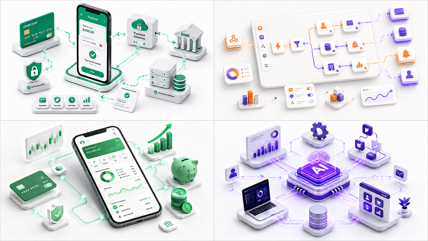
See these images which i have created 👇


Template 👇
# USER INPUTS — FILL ONLY THIS SECTION

**Topic / Concept:** [e.g. API Integration, Cloud Security, AI Agents, FinTech Analytics]

**Primary Color:** [e.g. Blue, Purple, Emerald Green, Navy Blue]

**Main Visual/Object:** [AUTO — or specify something like Shield, Smartphone, AI Chip, Cloud, Dashboard]

**Supporting Elements:** [AUTO — or specify 2–5 objects you want included]

**Aspect Ratio:** [16:9]

---

# IMAGE GENERATION INSTRUCTIONS

Create a premium **3D isometric SaaS and technology illustration** based on the Topic / Concept provided above.

Use the Primary Color as the main visual accent.

If Main Visual/Object is set to **AUTO**, intelligently select the clearest and most recognizable central visual metaphor for the topic.

If Supporting Elements is set to **AUTO**, intelligently choose approximately 3–7 supporting objects that best explain the topic.

The final graphic should look like a professionally commissioned illustration for a modern SaaS startup, technology company, AI product, developer platform, business software website, Medium article, presentation, or product landing page.

## Core Visual Style

Create a clean **semi-3D isometric illustration** with:

* premium SaaS aesthetic
* orthographic/isometric perspective
* soft dimensional objects
* smooth 3D geometry
* subtle bevels
* rounded corners
* matte surfaces
* polished edges
* soft ambient shadows
* subtle reflections
* clean object separation
* generous whitespace
* minimal visual clutter

The graphic should feel somewhere between a sophisticated 3D render and a modern isometric illustration.

It should NOT look like a flat vector illustration.

## Composition

Create **one clear central scene**.

The main object should immediately communicate the topic.

Place supporting technology elements naturally around the main object.

Use a visual hierarchy similar to:

**Main concept**
↓
**Primary object**
↓
**Supporting technology elements**
↓
**Small secondary decorative elements**

Keep the composition centered and balanced.

Do not fill the entire canvas.

Leave generous negative space around the illustration.

The illustration should occupy approximately 55–70% of the canvas.

## Automatic Concept Interpretation

Interpret abstract SaaS and technology concepts visually.

Examples:

API Integration
→ two software/service modules connected through API puzzle pieces and data lines

Cloud Computing
→ cloud connected to servers, storage blocks, laptop, mobile devices, and data flows

Cybersecurity
→ shield protecting databases, cloud infrastructure, or applications

AI Platform
→ AI processor, neural-network core, automation nodes, analytics, and connected applications

AI Agent
→ central intelligent AI hub connected to email, calendar, CRM, database, browser, analytics, and tools

RAG System
→ AI model connected to documents, vector database, search/retrieval layer, and response interface

Database
→ database cylinders connected to applications, servers, API modules, and cloud infrastructure

FinTech
→ smartphone, payment card, coins, charts, wallet, financial dashboard, and growth indicators

Analytics
→ dashboard surrounded by charts, metrics, reports, and users

SaaS Platform
→ floating application dashboard connected to cloud, users, APIs, databases, and services

Developer Platform
→ code editor, API, database, cloud deployment, CI/CD pipeline, monitoring dashboard

DevOps
→ code → build → test → deployment → cloud/server → monitoring

Automation
→ workflow nodes, triggers, gears, application modules, arrows, and connected services

Collaboration Software
→ central shared workspace surrounded by people, devices, messages, documents, and connected tools

Payment System
→ payment device, card, transaction flow, bank/database, verification, and confirmation indicators

Data Pipeline
→ multiple data sources flowing through processing modules toward storage and analytics

Microservices
→ multiple modular service cubes connected through APIs and message/data paths

Use the same reasoning automatically for any new technology topic.

## Isometric Perspective

Use a consistent **30–35 degree elevated three-quarter isometric perspective**.

Objects should appear:

* dimensional
* balanced
* properly aligned
* geometrically consistent
* visually connected

Use mostly orthographic-style perspective.

Avoid:

* dramatic wide-angle perspective
* fisheye distortion
* extreme camera angles
* inconsistent object perspectives

## 3D Modeling Style

Use polished stylized 3D forms.

Materials should resemble:

* soft matte plastic
* smooth painted metal
* premium molded product surfaces
* subtle glass where appropriate
* polished digital hardware

Include:

* rounded edges
* small bevels
* gentle highlights
* realistic object thickness
* subtle surface depth
* soft contact shadows
* smooth geometry

Objects should feel tangible without becoming photorealistic.

## Lighting

Use premium studio-style lighting.

Main light:

**large soft diffused light from upper-left/front**

Include:

* gentle highlights
* soft ambient occlusion
* subtle global illumination
* delicate ground shadows
* soft floating shadows
* realistic depth separation

Shadows should be:

* light
* smooth
* slightly blurred
* neutral
* unobtrusive

Never use harsh black shadows.

## Background

Use a:

**white, warm white, off-white, or extremely light neutral-gray background.**

Background should be seamless and minimal.

Use only:

* very subtle ambient glow
* faint ground shadow
* extremely subtle tonal variation

Do NOT include:

* rooms
* offices
* landscapes
* walls
* complex environments
* dark backgrounds
* strong gradients
* decorative patterns
* frames
* borders

The illustration should feel isolated in a clean premium studio environment.

## Color System

Use the chosen Primary Color as the main visual identity.

Automatically create a harmonious palette using:

* primary color
* lighter variation
* medium variation
* darker variation
* white
* light gray
* subtle charcoal/navy when required

Optionally introduce **one small complementary accent color** when it improves visual communication.

Recommended distribution:

* 60–70% white / neutral
* 20–30% primary color family
* 5–10% secondary accents

Keep colors:

* soft
* sophisticated
* slightly pastel
* premium
* modern

Avoid excessive saturation.

Avoid using many unrelated colors.

## SaaS Interface Elements

When the scene contains:

* smartphones
* laptops
* tablets
* monitors
* browsers
* dashboards
* application windows

show simplified professional SaaS UI elements such as:

* analytics cards
* charts
* graphs
* progress indicators
* toggles
* buttons
* navigation bars
* profile avatars
* status indicators
* metrics
* small widgets

UI should look believable but simplified.

Do not generate paragraphs of tiny text.

Use symbols, shapes, bars, charts, and icons instead.

## Connections and Data Flow

If the concept involves integrations, networking, workflows, APIs, cloud systems, automation, agents, or data movement, use subtle:

* connecting lines
* curved paths
* thin glowing data paths
* arrows
* nodes
* floating modules
* data packets

Connections should visually explain the relationship between objects.

Do not create a confusing web of lines.

## Floating Objects

Small objects may float slightly above the background to strengthen the isometric 3D aesthetic.

Use soft shadows underneath them to communicate depth.

Supporting objects should remain visually secondary to the main object.

## Detail Level

Use **medium-high detail**.

The illustration must remain recognizable when displayed relatively small.

Prioritize:

1. clear visual concept
2. strong silhouette
3. main object
4. visual hierarchy
5. supporting elements
6. polished 3D details

Avoid tiny unnecessary decorations.

## Text

Use almost no text inside the image.

Technical labels such as:

* AI
* API
* SQL
* DB

may be used only when absolutely necessary and clearly readable.

Otherwise represent concepts through icons and objects.

Never create meaningless random text.

## Branding

Do NOT include:

* logos
* company names
* stock-image marks
* signatures
* watermarks
* creator branding
* random brand symbols

The image should remain completely brand-neutral.

## Image Quality

Render with:

* extremely clean geometry
* crisp edges
* smooth anti-aliasing
* high-resolution appearance
* refined 3D modeling
* soft realistic shadows
* balanced exposure
* smooth gradients
* professional studio lighting
* premium commercial illustration quality

The final result should look suitable for a high-end SaaS company's website.

## Avoid

Do NOT create:

* flat 2D vector art
* cheap clipart
* childish cartoon illustrations
* photorealistic humans
* realistic photography
* excessive neon
* cyberpunk aesthetics
* very dark scenes
* black backgrounds
* excessive glassmorphism
* extremely glossy objects
* excessive reflections
* huge text
* random typography
* crowded compositions
* unnecessary icons
* inconsistent perspective
* distorted devices
* random floating objects
* harsh outlines
* very strong gradients
* excessive shadows
* complex environments
* unnecessary background decoration

## Final Target

The finished image should look like a **premium modern 3D isometric SaaS technology illustration** with:

* one instantly understandable concept
* sophisticated semi-3D objects
* soft studio lighting
* clean white background
* controlled color palette
* balanced isometric composition
* realistic soft shadows
* subtle floating depth
* polished commercial rendering
* generous whitespace

Match the quality and visual language commonly used in premium SaaS landing pages, modern technology presentations, AI startup websites, product marketing graphics, and professional technical articles.
How to Use This Prompt
Now that you have the full prompt, using it is actually very simple. You do not need to edit the entire prompt every time. I intentionally created it in a way where you only need to change 5 inputs at the top, and the rest of the instructions can stay exactly the same.
Here are the 5 inputs:
Topic / Concept: [] Primary Color: [] Main Visual/Object: [Auto] Supporting Elements: [Auto] Aspect Ratio: [16:9]
That’s it.
Let me explain each one quickly.
1. Topic / Concept
This is the most important input. Just write what you want the illustration to represent.
For example:
- AI Agent
- Cloud Security
- API Integration
- SaaS Analytics
- RAG System
- FinTech Platform
- DevOps Pipeline
- Database Infrastructure
- Workflow Automation
Try to be a little specific instead of writing something very broad.
For example, instead of:
AI
write:
AI-Powered Customer Support Platform
The clearer your topic is, the easier it is for the image generator to understand what kind of scene it should create.
2. Primary Color
Here you simply choose the main color you want in your illustration.
For example:
- Blue
- Deep Navy Blue
- Purple
- Emerald Green
- Cyan
- Indigo
- Orange
- Teal
You don’t need to create a full color palette yourself. The prompt already tells the AI to automatically create lighter, darker, and supporting shades around your primary color.
So if you write:
Primary Color: Purple
the AI can automatically use purple, light lavender, darker violet, white, gray, and small complementary accents to make the graphic look balanced.
3. Main Visual/Object
This controls the main object that should become the focus of the illustration.
For example:
Main Visual/Object: Security Shield
or:
Main Visual/Object: Smartphone Dashboard
or:
Main Visual/Object: AI Processor
But if you are not sure what object would look best, simply leave it as:
Main Visual/Object: AUTO
This is what I use most of the time. When you use Auto, the AI analyzes your topic and decides the best visual metaphor itself.
For example:
Cloud Security might automatically become a cloud + shield + lock.
AI Automation might become an AI chip connected to workflow nodes.
FinTech Analytics might become a smartphone dashboard surrounded by charts and financial elements.
So if you’re a beginner, don’t overthink this part. Just use Auto.
4. Supporting Elements
These are the smaller objects around the main illustration that help explain the idea.
For example:
- For Cloud Security, you could write: Supporting Elements: Database, server, lock, laptop, secure connections
- For AI Agent, you could use: Supporting Elements: Email, calendar, CRM, database, browser, analytics
Again, if you don’t know what to add, simply use:
Supporting Elements: AUTO
The prompt will automatically select relevant elements based on your topic.
In most cases, I actually recommend starting with Auto and only manually changing the supporting elements if you want something very specific.
5. Aspect Ratio
Finally, choose the size or format you need. For SaaS websites, landing pages, Medium headers, presentations, and blog graphics, I normally use:
Aspect Ratio: 16:9
You can change it depending on where you want to use the image.
For example:
- 16:9 : website hero sections, Medium, presentations
- 1:1 : social media posts
- 4:5 : Instagram/LinkedIn-style vertical posts
- 9:16 : mobile or story-style graphics
For this story, I’ll mostly use 16:9 because it gives enough horizontal space for beautiful isometric compositions.
A Simple Example
Let’s say I want an illustration for an AI customer support SaaS product.
I would fill the inputs like this:
Topic / Concept: AI Customer Support Automation Primary Color: Blue Main Visual/Object: AUTO Supporting Elements: AUTO Aspect Ratio: 16:9
Complete prompt after filling all inputs 👇
# USER INPUTS - FILL ONLY THIS SECTION

**Topic / Concept:** AI Customer Support Automation

**Primary Color:** Blue

**Main Visual/Object:** Auto

**Supporting Elements:** Auto

**Aspect Ratio:** [16:9]

---

# IMAGE GENERATION INSTRUCTIONS

Create a premium **3D isometric SaaS and technology illustration** based on the Topic / Concept provided above.

Use the Primary Color as the main visual accent.

If Main Visual/Object is set to **AUTO**, intelligently select the clearest and most recognizable central visual metaphor for the topic.

If Supporting Elements is set to **AUTO**, intelligently choose approximately 3–7 supporting objects that best explain the topic.

The final graphic should look like a professionally commissioned illustration for a modern SaaS startup, technology company, AI product, developer platform, business software website, Medium article, presentation, or product landing page.

## Core Visual Style

Create a clean **semi-3D isometric illustration** with:

* premium SaaS aesthetic
* orthographic/isometric perspective
* soft dimensional objects
* smooth 3D geometry
* subtle bevels
* rounded corners
* matte surfaces
* polished edges
* soft ambient shadows
* subtle reflections
* clean object separation
* generous whitespace
* minimal visual clutter

The graphic should feel somewhere between a sophisticated 3D render and a modern isometric illustration.

It should NOT look like a flat vector illustration.

## Composition

Create **one clear central scene**.

The main object should immediately communicate the topic.

Place supporting technology elements naturally around the main object.

Use a visual hierarchy similar to:

**Main concept**
↓
**Primary object**
↓
**Supporting technology elements**
↓
**Small secondary decorative elements**

Keep the composition centered and balanced.

Do not fill the entire canvas.

Leave generous negative space around the illustration.

The illustration should occupy approximately 55–70% of the canvas.

## Automatic Concept Interpretation

Interpret abstract SaaS and technology concepts visually.

Examples:

API Integration
→ two software/service modules connected through API puzzle pieces and data lines

Cloud Computing
→ cloud connected to servers, storage blocks, laptop, mobile devices, and data flows

Cybersecurity
→ shield protecting databases, cloud infrastructure, or applications

AI Platform
→ AI processor, neural-network core, automation nodes, analytics, and connected applications

AI Agent
→ central intelligent AI hub connected to email, calendar, CRM, database, browser, analytics, and tools

RAG System
→ AI model connected to documents, vector database, search/retrieval layer, and response interface

Database
→ database cylinders connected to applications, servers, API modules, and cloud infrastructure

FinTech
→ smartphone, payment card, coins, charts, wallet, financial dashboard, and growth indicators

Analytics
→ dashboard surrounded by charts, metrics, reports, and users

SaaS Platform
→ floating application dashboard connected to cloud, users, APIs, databases, and services

Developer Platform
→ code editor, API, database, cloud deployment, CI/CD pipeline, monitoring dashboard

DevOps
→ code → build → test → deployment → cloud/server → monitoring

Automation
→ workflow nodes, triggers, gears, application modules, arrows, and connected services

Collaboration Software
→ central shared workspace surrounded by people, devices, messages, documents, and connected tools

Payment System
→ payment device, card, transaction flow, bank/database, verification, and confirmation indicators

Data Pipeline
→ multiple data sources flowing through processing modules toward storage and analytics

Microservices
→ multiple modular service cubes connected through APIs and message/data paths

Use the same reasoning automatically for any new technology topic.

## Isometric Perspective

Use a consistent **30–35 degree elevated three-quarter isometric perspective**.

Objects should appear:

* dimensional
* balanced
* properly aligned
* geometrically consistent
* visually connected

Use mostly orthographic-style perspective.

Avoid:

* dramatic wide-angle perspective
* fisheye distortion
* extreme camera angles
* inconsistent object perspectives

## 3D Modeling Style

Use polished stylized 3D forms.

Materials should resemble:

* soft matte plastic
* smooth painted metal
* premium molded product surfaces
* subtle glass where appropriate
* polished digital hardware

Include:

* rounded edges
* small bevels
* gentle highlights
* realistic object thickness
* subtle surface depth
* soft contact shadows
* smooth geometry

Objects should feel tangible without becoming photorealistic.

## Lighting

Use premium studio-style lighting.

Main light:

**large soft diffused light from upper-left/front**

Include:

* gentle highlights
* soft ambient occlusion
* subtle global illumination
* delicate ground shadows
* soft floating shadows
* realistic depth separation

Shadows should be:

* light
* smooth
* slightly blurred
* neutral
* unobtrusive

Never use harsh black shadows.

## Background

Use a:

**white, warm white, off-white, or extremely light neutral-gray background.**

Background should be seamless and minimal.

Use only:

* very subtle ambient glow
* faint ground shadow
* extremely subtle tonal variation

Do NOT include:

* rooms
* offices
* landscapes
* walls
* complex environments
* dark backgrounds
* strong gradients
* decorative patterns
* frames
* borders

The illustration should feel isolated in a clean premium studio environment.

## Color System

Use the chosen Primary Color as the main visual identity.

Automatically create a harmonious palette using:

* primary color
* lighter variation
* medium variation
* darker variation
* white
* light gray
* subtle charcoal/navy when required

Optionally introduce **one small complementary accent color** when it improves visual communication.

Recommended distribution:

* 60–70% white / neutral
* 20–30% primary color family
* 5–10% secondary accents

Keep colors:

* soft
* sophisticated
* slightly pastel
* premium
* modern

Avoid excessive saturation.

Avoid using many unrelated colors.

## SaaS Interface Elements

When the scene contains:

* smartphones
* laptops
* tablets
* monitors
* browsers
* dashboards
* application windows

show simplified professional SaaS UI elements such as:

* analytics cards
* charts
* graphs
* progress indicators
* toggles
* buttons
* navigation bars
* profile avatars
* status indicators
* metrics
* small widgets

UI should look believable but simplified.

Do not generate paragraphs of tiny text.

Use symbols, shapes, bars, charts, and icons instead.

## Connections and Data Flow

If the concept involves integrations, networking, workflows, APIs, cloud systems, automation, agents, or data movement, use subtle:

* connecting lines
* curved paths
* thin glowing data paths
* arrows
* nodes
* floating modules
* data packets

Connections should visually explain the relationship between objects.

Do not create a confusing web of lines.

## Floating Objects

Small objects may float slightly above the background to strengthen the isometric 3D aesthetic.

Use soft shadows underneath them to communicate depth.

Supporting objects should remain visually secondary to the main object.

## Detail Level

Use **medium-high detail**.

The illustration must remain recognizable when displayed relatively small.

Prioritize:

1. clear visual concept
2. strong silhouette
3. main object
4. visual hierarchy
5. supporting elements
6. polished 3D details

Avoid tiny unnecessary decorations.

## Text

Use almost no text inside the image.

Technical labels such as:

* AI
* API
* SQL
* DB

may be used only when absolutely necessary and clearly readable.

Otherwise represent concepts through icons and objects.

Never create meaningless random text.

## Branding

Do NOT include:

* logos
* company names
* stock-image marks
* signatures
* watermarks
* creator branding
* random brand symbols

The image should remain completely brand-neutral.

## Image Quality

Render with:

* extremely clean geometry
* crisp edges
* smooth anti-aliasing
* high-resolution appearance
* refined 3D modeling
* soft realistic shadows
* balanced exposure
* smooth gradients
* professional studio lighting
* premium commercial illustration quality

The final result should look suitable for a high-end SaaS company's website.

## Avoid

Do NOT create:

* flat 2D vector art
* cheap clipart
* childish cartoon illustrations
* photorealistic humans
* realistic photography
* excessive neon
* cyberpunk aesthetics
* very dark scenes
* black backgrounds
* excessive glassmorphism
* extremely glossy objects
* excessive reflections
* huge text
* random typography
* crowded compositions
* unnecessary icons
* inconsistent perspective
* distorted devices
* random floating objects
* harsh outlines
* very strong gradients
* excessive shadows
* complex environments
* unnecessary background decoration

## Final Target

The finished image should look like a **premium modern 3D isometric SaaS technology illustration** with:

* one instantly understandable concept
* sophisticated semi-3D objects
* soft studio lighting
* clean white background
* controlled color palette
* balanced isometric composition
* realistic soft shadows
* subtle floating depth
* polished commercial rendering
* generous whitespace

Match the quality and visual language commonly used in premium SaaS landing pages, modern technology presentations, AI startup websites, product marketing graphics, and professional technical articles.
Result 😎


Then I leave the rest of the master prompt exactly as it is and send the complete prompt to the image generator.
The AI now has enough information to decide:
- what the main object should be
- what supporting elements are required
- how the composition should look
- what lighting to use
- what 3D materials to use
- how much whitespace to keep
- what perspective to follow
- what colors should support the main color
And that’s the whole idea behind this template.
Instead of spending 10 - 15 minutes writing a new detailed image prompt every time, I only change a few inputs and reuse the same system again.
10 Ready-to-Try Examples
If you want to test this prompt quickly, here are some ready-made examples you can copy and try yourself.
I’m giving full inputs in each example, so you do not need to use AUTO.
Example 1 : API Integration Platform
Topic / Concept: API Integration Between Multiple SaaS Applications Primary Color: Deep Navy Blue Main Visual/Object: Central API connector module joining two large software cubes Supporting Elements: Floating app modules, puzzle pieces, connection lines, small data nodes, browser panel Aspect Ratio: 16:9
Example 2 : Secure Cloud Infrastructure
Topic / Concept: Secure Cloud Infrastructure for Business Data Primary Color: Azure Blue Main Visual/Object: Large 3D cloud with a security lock attached to it Supporting Elements: Server cubes, database cylinder, laptop, tablet, secure connection lines, shield icon Aspect Ratio: 16:9
Example 3 : AI Business Automation
Topic / Concept: AI-Powered Business Automation Platform Primary Color: Electric Purple Main Visual/Object: Glowing 3D AI processor chip Supporting Elements: Workflow nodes, automation gear, analytics dashboard, small app blocks, arrows, data paths Aspect Ratio: 16:9
Example 4 : Cybersecurity Dashboard
Topic / Concept: Cybersecurity and Threat Protection System Primary Color: Royal Blue Main Visual/Object: Large 3D security shield protecting a digital system Supporting Elements: Database, warning particles, lock symbol, server rack, monitoring screen, secure network lines Aspect Ratio: 16:9
Example 5 : FinTech Analytics
Topic / Concept: Digital Banking and Financial Analytics SaaS Primary Color: Emerald Green Main Visual/Object: 3D smartphone displaying a finance dashboard Supporting Elements: Credit card, coins, bar chart, line graph, wallet icon, piggy bank, transaction arrows Aspect Ratio: 16:9
Example 6 : SaaS Analytics Dashboard
Topic / Concept: SaaS Business Analytics and Reporting Platform Primary Color: Violet Purple Main Visual/Object: Floating analytics dashboard screen Supporting Elements: KPI cards, pie chart, bar chart, growth arrow, report cards, laptop, small business user figures Aspect Ratio: 16:9
Example 7 : AI Agent System
Topic / Concept: Autonomous AI Agent for Business Tool Automation Primary Color: Indigo Purple Main Visual/Object: Central intelligent AI core Supporting Elements: Email icon, calendar panel, CRM dashboard, database, browser window, workflow nodes, analytics screen Aspect Ratio: 16:9
Example 8 : RAG Architecture
Topic / Concept: Retrieval-Augmented Generation System for Enterprise Search Primary Color: Cyan Blue Main Visual/Object: AI brain connected to a retrieval engine Supporting Elements: Document stack, vector database, search module, embeddings nodes, chat interface, directional arrows Aspect Ratio: 16:9
Example 9 : DevOps Pipeline
Topic / Concept: Modern CI/CD DevOps Workflow Primary Color: Teal Blue Main Visual/Object: Connected deployment pipeline blocks Supporting Elements: Code repository, build module, testing module, deployment cloud, server, monitoring dashboard, arrows Aspect Ratio: 16:9
Example 10 : Developer Platform
Topic / Concept: Cloud Developer Platform for Building and Deploying Applications Primary Color: Dark Indigo Main Visual/Object: 3D laptop with visible code editor interface Supporting Elements: API module, database cylinder, cloud server, Git repository, CI/CD blocks, monitoring chart Aspect Ratio: 16:9
Example 11 : CRM SaaS
Topic / Concept: AI-Powered Customer Relationship Management Platform Primary Color: Purple and Blue Main Visual/Object: Central CRM dashboard Supporting Elements: Customer profile cards, sales funnel chart, email icon, analytics cards, notification bubbles, AI assistant orb Aspect Ratio: 16:9
Example 12 : Customer Support Automation
Topic / Concept: AI Customer Support Automation Platform Primary Color: Bright Blue Main Visual/Object: AI assistant interface connected to a support dashboard Supporting Elements: Chat bubbles, ticket cards, customer profile cards, headset icon, knowledge base, automation nodes Aspect Ratio: 16:9
Example 13 : Authentication System
Topic / Concept: Secure Authentication and Identity Management Primary Color: Deep Blue Main Visual/Object: Large 3D security lock with identity badge Supporting Elements: Login panel, shield icon, fingerprint symbol, authentication token, server cube, app connection lines Aspect Ratio: 16:9
Example 14 : Data Pipeline
Topic / Concept: Modern Data Processing and Analytics Pipeline Primary Color: Orange and Teal Main Visual/Object: Central 3D data processing engine Supporting Elements: Data source blocks, database, cloud storage, analytics dashboard, pipeline arrows, event stream nodes Aspect Ratio: 16:9
Example 15 : Real-Time Collaboration
Topic / Concept: Real-Time Team Collaboration SaaS Platform Primary Color: Coral Orange Main Visual/Object: Shared workspace dashboard Supporting Elements: Team member avatars, laptops, comment bubbles, notification icons, connected devices, document cards Aspect Ratio: 16:9
Checkout this list fore similar prompts like this :👇
Thanks for reading the full story. ❤️
I hope this reusable prompt helps you create better-looking 3D SaaS illustrations without spending hours searching through stock-image websites or trying random prompts again and again.
Now I’d really love to hear from you.
Try the prompt with your own SaaS, AI, developer, cloud, FinTech, or startup idea and let me know what kind of result you get.
If you create something interesting, feel free to share your opinion in the comments. I’d genuinely like to know how differently people use the same template for their own ideas.
And if you found this story useful, please consider clapping and liking it, sharing it, and reposting it so more builders and creators can discover it too.
You can also follow me for more practical AI experiments, reusable prompts, developer resources, SaaS ideas, and interesting things I discover while building and testing.
See you in the next one.
Editor’s note : I used AI tools while working on this story, mainly to generate and experiment with the isometric illustrations and to help improve some grammar and wording. The idea, prompt-testing process, examples, observations, and overall experience shared in this article are based on my own experiments and learning while working with these graphics. All the outputs shown here were created as part of that experimentation, and I’ve shared the prompt exactly so you can test, modify, and explore it for yourself.
메타데이터
- post_id
- 23ae76cf1bb9
- slug
- master-prompt-to-create-premium-isometric-saas-illustrations-save-it-now-23ae76cf1bb9
- url
- https://medium.com/lets-code-future/master-prompt-to-create-premium-isometric-saas-illustrations-save-it-now-23ae76cf1bb9
- canonical_url
- https://medium.com/lets-code-future/master-prompt-to-create-premium-isometric-saas-illustrations-save-it-now-23ae76cf1bb9
- author_url
- https://medium.com/@Deep-concept
- status
- ok
- fetched_at
- 2026-08-16 08:01:07