How user-friendly is Altair really?
Dive into how easy it is to learn Altair for Python, grasp some essential concepts, and discover why it’s so well-loved.
How user-friendly is Altair really? You can create stunning plots in a straightforward, declarative manner without getting lost in tutorial hell.
Dive into how easy it is to learn Altair for Python, grasp some essential concepts, and discover why it’s so well-loved.
After spending about five years using matplotlib, seaborn, and plotly, a homework assignment for a course inspired me to explore a new plotting library with a fresh perspective. While seaborn is also a declarative library, the need to style and tweak plots in matplotlib has made me more accustomed to it. As you might have noticed in my recent stories, it has even become my preferred method. So, it’s time for a change! Altair has consistently appeared on ‘top python plotting libraries’ lists for years (see here, here, or here) and it apparently offers some exciting features:
- Concise and intuitive API based on Vega-Lite;
- Powerful composition system for complex visualizations;
- Excellent handling of interactive plots;
- Create web-based dashboard or publication quality static plots in PNG, SVG and other formats;
- Strong type system preventing common errors;
- Work with huge datasets by integrating Apache Arrow and Pandas with Altair.
To start, I’ll create five plots that were part of a Data Science course I’m taking to illustrate what you can expect when you first dive into Altair. Then, I’ll explore some of the library’s unique features before wrapping up with my initial thoughts on how easy it is.

Image created with www.magicstudio.com
🚀 Top Remote Tech Roles — $50–$120/hr Hiring experienced developers (3+ years) only.
- Frontend / Backend / Full Stack
- Mobile (iOS/Android)
- AI / ML
- DevOps & Cloud
If you want to work from anywhere, start here: 👉 **Apply Here**
Five exploratory plots to start with
Before we dive in, every altair Charts consist of three elements¹’²:
- data: the starting point is some form of tabular data and may include csv, json, geojson or (Geo)DataFrames (details here);³
- mark: next the method of displaying data is declared (details here).⁴ This is the first moment you can visualize the data, however
Chart(<DATA>).mark_point()will result in nothing more than a stack of points;

The first plot in Altair. Image created by author.
- encoding: then meaning is given to the properties of the data via encodings. The encodings consist of three required elements namely the channel option, the property name, and the data type. Channels are element of the chart such as the position of elements, the properties of the mark, and faceting. Some encoding channels allow for additional options to be expressed.⁵ The property name is the variable in the dataset or simply put the column name. The data type can be any of these five:
- Q: Quantitative, a continuous real-valued quantity i.e. numbers;
- O: Ordinal, a discrete ordered quantity;
- N: Nominal, a discrete unordered category;
- T: Temporal, a time or date value;
- G: GeoJSON, a geographic shape.⁶
This will result in a statement to make a chart that essentially always is chart(<DATA>).mark_???.encode(). And the encodings all follow a pattern being <CHANNEL_OPTION>="<PROPERTY_NAME>:<ENCODING>".¹
1. Gapminder — line plot => LayerChart
Show the development of the life expectancy of Afghanistan, Brazil and the Netherlands using the Gapminder dataset.
1a. Sufficiently simple plot
Since we are looking for a trend over time, a line plot is a good option. To make that we use the mark_line⁴ and we encode year as the x-value and life expectancy as the y-value. To distinguish the nation we color by country, and lastly we filter using transform_filter⁷ to get just the needed three countries. In this case, FieldOneOfPredicate evaluates whether a field is among a list of specified values⁸.
[embed]
This one line altair statement results in this plot.
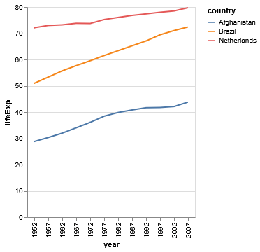
Simple line plot. Image created by author.
1b. Fancy plot
Taking some inspiration from the book “Data Visualization: A practical introduction” by Kieran Healy (website) and this blog (website), I want some additions and changes to the plot to try to give more insight and clarity without completely crowding the plot:
- show the life expectancy for every country in the dataset;
- show the median life expectancy for ever recorded year;
- highlight the selected countries, show the name next to the line perpendicular to it, note the age at the first and last moment, and hide the legend;
- add a title and subtitle, have simple axis ticks, and have clear and lighter colored axis labels.
dataset = plotly.data.gapminder()
chart = alt.Chart(dataset).mark_line(color="lightgrey").encode(
    x="year:O", y="lifeExp:Q", detail="country:N")
avg = alt.Chart(dataset).mark_line(color="darkslategray").encode(
    x="year:O", y="median(lifeExp):Q")
avg_text = avg.mark_text().encode(
    x="year:O", y="median(lifeExp):Q",
    text=alt.datum("Median life expactancy"))
subset = alt.Chart(dataset).encode(
    x="year:O", y="lifeExp:Q", color="country:N").transform_filter(
    alt.FieldOneOfPredicate(
        field="country", oneOf=["Afghanistan", "Brazil", "Netherlands"]))
highlight = subset.mark_line().encode()
country_name = subset.mark_text().encode(
    x="year:O", y="lifeExp:Q", text="country:N")
min_exp = subset.mark_text().encode(
    x="year:O", y="min(lifeExp):Q", text="min(lifeExp)")
max_exp = subset.mark_text().encode(
    x="year:O", y="max(lifeExp):Q", text="max(lifeExp)")
combined = chart+avg+highlight+avg_text+country_name+min_exp+max_exp
combined = combined.properties(title=alt.Title(
    f"The life expectancy in three countries between {dataset["year"].min()} and {dataset["year"].max()}.",  # noqa E501
    subtitle="Data is taken from the Gapminder dataset."))
By combining the series of charts, each created with an encoding, we get a LayerChart⁹ as shown below. All the elements are there, however at the moment it is quite crowded and unpleasant to view.
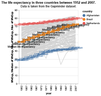
Chart without additional configuration. Image created by author.
To make the chart easier to read and more appealing there are a few additions we’ll do. I’ll briefly go over the notable elements of the chart creation:
- To start off, we use
strokeWidth⁴ to set the line width, andalt.X¹⁰ andalt.Y¹¹ in the first chart’s encoding to specify the variables, style the axes, and eliminate the grid; alt.Axis¹² is employed to get rid of grid lines with thegridparameter, color the labels (labelColor) and ticks (titleColor), and set the tick valuevalues;alt.Scale¹³ is applied to extend the x-axis so that it’s clear where the data begins and ends. Thedomain¹⁴ parameter is provided with the new extend.- In the second chart,
StrokeDash¹⁵ determines the line style and the gap size in pixels. - For selecting the three countries,
transform_filter⁸ andalt.FieldOneOfPredicate⁸ come into play. The latter checks if a variable falls within the specified values as mentioned before. - Since there’s no known way to align the text labels with a line (See here, and here), the angles are hard-coded. To round the numbers, the
format¹⁶ parameter is used with a D3-format specifier.¹⁷ - To build the
alt.LayerChart¹⁸, all the individual charts are merged using the+operator, which functions as layering. Finally, the properties for the combined plot are defined:height,width, andtitle. ThestrokeOpacityparameter removes the top and right axes.¹⁹’²⁰
All this together results in a more pleasant and informative chart.
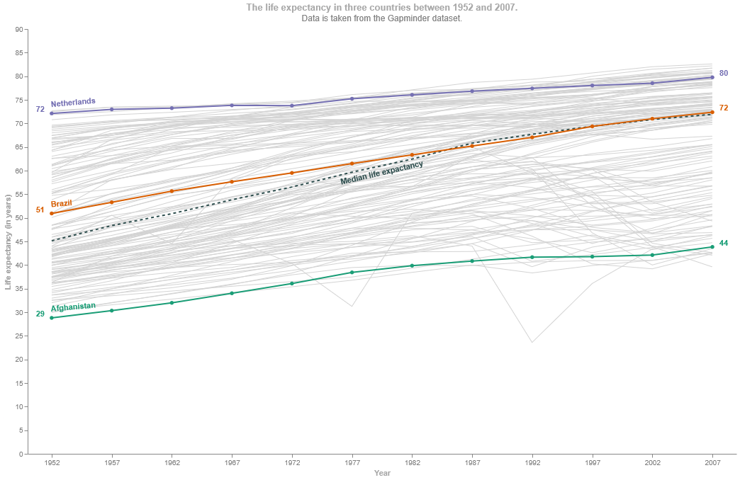
Styled life expectancy chart. Image created by author.
2. Ames housing — faceted scatter plot => FacetChart
Show the number of sales and the average sale price for each neighborhood by year using the Ames housing dataset.
2a. Sufficiently simple plot
Given the task we now have four dimensions of the data to visualize. Using a facet on the neighborhood and set size to the average sale price, we make scatter plots of the total number of sales per year.
[embed]
Again, a one liner gives a very good basic chart.
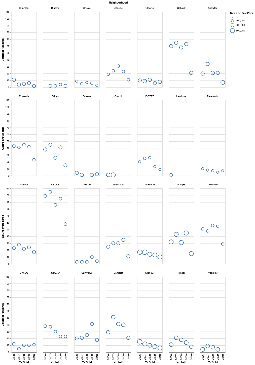
Simple faceted scatter plot. Image created by author.
2b. Fancy plot
Altair 5.0 introduced a method-based syntax for setting channel options as a more convenient alternative to the traditional attribute-based syntax.⁶
Where the first plot used more of the “Attribute-Based Syntax”, now we’ll use as much as possible of the “Method-Based Syntax” approach. Furthermore we’ll:
- Show the missing values;
- Color the circles by year and position a legend;
- Adjust width and height to make it better fit to a screen;
- Color the title, headers and labels.
There were two things that took quite a long time to figure out: how to use the method-based syntax, if possible, in some cases and how to visualize the missing values. To start with the latter, trying to overlay another chart that has the missing values imputed, results in an error, like below, since the data for all charts that are faceted needs to be the same.
ValueError: Facet charts require data to be specified at the top level. If you are trying to facet layered or concatenated charts, ensure that the same data variable is passed to each chart or specify the data inside the facet method instead.I’ll discuss the method-based syntax by go through the creation of the chart:
- In the definition of the chart the width and height of each panel is defined.
- To deal with the missing values, the
tranform_imputemethod is used to fill in missing values²¹. We want to create and fill the property “SalePrice” for each year that a neighborhood does not have such a record. Therefore, we specify to impute the “SalePrice” with the value 0. We group the records by “Yr Sold” to force that for each “Neighborhood” a record is created and filled.
.transform_impute(
  impute="SalePrice",  # the property that has missing value
  value=0,  # the fill value for missing values
  key="Neighborhood",  # the key to identify unique data
  groupby=["Yr Sold"],  # force imputation on per-group basis
  method="value"  # the method for imputation
)- To get the number of sales and the average sale price we use the
tranform_aggregatemethod²². In this method we can provide the resulting aggregates with a name. - To create easily identifiable steps in the average sales price, we use
tranform_bin²³ to bin the values in set steps. - In the encoding we use the before created aggregates. To have the color and shape of the points be conditional on whether the value was missing a condition is created. I choose to use the newer
when()method that was introduced in version5.5.0.²⁴ The approach to use an aggregate field and then check it against the fill value is the result of iteratively testing approaching and this SO answer²⁵.
shape=alt.when(alt.datum.avg_sale_price == empty_value
               ).then(alt.value("square")
).otherwise("Average Sale Price:O")- To create the panels the
facetmethod is provided with the property on which to facet. To force the chart to wrap the parametercolumnsis provided with the desired number of columns.²⁶’²⁷ - With the
configure_axismethod we set the color of the axis label and title.¹⁴’²⁸ - With the
configure_headermethod we set the color of the facet header, the name of the neighborhood, and position the facet header and title.²⁸ - To have the legend inside the chart area, we supply the
legendXandlegendYparameters to theconfigure_legendmethod. The other parameters create a background for the legend.²⁸’²⁹
.configure_legend(
cornerRadius=10, direction="horizontal", fillColor="#EEEEEE", orient="none",
legendX=200, legendY=15, padding=5, offset=0)- The color and size of the title and subtitle, and the position are set in the
configure_titlemethod.²⁸ - Finally, the
configure_viewmethod is used to remove all the borders on the panels.²⁸
A summarized version of the code for the chart is this:
empty_value: int = 0
is_empty = alt.datum.avg_sale_price == empty_value

chart: alt.FacetChart = alt.Chart(data=dataset, height=HEIGHT // (number_of_rows + 1), width=WIDTH // number_of_columns
).transform_impute(impute=y_property, value=empty_value, key=x_property, groupby=[facet_property]
).transform_aggregate(avg_sale_price=f"mean({y_property})", number_of_sales=f"count({y_property})", groupby=[facet_property, x_property]
).transform_bin(as_="Average Sale Price", bin=alt.BinParams(nice=True, step=100_000), field="avg_sale_price"
).mark_point().encode(x=alt.X(f"{x_property}:N").title("Year of sale"), y=alt.Y("number_of_sales:Q").title("Number of sales"), size="Average Sale Price:O",
    color=alt.when(is_empty).then(alt.value("black")).otherwise(alt.Color(f"{x_property}:N", legend=None).scale(scheme=COLOR_SCHEME)),
    shape=alt.when(is_empty).then(alt.value("square")).otherwise("Average Sale Price:O")
).facet(facet=alt.Facet(f"{facet_property}:N", title=None), columns=number_of_columns,
    title=alt.Title(text="Average Sales Volume and Total Number of Sales for Each Year per Neighborhood",
                    subtitle="Missing values are denoted by a black square; circles are sized and shaped by average sale volume in steps of 100,000")
).configure_axis(labelColor=SUBTITLE_COLOR, titleColor=TITLE_COLOR
).configure_header(labelColor=SUBDUED_COLOR, labelAnchor="start", titleAnchor="middle"
).configure_legend(cornerRadius=10, direction="horizontal", fillColor="#EEEEEE", orient="none", legendX=200, legendY=15, padding=5, offset=0
).configure_title(anchor="middle", color=TITLE_COLOR, fontSize=TITLE_SIZE, subtitleColor=SUBTITLE_COLOR, subtitleFontSize=SUBTITLE_SIZE
).configure_view(strokeOpacity=0)
And the final result is this chart.
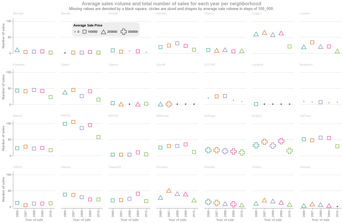
Fancy styled faceted plot. Image created by author.
3. MT Cars — multiple scatter plots => HConcatChart of LayerCharts
Show which factor/feature influence the target, Miles per Gallon, the most: “Horsepower”, “Displacement”, or “Weight in Lbs”.
3a. Sufficiently simple plot
One way to easily compare the relationship between the factors is to create three scatter plots side by side.
[embed]
Using the HConcatChart³⁰ and the |=³¹ three panels are easily created.
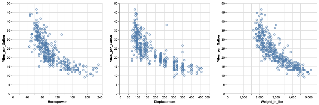
Horizontally concatenated plot. Image created by author.
3b. Fancy plot
To create more insightful plots, we’ll add the following elements:
- Color the points by target value;
- Calculate the R value using
altairmethods; - For each panel add a regression line and add the R value;
- Keep only the left y-axis for the panels.
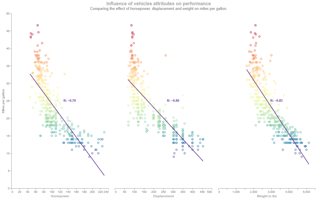
Horizontally concatenated plot with a regression line and the R-value. Image created by author.
To create the chart above the following key elements were used:
- The styling is done at the start with the properties and the configuration of the
HConcatChart³⁰. - Then for each panel a scatter plot, a line plot and a label are layered, and the panels are concatenated. Just like proposed in this SO answer,³² the way to have a continuous color for the scatter plot and set colors for the line and text, is by making a separate base chart. To only have the axis and its labels on the outer left axis, an
altair.Axisis passed with someFalseflags to remove these elements to the other charts.³³ - For the scatter plot the domain of the color scheme is set as the inverse of the range of the values to invert the color scheme, as mention in a Github issue³⁴.
- The regression line was created with the
transform_regressionmethod which is pretty straightforward³⁵. - The most difficult part to achieve and understand was adding an R value to the chart. Based on a SO answer³⁶, I’ve came to a way to calculate the value using
altairmethods, grasp how it works and add it to the chart with some styling. - First, the rows that have missing or incorrect values are removed using
transform_filter³⁷ and theisValid³⁸ expression which returns true if value is notnull,undefined, orNaN, false otherwise. - Next, the
transform_joinaggregatecreates an aggregate and joins it with the dataset.³⁹ In this case the median is calculated for the x and y value which are joined to the dataset. - Then using
transform_calculate⁴⁰ the first part of calculating the covariance is done where for each row the deviations for x and y are multiplied. - In the following step four measures are aggregated with
transform_aggregate⁴¹: the standard deviation for all the x and all the y values, the total amount of elements and the outcome of the previous step is summed. - The last step is calculating the R value, the correlation coefficient, using the measures from previous steps. In the same
transform_calculatestatement the label is created. The SO posts⁴²’⁴³ gave ideas on how the label can be constructed. Either adding data elements and combining it with strings, i.e.:alt.datum.x + "some text" + alt.datum.yor create one string if you want to include formatting using a Vega expression³⁸ such as'format(alt.datum.x, ".2f")+"some text"'. - In
encode, the label field is called as text. - Every layered panel is then horizontally concatenated using the
|=³¹ operator.
4. Iris — multiple scatterplots=> VConcatChart
Plot the sepal length versus the sepal width, and the petal length versus the petal width.
4a. Sufficiently simple plot
Since there is no real connection between the two plots we can put them below each other to try the other concatenation option.
[embed]
And a simple plot appears…
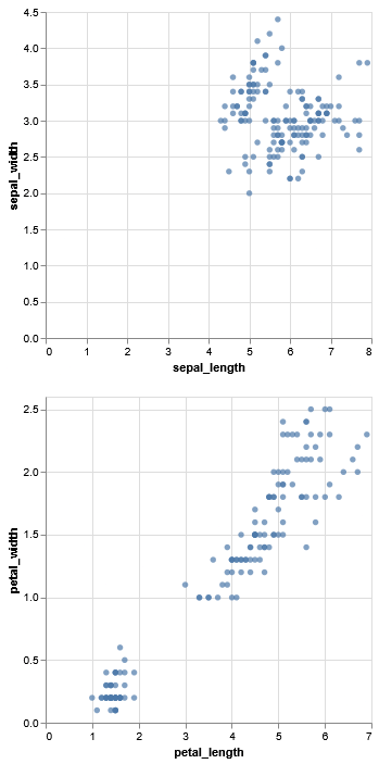
Vertically concatenated plot. Image created by author
4b. Fancy plot
Since creating a scatter plot and concatenating it, is something we can do now, let’s try new things:
- Create the charts in a list comprehension;
- Create a vertical concatenation chart by using the
alt.vconcatmethod; - Add a tool tip;
- Make an interactive chart by creating an interactive legend;
- Give the plots the same axis range for easier comparison.
Using the example from the altair website⁴², an interactive legend is added. With a list comprehension and using zip to get tuple of x and y (for background see my story on the zip function), a list of charts is created that have a tooltip through the use of the tooltip parameter⁴³ and the same axis ranges. The list is unpacked in the alt.vconcat³¹’⁴⁴. Finally, a parameter is added to the concatenated chart to create the interactive legend by creating it with the alt.selection_point⁴⁵ into the add_params method⁴⁶.
To see the interactive figure, go here: https://unicornonazur.github.io/altair_interactive_chart/index.html. The non-interactive version of the chart is shown below.
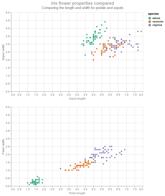
Vertically concatenated plots colored by species. Image created by author.
5. Ames housing — multiple scatter plots => RepeatChart
Show what affects the house sale price the most: the year it was built, the year it was sold, the size of the lot or the overall quality?
5a. Sufficiently simple plot
Reusing some of the code of the previous charts, we can come up with a 2x2 scatter plot chart. It has two charts horizontally concatenated as a row, and the rows vertically concatenated.
[embed]
This creates a plot. However, it is awkwardly shaped, hard to compare the features, and difficult to comprehend.
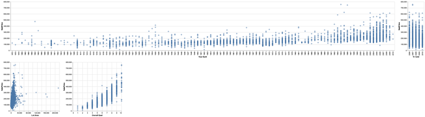
Simple concatenated plots. Image created by author.
5b. Fancy plot
For this last plot, just to try out something new, we’ll do this:
- Use repeat chart;
- Color the points by target value (like chart 3);
- Add a regression line and R-value to show the correlation between feature and target;
- Make the x-axes better comprehensible. As you can see below with out adjustment the left two panels have unreadable axis: so we would like to improve that.
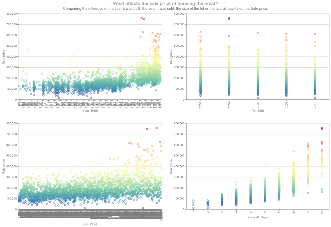
Repeated chart with the default x-axis. Image created by author.
Creating the repeated chart is pretty straightforward by using the alt.repeat() function and the repeat method.⁹
dataset.columns = [col.replace(" ", "_") for col in dataset.columns]
features = ["Year_Built", "Yr_Sold", "Lot_Area", "Overall_Qual"]

scatter_plots = alt.Chart(dataset).mark_point().encode(
    x=alt.X(alt.repeat(), type="quantitative"),
    y=f"{target_property}:Q",
    ).repeat(features, columns=2)
However, some elements seemed unable to adjust to my taste.
- Adjusting the repeated axis on the chart i.e. the title and the range. The title for all the panels can be set to one value but I could not find an option similar to the other charts to format or replace the text. Also, the best I could figure out was setting a bin on the feature to clean up the clutter.
- It is, currently, not possible to layer repeated panels with transformations. You’ll get the error message below.
TypeError: Repeat charts cannot be layered. Instead, layer the charts before repeating.- Lastly, using the original column names proofed very difficult. There are options to handle and escape special characters⁶ in the encoding. Despite all the issues and questions that I read (here, here, here, here and here), I couldn’t find a way to make it work within a transformation.
So, this for now, is the closest I could get using a Repeated chart.
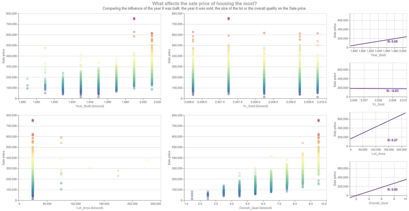
Final chart with a HConcat Chart containing a Repeated Chart and a VConcat Chart. Image created by author.
Deep in Altair
Before I wrap up this story, I would like to dive into two interesting parts of Altair for Python, the declarative nature of the library, and the shorthand for combining plots.
A declarative library
Imperative and declarative programming are two popular programming paradigms. The first one emphasizes the ‘how’ of a program, where the code outlines a detailed step-by-step process for executing the program. You can usually follow this process without much trouble. But as you add more features and lines of code, it can get longer and more complicated, which makes it harder and more time-consuming to read. Users have direct control over every aspect of the plot, allowing for very detailed customization. On the other hand, the second paradigm focuses on the ‘what.’ This approach is simpler and needs less code, which makes it easier to understand. Users specify the elements they want, and the plotting library handles the implementation behind the scenes.⁴⁷’⁴⁸
In Altair documentation, they explain the choice as follows:
The key idea is that you are declaring links between data columns and visual encoding channels, such as the x-axis, y-axis and color. The rest of the plot details are handled automatically. Building on this declarative system, a surprising range of plots, from simple to sophisticated, can be created using a concise grammar.⁴⁹
We saw that coming back in the approach of declaring the three elements: the data, the mark, and the encoding.
Combining plots in Altair
As we have seen the commonly known operators in Python, +, |, and &, are used to combine plots. Normally, these operators are associated with addition, bitwise or, and bitwise and.⁵⁰ In the Altair library these dunder methods are overriding to create this behavior.⁵¹ A trimmed-down version of this code is down below.
# Layering and stacking
def __add__(self, other: ChartType) -> LayerChart:
    return layer(t.cast("ChartType", self), other)

def __and__(self, other: ChartType) -> VConcatChart:
    return vconcat(t.cast("ChartType", self), other)

def __or__(self, other: ChartType) -> HConcatChart | ConcatChart:
    return hconcat(t.cast("ChartType", self), other)
My first impression
The strength of the Altair library are that it’s easy to quickly make charts and the interactive editor allows quick edits to the chart to test out changes. The transformations allow you to do amazing things with the data and its visualization while using just that library.
What I found less wonderful after having spent hours figuring out some methods and details are the following:
- There currently is a lack of detailed documentation on methods, parameters and more. Here are a few examples:
- How to angle text and preferably align the test to a line is not mentioned in the documentation;
- When and how to configure charts. Some things may be done on creating the chart, and others are only allowed after for example layering all the elements. However, I couldn’t find any warning or advice beforehand.
- The order of applying the methods seems to matter. However, I couldn’t find any documentation on knowing how the chain the
mark,encodeandtransformationmethods. In some cases you do the transformation before the encode and sometimes after, and the results vary greatly. - The syntax for
transform_aggregateis vastly different from the othertransformmethods but you’ll have to figure it out on your own. - The same parameter has different effect on different charts.
StrokeOpacityseems to remove a varying number of axis. - Furthermore, some error messages are unclear or absent;
- One error message simply stated “IPython” and nothing else.
- Sometimes the code quietly fails resulting in a null sized empty chart.
- Colors seem to differ between plot types. Having made all the five charts with the same color, you get the feeling that they are slightly different.
- Finally, there unfortunately is no support for animation. There are some resources (for example here and here) but that’s not what I would like from a plotting library.
To conclude
Having spend numerous hours trying out Altair and reading documentation and blogs, I’m happy to have tried out the library. It has not swept me of my feet. The easy of starting with this is greater than I can remember from matplotlib or plotly. But similarly to my experience with seaborn, as soon as you really want to change and adjust to your liking you’ll get bogged down in the nitty gritty details of the language.
All in all, it is a nice graphing library and a good starting point. Just as with most libraries in my experience as soon as you want more you’ll need to invest time to learn the underlying basics.
This story is my way to share my coding experience and the lessons I learned, and to document my solutions. All claps, comments, and highlights are appreciated, as well as sharing the story. For more code and my other links see: https://github.com/UnicornOnAzur/.
[1] https://altair-viz.github.io/getting_started/starting.html
[2] https://www.geeksforgeeks.org/data-science/introduction-to-altair-in-python/
[3] https://altair-viz.github.io/user_guide/data.html
[4] https://altair-viz.github.io/user_guide/marks/index.html
[5] https://altair-viz.github.io/user_guide/encodings/channels.html
[6] https://altair-viz.github.io/user_guide/encodings/index.html
[7] https://altair-viz.github.io/user_guide/transform/index.html
[8] https://altair-viz.github.io/user_guide/transform/filter.html
[9] https://altair-viz.github.io/user_guide/compound_charts.html
[10] https://altair-viz.github.io/user_guide/generated/channels/altair.X.html
[11] https://altair-viz.github.io/user_guide/generated/channels/altair.Y.html
[12] https://altair-viz.github.io/user_guide/generated/core/altair.Axis.html
[13] https://altair-viz.github.io/user_guide/generated/core/altair.Scale.html
[14] https://altair-viz.github.io/user_guide/customization.html
[15] https://github.com/vega/altair/issues/2116
[16] https://altair-viz.github.io/user_guide/generated/channels/altair.Text.html
[17] https://d3js.org/d3-format
[18] https://altair-viz.github.io/user_guide/generated/toplevel/altair.LayerChart.html
[19] https://github.com/vega/altair/issues/975
[20] https://altair-viz.github.io/user_guide/marks/line.html
[21] https://altair-viz.github.io/user_guide/transform/impute.html
[22] https://altair-viz.github.io/user_guide/transform/aggregate.html
[23] https://altair-viz.github.io/user_guide/transform/bin.html
[24] https://altair-viz.github.io/user_guide/interactions/parameters.html
[25] https://stackoverflow.com/questions/72442037/altair-syntax-for-condition-involving-aggregate-field
[26] https://www.geeksforgeeks.org/data-visualization/understanding-facet-wrap-in-altair/
[27] https://altair-viz.github.io/gallery/line_chart_with_cumsum_faceted.html
[28] https://altair-viz.github.io/user_guide/configuration.html
[29] https://linuxtut.com/en/7f9995fd6b0e66880553/
[30] https://altair-viz.github.io/user_guide/generated/toplevel/altair.HConcatChart.html
[31] https://altair-viz.github.io/user_guide/compound_charts.html
[34] https://github.com/vega/altair/issues/1068
[35] https://altair-viz.github.io/user_guide/transform/regression.html
[36] https://stackoverflow.com/questions/61277181/adding-r-value-correlation-to-scatter-chart-in-altair
[37] https://altair-viz.github.io/user_guide/transform/filter.html
[38] https://vega.github.io/vega/docs/expressions/
[39] https://altair-viz.github.io/user_guide/transform/joinaggregate.html
[40] https://github.com/vega/altair/issues/2335
[41] https://github.com/vega/altair/issues/3784
[42] https://altair-viz.github.io/gallery/interactive_legend.html
[43] https://altair-viz.github.io/gallery/scatter_tooltips.html
[44] https://altair-viz.github.io/user_guide/generated/api/altair.vconcat.html
[45] https://altair-viz.github.io/user_guide/generated/api/altair.selection_point.html
[46] https://altair-viz.github.io/user_guide/interactions/parameters.html
[47] https://towardsdatascience.com/declarative-vs-imperative-plotting-3ee9952d6bf3/
[48] https://www.educative.io/blog/declarative-vs-imperative-programming
[49] https://altair-viz.github.io/getting_started/overview.html
[50] https://www.geeksforgeeks.org/python/dunder-magic-methods-python/
https://altair-viz.github.io/altair-tutorial/notebooks/02-Simple-Charts.html
Thank you for being a part of the community
Before you go:

👉 Be sure to clap and follow the writer ️👏️️
👉 Follow us: **X | [Medium](https://medium.com/codetodeploy)**
👉 CodeToDeploy Tech Community is live on Discord — **Join now!**
👉 Follow our publication, CodeToDeploy
Note: This Post may contain affiliate links.
메타데이터
- post_id
- 246d3722e618
- slug
- how-user-friendly-is-altair-really-246d3722e618
- url
- https://medium.com/codetodeploy/how-user-friendly-is-altair-really-246d3722e618
- canonical_url
- https://medium.com/codetodeploy/how-user-friendly-is-altair-really-246d3722e618
- author_url
- https://medium.com/@unicornonazur
- status
- ok
- fetched_at
- 2026-07-14 19:49:40