Using Color in Store Design — How to Recreate the Look of Blooming Trees
Introduction
Using Color in Store Design — How to Recreate the Look of Blooming Trees
Introduction
In the realm of retail, where competition is fierce and consumer preferences constantly evolve, the significance of store design cannot be overstated.
It’s not merely about creating a space to display products; rather, it’s about crafting an immersive environment that engages customers on multiple levels, leaving a lasting impression that goes beyond just making a purchase.
At the heart of effective store design lies the strategic use of color, a powerful tool that can shape perceptions, influence emotions, and ultimately enhance the overall customer experience.
Store design serves as the physical manifestation of a brand’s identity and values. It’s the first point of contact between a business and its customers, setting the tone for the entire shopping experience.
A well-designed store not only attracts attention but also communicates professionalism, creativity, and attention to detail.
From the layout of aisles to the placement of displays, every aspect of design plays a crucial role in guiding customers through the space and encouraging them to explore products further.
Beyond aesthetics, store design also directly impacts business performance. Studies have shown that thoughtfully designed stores can increase foot traffic, boost sales, and foster customer loyalty.
In an era where online shopping continues to rise, creating an inviting and memorable physical environment becomes even more essential for brick-and-mortar retailers to differentiate themselves and draw customers away from their screens.
Among the various elements of store design, color stands out as one of the most potent and versatile. It has the ability to evoke emotions, evoke memories, and even influence purchasing decisions. Different colors carry different connotations and associations, tapping into subconscious perceptions that can shape how customers perceive a brand and its products.
Moreover, color psychology research has revealed the profound impact that specific colors can have on human behavior. Warm tones like red and orange are often associated with energy, excitement, and urgency, making them ideal for stimulating impulse purchases.
In contrast, cool tones such as blue and green evoke feelings of calmness, trust, and reliability, which can be particularly effective in promoting high-end or luxury products.
In the pursuit of creating captivating store environments, designers often draw inspiration from various sources, including nature. One such source of inspiration that holds particular allure is the sight of blooming trees.
In springtime, when trees burst into a riot of colors with their blossoms, it creates a spectacle of beauty and vitality that captivates the senses.
In the following sections, we will delve deeper into the psychology of color, explore strategies for incorporating nature-inspired palettes into store design, and examine real-world examples of retailers successfully bringing the look of blooming trees to life in their stores.
From choosing the right hues to implementing lighting techniques and accents, we will uncover the secrets to creating immersive retail environments that leave a lasting impression on customers.
Understanding the Psychology of Color
Color is a powerful tool that influences human emotions, perceptions, and behaviors in profound ways. Understanding the psychology behind color is essential for creating impactful store designs that resonate with customers on a deep level.
The Impact of Color on Emotions and Behavior
Research in color psychology has shown that different colors can evoke distinct emotional responses and trigger specific behavioral reactions. For example, warm colors like red, orange, and yellow are often associated with energy, passion, and excitement. These hues have been found to increase heart rate and stimulate appetite, making them popular choices for restaurants and food retailers aiming to create a sense of urgency or encourage impulse purchases.
On the other hand, cool colors such as blue, green, and purple are often linked to feelings of calmness, tranquility, and trust. These colors are commonly used in healthcare settings, spas, and wellness brands to promote relaxation and a sense of well-being among customers.
Neutral colors like white, gray, and beige are often used as background tones to provide balance and contrast in store designs. They can create a sense of spaciousness, simplicity, and sophistication, allowing products or accent colors to stand out more prominently.
How Different Colors Evoke Specific Feelings
Each color carries its own set of associations and cultural meanings, which can vary significantly across different societies and contexts. For example:
Red: Symbolizes passion, energy, and urgency. It can also evoke feelings of excitement and intensity. In retail settings, red is often used to grab attention and create a sense of urgency, making it a popular choice for sale signs and promotional materials.
Blue: Represents calmness, trust, and reliability. It has a soothing effect on the mind and is associated with stability and professionalism. Many financial institutions and tech companies use shades of blue in their branding to convey a sense of security and dependability.
Green: Symbolizes nature, growth, and harmony. It is often associated with health, freshness, and sustainability. Green is commonly used in stores selling eco-friendly or organic products to convey a sense of environmental responsibility and wellness.
Yellow: Evokes feelings of happiness, optimism, and warmth. It is often used to grab attention and create a sense of positivity. Yellow is commonly used in retail settings to highlight sales and promotions or to create a cheerful atmosphere in children’s stores.
Purple: Represents luxury, creativity, and spirituality. It is often associated with royalty and extravagance. Purple hues are commonly used in high-end fashion boutiques and beauty salons to create a sense of elegance and sophistication.
Importance of Selecting the Right Color Palette for Your Store
Choosing the right color palette for your store is crucial for creating the desired atmosphere and eliciting the desired emotional response from customers. A well-coordinated color scheme can enhance brand identity, improve navigation, and influence purchasing decisions.
When selecting a color palette for your store, consider factors such as your target audience, brand personality, and the type of products or services you offer. For example, if you’re targeting a younger demographic or selling playful, trendy products, you may opt for bright, bold colors to create a vibrant, energetic atmosphere. Conversely, if you’re targeting a more mature audience or selling luxury goods, you may prefer softer, more muted tones to convey elegance and sophistication.
It’s also important to consider the psychological effects of different colors and how they align with your brand values and objectives. For example, if you want to create a sense of trust and reliability, you may choose calming blue tones for your store’s interior. If you want to evoke feelings of warmth and friendliness, you may opt for inviting shades of yellow or orange.
Ultimately, the right color palette for your store will depend on a variety of factors, including your brand identity, target audience, and desired emotional impact.
Inspiration from Nature: Blooming Trees
In the realm of store design, drawing inspiration from the natural world has long been a celebrated practice. Among the myriad wonders of nature, blooming trees stand out as a particularly enchanting source of inspiration. From the delicate petals of cherry blossoms to the vibrant hues of magnolia flowers, the beauty of blooming trees captivates the senses and ignites the imagination.
Exploring the Beauty of Blooming Trees
The sight of blooming trees in springtime is nothing short of breathtaking. As winter fades away and the weather warms, trees burst into a profusion of colors, transforming the landscape into a tapestry of beauty and wonder. Each blossom represents a moment of renewal and growth, a testament to the resilience of nature and the cycle of life.
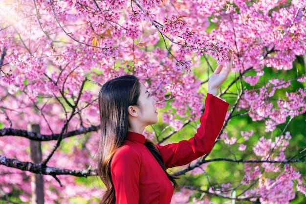
Cherry blossoms, with their ethereal pink petals, are perhaps the most iconic symbol of spring. These delicate flowers adorn trees in parks, gardens, and streetscapes, drawing crowds of admirers eager to witness their fleeting beauty. Magnolia trees, with their large, showy blooms in shades of white, pink, and purple, evoke a sense of grandeur and elegance. And dogwood trees, with their clusters of star-shaped flowers in shades of white, pink, and red, add a touch of whimsy and charm to any landscape.
How Blooming Trees Create a Sense of Vibrancy and Renewal
The sight of blooming trees not only delights the eye but also uplifts the spirit. After months of dormancy, the emergence of blossoms signals the arrival of spring and the promise of warmer days ahead. This sense of renewal and rejuvenation is deeply ingrained in human consciousness, evoking feelings of hope, optimism, and vitality.
Moreover, blooming trees infuse their surroundings with a sense of vibrancy and energy. The vibrant colors of their blossoms create a visual feast for the senses, attracting pollinators and wildlife and transforming ordinary landscapes into extraordinary works of art. Whether planted along city streets, in public parks, or in private gardens, blooming trees have a transformative effect on their environment, bringing joy and beauty to all who encounter them.
Translating the Essence of Blooming Trees into Store Design
The essence of blooming trees — vibrancy, renewal, and natural beauty — can be translated into store design in myriad ways. By incorporating elements inspired by blooming trees, retailers can create immersive environments that engage customers on a deeper level and evoke positive emotions.
One approach is to integrate colors inspired by blooming trees into the store’s color palette. Soft shades of pink, white, and green can be used to create a sense of freshness and vitality, while pops of vibrant color can add visual interest and excitement. These colors can be applied to walls, flooring, furnishings, and decor elements to create a cohesive and inviting atmosphere.
Additionally, retailers can incorporate natural materials and textures into store design to evoke the feeling of being surrounded by blooming trees. Wood accents, stone finishes, and floral motifs can create a sense of warmth and authenticity, while live plants and foliage can bring a touch of nature indoors.
Lighting plays a crucial role in enhancing the beauty of blooming trees and can likewise be used to dramatic effect in store design. Soft, diffused lighting can create a warm and inviting ambiance, while spotlights can highlight focal points and create a sense of drama.
Choosing the Right Colors
In the intricate dance of store design, selecting the perfect color palette is akin to orchestrating a symphony of hues that harmonize effortlessly to create a captivating visual experience. When drawing inspiration from the enchanting beauty of blooming trees, the choice of colors becomes even more significant, as it sets the tone for the entire retail environment and shapes the emotional response of customers.
Selecting Colors Inspired by Blooming Trees
The vibrant palette of blooming trees offers a wealth of inspiration for store designers seeking to infuse their spaces with the same sense of vitality and renewal found in nature. Soft pastel tones of pink, reminiscent of cherry blossoms in full bloom, evoke feelings of innocence, romance, and whimsy. These delicate hues can add a touch of femininity and elegance to a retail environment, creating a sense of warmth and intimacy that invites customers to linger and explore.
Shades of green, ranging from the fresh, springtime green of new leaves to the deeper, more muted tones of foliage, symbolize growth, harmony, and vitality. Green has a calming effect on the mind and is often associated with nature, wellness, and sustainability. Incorporating shades of green into store design can create a sense of balance and tranquility, fostering a connection with the natural world and instilling a feeling of trust and reliability in customers.
White, with its purity, simplicity, and luminosity, serves as a blank canvas upon which the vibrant colors of blooming trees can truly shine. White walls, floors, and furnishings create a sense of spaciousness and lightness, allowing products and accent colors to take center stage. White also symbolizes cleanliness and clarity, making it an ideal choice for retailers seeking to convey a sense of professionalism and attention to detail.
Incorporating Shades of Green, Pink, and White
Incorporating shades of green, pink, and white into store design requires a delicate balance and careful consideration of the desired aesthetic and emotional impact. While each color can stand alone as a dominant feature, they can also be combined in various ways to create harmonious and visually striking compositions.
For example, a retail space inspired by the beauty of cherry blossoms may feature soft pink walls accented with touches of greenery and complemented by crisp white furnishings. This color scheme evokes the feeling of strolling through a springtime garden, with blossoms in full bloom and fresh green leaves rustling in the breeze.
Alternatively, a store design inspired by lush, verdant forests may incorporate rich shades of green on walls and flooring, punctuated by pops of vibrant pink and white accents. This color palette creates a sense of depth and dimension, mimicking the layers of foliage and flowers found in nature and infusing the space with a sense of energy and vitality.
Creating Harmony and Balance in Color Combinations
Achieving harmony and balance in color combinations is essential for creating a cohesive and visually pleasing store environment. One approach is to use a dominant color as a base and accent it with complementary or contrasting hues to create visual interest and depth.
For example, a predominantly green color scheme can be enhanced with pops of pink and white to create contrast and focal points throughout the space. Similarly, a primarily pink or white color palette can be complemented by touches of green to add depth and balance.
It’s also important to consider the psychological effects of different color combinations and how they resonate with the brand identity and target audience. Warm color combinations, such as pink and orange, can create a sense of energy and excitement, while cool color combinations, such as green and blue, can evoke feelings of calmness and serenity.
Implementing Color in Store Design
Once the ideal color palette inspired by blooming trees has been chosen, the next step is to implement these colors effectively throughout the store design. From walls to flooring, furniture to signage, each element plays a crucial role in creating a cohesive and immersive retail environment that resonates with customers.
Wall Colors and Paint Techniques
The choice of wall colors sets the foundation for the overall ambiance of the store. Soft pastel tones of pink, soothing shades of green, and crisp whites can be used to create a backdrop that complements the merchandise and enhances the customer experience.
Paint techniques such as ombre, sponge painting, or stenciling can add texture and depth to the walls, evoking the natural beauty of blooming trees. For example, a subtle gradient of pink from floor to ceiling can mimic the effect of cherry blossoms in full bloom, while a mural depicting a lush forest scene can transport customers to a tranquil woodland retreat.
Flooring Options and Textures
Flooring serves as the literal foundation of the store and plays a significant role in shaping the overall aesthetic and atmosphere. When selecting flooring options, consider textures and patterns that complement the chosen color palette and evoke the feeling of walking through a natural landscape.
For instance, hardwood floors in warm, earthy tones can create a sense of warmth and authenticity, while patterned tiles reminiscent of flower petals can add visual interest and whimsy. Area rugs in soft, plush fabrics can provide contrast and comfort, creating cozy seating areas or defining different zones within the store.
Furniture and Fixtures Selection
Furniture and fixtures serve both functional and aesthetic purposes in store design. When selecting furniture pieces, consider materials, shapes, and finishes that harmonize with the chosen color palette and reinforce the theme inspired by blooming trees.
For example, natural wood furniture with organic shapes and textures can evoke the feeling of being surrounded by nature, while sleek, modern pieces in metallic finishes can add a touch of contemporary elegance. Upholstered seating in soft, pastel hues can provide comfort and contrast against the backdrop of neutral walls and flooring.
Additionally, fixtures such as shelving units, display cases, and lighting fixtures should be chosen to complement the overall aesthetic and enhance the presentation of merchandise. Consider incorporating elements inspired by nature, such as branch-like shelving or floral-inspired lighting, to reinforce the theme and create a cohesive design scheme.
Signage and Branding Elements
Signage and branding elements play a crucial role in communicating the identity of the store and guiding customers through the space. When designing signage and branding materials, ensure that colors, fonts, and imagery align with the chosen color palette and evoke the desired emotional response.
For instance, signage featuring soft, pastel colors and whimsical illustrations can create a playful and inviting atmosphere, while sleek, minimalist designs in muted tones can convey a sense of sophistication and elegance. Incorporating branding elements such as logos, slogans, and graphics into store decor can further reinforce the theme inspired by blooming trees and create a memorable and cohesive brand experience for customers.
Lighting Techniques
Lighting is a powerful tool in store design, capable of transforming the mood, atmosphere, and appearance of a space. When used effectively, lighting can enhance colors, highlight merchandise, and create a memorable shopping experience for customers. In the context of a color palette inspired by blooming trees, lighting plays a crucial role in bringing the vibrancy and beauty of nature indoors.
Importance of Lighting in Enhancing Colors
Lighting plays a fundamental role in enhancing the colors used in store design. The intensity, direction, and color temperature of light can all influence how colors are perceived by the human eye. Proper lighting can make colors appear more vibrant and true to life, while poor lighting can dull their appearance and diminish their impact.
Natural light, in particular, is highly effective at illuminating colors and bringing out their inherent richness and depth. Sunlight contains a full spectrum of colors, allowing hues to appear as they would under natural daylight. By strategically positioning windows, skylights, and glass doors, retailers can maximize the use of natural light in their stores and create a bright, inviting atmosphere that showcases colors at their best.
Utilizing Natural Light for a Fresh and Inviting Ambiance
Natural light has a unique ability to create a sense of warmth, openness, and connection to the outdoors. By allowing ample natural light to flood into the store, retailers can create a fresh and inviting ambiance that draws customers in and encourages them to explore further.
Large windows and glass doors can serve as focal points, framing views of the surrounding landscape and bringing the beauty of nature indoors. Daylighting techniques, such as clerestory windows and light wells, can diffuse sunlight throughout the store, minimizing the need for artificial lighting and creating a more sustainable and energy-efficient environment.
In addition to enhancing colors, natural light can also have a positive impact on the well-being and mood of customers. Studies have shown that exposure to natural light can reduce stress, improve mood, and increase productivity, making it an invaluable asset in store design.
Adding Artificial Lighting for Highlighting Focal Points
While natural light is ideal for creating a bright and airy atmosphere, artificial lighting is essential for supplementing daylight and highlighting focal points within the store. By strategically placing lighting fixtures and controlling their intensity and direction, retailers can draw attention to specific areas, products, or displays.
Spotlights, track lights, and recessed downlights can be used to illuminate merchandise and create visual interest. Adjustable fixtures with dimming capabilities allow retailers to control the intensity of light and create different moods throughout the day. Colored lighting can be used to enhance the colors of merchandise or create a specific ambiance, such as a soft pink glow for a lingerie boutique or a cool blue hue for a technology store.
Incorporating lighting controls, such as timers, sensors, and dimmers, allows retailers to customize the lighting environment to suit the needs of their customers and optimize energy efficiency. By combining natural and artificial lighting techniques, retailers can create dynamic and visually stunning store environments that enhance the beauty of colors inspired by blooming trees and elevate the overall shopping experience.
Creating Visual Interest with Accents
In the intricate tapestry of store design, accents play a crucial role in adding depth, personality, and visual interest to the overall aesthetic. When inspired by the enchanting beauty of blooming trees, accents take on a new dimension, infusing the retail environment with the same sense of vibrancy, freshness, and natural beauty found in nature’s floral wonders.
Incorporating Floral Patterns and Motifs
Floral patterns and motifs are timeless elements that evoke the delicate beauty and ephemeral charm of blooming flowers. Incorporating floral patterns into store design adds a touch of femininity, romance, and whimsy, creating a sense of enchantment and allure that resonates with customers.
From wallpaper and upholstery to textiles and signage, floral patterns can be applied to a variety of surfaces to create visual interest and evoke the feeling of being surrounded by nature’s bounty. Soft pastel hues of pink, white, and green can be used to create a harmonious color palette that complements the overall design scheme and enhances the sense of tranquility and renewal.
Using Plants and Foliage as Decor Elements
Plants and foliage are natural companions to blooming trees, adding texture, color, and life to the retail environment. Whether used as standalone decor elements or integrated into displays and fixtures, plants create a sense of freshness, vitality, and connection to the natural world.
Live plants such as ferns, palms, and succulents can be strategically placed throughout the store to create pockets of greenery and soften the architectural lines. Hanging baskets, planters, and terrariums can be suspended from ceilings or displayed on shelves and countertops, adding height and dimension to the space.
In addition to live plants, retailers can also incorporate faux foliage and botanical-inspired decor accessories such as botanical prints, leaf motifs, and sculptural planters. These elements add visual interest and texture without the need for ongoing maintenance, making them a practical and versatile option for store design.
Adding Pops of Color Through Accessories and Displays
Accessories and displays serve as the finishing touches that bring the entire store design together and create a cohesive and immersive experience for customers. By adding pops of color through accessories and displays, retailers can inject energy, excitement, and personality into the space.
Bold accent colors inspired by blooming trees, such as vibrant pinks, soft greens, and crisp whites, can be incorporated into signage, packaging, and merchandising displays to create focal points and draw attention to specific areas of the store. For example, a display featuring a curated selection of products in shades of pink and green can create a visually striking vignette that showcases the merchandise and reinforces the theme inspired by nature.
In addition to color, retailers can also use accessories such as cushions, throws, rugs, and decorative objects to add texture, pattern, and visual interest to the space. By layering different textures and materials, retailers can create a multi-dimensional and inviting environment that encourages customers to explore, engage, and linger.
Practical Tips for Implementation
Implementing a color-inspired store design that reflects the beauty of blooming trees requires careful planning, attention to detail, and a strategic approach. While the goal is to create a visually stunning and immersive environment, it’s also important to consider practical considerations such as budget constraints, maintenance requirements, and customer feedback. Here are some practical tips for successfully implementing a color-inspired store design:
Budget-Friendly Ways to Incorporate Color into Store Design
Paint and Wallpaper: One of the most cost-effective ways to incorporate color into store design is through paint and wallpaper. Opt for accent walls or focal points to make a bold statement without breaking the budget.
Textiles and Accessories: Introduce color through textiles such as rugs, curtains, cushions, and upholstery. These can be easily updated or replaced to refresh the look of the store without significant investment.
DIY Projects: Get creative with DIY projects such as painted furniture, handmade artwork, or upcycled decor items. This allows for customization and adds a unique touch to the store design on a budget.
Lighting: Utilize colored lighting or LED fixtures to add ambiance and highlight specific areas of the store. Colored bulbs are often inexpensive and can be used strategically to enhance the overall color scheme.
Merchandising Displays: Use colorful packaging, signage, and displays to introduce pops of color throughout the store. This not only adds visual interest but also draws attention to merchandise and promotional items.
Importance of Regular Maintenance for Preserving the Vibrant Look
Maintaining the vibrant look of a color-inspired store design is essential for preserving its visual impact and ensuring a positive shopping experience for customers. Regular maintenance tasks include:
Cleaning: Keep surfaces clean and free of dust, dirt, and debris to maintain the freshness and vibrancy of colors. Regularly dust shelves, wipe down displays, and vacuum or mop floors as needed.
Touch-Ups: Periodically touch up paint or wallpaper to address any signs of wear, fading, or damage. This helps keep the color palette looking crisp and vibrant over time.
Plant Care: If incorporating live plants and foliage into the store design, ensure they receive proper care and maintenance. Water plants regularly, prune dead leaves, and remove any pests or diseases to keep them healthy and vibrant.
Lighting Maintenance: Check and replace light bulbs as needed to ensure consistent illumination throughout the store. Clean light fixtures and lenses to prevent dust buildup and maintain optimal light quality.
Seeking Feedback and Making Adjustments Based on Customer Response
Finally, it’s important to seek feedback from customers and make adjustments to the store design based on their responses. Pay attention to customer reactions, comments, and behaviors to gauge the effectiveness of the color palette and overall ambiance.
Encourage customers to provide feedback through surveys, comment cards, or online reviews. Use this feedback to identify areas for improvement and make adjustments to the store design as needed. This could include tweaking the color palette, rearranging displays, or introducing new accents and accessories to enhance the overall experience.
Additionally, consider conducting A/B testing or pilot programs to experiment with different color schemes or design elements and measure their impact on customer engagement and satisfaction.
Conclusion
As we conclude our exploration of using color in store design, it’s evident that color plays a pivotal role in creating immersive and memorable shopping experiences. Inspired by the beauty of blooming trees, color transforms retail environments into vibrant landscapes that captivate the senses and evoke a sense of renewal and vitality.
Throughout our discussion, we’ve highlighted the significance of color in store design. From influencing emotions and behaviors to shaping perceptions and reinforcing brand identity, color serves as a powerful tool for engaging customers and creating a lasting impression.
We encourage retailers to embrace the beauty of nature-inspired color palettes and experiment with hues inspired by blooming trees. Whether it’s soft pastels evoking cherry blossoms, lush greens reminiscent of foliage, or crisp whites symbolizing purity and renewal, nature offers endless possibilities for creating captivating and inviting store environments.
In the dynamic landscape of retail, creating memorable shopping experiences is essential for building brand loyalty and driving business success. Color plays a central role in shaping these experiences, evoking emotions, guiding behaviors, and leaving a lasting impression.
메타데이터
- post_id
- 2686c74cd7bc
- slug
- using-color-in-store-design-how-to-recreate-the-look-of-blooming-trees-2686c74cd7bc
- url
- https://medium.com/@bispendra1.suren/using-color-in-store-design-how-to-recreate-the-look-of-blooming-trees-2686c74cd7bc
- canonical_url
- https://medium.com/@bispendra1.suren/using-color-in-store-design-how-to-recreate-the-look-of-blooming-trees-2686c74cd7bc
- author_url
- https://medium.com/@bispendra1.suren
- status
- ok
- fetched_at
- 2026-08-04 09:22:19