How to Run a Cohort LTV Analysis Without Spreadsheets (Step-by-Step)
Your average LTV is lying to you — not maliciously, but by omission.
How to Run a Cohort LTV Analysis Without Spreadsheets (Step-by-Step)
Your average LTV is lying to you — not maliciously, but by omission.
That single number on your dashboard quietly averages together your best customers (low churn, high ARPU, fast payback) and your worst (high churn, subsidized by discounts, still underwater on CAC). The result looks acceptable, so you keep spending in all the same places.
Cohort LTV analysis breaks the average open and shows you which customer segments are actually healthy, which are bleeding cash, and exactly where to reallocate budget. This tutorial walks through how to do it in minutes — no spreadsheet required.
Why Average LTV Hides the Real Story
Imagine two acquisition channels: organic search and paid social.
- Organic (Cohort A): ARPU $60, monthly churn 2%, CAC $120
- Paid Social (Cohort B): ARPU $65, monthly churn 9%, CAC $180
On first glance, Cohort B looks slightly better — higher ARPU. But run the LTV numbers:
- Cohort A LTV: ~$1,800 | LTV:CAC ratio: 15x
- Cohort B LTV: ~$430 | LTV:CAC ratio: 2.4x
Cohort B is destroying value. Every customer costs $180 to acquire and returns only $430 — leaving almost nothing after product costs. Meanwhile Cohort A returns $1,800 on a $120 investment.
Blend these two channels together and your “average” LTV might look like $900 with a 5x LTV:CAC. Healthy on paper. A slow disaster in reality.
This is why cohort analysis is not optional for SaaS teams past the early traction phase. It’s the difference between knowing you’re growing and knowing where you’re growing.
What You Need Before You Start
You do not need a data warehouse or BI tool. For each cohort you want to compare, gather these five numbers:
- ARPU — What It Means: Average monthly revenue per customer, Typical Range: $10 — $10K+
- Monthly Churn Rate — What It Means: % of customers leaving each month, Typical Range: 0.5% — 15%
- Customers — What It Means: How many customers in this cohort, Typical Range: 10–10,000+
- CAC — What It Means: Total acquisition cost per customer, Typical Range: $10 — $50K
- Gross Margin — What It Means: Revenue minus direct costs, Typical Range: 50% — 90% (SaaS avg: ~80%)
You can pull ARPU and churn from your MRR tool (Stripe, Baremetrics, or even a spreadsheet). CAC is marketing spend ÷ new customers in the period. If you don’t know exact CAC, use a rough estimate — relative comparisons between cohorts are still valid.
Step-by-Step: Running a Cohort LTV Analysis
Step 1 — Define Your Cohorts
Decide what grouping makes sense for your question. Common approaches:
- Time-based: Q1 vs Q2 vs Q3 signups — tracks the impact of product changes on retention over time
- Plan-based: Basic vs Pro vs Enterprise — reveals which tier has the best unit economics
- Channel-based: SEO vs paid ads vs partner referrals — guides marketing budget allocation
Start with two cohorts. You can add up to five.
Step 2 — Open the Analyzer and Set Global Parameters
**Try the Cohort LTV Analyzer →**
At the top of the tool, set:
- Currency: USD by default (supports 30+ currencies including KRW, EUR, GBP)
- Gross Margin: Leave at 80% unless you know your exact figure — it doesn’t affect relative cohort rankings
Step 3 — Enter Your First Two Cohorts
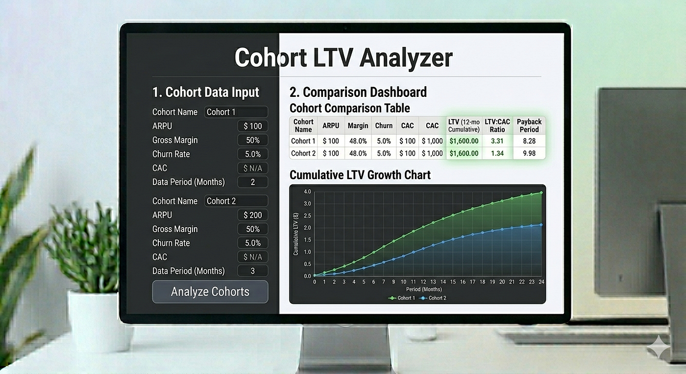
Each cohort gets its own color-coded input card. Fill in:
- A descriptive name (e.g., “Q1 Signups”, “Organic SEO”, “Pro Plan”)
- Monthly ARPU
- Monthly churn rate (%)
- Number of customers
- CAC per customer
If you don’t have real data yet, select an Industry Preset from the dropdown (B2B SaaS, E-commerce, Mobile App, etc.) to auto-fill benchmark values. This is useful for early-stage planning or competitive benchmarking.
Caption: Two cohort cards with color-coded fields — name, ARPU, churn, customers, CAC
Step 4 — Read the Comparison Dashboard
Below your inputs, a comparison table updates in real time:
- LTV — What to Look At: Absolute value over 120-month horizon
- LTV:CAC Ratio — What to Look At: The key health indicator. Below 1x = losing money. 3x+ = healthy. 5x+ = excellent
- CAC Payback — What to Look At: Months to recover acquisition cost. Under 12 months = strong cash efficiency
- Customer Lifespan — What to Look At: Average months before churn. Calculated as 1 ÷ monthly churn rate
- Health — What to Look At: Automatic badge: Critical / Warning / Adequate / Healthy / Excellent
The last row shows the Blended Average — a customer-weighted average across all cohorts. This is your actual portfolio health, not a simple mean.
**Start Your Cohort Analysis →**
Step 5 — Interpret the LTV:CAC Ratio Chart
This is the chart most SaaS tools don’t show you.
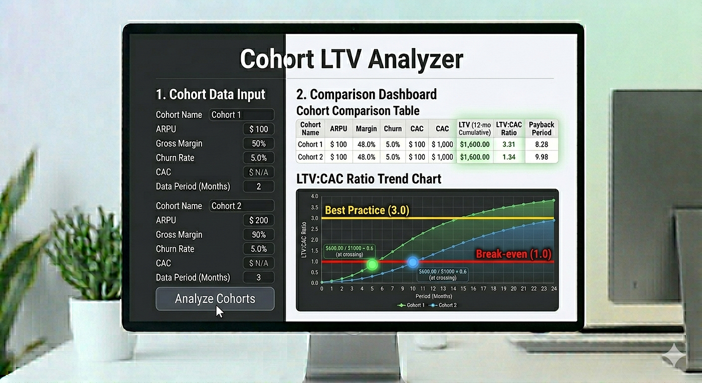
The X-axis is time (months 0–36). The Y-axis is cumulative LTV divided by CAC. Two reference lines appear:
- Orange dashed line at 1.0 — break-even point (you’ve recovered your acquisition cost)
- Green dashed line at 3.0 — healthy threshold
Watch where each cohort’s curve crosses the 1.0 line. That’s the CAC payback point — marked automatically on each curve. A cohort that crosses at month 6 vs one that crosses at month 20 tells you everything about cash flow sustainability.
Caption: LTV:CAC ratio over 36 months — orange line is break-even (1.0), green is healthy threshold (3.0)
Step 6 — Use the Retention Curves to Diagnose Churn
The retention chart shows (1 - churn_rate)^t for each cohort over 36 months, with a horizontal reference line at 50% retention (the half-life marker).
A cohort with 2% monthly churn retains 79% of customers at 12 months. A cohort with 8% monthly churn retains only 37% at the same point. If you’ve made product changes between cohorts, this chart shows whether those changes actually moved the needle.
Step 7 — Check the Acquisition Efficiency Scatter Plot
The scatter plot maps each cohort on two axes: CAC (x) and LTV (y). The bubble size represents customer count. A diagonal line at LTV:CAC = 3x divides the chart into quadrants:
- Ideal (upper left): High LTV, low CAC — scale this aggressively
- Premium (upper right): High LTV, high CAC — monitor payback carefully
- Efficient (lower left): Low LTV, low CAC — acceptable for volume plays
- Risky (lower right): Low LTV, high CAC — reallocate or pause immediately
Step 8 — Act on the Cohort Advisor
Scroll to the Cohort Advisor section. It evaluates your inputs against 9 rules and surfaces automated insights ranked by severity:
- Critical (red): Negative unit economics, extreme churn over 15% monthly
- Warning (amber): Churn disparity between cohorts, payback over 12 months, blended LTV:CAC below 3x
- Strength (green): Best performer identified, fast payback under 6 months, strong retention under 2%
Each insight comes with a specific action: “Pause acquisition for this segment”, “Double down on this channel”, “Investigate onboarding differences between Q1 and Q2.”
Advanced: SaaS Cohort Benchmarks by Stage
Not sure if your numbers are good? Compare against stage-appropriate benchmarks:
- Seed — Monthly Churn: 8–15%, LTV:CAC: 1–2x, CAC Payback: 18–24 months, Typical ARPU: $20–$50
- Series A — Monthly Churn: 5–8%, LTV:CAC: 2–3x, CAC Payback: 12–18 months, Typical ARPU: $50–$200
- Series B — Monthly Churn: 3–5%, LTV:CAC: 3–5x, CAC Payback: 6–12 months, Typical ARPU: $100–$500
- Growth — Monthly Churn: 1–3%, LTV:CAC: 5–8x, CAC Payback: 3–6 months, Typical ARPU: $200–$2,000+
Sources: OpenView SaaS Benchmarks, Bessemer Cloud Index, ChartMogul SaaS Metrics Report
A few observations that save founders from false alarms:
Seed stage: 10% monthly churn is brutal but survivable. What matters is the trajectory — if Q2 churn is lower than Q1, you’re finding PMF. If it’s higher, you have a systematic product problem.
Series A: Investors expect unit economics to turn positive. A blended LTV:CAC of at least 2x with a path to 3x is the minimum credible story. Your best-performing cohort should be at 3x or above already.
Series B: CAC payback under 12 months is table stakes for efficient growth. If any significant cohort is above 18 months, you have a cash flow risk that compounds as you scale.
Growth stage: Monthly churn below 3% and LTV:CAC above 5x unlocks aggressive reinvestment. This is where the math of compounding customer value becomes very powerful.
Practical Tip: Use Scenario Cohorts
You don’t need real historical data to get value. Create a “Current State” cohort with your actual numbers and a “Target State” cohort with improved churn or ARPU. The LTV delta tells you exactly how much each improvement is worth in lifetime value — useful for prioritizing engineering and CS resources.
Privacy and Data Security
All calculations run entirely in your browser. No data is sent to any server. Input fields for ARPU, CAC, and churn rates never leave your machine. You can safely analyze unannounced pricing tiers, unreleased cohort data, or acquisition cost information you wouldn’t want competitors to see.
FAQ
How many cohorts should I compare at once?
Start with two. The comparison is most actionable when you have a clear “better” and “worse” cohort to learn from. Add a third when you want to see a trajectory (e.g., Q1, Q2, Q3 to show improvement over time). Five cohorts works well for plan-tier comparisons (Basic / Growth / Pro / Business / Enterprise).
My churn rate is 15% monthly. Is the tool even useful at that rate?
Yes — especially at that rate. High-churn cohorts are exactly where the LTV:CAC ratio chart is most revealing. You’ll likely see the curve never reaching 3x within 36 months, which quantifies how much value is being destroyed. Use it to calculate how much churn reduction is needed to reach 3x.
What is the difference between this tool and a SaaS LTV calculator?
A standard SaaS LTV calculator computes a single number for a single scenario. This cohort analyzer compares multiple customer groups simultaneously, produces six visualizations, and generates automated action recommendations. It’s designed for decision-making across segments rather than a single data point.
What if I don’t have CAC data yet?
You can set CAC to zero — the tool will calculate LTV and customer lifespan but will disable unit economics metrics like LTV:CAC ratio and payback period. For early-stage estimates, use your total monthly marketing spend ÷ new customers in that month as a proxy.
Can I use this for non-SaaS businesses?
Yes. The underlying model (finite-sum LTV with monthly churn) works for any subscription or recurring revenue business — mobile apps, newsletters, e-commerce subscription boxes, marketplaces with repeat purchase rates. Adjust ARPU to reflect your average transaction or subscription value per customer per month.
Related Tools
If you found cohort LTV analysis useful, these related tools cover complementary aspects of SaaS financial modeling:
- **SaaS LTV Calculator** — Single-scenario LTV with industry benchmarks and sensitivity analysis
- **Ad Revenue Calculator** — Model ad-funded revenue alongside subscription revenue
- **Cashflow Simulator** — Project long-term financial health with Sankey flow visualization
**Try the Free Cohort LTV Analyzer →**
No signup. No spreadsheet. Results in under 5 minutes.
메타데이터
- post_id
- 2849d14acaa3
- slug
- how-to-run-a-cohort-ltv-analysis-without-spreadsheets-step-by-step-2849d14acaa3
- url
- https://medium.com/@defifarmer/how-to-run-a-cohort-ltv-analysis-without-spreadsheets-step-by-step-2849d14acaa3
- canonical_url
- https://medium.com/@defifarmer/how-to-run-a-cohort-ltv-analysis-without-spreadsheets-step-by-step-2849d14acaa3
- author_url
- https://medium.com/@defifarmer
- status
- ok
- fetched_at
- 2026-06-09 15:37:30