The Romance of Antique Maps: Why a Hand-Drawn World Looks Different from a Printed One.
The Romance of Antique Maps: Why a Hand-Drawn World Looks Different from a Printed One.
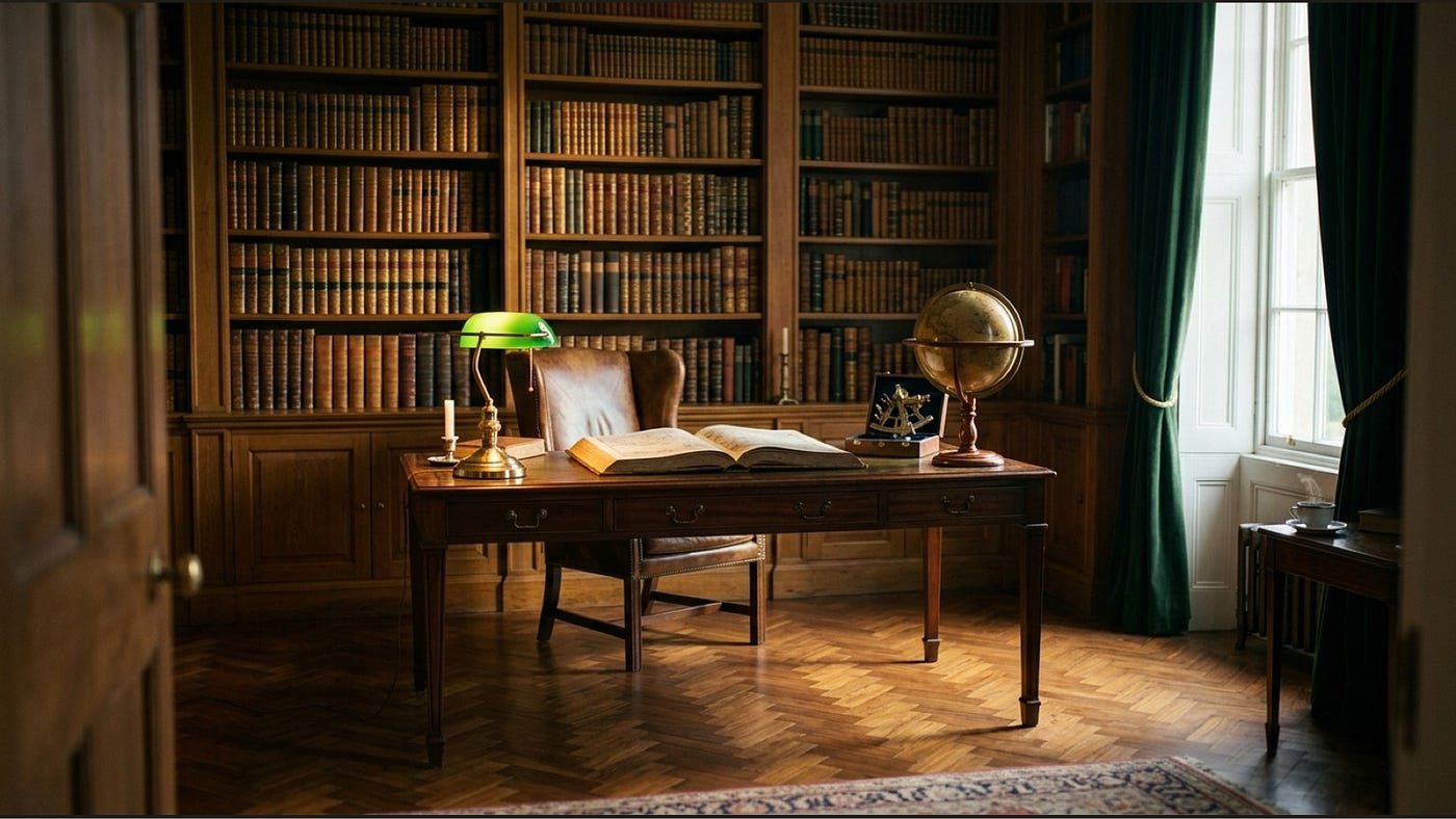
On Joan Blaeu, the burin, sea monsters, and what we lost when cartography got perfect.
There is a particular kind of quiet you fall into when you sit with an antique map for long enough.
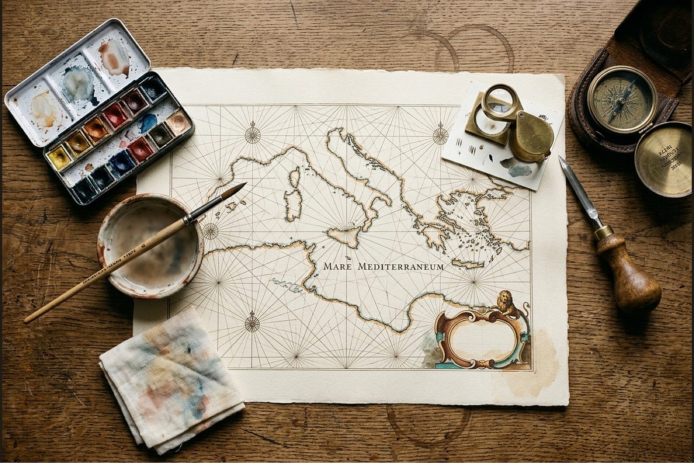
The first one I ever really sat with was a digitised Joan Blaeu plate of the Mediterranean — the kind with five compass roses scattered across the sea, rhumb lines radiating from each one in faded sepia, a leviathan rising between Sicily and the African coast, and Latin lettering so hand-cut and slightly wobbling that you can almost see the engraver pausing to flex his wrist.
I had it open on my laptop while I was supposed to be doing something else, and I lost about forty minutes.
What I want to write about here is what I think I lost — and what I think a lot of us are quietly missing on our walls — when cartography became a thing that machines were better at than people.
A Brief, Honest History of Why These Plates Exist
In 1662, a Dutch printer named Joan Blaeu published the Atlas Maior, a multi-volume world atlas containing nearly 600 hand-coloured engraved maps. It was the most expensive book a private collector could buy in the 17th century. It took ten years and a workshop of engravers, colourists, and binders to produce a single complete set. The plates inside were the result of a specific chain of skilled hands:
A cartographer would draw the master.
An engraver would cut a mirror-image of that drawing in reverse onto a copper plate, using a V-shaped chisel called a burin. The deeper the cut, the darker the line; the shallower the cut, the finer the line. The plate was the matrix from which every print was pulled.
A printer would ink the plate, wipe it back so the ink remained only in the engraved grooves, lay damp rag-pulp paper over it, and run it through a heavy press. The pressure pushed the paper into the grooves to pick up the ink — and also pushed the paper against the smooth edges of the plate, leaving a slight pressed indentation just inside the bleed. You can still feel it with a fingernail on an original.
Finally, a colourist would hand-tint the print with watercolour washes. The colourists were often a separate workshop, paid by the plate. They worked fast, which is why on real Blaeu plates the colour pools at the edges of the engraved lines instead of sitting perfectly inside the coastlines.
Every print in every Atlas Maior went through that whole chain. Every print is therefore slightly different from every other print. There is no “master file.” There is only the plate, the press, the paper, and the people who pulled it.
This is what I think most modern maps on walls are missing. Not the look. The labour.
What I Notice When I’m Looking
After spending a few months going through every digitised Blaeu, Hondius, and Mercator I could find, I started noticing things I’d never been able to articulate before.
The line breathes.
A burin cut can swell where shadow needs weight and thin where a line tapers into highlight. A modern reproduction — vector traced, digitally redrawn — almost always has uniform line weights, because that’s what’s easy to do digitally. The Blaeu coastlines feel like a hand made them because a hand made them.
Foxing is a certificate.
I used to think foxing — those small brown age spots — meant a plate had been mistreated. It actually means the opposite. It’s a slow oxidation that happens to almost all rag-pulp paper from the period. Most antique-map dealers leave it alone, or even prefer it, because it’s a quiet certificate of age. A 1640 Blaeu without any foxing is more suspicious than one with it.
The colour bleeds.
The watercolour wash on a real hand-coloured plate doesn’t sit perfectly within the engraved coastlines. It pools at the edges, sometimes overshoots, sometimes thins out unevenly. The colourists were skilled but they were fast — paid by the plate, working from light to dark — and the work has that human looseness. Machine-applied colour, by contrast, is too clean to be believable.
The cartouche is personal.
The cartouche is the decorative scrollwork frame around the title of a plate. It’s where the engraver got to show off — putti, sea creatures, classical figures, ribbons, sometimes a tiny self-portrait. Every cartouche on every plate in an atlas is its own composition. They aren’t repeated. If you see the same cartouche on two “different” plates being sold separately, one of them is a copy.
The Latin script wobbles.
The text on a Blaeu plate isn’t typeset. It was cut into the copper by hand, letter by letter, in mirror image. If you look closely the letterforms wobble very slightly — the engraver’s wrist, made visible. A reproduction using a digital “Trajan” or similar will always look uniform by comparison.
These are the details I started chasing after a friend told me she couldn’t tell why an antique chart on her wall felt so different from a poster of the same map. The difference is in the line, the colour, the foxing, the cartouche, the script. The difference is the evidence of a person.
Why It Matters Now
I think a lot of us are walking around quietly hungry for things that show evidence of having been made. Our phones, our cars, our refrigerators, our walls — they’re all increasingly the result of processes designed to eliminate the visible hand. Everything fits. Everything is uniform. Everything is “premium.”
And the result is rooms that look like a magazine and feel like a hotel.
I think there’s a small, slow rebellion happening in interior design right now that I want to name. People are bringing back the visible hand. Real plaster instead of skim coat. Hand-thrown ceramics instead of stacking sets. Linen with slubs in it. Floors with knots. Stone with veins. Wallpaper with pattern repeats you can spot. A book on a bedside table with a creased spine.
Antique cartography fits into that rebellion perfectly. A real plate from the 17th century has everything modernity tries to sand off — the wobble, the bleed, the foxing, the asymmetric cartouche, the sea monster the engraver drew because he felt like it. A wall with one of these on it looks lived-in even if you only hung it yesterday.
How to Bring It Home Without Buying a Real Blaeu

Let me be honest. A real Joan Blaeu plate from the Atlas Maior sells at auction for somewhere between two thousand and twenty-five thousand dollars depending on the region and condition. Most of us aren’t doing that.
What we can do is hang work that respects the same tradition. A few thoughts on what to look for, whether you’re shopping vintage prints on Etsy, sourcing reproductions from a museum gift shop, or making your own:
Look for evidence of the hand.
Variable line weights. Wobbly hand-lettering. A cartouche that isn’t perfectly centred. Hand-tinted colour that pools or bleeds at the edges. A subtle paper grain. Any of these signals you’re looking at work that respects the craft. Vector-traced reproductions look too clean — they read as design, not as document.
Mind the foxing.
A few age spots are good. They tell the story. Heavy foxing across the whole image starts to feel like a costume; a few foxing points at the edges and corners feel like a quiet whisper.
The frame should be slim and warm.
Antique maps look best in slim frames that don’t compete with the artwork — natural oak, antique brass, dark walnut, weathered driftwood. Wide ornate gilt frames will overpower the plate. Save those for portrait paintings.
Group by orientation, not by content.
A wall of all-square cartography plates reads as a curated collection. A wall mixing portrait, landscape, and square plates reads as a clutter unless you really know what you’re doing. The Dutch atlases bound their plates in spreads of two facing pages — there’s a reason. Symmetry helps the eye breathe.
Don’t centre. Don’t shrink-wrap.
An antique chart hung dead-centre over a sofa looks like a hotel painting. Hung slightly off-centre, leaned against a wall, or anchored on one side of a bookshelf — it starts to look like yours.
A Last Thought
The thing I keep returning to, when I think about why I’m spending so much of my time these days drawing and painting in the tradition of the Dutch Golden Age cartographers, is that I think the appeal of an antique map isn’t about geography at all. It’s about evidence.
Evidence of a person who sat at a desk in Amsterdam in 1660 with a copper plate and a burin and decided that the kraken in the Pacific needed seven tentacles, not eight. Evidence of a colourist whose hand was a little tired by the time she got to the watercolour wash on the Mediterranean and let the blue pool a little too far up the Italian coast. Evidence of a press operator pulling the paper off the plate and seeing the impression he’d just made.
A wall with that kind of evidence on it is a room that feels lived in by an interesting mind, even if you’ve only lived in it for a year.
I think that’s worth fighting for.
메타데이터
- post_id
- 2bb85b3360e7
- slug
- the-romance-of-antique-maps-why-a-hand-drawn-world-looks-different-from-a-printed-one-2bb85b3360e7
- url
- https://medium.com/@broniversetech/the-romance-of-antique-maps-why-a-hand-drawn-world-looks-different-from-a-printed-one-2bb85b3360e7
- canonical_url
- https://medium.com/@broniversetech/the-romance-of-antique-maps-why-a-hand-drawn-world-looks-different-from-a-printed-one-2bb85b3360e7
- author_url
- https://medium.com/@broniversetech
- status
- ok
- fetched_at
- 2026-06-09 15:37:30