UX for Wearables: Visual vs. Haptic Interaction Design
Designing for wearables is not about “shrinking apps.” It’s about rethinking interaction altogether. The screen may be small, but invaluable
UX for Wearables: Visual vs. Haptic Interaction Design
UX for Wearables: Visual vs. Haptic Interaction Design
I still recall the first time I tried on a smartwatch, many years ago. It was a birthday gift from my hubby, who said, “You are always on your phone, moving forward, this will change how you live.” At first, I was skeptical. A smaller screen? Tiny icons? But then, something happened.
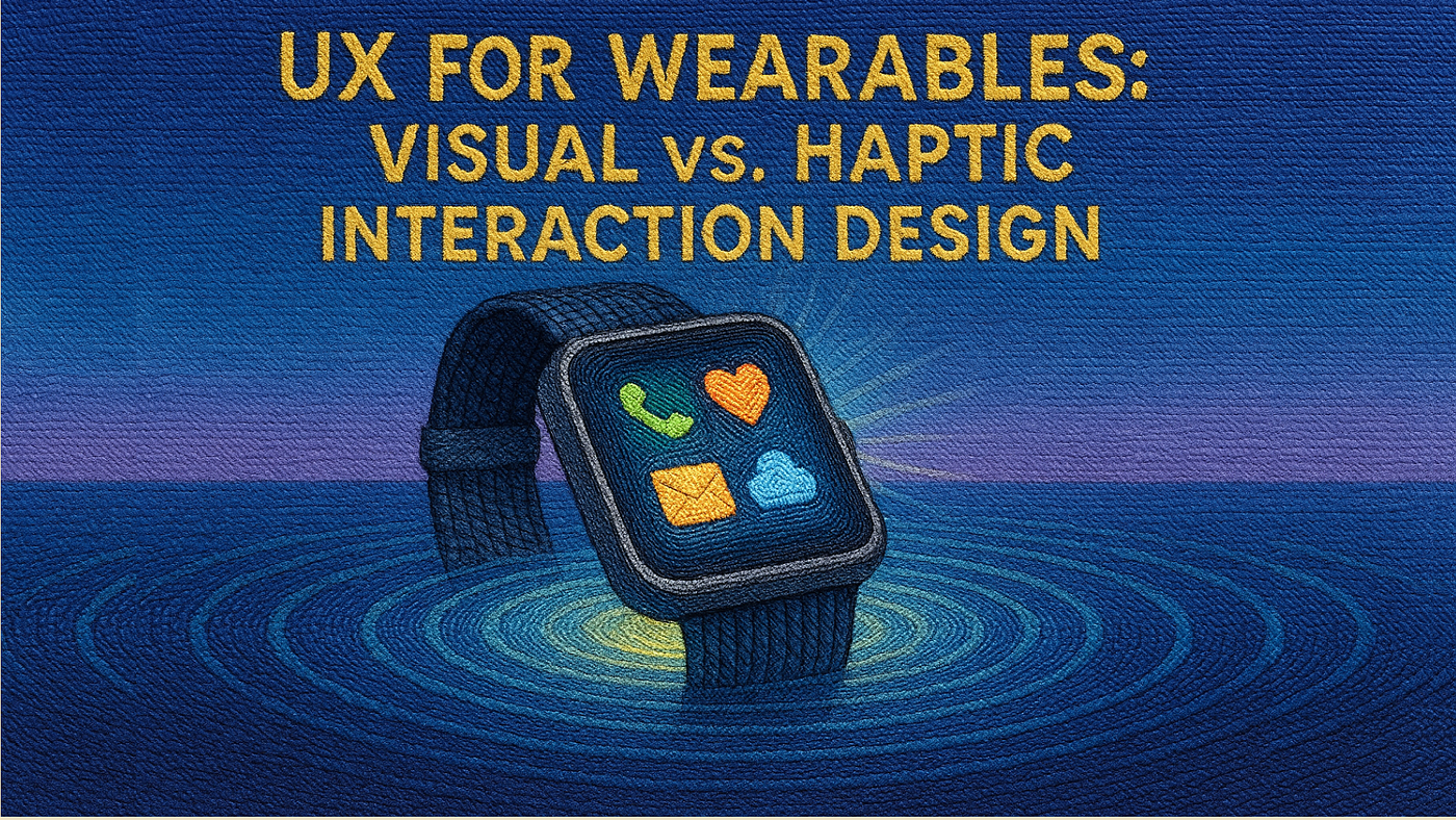
I was in a meeting when my wrist buzzed lightly; no loud ringtone, no disruptive vibration. Just a subtle tap telling me, “you’ve got a message.” That moment was my first real taste of haptic UX. Unlike the visual overload of apps on my phone, this was quiet, personal, and seamless.
That experience taught me something powerful: wearables don’t just shrink our smartphone screens onto our wrists. They introduce a new design frontier where visual interfaces and haptic interactions need to work hand in hand.
The Promise and Challenge of Wearable UX
Wearables, from Apple Watch to Fitbit to medical-grade health trackers, are becoming deeply personal devices. Unlike phones, they live on our skin, sense our bodies, and respond instantly. But this intimacy comes with a design challenge:
- Tiny screens make visual design constrained.
- Constant use requires interactions to be intuitive and non-intrusive.
- Context matters as people don’t use wearables like they do smartphones.
This is why designers must carefully balance visual UX (what users see) with haptic UX (what they feel).
Case Study 1: Apple Watch and the “Taptic Engine”
Apple revolutionized wearable UX with its Taptic Engine. Instead of generic vibrations, it introduced distinct haptic cues. For example:
- A navigation tap for turning left feels different from turning right.
- Heartbeat notifications mimic an actual pulse, creating emotional resonance.
- Subtle nudges let users check time discreetly without pulling out their phones.
By designing haptics as part of the UX language, Apple created an interaction system where touch communicates as clearly as visuals.
Case Study 2: Google Fitbit and Visual Simplicity
Fitbit leaned heavily on visual minimalism. Their UI focuses on glanceable data: steps, heart rate, sleep. No clutter, no distractions. They also rely on color psychology, such as green for success, red for alerts, to convey meaning quickly.
When paired with gentle haptics (like a buzz when daily goals are achieved), Fitbit combines visual and haptic UX to encourage healthy habits without overwhelming users.
Case Study 3: Haptics in Healthcare Wearables
Healthcare wearables like continuous glucose monitors (CGMs) for diabetics show how haptic UX can literally be life-saving.
Instead of flashing alerts on tiny screens, these devices often use customized vibrations to warn patients about dangerous blood sugar levels. Research shows that haptic alerts are faster and more reliable for patients, especially in noisy or visually distracting environments.
Why Balance Matters: Visual vs. Haptic
Visual UX is still essential; for example, charts, icons, and notifications help users interpret complex data. But haptics brings:
- Discretion (a tap is private, a screen flash is not)
- Accessibility (supports users with visual impairments)
- Emotional depth (a haptic heartbeat feels more human than a blinking icon)
The key isn’t choosing one over the other, it’s designing experiences where both work together.
The Future of Wearable UX
Looking ahead, we can expect:
- Personalized haptic patterns whereby your watch “learns” your preference for intensity.
- Multi-sensory feedback for combining sight, touch, and even sound.
- Context-aware interactions for wearables that change how they alert you depending on whether you’re running, sleeping, or in a meeting.
Companies like Meta Reality Labs are already experimenting with haptic gloves that simulate touch in virtual environments. Imagine the possibilities for accessibility, gaming, and remote work.
Closing Remarks
Designing for wearables is not about “shrinking apps.” It’s about rethinking interaction altogether. The screen may be small, but the opportunity is huge, especially when visual and haptic design work in harmony.
As UX designers, our challenge is to ask: How can touch, sight, and subtle cues create experiences that feel natural, empowering, and even emotional?
What’s one wearable interaction you found delightful or frustrating? Share your story. Let’s explore how we can make wearables more human-centred together.
References
- Apple Watch User Guide
- Taptic/Haptic Feedback
- Taptic Engine
- Get to know the redesigned Fitbit app
- A Review of Haptic Technology Applications in Healthcare
- Smart Wearable Systems for Health Monitoring
- Inside Reality Labs Research: Bringing Touch to the Virtual World
BlessingNuggets #Apple #Google #UXDesign #Wearables #Haptics #AppleWatch #FitbitUX #UserExperience
메타데이터
- post_id
- 2d3f933a4641
- slug
- ux-for-wearables-visual-vs-haptic-interaction-design-2d3f933a4641
- url
- https://medium.com/@blessingokpala/ux-for-wearables-visual-vs-haptic-interaction-design-2d3f933a4641
- canonical_url
- https://medium.com/@blessingokpala/ux-for-wearables-visual-vs-haptic-interaction-design-2d3f933a4641
- author_url
- https://medium.com/@blessingokpala
- status
- ok
- fetched_at
- 2026-07-19 09:32:00