Color systems for the Web in AI: Guide to palettes, tokens, and perceptual consistency
There’s a moment in every design system’s life when someone asks, “Can we adjust the brand color, so it can….?” — and the entire team goes…
Color systems for the Web in AI: Guide to palettes, tokens, and perceptual consistency
There’s a moment in every design system’s life when someone asks, “Can we adjust the brand color, so it can….?” — and the entire team goes quiet. If that question fills you with dread instead of confidence, your color system isn’t a system. It’s a pile of hex codes in a trench coat.

https://mood-to-colors.vercel.app/
This article is for designers and engineers who already familiar what #RRGGBB means and want to stop arguing about it in PRs. We’ll go from the physics of color perception down to the CSS custom properties you’ll ship on Monday — covering color theory, color models (with a serious case for OKLCH), palette architecture, look-and-feel analysis, and the token discipline that separates a real design system from a Figma file with opinions. Here is the markdown logic file I have refined for references — https://github.com/Ictraeh/designers-pandora-box/blob/main/Mood%20to%20Color/AI_PALETTE_SWITCH_GUIDELINES.md
Why color systems matter more than you think
Color is the single most loaded variable in a UI. It carries brand identity, signals interactivity, encodes state (success, error, warning), establishes hierarchy, and quietly determines whether 8% of your male users can tell your “delete” button apart from your “cancel” button.
A scalable color system isn’t a Pinterest board. It’s infrastructure. It needs to:
- Survive rebrands without a 600-file find-and-replace.
- Support light and dark modes without doubling your maintenance burden.
- Meet WCAG contrast minimums by construction, not by accident.
- Express brand personality while remaining functionally legible.
- Scale across products, platforms, and themes (think Airbnb’s marketplace vs. host tools, or Google’s Material across Workspace, Search, and Android).
When color is treated as decoration, you get inconsistency, accessibility lawsuits, and engineers hardcoding *#3B82F6* in 47 components. When it’s treated as a system, you get the kind of visual coherence that lets a company refresh its identity in a sprint instead of a quarter (I guess that is how some tech chore piled up?)
Color theory 101: Hue, Saturation, and Lightness
Let’s firstly check about how humans actually perceive color. Three properties define almost every meaningful color decision in UI (skip it if you already know this):

https://elementor.com/blog/color-theory-web-design/
Hue
Hue is the wavelength identity of a color — what we colloquially call “red,” “blue,” or “teal.” It’s measured in degrees on a 360° wheel: 0° red, 120° green, 240° blue. Hue carries the heaviest psychological signal: warm hues (reds, oranges, yellows) feel energetic and immediate; cool hues (blues, greens, purples) feel calm, trustworthy, technical.
Saturation (Chroma)
Saturation describes how pure or vivid a hue is. A fully saturated red is a fire-engine red; desaturate it and you walk it toward grey. In UI, saturation is your volume knob:
- High saturation → demands attention (CTAs, alerts, brand moments)
- Mid saturation → confident but livable (most product surfaces)
- Low saturation → neutral, calm, professional (backgrounds, body text, large fields)
Pro tip: a common rookie mistake is making every color in a palette equally saturated. The result feels like a children’s toy aisle. Saturation should follow hierarchy — neutrals barely there, accents loud.

Lightness
Lightness is how much white or black is in the color — from 0 (pure black) to 100 (pure white). Lightness drives readability and hierarchy more than hue does. The contrast between a lightness=15 background and a lightness=92 text color is what makes a UI legible — not which hue you picked.
Here’s the catch that breaks most early palettes: HSL’s “lightness” doesn’t match what your eyes perceive as equally light. A 50% lightness yellow looks much brighter than a 50% lightness blue. This is the perceptual problem OKLCH solves, which we’ll get to shortly.

https://dev.to/matfrana/the-mystery-of-tailwind-colors-v4-hjh
Making Sense of RGB, CMYK, HSL, and OKLCH
Color models are just different coordinate systems for describing the same physical phenomenon. Each was designed for a different problem, and using the wrong one is how you end up with a palette that looks great in Figma and radioactive in production.
RGB (and Hex) — The Machine’s Language

https://15462.courses.cs.cmu.edu/fall2019/article/16
RGB mixes red, green, and blue light additively, mapping directly to how screens emit photons. Hex (#FF5733) is just RGB in base-16 shorthand. It’s universal, performant, and completely unintuitive for humans. You cannot look at #7C3AED and know it’s a vibrant violet. You cannot mentally darken #3B82F6 by 10%. RGB is a transport format, not a thinking format.
Use it for: final output, storage, browser compatibility.
CMYK — The Print World

https://mixam.co.uk/support/cmykvsrgb
CMYK (cyan, magenta, yellow, black) is a subtractive model used in print. Inks absorb light rather than emit it, so the math is inverted. CMYK has a smaller gamut than RGB, which is why your gorgeous neon green website looks like sad moss on a printed brochure.
Use it for: print collateral. Never for screens. If a developer hands you CMYK values for a website, gently confiscate their laptop.
HSL — The designer’s childhood friend

https://en.wikipedia.org/wiki/HSL_and_HSV#/media/File:Hsl-hsv_models.svg
HSL (hue, saturation, lightness) was the first widely-supported model that thought in human terms. It’s been the default in CSS for years, and it’s fine — until you try to build a tonal scale.
The problem: HSL is mathematically uniform but perceptually warped. Compare these two HSL colors at identical lightness:

hsl(60, 100%, 50%) — yellow, looks blindingly bright

hsl(240, 100%, 50%) — blue, looks deeply dark
Same “lightness” value. Wildly different perceived brightness. Build a tonal scale in HSL and your “500” yellow will visually outweigh your “500” blue every time. This is why automated dark-mode conversions in HSL look like garbage.
OKLCH — The Modern Web Standard

https://en.wikipedia.org/wiki/Oklab_color_space#/media/File:Oklab_vs_oklch.png
OKLCH (lightness, chroma, hue) is built on the Oklab color space, designed by Björn Ottosson in 2020 specifically to fix HSL’s perceptual problems.

It’s now natively supported in CSS:
color: oklch(0.7 0.18 145);
/* lightness 0.7, chroma 0.18, hue 145° */
Why OKLCH wins for modern web work:

For modern design systems — especially anything that needs to programmatically generate dark modes, theme variants, or accessible state colors — OKLCH is the right default for your internal math, even if you output hex for legacy compatibility. Tailwind v4, Radix Colors, and most serious design systems shipping in 2025 have made the switch.
The practical workflow: think and compute in OKLCH, ship in whatever format your stack requires.
The logic of building a website color palette
A good palette is not “five colors I like.” It’s a role-based system where every color has a job, and every job has a color. Here’s the architecture used at the design-system level:
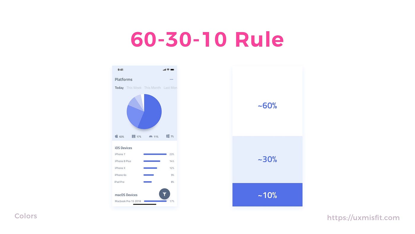
https://uxmisfit.com/2019/05/21/ui-design-in-practice-colors/
1. Primary
Your brand’s signature color. The one that appears in the logo, the primary CTA, and the focus ring. It should be distinctive, accessible against your backgrounds, and reproducible across screens, print, and merchandise.
2. Secondary
Supports the primary without competing. Often used for secondary actions, supporting brand moments, or category differentiation in larger products. Many products skip this and use neutrals + a single accent — that’s a valid choice.
3. Neutrals
The unsung hero. Neutrals carry 80%+ of your interface — backgrounds, surfaces, borders, body text, dividers, disabled states. A great neutral ramp is the difference between a UI that feels premium and one that feels like a 2014 admin dashboard.
Build a tonal scale of 9–12 steps from near-white to near-black, slightly tinted toward your brand’s temperature (warm grey for cozy brands, cool grey for technical ones, true grey for neutral).
4. Accent
Decorative or highlight color used sparingly — illustrations, badges, data visualization. Distinct from primary, which carries interaction meaning.
5. Semantic Colors
Encode meaning, not brand:
- Success — typically green
- Warning— typically amber/orange
- Error/Danger — typically red
- Info — typically blue
These should be brand-adjacent but not brand-identical. Your error red doesn’t need to match your brand red — it needs to be unmistakably “error.” And critically: never rely on color alone for semantic meaning. Pair with icons, labels, or patterns for color-blind users.
Tonal scales: The 50–950 pattern
Each color (primary, neutrals, semantics) should ship as a tonal scale, typically 10–11 steps:
50, 100, 200, 300, 400, 500, 600, 700, 800, 900, 950
Where 500 is the “true” color and steps move toward white (lower numbers) or black (higher numbers). This pattern, popularized by Tailwind and Material, gives you:
- Hover/active states (usually ±100 from base)
- Background tints (50–100)
- Text-on-tint colors (700–900)
- Disabled and muted variants (200–300)

https://www.dreamten.com/insights/mastering-design-system-colors
Build these in OKLCH with uniform lightness steps (e.g., L = 0.97, 0.93, 0.87, 0.78, 0.68, 0.58, 0.48, 0.38, 0.28, 0.18, 0.10) and adjust chroma per hue to keep saturation visually balanced.
Light and Dark Mode: Don’t Just Invert
The single most common dark-mode mistake: inverting the light palette. Pure inversion produces eye-searing contrast, washed-out brand colors, and surfaces that feel like staring into a welder’s torch.
Real dark-mode design rules:
- Backgrounds get lighter, not blacker. True
#000is harsh; useoklch(0.15 0.01 250)or similar — a deep, slightly tinted near-black. - Surfaces lift via lightness, not shadow.* Layered surfaces (cards, modals) use progressively lighter* backgrounds. Shadows barely work in dark mode.
- Saturation drops slightly. Highly saturated colors that look great on white vibrate uncomfortably on dark backgrounds. Reduce chroma by ~10–20%.
- Text softens. Pure white text on dark causes eye strain. Use
oklch(0.95 0.01 250)— an off-white with slight tint.
Define semantic tokens that swap between modes (e.g., — color-bg-primary), not raw color values.
Interface Roles to Map Explicitly
Beyond the brand layer, every serious system defines colors for:
- Backgrounds (page, surface, elevated surface)
- Text (primary, secondary, tertiary, disabled, inverse)
- Borders (subtle, default, strong, focus)
- Buttons (default, hover, active, disabled, destructive variants)
- Links (default, hover, visited)
- Inputs (background, border, focus ring, error state)
- Focus rings (must be ≥3:1 contrast against adjacent surfaces — this is a WCAG 2.4.11 requirement)
- Overlays and scrims (modal backdrops, drawer dimming)
- Selection states (hover, selected, active row)
Each of these is a role, not a color. Which brings us to tokens — but first, let’s talk about reading a palette before you build one.
How to analyze the look and feel of a palette
Before adopting or extending a palette, audit it like a senior critic. Color choices encode brand decisions, and your job is to read them correctly.

Brand Personality
What does the palette say? Match the palette against the brand’s positioning:
- Saturated + warm → energetic, youthful, consumer (Spotify, Airbnb)
- Desaturated + cool → trustworthy, technical, enterprise (Stripe, Linear)
- High contrast + neon → modern, edgy, developer-focused (Vercel, Anthropic’s earlier marks)
- Earthy + muted → premium, considered, lifestyle (Aesop, Notion)
Mismatches are obvious: a neobank using kindergarten primaries reads as untrustworthy.
Contrast Architecture
Walk through the palette and ask: what’s the contrast rhythm? Strong UIs have clear contrast classes — loud accents on quiet bases, subtle borders, readable text. Flat-contrast palettes (everything mid-saturation, mid-lightness) feel mushy.

https://esail.tamu.edu/faculty-tutorials/accessibility/accessibility-series/contrast-color/
Test text contrast against every background pairing the palette will produce. The WCAG 2.1 minimums:
- Normal text: 4.5:1
- Large text (≥18pt or 14pt bold): 3:1
- UI components and graphics: 3:1 (WCAG 2.1 SC 1.4.11)
WCAG 3.0’s APCA model is more perceptually accurate but not yet a legal standard — track it, but ship to 2.1 today.
Warmth / Coolness
Is the palette warm-leaning, cool-leaning, or neutral? This affects everything from neutral grey selection (warm UIs use slightly yellow/red-tinted greys) to photography choices.
Saturation Distribution
Plot the palette’s chroma values. A healthy palette has a wide saturation range — near-zero for neutrals, mid for surfaces, high for accents. A flat saturation curve means a flat hierarchy.
Emotional Tone
Run the palette past someone outside your team. “What does this feel like?” Trust the gut response over your own three-week-deep adaptation.
Accessibility
Run the entire palette through a contrast matrix and a color-blindness simulator (Sim Daltonism, Stark, Figma’s built-in). Specifically check:
- Red/green pairings (8% of men have some form of red-green deficiency)
- Blue/yellow pairings (rarer but real)
- Critical state colors (error, success) tested as the only differentiator
Scalability
Will the palette survive:
- A new product line?
- A dark mode?
- A high-contrast accessibility mode?
- A campaign that needs three new accent colors?
If extending the palette requires a complete rebuild, it’s not scalable.
Test in Components, Not Swatches
The most important rule of palette evaluation: swatches lie. A color that looks gorgeous in a 200×200 square can feel completely wrong as a button hover, a chart segment, or a 1px border. Always validate in real components — buttons, forms, tables, charts — before committing.
The Important Part! Turning palettes into front-end design tokens
This is where most teams quietly fall apart. They have a palette in Figma, then engineers hardcode #3B82F6 in components, and within six months no one knows which blue is the real blue.
A token system is a layered abstraction that separates raw values from their usage. The industry standard is three layers:
Layer 1: Primitive Tokens (the raw palette)
These are the literal color values from your tonal scales. Named by hue and step, with no semantic meaning:
- blue-50, - blue-100, …, - blue-900
- neutral-50, …, - neutral-950
- red-500, - green-500, - amber-500
Primitives never appear in component code. They’re the ingredient list, not the recipe.
Layer 2: Semantic Tokens (the roles)
Semantic tokens map primitives to purpose:
- color-bg-default → - neutral-50 (light) / - neutral-950 (dark)
- color-text-primary → - neutral-900 (light) / - neutral-50 (dark)
- color-border-subtle → - neutral-200 (light) / - neutral-800 (dark)
- color-action-primary → - blue-600
- color-feedback-error → - red-600
- color-focus-ring → - blue-500
Components reference only semantic tokens. When you switch from light to dark mode, or rebrand from blue to purple, you change the semantic mapping — not 400 components.
Layer 3: Component Tokens (optional, for scale)
For very large systems, component-specific tokens add another layer:
- button-primary-bg → - color-action-primary
- button-primary-bg-hover → - color-action-primary-hover
- button-primary-text → - color-text-on-action
This lets you tune one component’s button color without affecting other action surfaces. Most products don’t need this layer until they’re at Airbnb/Shopify/Atlassian scale.
Implementing Tokens in CSS, Tailwind, and JavaScript
Pure CSS with Custom Properties
The simplest, framework-agnostic approach:
```css
:root {
 /* Primitives */
 - blue-500: oklch(0.62 0.19 250);
 - blue-600: oklch(0.55 0.20 250);
 - neutral-50: oklch(0.98 0.005 250);
 - neutral-900: oklch(0.20 0.01 250);
/* Semantics - light mode */
 - color-bg-default: var( - neutral-50);
 - color-text-primary: var( - neutral-900);
 - color-action-primary: var( - blue-600);
 - color-action-primary-hover: var( - blue-500);
 - color-focus-ring: var( - blue-500);
}
[data-theme="dark"] {
 - color-bg-default: var( - neutral-900);
 - color-text-primary: var( - neutral-50);
 - color-action-primary: var( - blue-500);
 - color-action-primary-hover: var( - blue-400);
}
.button-primary {
 background: var( - color-action-primary);
 color: var( - color-text-on-action);
}
.button-primary:hover {
 background: var( - color-action-primary-hover);
}
.button-primary:focus-visible {
 outline: 2px solid var( - color-focus-ring);
 outline-offset: 2px;
}
Theme switching becomes a single attribute toggle: `document.documentElement.dataset.theme = ‘dark’`. No JavaScript-based style recalculation, no flash of unthemed content.

## Tailwind CSS (v3 and v4)

Tailwind’s `theme.extend.colors` config lets you wire CSS variables directly into utility classes:
// tailwind.config.js
module.exports = {
 theme: {
 extend: {
 colors: {
 bg: {
 default: 'var( - color-bg-default)',
 surface: 'var( - color-bg-surface)',
 },
 text: {
 primary: 'var( - color-text-primary)',
 secondary: 'var( - color-text-secondary)',
 },
 action: {
 primary: 'var( - color-action-primary)',
 'primary-hover': 'var( - color-action-primary-hover)',
 },
 },
 },
 },
};
Now `bg-bg-default text-text-primary` in JSX produces theme-aware components automatically. Tailwind v4 takes this further with native CSS-first config and built-in OKLCH support, making the variable layer even cleaner.

## JavaScript / TypeScript Tokens

For runtime theme manipulation, charting libraries, or non-CSS contexts (canvas, WebGL, email templates), expose tokens as a typed object:
export const tokens = {
 color: {
 bg: {
 default: 'oklch(0.98 0.005 250)',
 surface: 'oklch(0.96 0.005 250)',
 },
 text: {
 primary: 'oklch(0.20 0.01 250)',
 secondary: 'oklch(0.45 0.01 250)',
 },
 action: {
 primary: 'oklch(0.55 0.20 250)',
 },
 },
} as const;
// Type-safe usage
import { tokens } from '@/design-tokens';
canvas.fillStyle = tokens.color.action.primary;
For a single source of truth, use a tool like *Style Dictionary *or *Tokens Studio* to compile one token file (typically JSON or W3C Design Tokens format) into CSS variables, Tailwind config, TypeScript constants, iOS/Android resources, and Figma libraries simultaneously. This is how Salesforce Lightning, Adobe Spectrum, and GitHub Primer stay synchronized across platforms.
# Hard Guardrail Rules for Color Systems
Treat these as non-negotiables. Every one of them exists because someone, somewhere, paid in production incidents to learn it.
**1. Never use raw hex values in components.** If you see `#3B82F6` in a JSX file, that’s a bug. Always reference a semantic token.
**2. Every color must have a defined role.** If you can’t name what a color *does* (background? action? feedback?), it doesn’t belong in the system.
**3. Separate primitive and semantic tokens.** Components reference semantics; semantics reference primitives. Never let a component import a primitive directly.
**4. All text must meet WCAG 2.1 contrast minimums** (4.5:1 normal, 3:1 large) — verified in CI, not by hope.
**5. All interactive components must meet 3:1 contrast** against adjacent surfaces (WCAG 2.1 SC 1.4.11).
**6. Define hover, active, focus-visible, and disabled states for every interactive token.** Interaction states are not optional. If a button has a primary background, it has a hover, active, and disabled background — defined by the system, not improvised by the next engineer.
**7. Focus indicators are mandatory and must be ≥3:1 contrast.** Removing focus outlines without replacement is an accessibility regression. `outline: none` without `:focus-visible` styling is a code smell.
**8. Never rely on color alone for meaning.** Errors get an icon and a label. Required fields get an asterisk. Chart segments get patterns or labels.
**9. Document every token’s intended use. **A token without documentation is a token that will be misused.
**10. Test in real UI, on real devices, in both modes.** Including mobile, including outdoor brightness, including older displays. The color that looks perfect on your calibrated 4K monitor may be invisible on a budget Android in sunlight.
**11. Lock the system, don’t gatekeep extensions.** Make it easy to *propose* new tokens through a documented process. Make it impossible to *bypass* the system silently.
**12. Audit quarterly. **Color systems decay. New components introduce one-off colors, dark mode coverage drifts, contrast regressions creep in. Schedule the audit or accept the rot.
# Final Takeaway
A great color system is invisible. Users don’t notice it; they just feel that the product is *coherent*, *trustworthy*, and *easy to use*. Designers don’t fight it; they build on it. Engineers don’t bypass it; they reach for it because it’s the path of least resistance.
The path to that invisibility is unglamorous: pick a perceptually uniform color space (OKLCH, please), build tonal scales with mathematical discipline, define every role explicitly, layer your tokens, enforce contrast in CI, and treat dark mode as a first-class citizen rather than an afterthought.
Do that, and the next time someone asks “can we just adjust the brand color?” — you’ll be able to push back — That’s not a color palette. That’s infrastructure. And it’s the difference between a design system that scales with your company and one your successor will quietly delete in two years.
## ……
# 💡 Stay inspired every day with Muzli!
Follow us for a daily stream of design, creativity, and innovation.
[***Linkedin](https://www.linkedin.com/company/muzli/)*** | [***Instagram](https://www.instagram.com/usemuzli/)*** | [***Twitter](https://x.com/usemuzli)***

메타데이터
- post_id
- 2da8940f2bc3
- slug
- color-systems-for-the-web-in-ai-guide-to-palettes-tokens-and-perceptual-consistency-2da8940f2bc3
- url
- https://medium.muz.li/color-systems-for-the-web-in-ai-guide-to-palettes-tokens-and-perceptual-consistency-2da8940f2bc3
- canonical_url
- https://medium.muz.li/color-systems-for-the-web-in-ai-guide-to-palettes-tokens-and-perceptual-consistency-2da8940f2bc3
- author_url
- https://medium.com/@wenjiaheartci
- status
- ok
- fetched_at
- 2026-06-09 15:37:30