CodeF1 | Formula 1 Data Analysis Using Python: A Pit Stop Analysis Using the Waffle Chart
Introduction: In the world of data-driven decision-making, visualizing data effectively is paramount. It helps us uncover patterns…
CodeF1 | Formula 1 Data Analysis Using Python: A Pit Stop Analysis Using the Waffle Chart
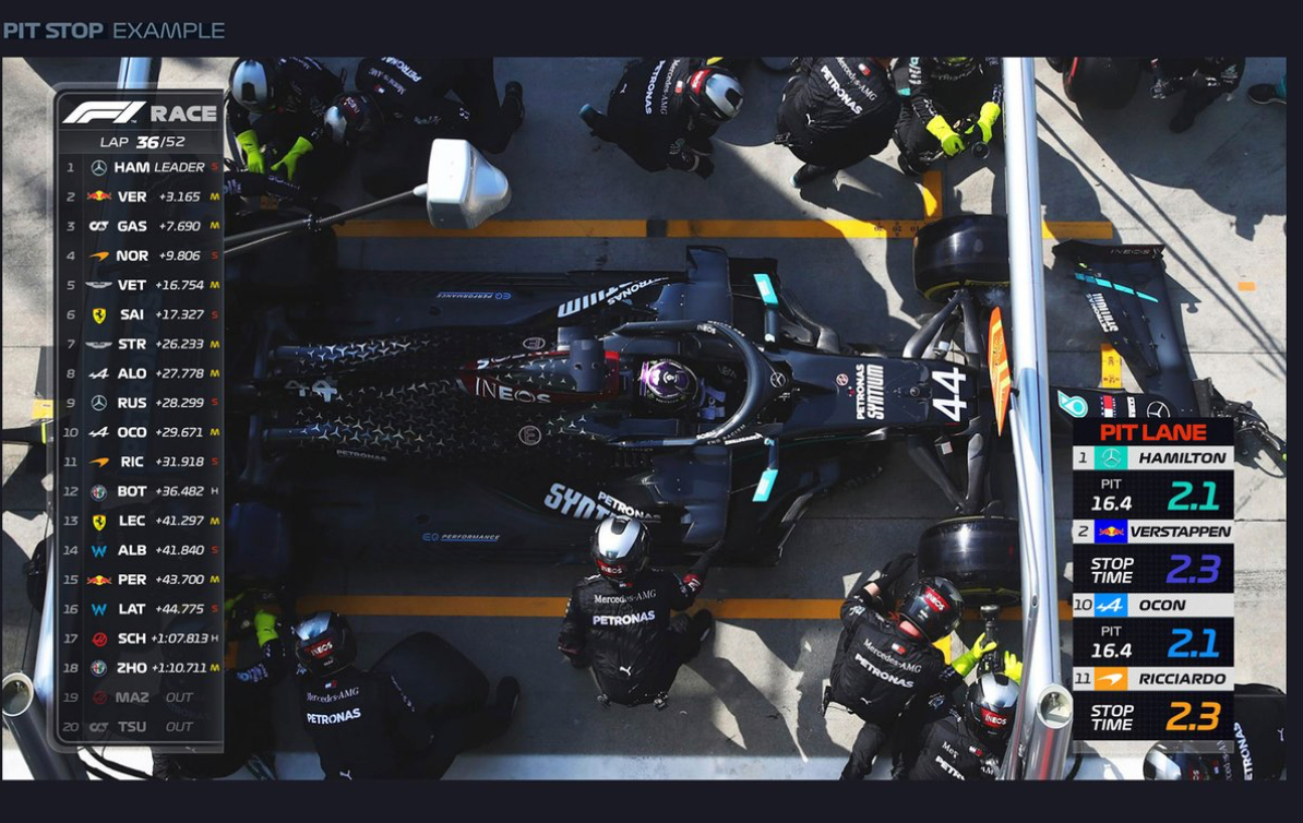
Formula 1 Pit Stop Graphic; Image from FOM
Introduction: In the world of data-driven decision-making, visualizing data effectively is paramount. It helps us uncover patterns, relationships, and insights that might be hidden within raw numbers. While bar charts, pie charts, and line graphs are commonly used to visualize data, there’s a lesser-known yet highly engaging chart type called waffle charts that is fully deserving of our attention.

Why Use Waffle Charts: Waffle charts offer a unique and intuitive way to represent data, especially when dealing with parts of a whole or proportions. They resemble a grid of squares, each square representing a portion of the total data. This visual representation can be especially impactful in situations where you want to emphasize the distribution of data elements. Waffle charts offer more of a quantitative approach to visualizing data over their pie chart predecessors. So how can we apply these types of charts for Formula 1?
Use Case for Formula 1:

Image from DHL.com
The Dance of Pit Stops: Unraveling the Strategic Ballet of Formula 1 Racing
In the heart-pounding world of Formula 1 racing, where every millisecond counts and split-second decisions can spell the difference between victory and defeat, pit stops take center stage. Pit stops stand as a strategic ballet that can either elevate a team to glory or send it spiraling into misfortune. The speed of a pit stop can make or break a race for a driver and team.
Let’s use the waffle chart to determine which teams have the strategic upper hand when it comes to speed in getting a car out of the pit lane and back into the race.
Step 1 Sourcing the Data to Analyze
DHL is a great resource for raw pitstop data after each race. These data can be found here: https://inmotion.dhl/en/formula-1/fastest-pit-stop-award
First, let’s download the data and place convert into a .csv format. In our case, we saved the .csv file as F1_2023_R12_pitstop.csv. You can copy and paste the data from DHL into an excel spreadsheet and then save. Then we can start with the code!

Image from the DHL.com
Dependencies: Before we dive into the code, make sure you have the following libraries installed: numpy, and pandas.
You can install them using the following command in your Jupyter notebook:
pip install pandas numpyNow we have the appropriate libraries in place, let’s import it into our Jupyter notebook to start working on our analysis.In the next section, we’ll walk through each line of the code and what it means.
import pandas as pd
import numpy as np

df = pd.read_csv("F1_2023_R12_pitstop.csv", low_memory=False)
Code Walkthrough:
- import pandas as pd: Here, we import the Pandas library using the alias
**pd**. This library provides us with tools for data analysis and manipulation, making it an essential asset in exploring our pit stop data. - import numpy as np: We also import the NumPy library using the alias
**np**. While not explicitly used in these lines, NumPy is another powerful library that offers support for arrays, mathematical functions, and operations, often working in harmony with Pandas. - df = pd.read_csv(“F1_2023_R12_pitstop.csv”, low_memory=False): This line reads the data from a CSV file named “F1_2023_R12_pitstop.csv” and stores it in a Pandas DataFrame named
**df**. A DataFrame is a two-dimensional tabular data structure that Pandas uses, and it's well-suited for handling structured data like the information found in CSV files. - low_memory=False: The
**low_memoryparameter is set to `False`** to prevent Pandas from trying to optimize memory usage during data reading. This is useful when working with larger datasets, as it ensures that the entire dataset is loaded into memory without any potential issues
Now let’s get the pitstop data per team!
ferrari_df = df[df['Team'] == 'Ferrari']
ferrari_df
#To count the total number of pitstops, run this command:
len(ferrari_df)Code Walkthrough:
- ferrari_df = df[df[‘Team’] == ‘Ferrari’]: In these lines, we’re creating a new DataFrame named
**ferrari_dfby filtering the original `df`** DataFrame. We're using a condition to select rows where the value in the 'Team' column is equal to 'Ferrari'. This effectively isolates the pit stop data specifically related to the Ferrari team. - len(ferrari_df): By applying the
**len()function to `ferrari_df`**, we're determining the number of rows in the DataFrame. This number corresponds to the count of pit stops made by the Ferrari team during the specified race or dataset.
quick_pit_df = ferrari_df[ferrari_df['Time (sec)'] <= 2.5]
quick_pit_df
#To count the total number of pitstops, run this command:
len(quick_pit_df)Code Walkthrough:
quick_pit_df = ferrari_df[ferrari_df[‘Time (sec)’] <= 2.5]: In this line of code, we’re creating a new DataFrame named **quick_pit_df that contains only the rows from the `ferrari_df`** DataFrame where the 'Time (sec)' column has a value less than or equal to 2.5 seconds. Let's break it down step by step:
- ferrari_df[‘Time (sec)’] <= 2.5: This part of the code creates a boolean mask. It checks each row in the ‘Time (sec)’ column of the
**ferrari_dfDataFrame to see if the value is less than or equal to 2.5 seconds. This results in a series of `True** andFalse` values, indicating which rows meet the condition. - ferrari_df[ferrari_df[‘Time (sec)’] <= 2.5]: Using the boolean mask, we’re filtering the rows in the
**ferrari_dfDataFrame. This results in a new DataFrame, `quick_pit_df`**, which only contains the rows where the pit stop time is 2.5 seconds or less. - len(quick_pit_df): With this line of code, we’re determining the number of rows in the
**quick_pit_df** DataFrame. This count corresponds to the number of pit stops by the Ferrari team that were executed in an impressively quick time of 2.5 seconds or less.
This code segment allows us to identify the instances where the Ferrari team executed exceptionally quick pit stops, showcasing their ability to minimize time spent in the pit lane.
You can do this for each team to get the information you need to make your plots.
Okay! Now on to the visualizations from our analysis!
PLOTTING THE WAFFLE CHART

Dependencies: Before we dive into the code, make sure you have the following libraries installed: matplotlib, pywaffle, and pandas. You can install them using the following command:
pip install matplotlib pywaffle pandasBy having these libraries in place, we’ll be able to create our waffle chart seamlessly.
In the next section, we’ll walk through each line of the code, explaining its purpose and how it contributes to creating a stunning waffle chart.
import matplotlib.pyplot as plt
from pywaffle import Waffle
import pandas as pd

plt.figure(
    FigureClass=Waffle,
    rows=5,
    values=[14, 35, 2],
    colors=["#232066", "#808080", "#DCB732"],

)
plt.show()

###To plot values with labels, repace with this code:
## values={'Cat1': 14, 'Cat2': 35, 'Cat3': 2},
Understanding the Code: Now, let’s delve into the code snippet you provided and unravel its mysteries. Don’t worry if you’re new to coding; we’ll break it down step by step.
Code Walkthrough:
- import matplotlib.pyplot as plt: This line imports the
**matplotliblibrary, a popular data visualization tool in Python. It's commonly aliased as `plt`**. - from pywaffle import Waffle: Here, we import the
**Waffleclass from the `pywaffle`** library, which provides a simple way to create waffle charts. - import pandas as pd: We import the
**pandaslibrary using the alias `pd**. Although we don't explicitly use it in this code,pandas` is a versatile data manipulation library that often complements data visualization tasks. - plt.figure(…): This is where the magic happens. We create a new figure using
**plt.figure(), and we're specifying the `FigureClass** parameter asWaffle`. This tells Matplotlib that we want to use the**Waffle** class for our visualization. - rows=5: This sets the number of rows in our waffle chart. In this example, we’ll have 5 rows of squares.
- values=[14, 35, 0]: Here, we provide the values for each square in the waffle chart. In this case, we have 14 squares of one color, 35 squares of another color, and 0 squares of the third color.
- colors=[“#232066”, “#808080”, “#DCB732”]: We specify the colors for each set of squares. The hexadecimal color codes define the appearance of the squares in the waffle chart.
- Running the Code: After you’ve installed the necessary dependencies, copy and paste the code into a Python script or a Jupyter Notebook. Running the script will generate the waffle chart and display it using
**plt.show()**.
Conclusion: Waffle charts offer a creative and engaging approach to visualizing data. By harnessing the power of libraries like Matplotlib and pywaffle, you can create stunning visualizations that capture your audience’s attention and convey insights effectively. Experiment with different values, colors, and arrangements to craft waffle charts that suit your data visualization needs.
Get in Touch! You can find more of our work on Instagram, be sure to give us a follow and share the work you do in these tutorials with us!
Instagram: https://www.instagram.com/code__f1/

메타데이터
- post_id
- 2e56c23b59de
- slug
- codef1-formula-1-data-analysis-using-python-a-pit-stop-analysis-using-the-waffle-chart-2e56c23b59de
- url
- https://medium.com/@codef1/codef1-formula-1-data-analysis-using-python-a-pit-stop-analysis-using-the-waffle-chart-2e56c23b59de
- canonical_url
- https://medium.com/@codef1/codef1-formula-1-data-analysis-using-python-a-pit-stop-analysis-using-the-waffle-chart-2e56c23b59de
- author_url
- https://medium.com/@codef1
- status
- ok
- fetched_at
- 2026-06-11 05:11:55