Text in PDF: Non-Latin Alphabets
This is Part 5 of a five-part series on encoding text in PDF. This post has examples of math, non-Latin alphabets, and emoji.
Text in PDF: Non-Latin Alphabets
This post is Part 5 of a five-part series on understanding the representation of text in PDF. This picks up from Part 4, *Text in PDF: Fonts and Spacing, and steps you through the PDF code for the remaining special features in that example file. Take a look at Part 1: [Text in PDF: Introduction](https://medium.com/@jberkenbilt/text-in-pdf-introduction-df3dd3dfa9ea)*, for a synopsis of (and links to) all the parts as well as a general introduction to the series. As with all the posts in this series, I mark some paragraphs or parenthetical remarks with the 🔍 symbol when they contain deeper information that will be of interest to some readers but can be safely skipped without losing the flow of the material.
Here’s the annotated copy of the PDF image as shown in Parts 3 and 4:
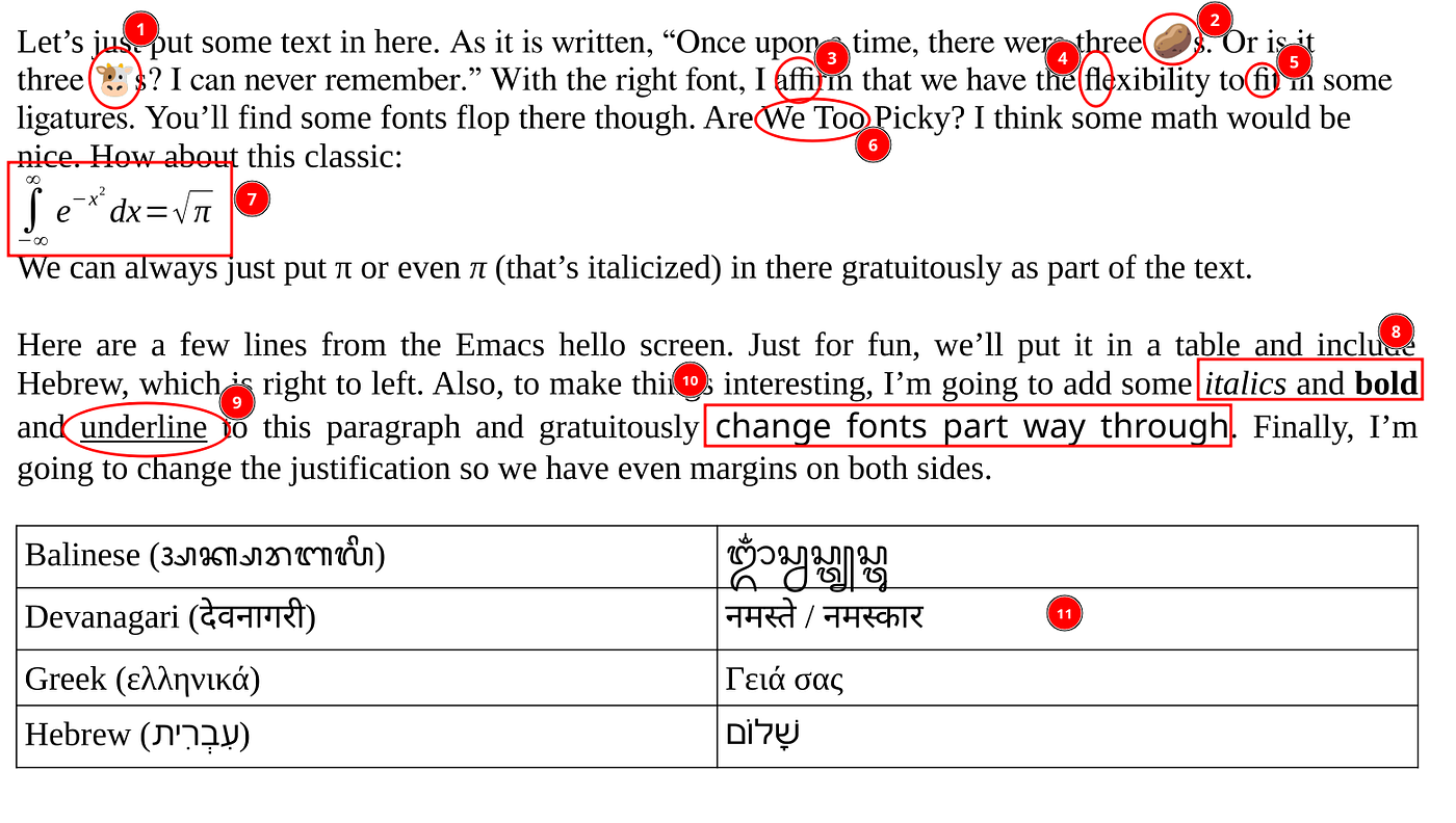
Annotated rendering of advanced.pdf
In this article, we’ll discuss
- 1, 2: emoji
- 7: mathematical formula
- 11: characters from non-Latin alphabets
Mathematical Formula
As we start scrolling through the content stream, we initially see text objects with long TJ operations, such as the ones we’ve looked at in Parts 3 and 4. At the end of the first paragraph, we have a mathematical formula. In the content stream, starting at line 101, things start to look a little different. Instead of our long TJ operations, we have a lot of short text blocks that display only a single character, and we have the introduction of fonts /F4 and /F5, which we had not occurred previously in the file, though we discovered in Part 4 that /F5 is an italics font. Here’s a bit of the content stream starting at line 101.
[embed]
It’s reasonable to guess that this is the formula. If you look at the first four text objects, each sets a text matrix with the horizontal positions being 57.55, 56.7, 62.6, and 59.85. Those are all pretty close to the left margin (recalling that these are points of size 1/72 of an inch, so 72 would be one inch from the left margin). The first one, on line 3, sets the font size to 17.5, which is considerably higher than the other neighboring text objects. Let’s see what it is by changing its color. Thankfully, it’s in its own q/Q block, so we can just change 0 0 0 rg on the first line to 0.5 0.5 1 rg to make it light grayish blue. What do we have?

blue integral sign
The integral sign turned blue. Nice. (I wouldn’t usually say “nice” in that way, but the subliminal message from the text above the integral was too much to resist!) This is not a big shock: it’s taller than the other symbols, and it’s not quite as far to the left as the minus in the integral’s lower bound.(Lower bound? You know, the stuff under the symbol? Didn’t take calculus? Don’t worry about it.) So this is definitely the formula. So we know /F4 is a font with mathematical operators. You can guess that /F5 must be an italics font (or maybe you remember from Part 4), and if you follow the trail to the font object, you will find that these are subsets of Open Symbol and Liberation Serif-Italic. Things continue to look about the same until we get to line 151. Here is an excerpt from that part of the file:
[embed]
On line 3 above, we have a Tm with a horizontal scale factor that’s a little less than 1. On line 8, we have an re operator, which is drawing a rectangle — not a character at all. Also, notice that rectangle is 0.4 points high (this is the number right before re), which is a suspicious number since 0.4 points is a very typical line width in typesetting. Then we have the string <04> in the italics font, /F5. What are these? Let’s change 0 0 0 rg to 1 0 0 rg to make the horizontally scaled one red, then 0 1 0 rg to make the rectangle green, then 0.7 0 0.7 rg to make the third one purple. What do we have?

square root of pi with pretty colors
The first character — the one that was scaled — is the check mark part of the square root symbol. It was in a 14.7-point font to make it tall enough, but it had to be shrunk a little horizontally to give it the right width. Then the rectangle is the line over the square root. It makes sense for that to be a line — it could be arbitrarily long, so you wouldn’t expect a font glyph for it. (Except, technically, it’s a really short rectangle, not a line!) Finally, we have our italicized π in purple, showing that the π just came from a regular italics font. Let’s see if the other italicized π is the same thing. We just have to go down to line 176 to see this:
q 0 0 0 rg
BT
217.85 643.8 Td /F5 12 Tf<04>Tj
ET
Q
This is another occurrence of <04> in /F5. We already know it’s going to be the italicized π, but let’s make it orange (1 0.5 0). (Sorry, I can’t make it apple, but maybe this makes it pumpkin π?) What does this give us?

orange pi
Yes, you can see that the π near the lower right has also turned colors. The proof is in the π, as they say. So this file uses regular italicized letters for the formula including Greek letters, which it takes from a font that contains letters from multiple alphabets. It’s a good thing we don’t have to embed the entire font.
Composed Characters: Devanagari
We talked a little about ligatures in Part 4. Ligatures are single glyphs that represent multiple characters. Ligatures are not really a part of a language’s writing system per se — they are all about typesetting and printing. English is a remarkably simple language to write. We just have our 26 letters that come in upper and lower case. We have no accents or special marks, we have no special letters for ends of words, and we have no composed characters, so if you’re an English-only speaker, you may not even know about them.
In languages that use Devanagari writing, like Hindi and Sanskrit, there are several combined characters where a different symbol is used for a pair of letters that come together. This is like some really heavy kerning or ligature. In some writing systems, there are combining characters that don’t even look exactly like the component characters. An example of a combined character is the “NA” letter composed with the “AA” vowel as appears in the word Devanagari (देवनागरी). The two characters separately are “न” and “ा”, which have Unicode values 0928 and 093E. When encoded as Unicode, the two characters are written side by side with न (NA) first and AA (which Medium won’t let me insert all by itself) second. The AA is what’s called a combining character in Unicode in that it combines with whatever letter precedes it. When the two characters appear together, a correct rendering produces the combined symbol “ना”.
By this time, we’ve done a fair amount of traversing the file looking for fonts, so I’ll just tell you: this file embeds a subset of Noto Sans Devanagari-Regular as font /F9. (What happened to /F8? That’s Balinese.) It’s / ToUnicode map is in object 52, and the character map starts on line 1540. Here is the character map:
10 beginbfchar
<01> <09260947>
<03> <0935>
<04> <0928093E>
<06> <0917>
<07> <09300940>
<09> <092E>
<0A> <0938094D>
<0B> <09240947>
<0C> <0020>
<0D> <0915093E>
Notice that the entry for <04> is <0928093E> and that there is no entry for <05>. What could be going on there? Let’s find this in the file. As it happens, there the string <0405> happens to appear exactly once in the file, and since it’s in font /F9, we can be confident that that’s it. There’s something new here though. Below is the entire text block of the word “देवनागरी” (Devanagari). This starts on line 307.
[embed]
Here, in addition to having several Tj and TJ operators, we have these BDC/EMC blocks. These are called marked content blocks and allow a range of drawing commands (text or otherwise) to be enhanced with some metadata. We have various bits like /Span<</ActualText<feff0928093e>>>, which is on line 9 above and precedes our <0405>on line 12. This PDF dictionary immediately precedes a BDCoperator, which is matched by an EMC operator and indicates that everything inside that block represents the specified text. We see our 0928093e in there, but there’s also feff. If you look this up, you’ll find that it’s actually a zero-width non-breaking space. I’ve actually used that character a few times in this article to prevent line breaks after the / character in things like /ToUnicode. So why is there a non-breaking zero-width space here? The Unicode value feff is frequently used as a marker to indicate that what follows is Unicode text. It would be very rare to start a block of text with a zero-width non-breaking text, and it’s a good choice since it doesn’t have any visual appearance. (🔍 Also, fffe is not a valid character, which means feff can introduce UTF-16-BE, and fffe can introduce UTF-16-LE — I talk about this in Part 1 of the series. The PDF specification does not allow UTF-16-LE, but most readers will accept it anyway since lots of people have done that by mistake.) So in this case, we’ve associated the text with only one of the two glyphs, but we’ve drawn two, and we’ve wrapped the code that draws those letters with this marked content section and included the text with a Unicode marker. That’s a lot harder than something like (देवनागरी) Tj, but that’s what we’re left with. Can you see that it would be pretty hard to freely edit Devanagari text in a PDF file?
Zero-Width Characters: Hebrew
I’m going to skip over the Balinese example, but you have the tools now to dive in if you want. Let’s wrap up non-Latin alphabetic characters with Hebrew. Here, you’ll see more of the same but with a twist. Hebrew is a right-to-left language. While PDF allows the text direction to be set, this PDF file just draws the characters in reverse order as if they were left-to-right. As you can guess, the Hebrew font is /F10, which is a subset of Free Sans. So rather than having a Hebrew-specific font, this particular file used a sans-serif Hebrew from a larger sans-serif font that that surely contains a wide range of characters.
At the end of the table of non-Latin characters at the bottom of the page in the PDF file, we have the Hebrew word שָׁלוֹם, which is “shalom.” Hebrew is a right-to-left language. Here’s a zoomed-in image:

When I pasted the word שָׁלוֹם into this article, Medium correctly rendered the text in the right order, but in a text file, the order of the characters is 05e9 05b8 05c1 05dc 05d5 05b9 05dd. What are these? They are, in order:
[embed]
So the order of the bytes in the file matches up with the logical, lexical orders of the characters. (🔍 Shin is “sh”, qamats is “ah”, the shin dot makes it a shin (“sh”) rather than a sin (“s”), lamed is “l”, vav in this case is silent, but having the holam over it makes it the long “o” sound, and mem is “m” with mem being one of the five Hebrew letters that has a special version for ends of words. Often Hebrew is written without the vowels, so those could have been left out.) Even if you have no familiarity with Hebrew, you can see that the first letter in the table above is the rightmost character in the table with the marks above and below it removed.
So what’s going on this time? Looking at the character map. Below, I am showing a table I created that combines the widths from the font subset (from line 585) and the character map from /ToUnicode (from line 1000):
[embed]
Now, here’s the last thing displayed in font /F10 from the PDF, line 426:
/Span<</ActualText<feff05e905b805c1>>>
BDC
1 0 0 1 326.2 477.85 Tm
/F10 12 Tf<0c0d0e>Tj
EMC
This is the last bit of Hebrew in the PDF, but it corresponds to the shin with its qamats (the T-shaped vowel under it) and dot. Notice the following:
0Cand0Dhave zero width and are absent from the character map.0Eis associated with the three-characters05E9,05B8,05C1, which are the first three Unicode characters, representing just “שָׁ” in the correct lexical order, just as in the table. That’s the shin with the dot and qamats vowel.- The actual text span (after the
feffUnicode marker) also contains those same three characters in that same order.
So what’s with 0c and 0d being zero-width? I’ll temporarily edit the string to be first <0c>, then <0d>, then <0e>. Let’s see what we have. From left to right in the image is what we see with just 0c, then just 0d, then just 0e:

0c, 0d, 0e
So this is interesting. The order of the glyphs is 0c, which is the glyph for qamats (05b8), 0d, shin dot (05c1), and finally 0e, the bare shin (05e9). Let’s unpack this. The order of the glyphs is different from the lexical order of the characters. It’s not even the reverse of the order. The vowel (qamats) and shin dot are both zero-width characters in /Widths. That means that they can be shown in a text string (<0c0d0e>) and just displayed normally, but since the first two are zero-width, the second and third characters just pile up. That works fine for drawing, but it’s not the right order for Unicode, which wants the shin to be first. For this, the actual text marked content indicators have the correct order on a per-letter basis. Also, the information in /ToUnicode shows the characters in the right order associated with <0e> alone. As for anything that tells text extraction that these are reverse-ordered Hebrew letters…well, there’s nothing there in this file. If I cut and paste this from evince into emacs, I get the consants together in the right order with the vowels and dots off to the side. Wow, there’s a lot going on there.
Reflections on Unicode
What could possibly be simpler? Never mind, we don’t have time to answer that. But let’s reflect on this. You might first think that the most sensible thing would be to just represent text as Unicode characters in UTF-8 so PDF strings like (देवनागरी) or even (שָׁלוֹם) or (ᬒᬁᬲ᭄ᬯᬲ᭄ᬢ᭄ᬬᬲ᭄ᬢᬸ) would “just work.” Why isn’t it this way?
There are lots of reasons. For one thing, PDF strings are basically PostScript strings, and PostScript is older than Unicode. The first edition of the PDF spec was published in 1993. Unicode was still pretty new, and it was certainly not universally accepted the way it is today. But even if we did that, we would still have to have some kind of way to map combinations of Unicode characters to combinations of glyphs, which as we’ve just seen, may not perfectly line up. And beyond that, there’s kerning (which, besides being font-specific, often causes words to be split up into multiple strings), and you might want to use kerning with these combining characters. Like the qamatz in our Hebrew example wasn’t really centered under the shin like it should be. A more careful rendering might have used kerning to move the qamatz over. That would also complicate things for mapping from UTF-8 to glyphs. Or maybe we would have wanted better marked content sections that led to better results when extracting text. Or think about the formula: the square root symbol was made up of a character from a font and a little tiny, strategically positioned rectangle. Half of the square root symbol was line drawing, and half was a character.
I imagine that coming up with a way to say “if you see these Unicode characters in this order, display it as these glyphs” in tabular form would be pretty hard and might overly complicate the process of generating PDF, particularly since the burden of knowing where to put stuff falls with the PDF generator. It would probably result in something more difficult than what we already have. The PDF reader just follows the rendering instructions in the file, which contains exact positions for things. Most software that generates PDF with complex fonts like this will already have a lot of font knowledge about character positions (probably via a font library like freetype) since they will also be showing the text to the user, and it would be a lot to require every PDF reader to do so much work to interpret strings. Remember, PDF content are very specific drawing instructions. It’s not a text-based system or a word processor.
Also, there’s actually nothing that says a character in a font even has to map to a Unicode character at all. In PDF, a string without a standard encoding is just a bunch of indexes into a font, which just a bunch of glyphs. (Well, glyphs, and a bunch of other tables.) You could make up a font containing characters in an invented language or symbols in a game, and those symbols may not map to Unicode at all. Also, this order-of-appearance coding style seems pretty weird when you’re trying to understand the text in the file, but it’s actually pretty convenient for generating font subsets: just assign the next value to each character as you first use it and map it to whatever combination of characters, if any, it maps to in Unicode, and you’re done. So, while it definitely seems to me that something that would just allow UTF-8 text in content stream strings would make things a lot easier in some cases, many of the issues we’ve seen still apply. It’s a lot more complicated than you might think.
Emoji
Now for our last topic: Emoji. Our document has just two emoji in it: my favorite one, the potato: 🥔, and another favorite: the cow head 🐮. (I also really like 💧 and 🐽, but I digress.) Our emoji come from a font, /F3, in object 12, called Noto Color Emoji. This is a type 3 font, which has a different structure and can encode characters as little images. I’m not going to talk about it, but you can find it at line 654 if you are interested. It still has a /ToUnicode map in object in object 34. The character map starts at line 1190 and is here:
2 beginbfchar
<01> <D83EDD54>
<02> <D83DDC2E>
These are the only two characters. The first one is the potato, and the second one is the cow. If you’re looking closely, you’ll notice that these are eight digits, which might make you think each maps to two characters. Are these emoji somehow composed of multiple Unicode characters? No, it’s something different. If you read my excursion into Unicode encodings in Part 1, you may remember that I talked about surrogate pairs. These are groups of two 16-bit characters that combine to form a code point whose value is too high to fit into UTF-16 in a single 16-bit quantity. In that section, I mentioned that the potato is 1F954, represented by the surrogate pair D83E DD54, and that’s what you’re actually seeing. The same thing is happening for the cow. And that’s really about all there is to say about it — everything else is stuff we’ve already seen. You can find /F3 12 Tf<01>Tj on line 74 and /F3 12 Tf<02>Tj on line 81, and if you’ve been tracking and your 🧠 hasn’t 🤯 or 🎃, then you will probably realize that these are drawing the 🥔 and the 🐮 respectively. They’re just regular characters in a regular font with a regular /ToUnicode map.
The End
If you’ve made it this far, you’ve now seen just about all there is to see. Well, I didn’t talk about text direction (true right-to-left or top-to-bottom) or other tweaks to text state, but they don’t change any of the fundamentals. Certainly there are ways to go deeper, but with the information presented in this file, you should be able to interpret just about any text you encounter in any well-created PDF file, and if you run into one that doesn’t seem to work, you’ll be armed with some tools to understand why it’s broken. I’ll wrap up with a few final comments.
- Sometimes text appears in PDFs as images, especially with scanned documents. In that case, none of this will be there.
- Sometimes, a PDF may be rendered in some very low-level way, like “print to PDF” without any font embedding. A PDF generator that doesn’t know how to do font subsetting may actually literally draw all the characters stroke by stroke in the PDF file, creating essentially a vector graphics file that looks like text. Such a file would be visually indistinguishable at any zoom level from a native PDF with text, but it would contain no PDF text. You’d have to use OCR to get the text just as with an image. This is real — I have seen many of these over the years.
- One of the properties you can set for text is its rendering mode. All our text was just “filled,” meaning that the characters were filled in. You can also “stroke”, which just draws the outline, or do various other things, including making text invisible. You can have PDF files that present one thing visually and encode something different with invisible (hidden) text. Most often, this is done for adding OCR text to image-based PDF files, but you could be really sneaky and create a PDF where extracted text didn’t match the visually displayed text at all. Or maybe you could embed a translation of the text. Imagine combining one of those weird draw-each-character-stroke-by-stroke files with “hidden text” that didn’t match. It would be really confusing to figure out what was going on. (🔍 If you want to know about text rendering modes, it’s the
Troperator.) - Some text in a PDF may be part of an annotation and may not appear in the page’s content stream. Sometimes a page’s content stream may contain what is known as “form xobjects”, which are treated like images, but instead of being bitmaps, the images are vector graphics drawn with PDF code. This is very common when doing page compositions, like 2-up for printing. So you may be poking around on a content stream and not be able to find the text because it may not even be there.
So there are many other edge cases, but even so, none of them are a huge stretch beyond what we’ve seen.
I hope this has taken some of the mystery out of PDF text display and helped you appreciate the richness and complexity of how text is represented in PDF. Thanks for reading.
메타데이터
- post_id
- 2edd88884b68
- slug
- text-in-pdf-non-latin-alphabets-2edd88884b68
- url
- https://medium.com/@jberkenbilt/text-in-pdf-non-latin-alphabets-2edd88884b68
- canonical_url
- https://medium.com/@jberkenbilt/text-in-pdf-non-latin-alphabets-2edd88884b68
- author_url
- https://medium.com/@jberkenbilt
- status
- ok
- fetched_at
- 2026-07-18 10:09:19