The Hardest Brief I Ever Wrote Was for Myself
On designing your own brand, articulating the inarticulate, and what fifty iterations of a logo actually teach you about yourself.
The Hardest Brief I Ever Wrote Was for Myself
On designing your own brand, articulating the inarticulate, and what fifty iterations of a logo actually teach you about yourself.
I have written briefs for design systems that govern thousands of components. I have written briefs for brand refreshes, component libraries, and token architectures so complex they needed their own documentation. I am, professionally speaking, someone who knows how to articulate a creative vision.
So when I sat down to design my own personal brand, I assumed it would be easy.
It was not.
What followed was a few days, two AI tools, somewhere north of fifty versions of the letter C, one accidental engagement ring, one Pac-Man moment, and the slow humbling realization that the hardest person to design for is yourself.
This is not an article about AI. It is an article about what happens when you try to explain your own taste to a machine that has no intuition, and what you discover about yourself in the process.
There is something deeply familiar about this process if you work in design systems. We spend our careers making decisions that scale, building structures that other people build on top of. We are used to thinking in systems. What we are less practiced at is turning that same rigor inward, applying the same precision and intentionality to ourselves that we apply to our components. This is the story of what happened when I finally did.
A Brand I Had Been Avoiding
I am a Senior Art Director and Design Systems Lead. My day job is building Fusion, Wells Fargo’s design system, which means I spend most of my time thinking about how design decisions scale, how components behave across contexts, and how to make complex systems feel inevitable and invisible to the people who use them.
Outside of work I go by carinaflyingv. It is my handle, my portfolio URL, my creative identity. I have had it for years. And for years I had been quietly avoiding the question of what it actually looked like.
Not because I did not have taste. I have plenty of taste. But designing for yourself is a specific kind of paralysis that I think every designer knows. You are simultaneously the client, the creative director, and the most difficult stakeholder in the room. You know too much. You care too much. And every decision feels permanent in a way that client work never does.
So I kept postponing it. Until I decided not to.
I opened a conversation with Claude and typed something like: “I want a logo for my professional brand. The name of my portfolio is carinaflyingv.”
What happened next taught me more about myself than any brief I have ever written for someone else.
Fifty Versions of the Letter C
The first logo Claude generated was fine. Clean. Inoffensive. Completely wrong.
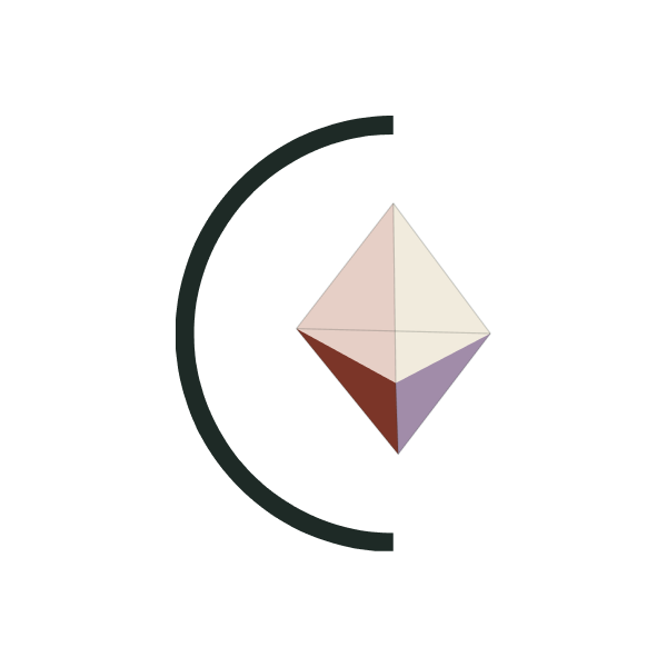
So I gave feedback. And then more feedback. And then I uploaded a reference image of a monogram I loved, a beautiful C with a prism cut into it, like light caught inside a letterform. That felt closer. We iterated. The prism floated. We moved it. The C looked like a moon. We closed it. The prism looked like an Ethereum logo. We flattened it. The lines were too bold. We made them hairline. The whole thing disappeared.
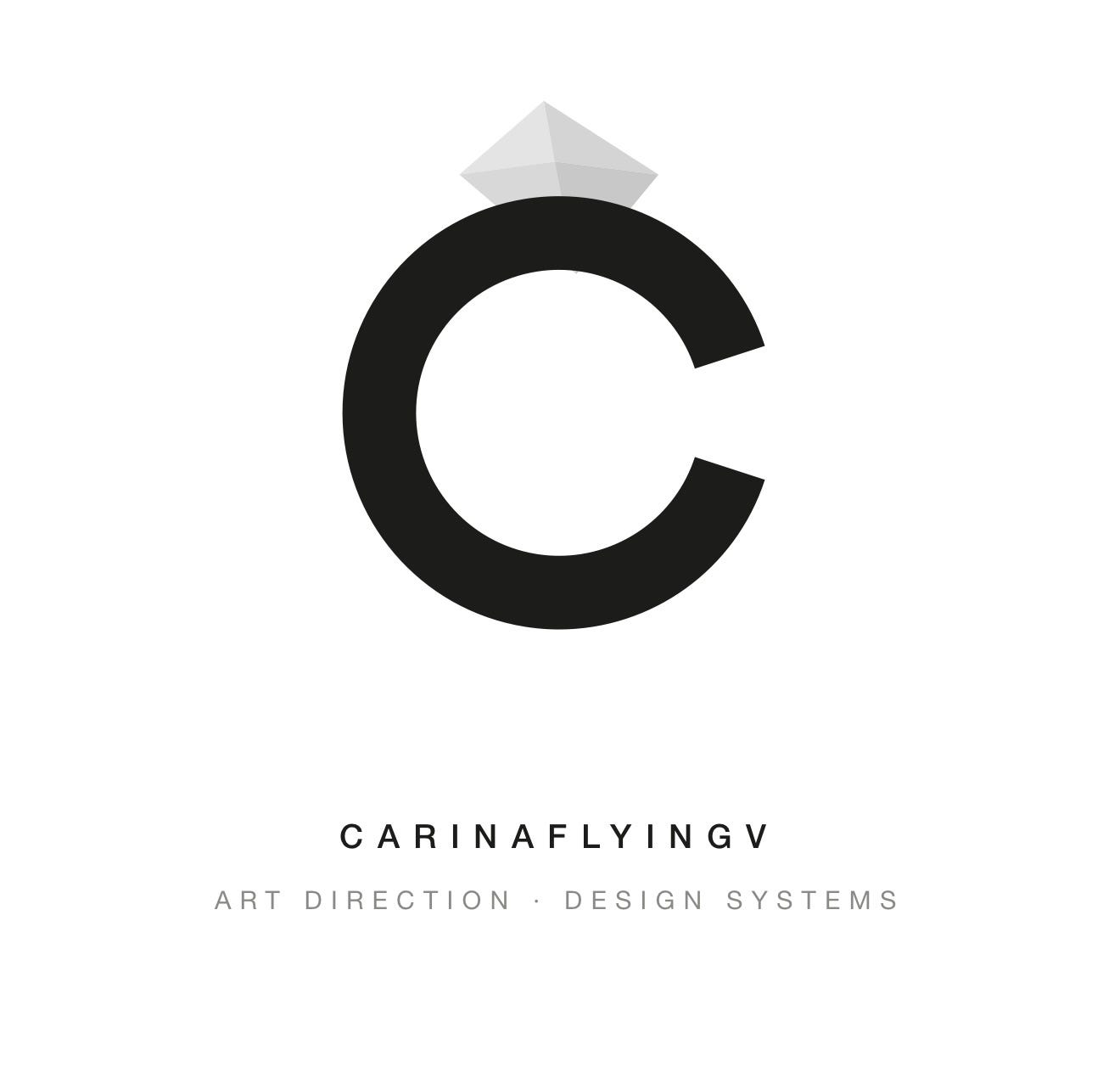
At one point Claude Design gave me a C with a 3D diamond floating above it like an engagement ring.
At another point it gave me a Pac-Man.
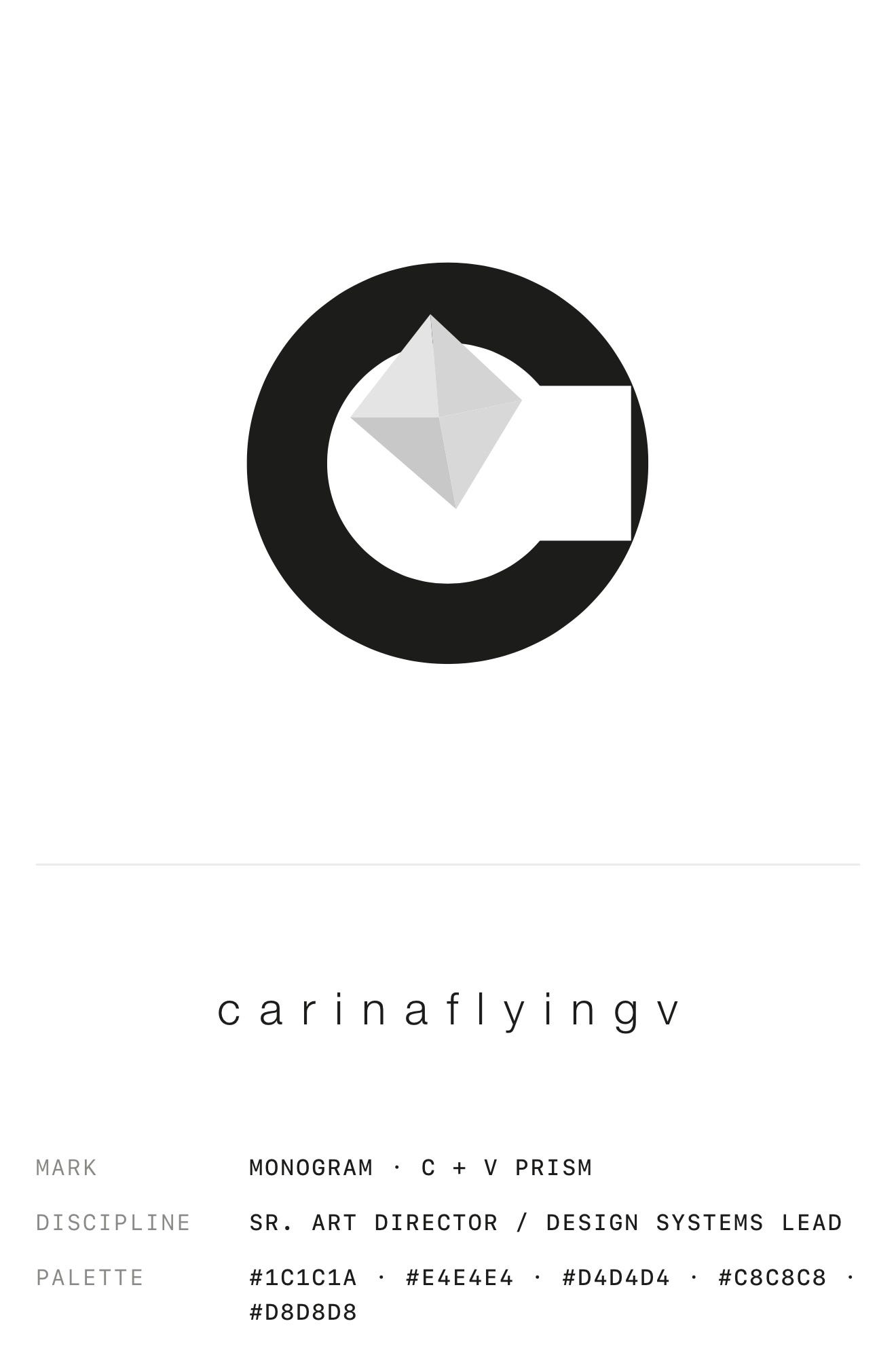
I am not exaggerating.
What I did not expect was how much the friction would teach me. Every time a version came back wrong I had to figure out exactly why it was wrong. Not “I don’t like it” but “the prism is too dominant,” “the C reads as a crescent not a letter,” “this feels like crypto not editorial.” I was building a vocabulary for my own aesthetic in real time. Forty seven versions in, I had a brand brief so specific it could only describe one person.
That person was me. I had just never written her down before.
The Brief I Could Never Have Written on Day One
By the end of the process I had produced something I could not have articulated at the start. Not just a logo, but a complete creative brief for who I am.
Editorial but warm. Architectural through proportion alone. Quietly magical without being decorative. Sophisticated without trying hard. A mark that says systems thinking and creative leadership and restrained imagination all at once, without saying any of those things out loud.
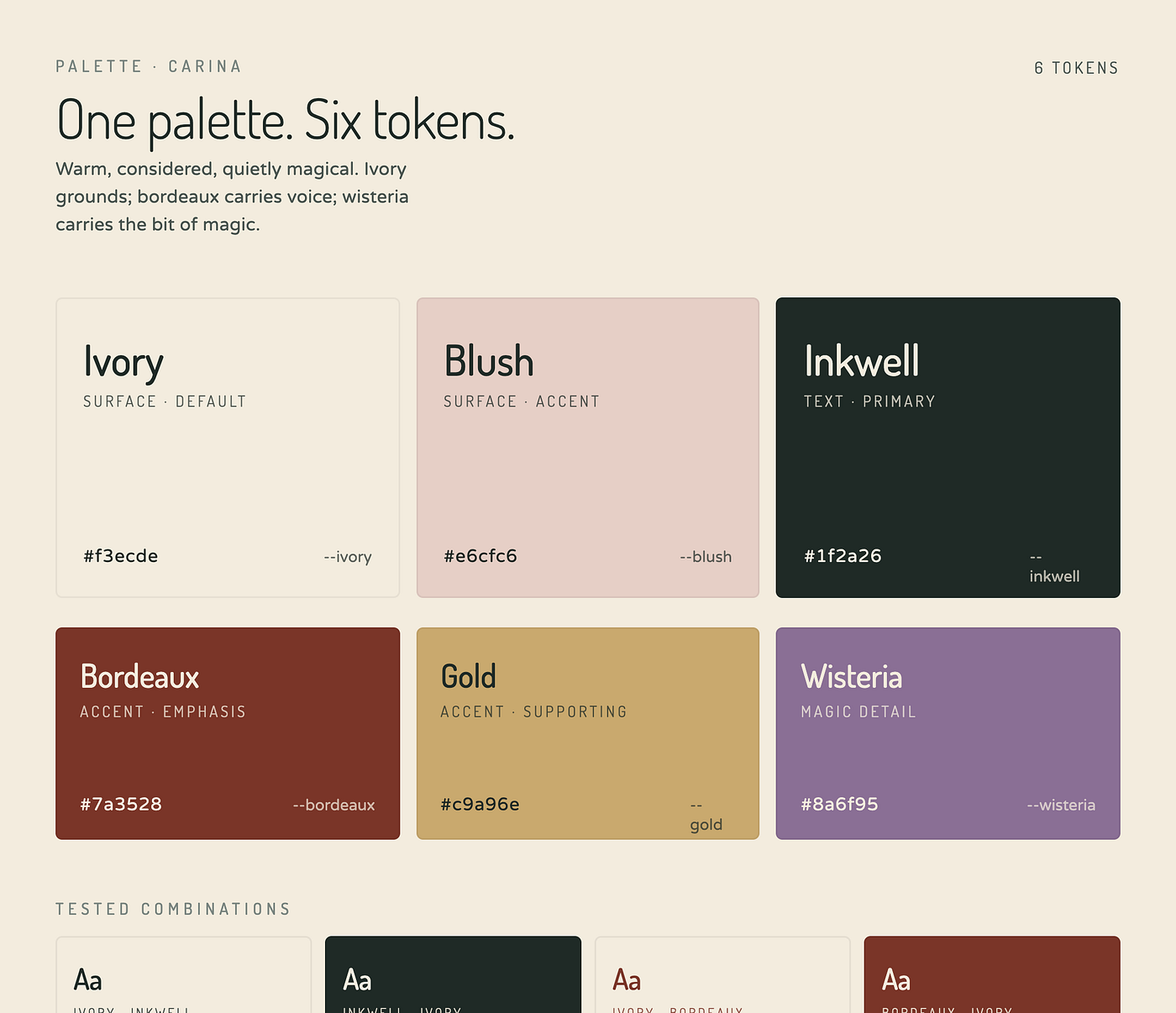
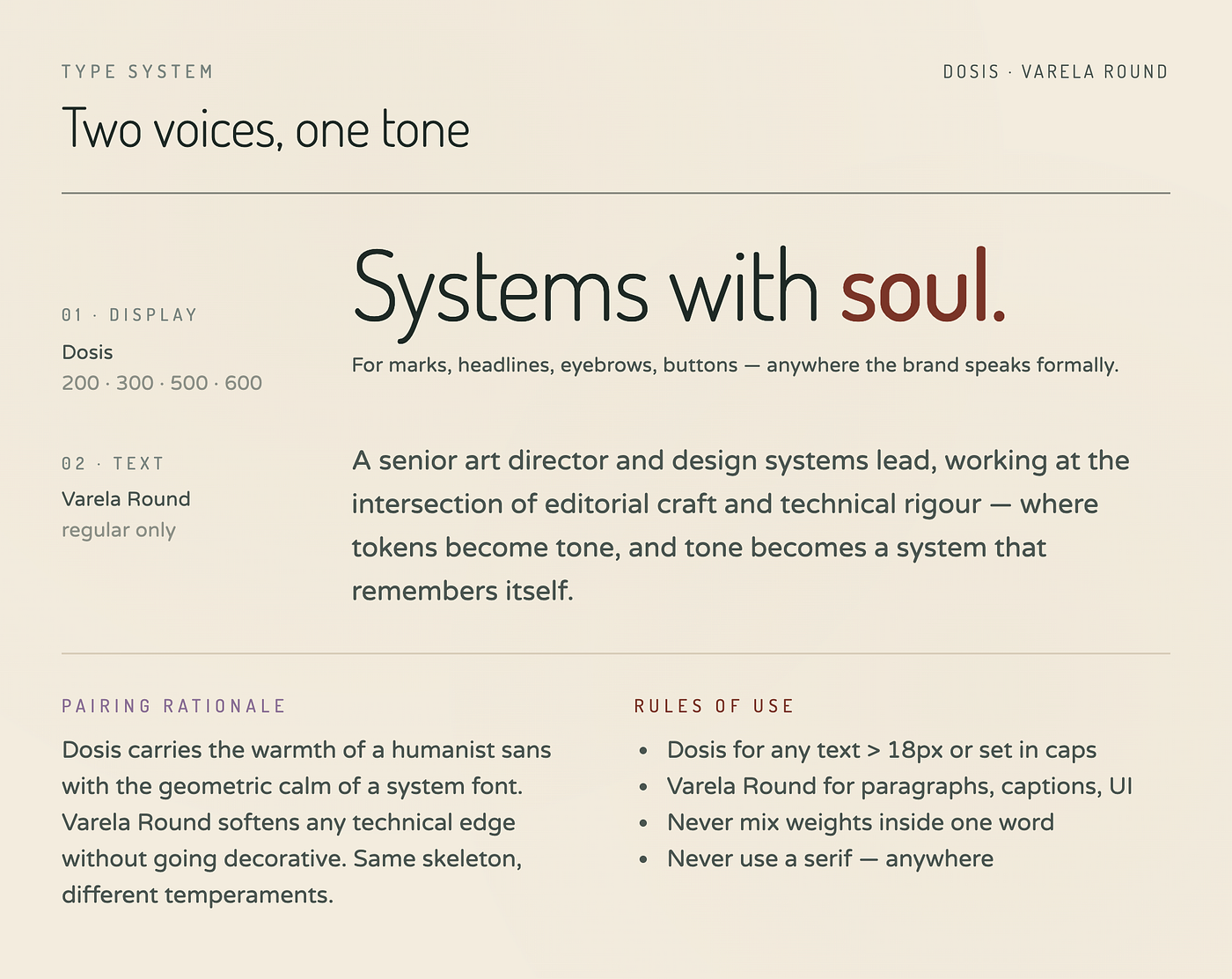
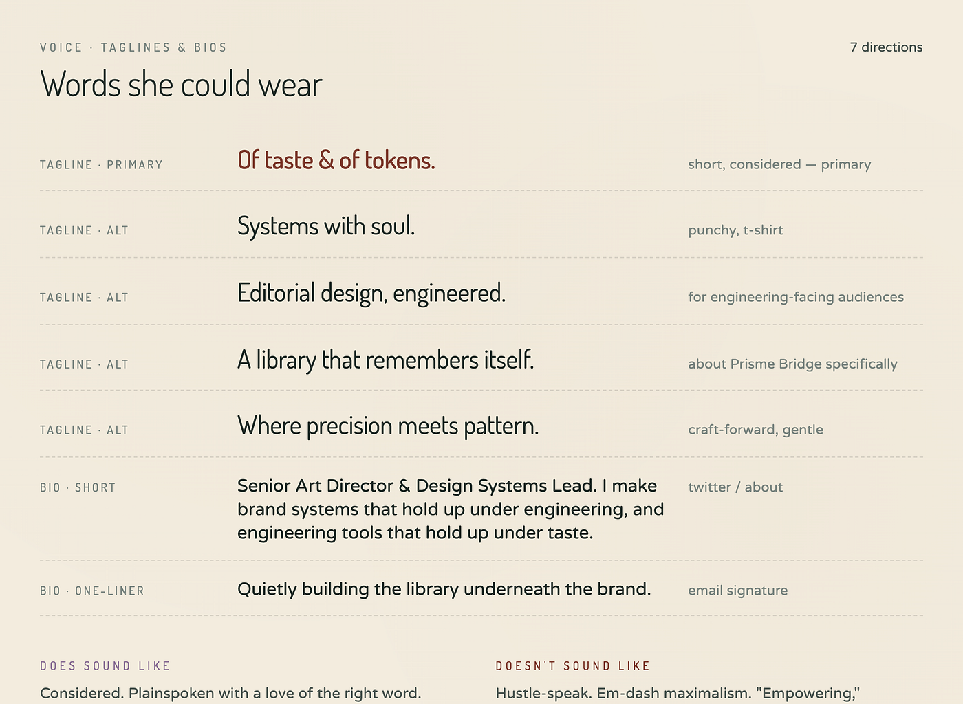
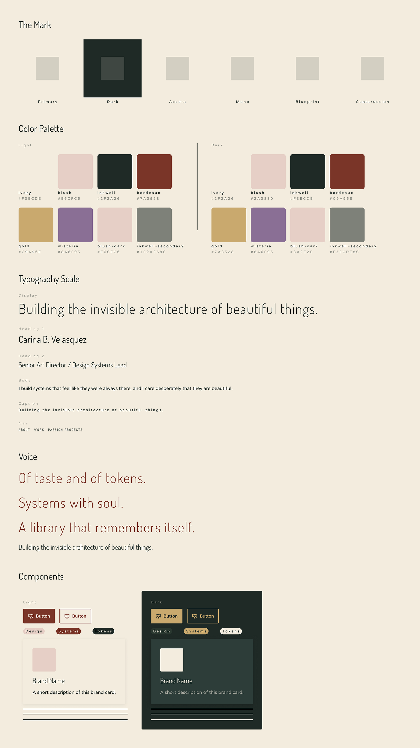
I also had a color palette named Carina, with tokens called Ivory, Blush, Inkwell, Bordeaux, Gold, and Wisteria. A typography system built on Dosis and Varela Round, the same fonts already living in my portfolio, which I had chosen years ago entirely by feel. A voice line that stopped me mid-iteration: “Of taste and of tokens.” A tagline that arrived fully formed and immediately felt true: “Building the invisible architecture of beautiful things.”
None of this came from the AI. The AI was the mirror. I was the one doing the looking.
Here is what I mean by that. At every stage the AI could only go as far as I could describe. When my feedback was vague, the output was vague. When I got specific, everything sharpened. The quality of what came back was in direct proportion to the quality of what I put in. And getting specific required me to actually know what I wanted, not just recognize it when I saw it.
This is not so different from how design systems actually work. A token is only as meaningful as the decision behind it. A component is only as useful as the use case it was built to serve. Precision requires intention. And intention requires knowing what you are trying to say.
That is a different skill. And it turns out I needed practice.
Two AIs, Two Different Superpowers
I used two Anthropic tools for this project and they could not have been more different in what they were good at.
Claude, the conversational AI, was my iterative partner. We built the logo mark together over dozens of versions, refining coordinates, adjusting proportions, debating whether the prism should sit inside the C or on top of it. Claude could generate SVG code, reason about optical centering, and hold the entire history of our decisions in context. It was precise and patient and never once made me feel like I was asking too much. But it could not see. Every visual judgment had to be translated into language first, which meant I had to find words for things I had previously only felt.
Claude Design was something else entirely. Where Claude was a craftsperson, Claude Design was a strategist. I gave it a loose brief about who I was and it came back with a complete brand identity system, color palettes with names like Parchment and Ink and Quietly Magical, voice lines that made me stop scrolling, and typography pairings that somehow already matched my portfolio fonts. It understood the emotional register of my brand in a way that felt almost uncanny.
But it could not follow precise instructions to save its life.
Every time I asked it to move the prism slightly to the left it moved the entire mark. Every time I asked it to make the C thinner it turned it into a crescent moon. It was extraordinary at the big creative picture and genuinely terrible at the surgical detail.
The lesson: use each tool for what it is actually good at. Claude for precision. Claude Design for vision. And yourself for everything in between.
If you have ever managed a design system team, this pattern is familiar. Some contributors are great at vision and terrible at execution. Some are meticulous and need direction. The best systems leads know how to get the right work from the right people. The same applies here. AI is not a replacement for creative leadership. It is a new kind of contributor that needs to be managed well.
What I Learned About Myself
I went into this process thinking I was going to design a logo. I came out of it knowing things about myself I had never quite put into words.
I know that I am not a serif person. I know that warmth matters more to me than coolness, but restraint matters more than decoration. I know that I am drawn to the tension between precision and softness, between the technical and the romantic, between the person who builds token pipelines and the person who cries at Pride and Prejudice.
I know that my signature color is Bordeaux. I have probably always known this.
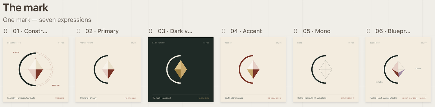
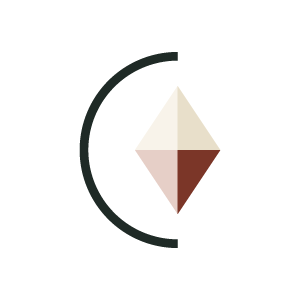
I know that the mark I landed on, a thin C with a four-panel prism sitting inside its bowl, works because it holds two ideas at once. The C is the letterform, clean and editorial. The prism is the light inside the system, the part that refracts and surprises. Together they say something I have been trying to articulate for years: that design systems are not just architecture. They are the invisible structure that makes beautiful things possible.
I know that I needed a machine with no intuition to help me find my own.
That is the part I did not expect. I thought the AI would do the creative work and I would do the approving. Instead the AI did the generating and I did the discovering. Every piece of feedback I gave was a piece of self knowledge I had not previously examined. Every version that came back wrong was a mirror showing me what right actually meant to me.
By the end I did not just have a brand. I had a brief for myself. And that, honestly, is worth more than any logo.
The System Behind the Brand
There is a moment in every design systems project where the pieces stop being separate decisions and start being a language. Colors that talk to each other. Spacing that breathes. Radius values that carry a feeling from one component to the next.
I know that moment well. I have built it for other people many times.
So once the brand felt resolved I did what any design systems lead would do. I built a system.
Using Claude Code and the Figma MCP I created a Figma file called “carinaflyingv — Brand System.” Three variable collections. A color library called flyingv, with tokens named after the colors themselves — Ivory, Blush, Inkwell, Bordeaux, Gold, Wisteria. A spacing scale called breath, because every good system needs room to breathe — whisper at 2px all the way up to scream at 80px, named after lion’s breath because why not. And a radius collection that stays honest and just calls itself radius.
Everything bound. Everything named. Auto Layout on every frame. No hardcoded values anywhere.
It took a fraction of the time the brand exploration took. Because by then I knew exactly what I was building and why. The system was just the truth of the brand, made precise.
That is what design systems are, in the end. Not rules. Not restrictions. Just the truth of something, made repeatable.
The Brief, If You Want to Try It
If you are a designer who has been avoiding your own brand, I want to tell you something. The avoidance is the data. The reason it feels hard is the same reason it is worth doing. You know too much. You care too much. And that means the answer, when you find it, will actually be yours.
Here is what I would tell you before you start.
Do not begin by asking for a logo. Begin by describing yourself. Not your job title, not your skills, not your years of experience. Describe the tension at the center of your creative identity. The thing that makes you different from every other designer with the same job title. For me it was this: I build systems that feel like they were always there, and I care desperately that they are beautiful.
Everything else followed from that.
Expect to iterate more than feels reasonable. Expect to be frustrated. Expect to learn things about your own taste that you cannot unlearn. Expect at least one version that looks like an engagement ring.
And when you finally land on something that feels right, sit with the discomfort. Because “is this really me” after days of iteration is not doubt. It is the feeling of seeing yourself clearly for the first time, which is always a little disorienting.
Sleep on it. Come back with fresh eyes. You will know.
The hardest brief I ever wrote was for myself. It was also the most worth writing.
메타데이터
- post_id
- 2fa5bda878ef
- slug
- the-hardest-brief-i-ever-wrote-was-for-myself-2fa5bda878ef
- url
- https://www.designsystemscollective.com/the-hardest-brief-i-ever-wrote-was-for-myself-2fa5bda878ef
- canonical_url
- https://www.designsystemscollective.com/the-hardest-brief-i-ever-wrote-was-for-myself-2fa5bda878ef
- author_url
- https://medium.com/@carinaflyingv
- status
- ok
- fetched_at
- 2026-06-15 20:49:13