Same Drug, Opposite Signals: Redesigning the GLP-1 Adverse Effect Figure
How a conflict-heavy review paper became two visual arguments — a graphic abstract and a Fig.1 redesign.
Same Drug, Opposite Signals: Redesigning the GLP-1 Adverse Effect Figure
How a conflict-heavy review paper became two visual arguments — a graphic abstract and a Fig.1 redesign.
The Starting Point
GLP-1 receptor agonists — semaglutide, liraglutide, dulaglutide — are among the most-discussed drugs in metabolic medicine right now. The efficacy data is strong. The adverse effect profile is messier.
The review paper I worked from (Kim JA & Yoo HJ, Diabetes Metab J 2025) does something genuinely useful: it maps side effects across nine organ systems using three separate evidence layers — randomized controlled trials (RCTs), real-world data (RWD), and spontaneous reporting systems (SRS). Most reviews pick one. This one compares all three simultaneously.
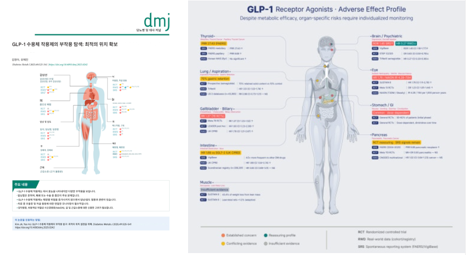
The original Fig.1 carries that structure. What it doesn’t make immediately readable is when those three layers disagree — and on GLP-1s, they disagree often.
That conflict pattern was where I wanted to start.
What I Built
Two outputs from a single paper:
Graphic abstract — single-page, simplified color system, built for fast scanning. Organ by organ, evidence tier by tier.
Fig.1 redesign — higher data density. Each organ card shows the specific study tags (SRS / RCT / RWD) alongside the actual numbers. The reader can trace why signals conflict, not just that they do.
The graphic abstract locked the color logic and layout. The redesign raised the information ceiling.
Step 1 — Read the Paper First. Then Run the Tools.
I read the paper before passing it to any AI assistant. That order matters.
During that pass, I noticed the NAION figures (4.28–7.64) needed a closer look at their units. In the eye complication section, those numbers represent IR — incidence rate per 1,000 person-years — not HR (hazard ratio). They’re measuring different things. Keeping the label clear in the visualization meant readers could interpret the risk correctly, rather than comparing it directly against HR values from other studies.
A small distinction. A significant one if you’re reading the figure as a clinician.
This is the kind of detail that gets lost when you move straight from abstract to design. Going back to the primary source is not optional on a medical project.
Step 2 — The Color System
Four categories. One color each.
Color Meaning
Coral Established concern — consistent risk increase
Amber Conflicting evidence — results vary by study type
Teal Reassuring profile — directional risk reduction
Grey Insufficient evidence
The original figure used blue for the reassuring signal. Blue and teal-green are difficult to distinguish in color-blind environments. I shifted it to teal and applied CUD (Color Universal Design) principles throughout. The logic stays intact. The accessibility improves.
Step 3 — The Brain Card Problem
The most visually demanding design decision was the Brain / Psychiatric section.
The data:
- VigiBase (SRS): ROR 1.45 — signal toward increased suicidal ideation
- TriNetX (RWD): HR 0.27 — signal toward decreased risk
Same drug. Different study design. Opposite direction.
In the original figure, both results sit inside the same cell. The conflict is there — but the visual weight doesn’t separate them. A reader skimming the figure can miss the disagreement entirely.
My fix: split the two signals into separate Coral and Teal badges, side by side. The layout doesn’t resolve the scientific question — it just makes sure the reader sees that the question exists.
That’s the job. Not to settle the debate. To make it legible.
Step 4 — Silhouette Generation (Gemini → Illustrator)
I generated two silhouette versions for the two outputs: a simplified flat silhouette for the graphic abstract, and a 2.5D editorial-style figure for Fig.1 with internal organs visible and editable.
The Fig.1 prompt was written to prioritize editability over aesthetic finish. I needed layers I could work with in Illustrator, not a rendered image I had to work around.

Step 5 — Production Order and Why It Matters
Graphic abstract first. Fig.1 second.
The graphic abstract forced me to commit to the color system, the badge logic, and the layout hierarchy before adding data density. Once those decisions were stable, the Fig.1 redesign had a clear framework to build on.
Working in reverse — dense figure first, then simplifying — almost always produces two things that look like they came from different projects. This order kept them coherent.
Abstract
Fig.1
What I Learned
Data verification is not a pre-design step. It’s part of the design process.
When a figure carries clinical numbers, the units, the source, and the study type all affect how a reader interprets risk. A clean layout that misrepresents a unit isn’t a good figure — it’s a precise one that points in the wrong direction.
The upgrade I made to this figure wasn’t primarily aesthetic. It was about making the evidence architecture visible so the reader could do their own reasoning. That’s a different goal than making something look good, and it changes most of the decisions that follow.
What I’d Refine Next
The Teal badge appears only in the Brain card — because that’s the only organ where the data shows a directional risk reduction. That constraint is intentional. But visually, it makes the Brain card read differently from every other card on the page.
Next version: I want to test whether a secondary visual cue — beyond color alone — could reinforce the conflict structure without making the Brain section feel isolated from the rest.
I’m also planning to pitch this to the original authors and will share their feedback in a follow-up post.
Want Something Like This for Your Research?
If you’re working in metabolic medicine, pharmacology, or any field where study-design conflicts drive clinical interpretation — and you need a graphic abstract or figure redesign that makes that conflict structure readable — reach out via the contact link in my profile.
Source: Kim JA, Yoo HJ. Diabetes Metab J 2025;49:525–541. https://doi.org/10.4093/dmj.2025.0242. Silhouette generation: Gemini (Google). Paper analysis support: Claude. Final production: Adobe Illustrator. All visuals are unofficial portfolio work. Not peer-reviewed.
메타데이터
- post_id
- 2fee8eacb5db
- slug
- same-drug-opposite-signals-redesigning-the-glp-1-adverse-effect-figure-2fee8eacb5db
- url
- https://medium.com/@lds1491/same-drug-opposite-signals-redesigning-the-glp-1-adverse-effect-figure-2fee8eacb5db
- canonical_url
- https://medium.com/@lds1491/same-drug-opposite-signals-redesigning-the-glp-1-adverse-effect-figure-2fee8eacb5db
- author_url
- https://medium.com/@lds1491
- status
- ok
- fetched_at
- 2026-06-14 13:58:26




