Urban Blend Café Sales Challenge — From Messy Data to Actionable Insights (Excel Project).
From messy data to actionable insights.
Urban Blend Café Sales Challenge — From Messy Data to Actionable Insights (Excel Project).
Working with real-world data is rarely clean. This project was a perfect example; inconsistent dates, mixed formats, text-based numbers, duplicated entries, and corrupted price fields. My goal was to turn this messy dataset into a structured analysis for Urban Blend Café’s management.
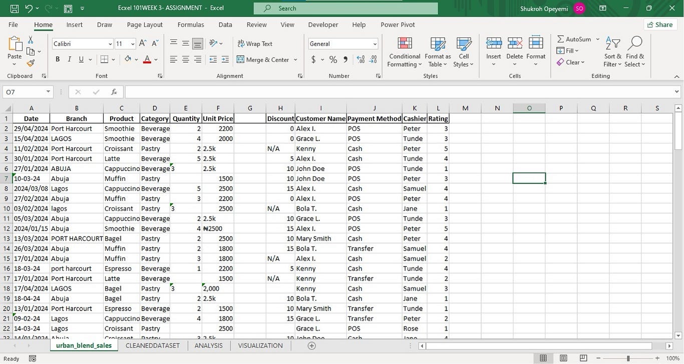
Understanding the Dataset
The café dataset contained daily transactions from multiple branches (Lagos, Abuja, Port Harcourt). The business wanted answers to core questions:
• How are branches performing?
• Which products drive revenue?
• How do payment methods influence sales?
• Who are the top-performing cashiers?
• What do ratings say about customer experience?
Before any insight could be extracted, the dataset needed serious cleaning.
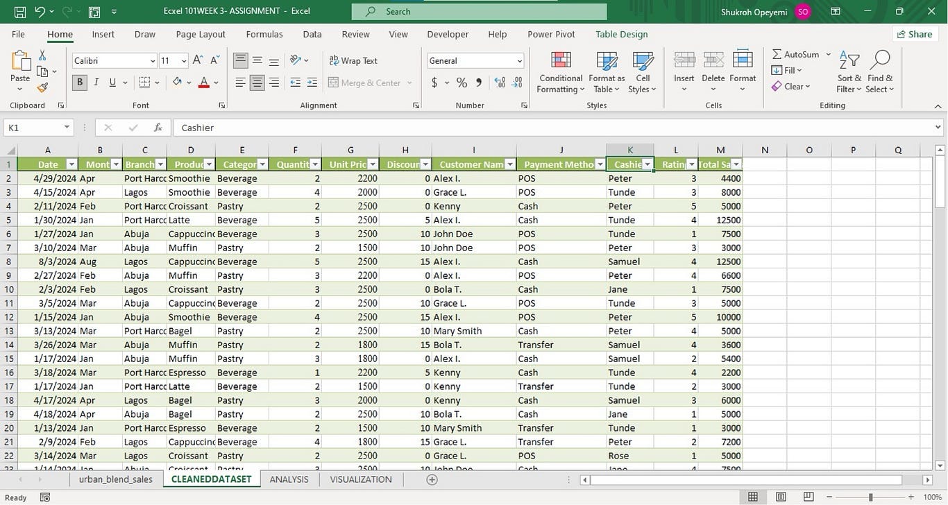
Data Cleaning Process
Date Field
The date column had mixed formats. I used Text to Columns twice — first standardizing to short date, then converting to DMY.
Extracted month with: =TEXT(A2, “mmm”).
Branches
Names were inconsistent (“lagos”, “LAGOS”).
Fixed with =PROPER(TRIM(A2)).
Quantity
The quantity column had written numbers (“two”), blanks, and errors.
• Converted text to numbers
• Replaced blanks with median using
=IF(ISBLANK(F2),MEDIAN($F$2:$F$126),F2)
Unit Price
This was the messiest: ₦ signs, commas, and entries ending with “K”.
After cleaning, I standardized all values using.
=IF(RIGHT(G2,1)=”K”,VALUE(LEFT(G2,LEN(G2)-1))*1000,VALUE(G2))
Discount
Missing and non-numeric values were converted to 0 using:
=IFERROR(VALUE(I2),0)
Customer Names
Some names had invisible characters.
Fixed with: =PROPER(TRIM(CLEAN(J2)))
All cleaning was done on a duplicate sheet to preserve the original dataset.
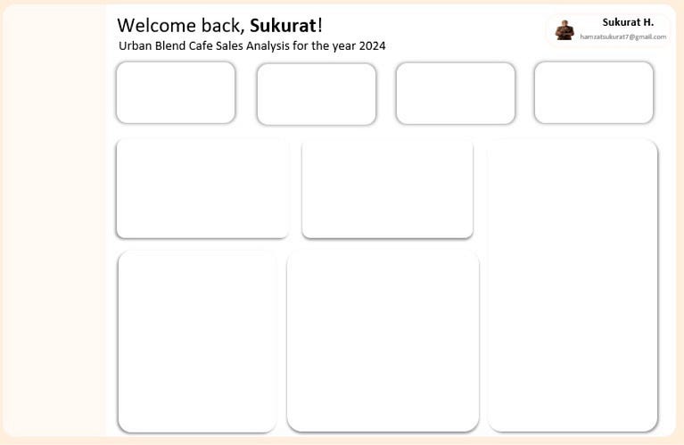
Dashboard Wireframing
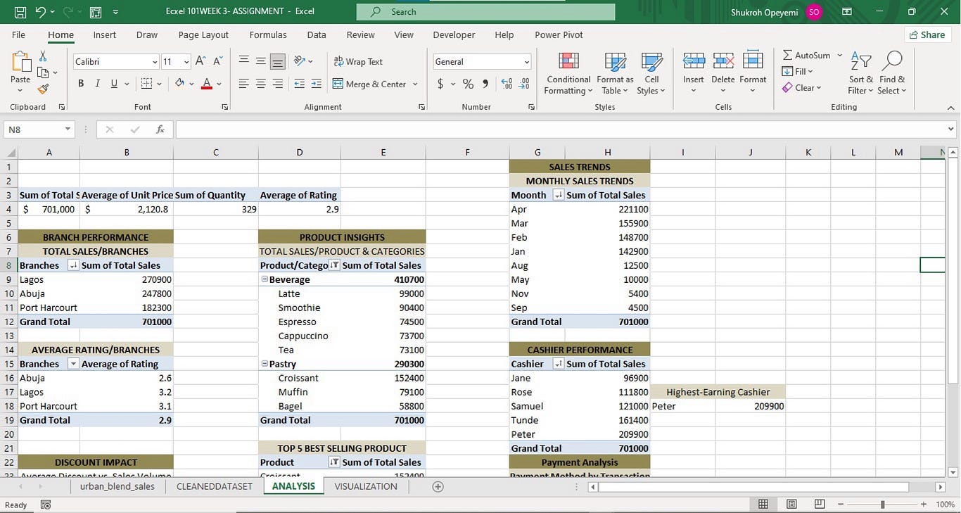
Wireframing was done in Excel.
Analysis & Visualizations
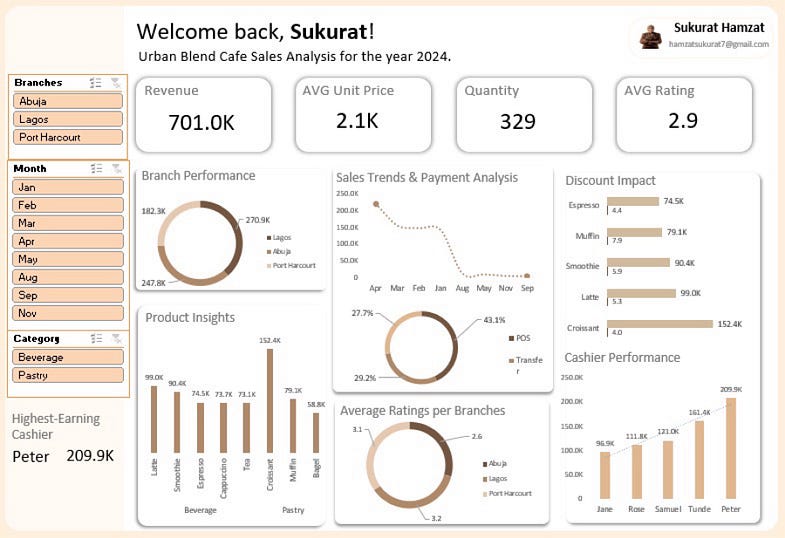
With the cleaned data, I built Pivot Tables, Pivot Charts, slicers, and a dashboard wireframe inside Excel.
Key Metrics
• Total Sales: ₦701.0K
• Average Unit Price: ₦2.1K
• Total Quantity Sold: 329
• Average Rating: 2.9
Business Insights
Branch Performance
• Lagos leads with ₦270.9K
• Abuja follows closely.
• Port Harcourt lags in sales but has better ratings.
Product Insight
Top revenue drivers:
-
Croissant: ₦152.4K
-
Latte: ₦99.0K
-
Bagel: ₦58.8K
Sales Trend
April had the highest sales (₦221.1K).
September and November were the lowest months.
Payment Behavior
• POS is the dominant method (43.1%).
• Transfers and Cash follow behind.
Cashier Performance
Peter stands out with ₦209.9K, the highest among all cashiers.
Recommendations
• Improve service in Abuja: high sales but low rating.
• Boost visibility in Port Harcourt: low sales but good customer satisfaction.
• Promote Cappuccino, Tea, Bagels to increase category-level revenue.
• Maintain Lagos’ strong performance with targeted customer retention strategies.
Conclusion
This project strengthened my skills in data cleaning, Excel functions, pivot-based insights, and dashboard storytelling.
It also shows how a messy dataset can tell a complete business story once properly structured.
Portfolio Link:
메타데이터
- post_id
- 30dba5ffc4e8
- slug
- urban-blend-café-sales-challenge-from-messy-data-to-actionable-insights-excel-project-30dba5ffc4e8
- url
- https://medium.com/@hamzatsukurat7/urban-blend-caf%C3%A9-sales-challenge-from-messy-data-to-actionable-insights-excel-project-30dba5ffc4e8
- canonical_url
- https://medium.com/@hamzatsukurat7/urban-blend-caf%C3%A9-sales-challenge-from-messy-data-to-actionable-insights-excel-project-30dba5ffc4e8
- author_url
- https://medium.com/@hamzatsukurat7
- status
- ok
- fetched_at
- 2026-06-09 15:37:30