Why Design Reviews Matter (and How I Built One)
We’ve all been there. You spend weeks perfecting a UI, only to see the live version and think… “Wait, that’s not what I designed.” Maybe…
Why Design Reviews Matter (and How I Built One)
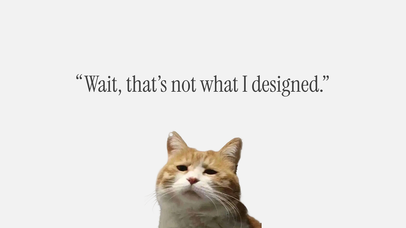
We’ve all been there. You spend weeks perfecting a UI, only to see the live version and think… “Wait, that’s not what I designed.” Maybe the spacing is a bit off, or a font weight feels heavy. It’s that “slightly off” feeling that kills a product’s polish.
I noticed this happening a lot, and instead of just pointing it out, I wanted to build something that would actually help our whole team. I created a standardized Design Review process and template in Figma to help bridge that gap between design and code.
What exactly is a “Design Review”?
To me, a design review is the ultimate “sanity check”. It’s a specialized inspection to see if the final developed product actually matches the design. It’s not a full system test; it’s a focused check from the design perspective to make sure everything from the flow to the motion is exactly where it needs to be.
Why I felt we needed this
I realized that having a clear system would make our lives easier in a few ways:
- Team Alignment: It gives the Product designer, Dev, and QA teams one single source of truth to look at.
- Quality & Consistency: It ensures our Design System rules are followed and identifies any UX/UI or motion errors before they reach the user.
- Developer Clarity: It gives developers a neat, orderly way to see what needs fixing without the guesswork.
The 6 Pillars I Focus On
When I do these reviews, I always check these six specific areas to keep the quality high:
- Spacing & Alignment: Checking for any pixel-level discrepancies.
- Typography: Verifying font sizes, weights, and line heights.
- Color Palette: Making sure the brand colors and system colors match.
- Components: Checking that buttons and inputs follow the Design System.
- Responsiveness: Testing how the design holds up across different screen sizes.
- Empty & Error States: Ensuring those “forgotten” states are actually there.
How the Workflow Actually Looks
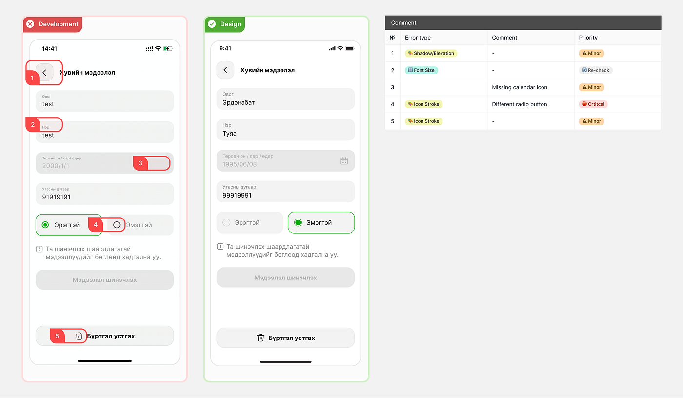
I didn’t want this to be a list of complaints, so I made it very visual. We use a dedicated Figma section for a Side-by-Side Comparison.
- Visual Side-by-Side: I place a screenshot of the dev implementation right next to the original design so the differences are undeniable.
- The “Sticker” System: To save time, I use a tagging system. I just drop a sticker on the error for Spacing, Typo, or Color.
- Prioritization: I tag everything so developers know what’s a Critical must-fix and what is just a Minor visual polish for later.
Why This Works
I’ve set this up as a four-step cycle: Initiate, Execute, Notify, and Resolve. Since I introduced this template, our feedback loops have gotten way shorter. I spend less time writing long explanations, and my developers have a clear, prioritized checklist to follow.
The gap between “what I designed” and “what we shipped” has never been smaller. If your handovers feel a bit messy, I highly recommend building a system like this — it’s a small investment that makes a huge difference for the whole team.
메타데이터
- post_id
- 322180ff8dbb
- slug
- why-design-reviews-matter-and-how-i-built-one-322180ff8dbb
- url
- https://medium.com/@nami0425/why-design-reviews-matter-and-how-i-built-one-322180ff8dbb
- canonical_url
- https://medium.com/@nami0425/why-design-reviews-matter-and-how-i-built-one-322180ff8dbb
- author_url
- https://medium.com/@nami0425
- status
- ok
- fetched_at
- 2026-06-22 17:31:34