API Monitoring of Scheduled Jobs: Lakeflow in Databricks
Lakeflow Monitoring in Databricks: How to create a Scheduled script density chart and visualize time slots using the API
API Monitoring of Scheduled Jobs: Lakeflow in Databricks
At Databricks, more and more teams are starting to use Lakeflow (Jobs & Pipelines), and some companies use it primarily for orchestrating scripts in Databricks. It's a powerful tool for building dependencies, but as the number of jobs grows, problems arise due to the lack of convenient monitoring.

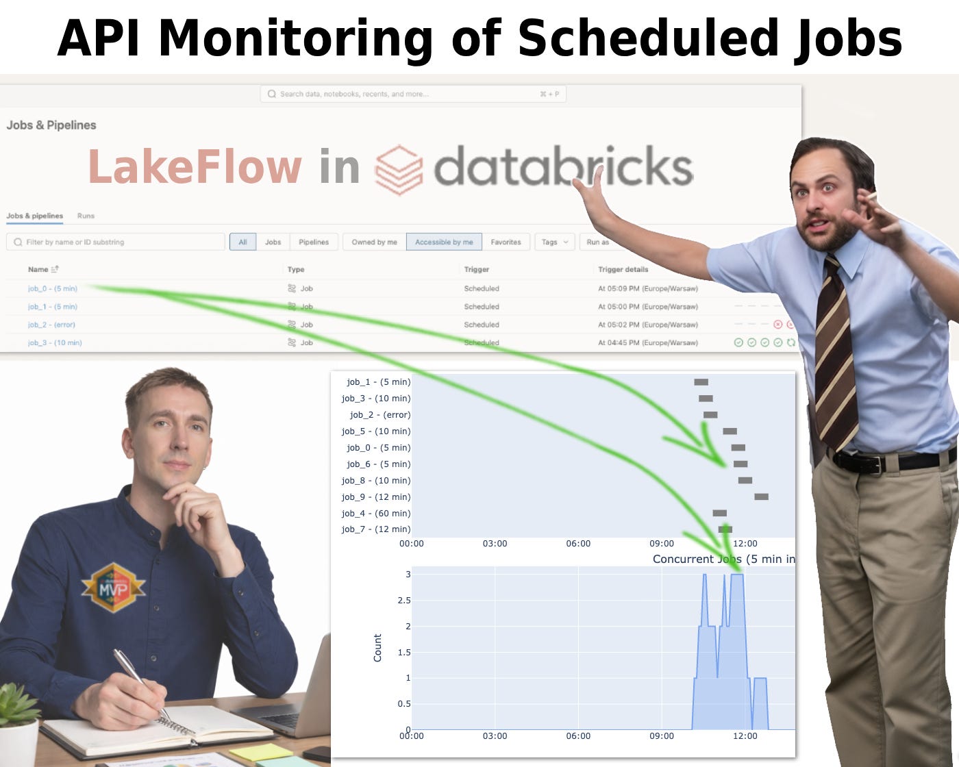
When you open Jobs & Pipelines, you see a list of jobs, but you don't see how they interact with each other or how dense they are.
There are dozens of tasks, most of which are scheduled for around 8 a.m. The result is chaos that's hard to see but has a significant impact on the infrastructure. Sometimes you might run out of IP addresses in your subnet or the number of reserved resources. And sometimes you just want to choose a free window, but how? In this article, I'll offer my solution.
Even in the cloud, there are limits, and technically, this is a problem of competition for resources:
- Cloud Quotas: vCPU limit per region.
- Databricks Control Plane: Limits on the number of concurrent API calls when starting clusters.
- Thundering Herd: The effect when dozens of jobs with a CRON schedule of *0 8 * ** simultaneously knock on the Cloud Provider's door for resources. This is guaranteed to increase Cluster Provisioning Time*.
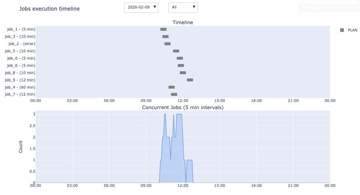
To solve this problem, I wrote a script that retrieves all the necessary information via the API. You can also use system tables (system.lakeflow.job_task_run_timeline and system.lakeflow.jobs ) instead, but the data appears with a delay and won't include jobs that haven't run yet. The script generates two key graphs.
1. Gantt Chart: Visualization of time slots. Here, we see not only the status (Running/Scheduled) but also the duration of execution. This allows us to instantly identify long jobs that are blocking resources for hours.

2. Concurrency Histogram: The most important tool. It breaks down the day into 5-minute intervals and shows how many jobs are running concurrently in each slot. This allows you to see load peaks that are invisible in the standard interface.

Technical Implementation
The solution is built on interaction with the Databricks Jobs API and simple time series mathematics.
- Using the API, we extract all current scripts that are set on the schedule, as well as their execution history:
wc = WorkspaceClient()

jobs = list(wc.jobs.list())
job_details = {j.job_id: wc.jobs.get(j.job_id) for j in jobs}- We use your current time zone instead of UTC (more about time zones):
report_time_zone = 'America/New_York' # set your time zone- From the parameters, we extract the planned launch time:
df_jr_jobs = df_jr_jobs.withColumn("plan_time", expr(f"""
        CASE
            WHEN job_cron_expression <> '' THEN
                from_utc_timestamp(
                    to_utc_timestamp(
                        make_timestamp(
                            year(current_timestamp()),
                            month(current_timestamp()),
                            day(current_timestamp()),
                            CAST(job_hour AS INT),
                            CAST(job_minute AS INT),
                            CAST(job_second AS INT)
                        ),job_timezone
                    ),
                    '{report_time_zone}'
                )
            ELSE null
        END
"""))- If desired, it can be distributed between teams to filter on the graphics:
df_jr_jobs = df_jr_jobs.withColumn("team", expr("""
        CASE
            WHEN
                job_name like '%(5 min)%'
                    THEN 'team 1'
            WHEN
                job_name like '%(10 min)%'
                    THEN 'team 2'
            ELSE 'Unknown'
        END
"""))- Draw two graphs:

The script takes into account not only active jobs, but also those planned for the future, allowing you to see everything in its entirety.
Having obtained the density graph, we discovered an expected but critical pattern: an extreme load peak. With easy-to-use monitoring, we shifted heavy but not urgent jobs. As a result, the concurrency graph became flatter. We reduced peak vCPU consumption, which allowed us to more reliably receive Spot instances from the cloud provider and reduced cluster startup latency.
Schedule monitoring via API transforms orchestration management from guesswork into a precision engineering discipline. (Full script at the link)
Subscribe to my free blog on Medium so you don’t miss future articles. This is one in a series of articles that will help you simplify Databricks Administration. I also recommend reading the previous ones:
메타데이터
- post_id
- 33a221d9f891
- slug
- api-monitoring-of-scheduled-jobs-33a221d9f891
- url
- https://medium.com/@protmaks/api-monitoring-of-scheduled-jobs-33a221d9f891
- canonical_url
- https://medium.com/@protmaks/api-monitoring-of-scheduled-jobs-33a221d9f891
- author_url
- https://medium.com/@protmaks
- status
- ok
- fetched_at
- 2026-06-25 07:00:49