Correct Use of Histogram Chart
From confusion to clarity in choosing histogram charts
Correct Use of Histogram Chart
From confusion to clarity in choosing histogram charts
Today in this article, we will learn how and when to choose a histogram chart, so you can visualize your data in the most accurate way.
First, let us understand what a histogram chart is. A histogram is similar to a bar chart, and they may look identical at first glance.
However, there is a key difference, which you can clearly notice if you look closely. In a histogram, the bars are wide and placed close to each other, showing the continuity in the dataset. In a bar chart, the bars are thinner and separated, showing distinct categories.
This is where the real answer lies. Even though both charts look similar, each one tells a different story.
means where you dont choose the chart randomly but the data hold the demand , data decided the which one is best for accurate represent
What is the Logic Behind the Use of a Histogram Chart
In a histogram chart, we measure events, the things that keep repeating and follow a certain pattern. This type of data has a natural flow. For example, temperature, age, time, or weight. Here we are analyzing one thing, one continuous variable.
Whereas in a bar chart, we analyze categories. We deal with different categories, for example different items sold by an Amazon seller.
Now, how to identify a histogram chart. When you see bars that are very close to each other and have a broader width, and the data is based on one variable, then yes, that is a histogram chart.
You can also find mistakes using this logic. If someone uses a histogram chart where there are different categories to compare, then it is the wrong use. In that case, a bar chart should be used instead.
Lets Understand in More Detail the Use of an Actual Histogram Chart
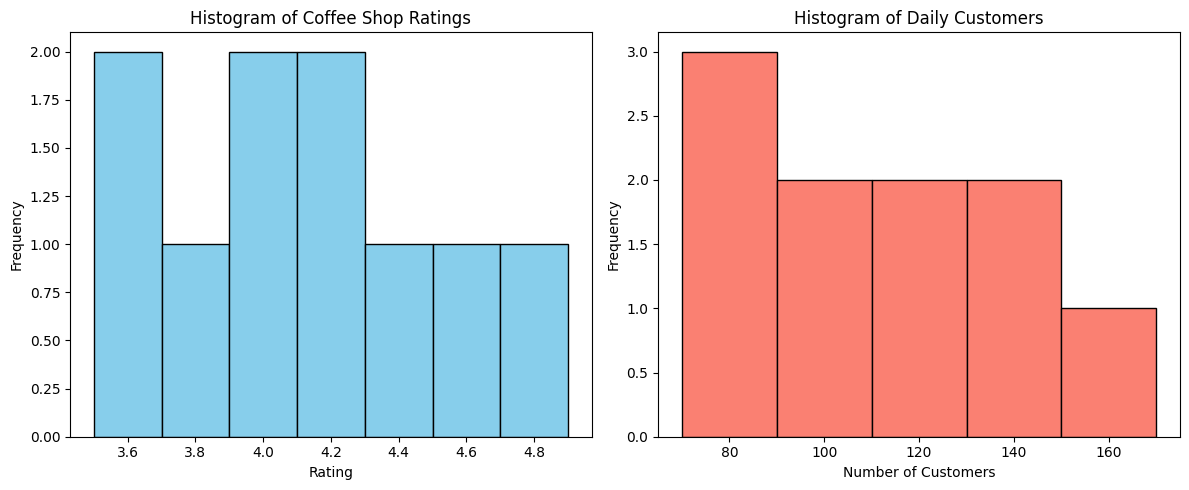
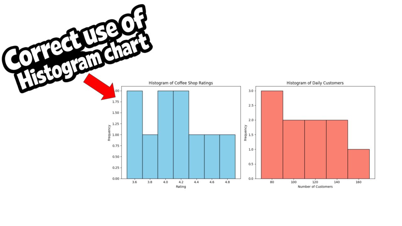
Here you can see the proper use of a histogram chart. I have taken an example of a coffee shop dataset. In this dataset, I made sure the data is not suitable for a bar chart. The right chart to use here is a histogram.
If you try to use this data in a bar chart, it will not make much sense, because the data is continuous, not categorical.
To make it more clear, I have also added a screenshot of the dataset. You can look at it and understand what type of data is best suited for a histogram chart.

If you want me to explain this dataset, the first thing you will notice is the continuity in the data. The first dataset is about ratings of the coffee shop, and the second one shows daily customer numbers.
Let’s take the rating dataset as an example. Imagine a coffee shop present across different cities, and it has different ratings in each city. We collect and analyze this rating data.
Now, this data falls under one variable and has a continuous nature. Because of that, it is not suitable for a bar chart.
When you plot this rating data using a histogram chart, you can clearly see how the ratings are distributed across cities. This makes it easier to understand the overall pattern of customer ratings.
import matplotlib.pyplot as plt
import numpy as np

ratings = [4.5, 3.8, 4.2, 4.0, 3.5, 4.7, 3.9, 4.1, 4.3, 3.6]
customers = [120, 85, 150, 95, 70, 130, 90, 110, 140, 75]

# Scatter plot
plt.scatter(ratings, customers, color='purple')
plt.title("Ratings vs Daily Customers")
plt.xlabel("Rating")
plt.ylabel("Daily Customers")
plt.show()

# Pearson correlation
correlation = np.corrcoef(ratings, customers)[0, 1]
print("Correlation coefficient:", correlation)
Here is the simple script I used to plot the chart. You can see I have used Matplotlib, which is one of the best libraries for plotting charts. I first imported the two datasets and then plotted them one by one.
You can see two charts after importing the data. This is because of the plt.subplot() function, which allows us to display multiple charts together.
plt.subplot()Hey there, I’m Ajay a passionate engineer, writer on Medium, and a huge Python enthusiast. Thanks for sticking with me till the end!
If you enjoyed this content and want to support my work, the best ways are:
- Drop a Clap 👏 and share your thoughts 💬 below!
- Follow me here on Medium.
- Connect with me on LinkedIn.
- Follow me on X here.
- Join my email list so you never miss another article.
- And don’t forget to follow **The Visual Analyst** for more stories like this.
Thanks again for reading! 😊
메타데이터
- post_id
- 346d5bc3562c
- slug
- correct-use-of-histogram-chart-346d5bc3562c
- url
- https://medium.com/the-visual-analyst/correct-use-of-histogram-chart-346d5bc3562c
- canonical_url
- https://medium.com/the-visual-analyst/correct-use-of-histogram-chart-346d5bc3562c
- author_url
- https://medium.com/@ajayparmar7058
- status
- ok
- fetched_at
- 2026-06-14 11:28:49