The Cost of Friction: 4 High-Impact Conversion Optimisation Tips to Double Your Revenue (Without…
We’ve all been there. You spend weeks perfecting an ad campaign or months grinding out an SEO strategy. The traffic finally starts pouring…
The Cost of Friction: 4 High-Impact Conversion Optimisation Tips to Double Your Revenue (Without Spending More on Ads)
We’ve all been there. You spend weeks perfecting an ad campaign or months grinding out an SEO strategy. The traffic finally starts pouring in, the charts look great, and then… cricket silence. The traffic leaves, and your revenue barely budges.
When a digital business wants to grow, the default reflex is almost always: “We need more traffic.”
But chasing more traffic before fixing your website is like trying to fill a leaking bucket by turning up the faucet. It’s expensive, exhausting, and highly inefficient.
Conversion Rate Optimisation (CRO) is the process of fixing the leaks in that bucket. If you double your traffic, you double your revenue. But if you double your conversion rate, you double your revenue without spending a single extra dollar on marketing.
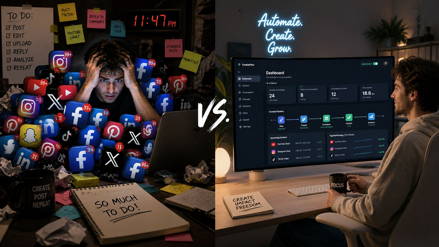
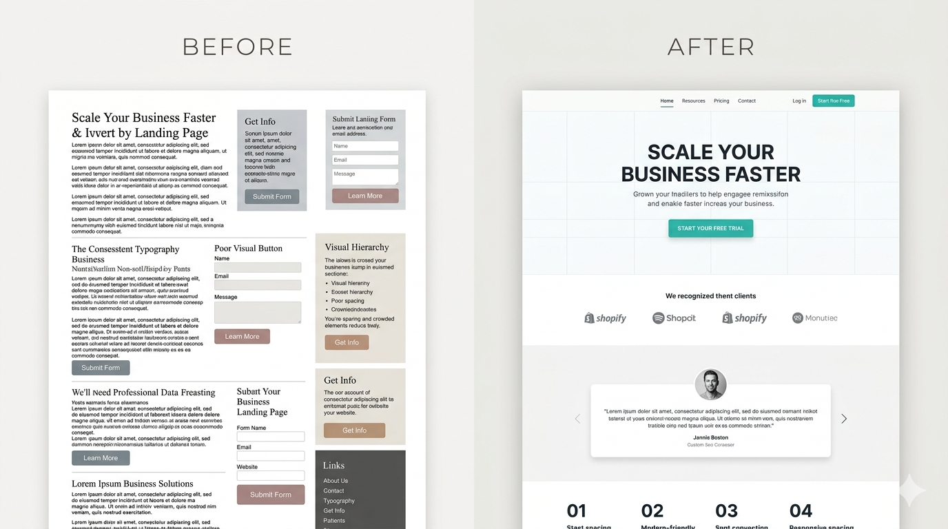
If your landing page feels a bit like the chaotic, cluttered mess on the left side of watermarked_img_15659047497270524932.png, it’s time to streamline. Here are four high-impact, low-effort CRO quick wins you can implement this week to transform your site into the high-converting machine on the right.
1. Master Your “Above the Fold” Real Estate
When a user lands on your website, a digital timer starts ticking. You have exactly 3 seconds to answer three critical questions before they bounce:
- What do you offer?
- Who is it for?
- What should I do next?
The Problem: Many businesses hide this information behind massive, ambiguous artistic videos, vague taglines (like “We empower synergy”), or force the user to scroll to find value.
The Fix: Your value proposition must be crystal clear and instantly visible without scrolling. Pair a bold, benefit-driven headline with a single, high-contrast Call to Action (CTA) button right at the top. If a user has to think to understand what you do, you’ve already lost them.
2. Ruthlessly Eliminate Form Friction
Every single form field you ask a user to fill out drops your conversion rate. It acts as a mental roadblock.
The Problem: Marketing and sales teams often want all the data upfront. They demand a name, personal email, business email, phone number, company size, annual revenue, and job title to download a simple 5-page e-book.
The Fix: Review your lead-generation forms and ruthlessly pare them down to the absolute essentials. In most cases, this is just Name and Email. If you genuinely need more data, use progressive profiling (asking for more details on subsequent visits) or multi-step forms that break the friction down into digestible chunks.
3. Replace Generic CTAs with “Value-Based” Language
The text inside your action buttons carries immense psychological weight. Yet, most websites treat it as an afterthought.
The Problem: Buttons that say “Submit,” “Click Here,” or “Learn More” trigger psychological friction. “Submit” sounds like work, and “Learn More” sounds like a homework assignment. Nobody actually wants to do either.
The Fix: Rewrite your CTAs to reflect the exact value or benefit the user gets the moment they click.
- ❌ Instead of: “Submit”
- Try: “Get My Free Audit”
- ❌ Instead of: “Sign Up”
- Try: “Start Growing My Traffic”
4. Inject Contextual Social Proof
Human beings are wired to look to others to determine correct behaviour. If potential customers see that people just like them trust you, their anxiety melts away.
The Problem: Many companies create a beautiful “Testimonials” or “Reviews” tab in their navigation menu and call it a day. The issue? Users rarely click it. They need reassurance at the exact moment they are feeling hesitant.
The Fix: Move your social proof out of its silo and place it contextually throughout the user journey. Put a powerful 5-star quote right under your checkout button. Place industry logos right beneath your main hero headline. Put a testimonial next to your pricing chart. Reassurance should always be within arm’s reach of an action.
The Bottom Line
True conversion optimisation isn’t about massive, risky website overhauls or guessing what looks pretty. It’s a disciplined practice of removing the friction, noise, and anxiety that cause potential customers to drop off.
Look at your landing page through the eyes of a sceptical, busy first-time visitor today. Where are they getting stuck? Fix that one thing, and watch your metrics shift.
What is the biggest conversion killer you’ve noticed on modern websites? Let’s talk about it in the comments below!
ConversionRateOptimization #CROTips #DigitalMarketing #GrowthMarketing #WebDesign #UIUX #MarketingStrategy #SitikanthaMuhuri #SMWebsphere
— — — — — — — — — — — — — — — — — — — — — — — — — — — — — — — — — — -
Name — Sitikantha Muhuri
Contact — https://linktr.ee/sm_websphere
메타데이터
- post_id
- 3a867a76878a
- slug
- the-cost-of-friction-4-high-impact-conversion-optimisation-tips-to-double-your-revenue-without-3a867a76878a
- url
- https://medium.com/@hello.designbysm/the-cost-of-friction-4-high-impact-conversion-optimisation-tips-to-double-your-revenue-without-3a867a76878a
- canonical_url
- https://medium.com/@hello.designbysm/the-cost-of-friction-4-high-impact-conversion-optimisation-tips-to-double-your-revenue-without-3a867a76878a
- author_url
- https://medium.com/@hello.designbysm
- status
- ok
- fetched_at
- 2026-06-09 15:37:30