Design vs. Countdown: I had 5 minutes to design a landing page
There’s a particular kind of pressure that comes from a ticking clock. Not the slow, grinding pressure of a deadline two weeks away — but…
Design vs. Countdown: I had 5 minutes to design a landing page
There’s a particular kind of pressure that comes from a ticking clock. Not the slow, grinding pressure of a deadline two weeks away — but the sharp, electric kind. The kind that shuts your brain up and forces your hands to just move.
That’s what I put myself through with the Design vs. Countdown Challenge.
The rules were simple: one landing page, one brief, five minutes on the clock. The subject? A travel booking site. Clean, aspirational, functional. The kind of page that makes you want to quit your job and book a flight before the tab even fully loads.
Here’s the full video of how I did it:
[embed]
The Setup
Here’s the thing most people get wrong about design challenges: they think speed means cutting corners. But this challenge wasn’t about drawing faster — it was about deciding faster.
Every single component I used was already pre-designed on MadeinFigma. The hero section, the booking widget, the resort cards, the testimonials, the FAQ accordion, the footer — all of it. Ready-made, pixel-perfect, and sitting one click away.
My job wasn’t to design anything from scratch. My job was to browse the library, hit “Copy to Figma,” paste each component into my file, and arrange it all into a layout that actually made sense.
That sounds simple. Under a five-minute countdown, it is anything but.
I set the timer and hit start.
The First 60 Seconds: Establish the Story
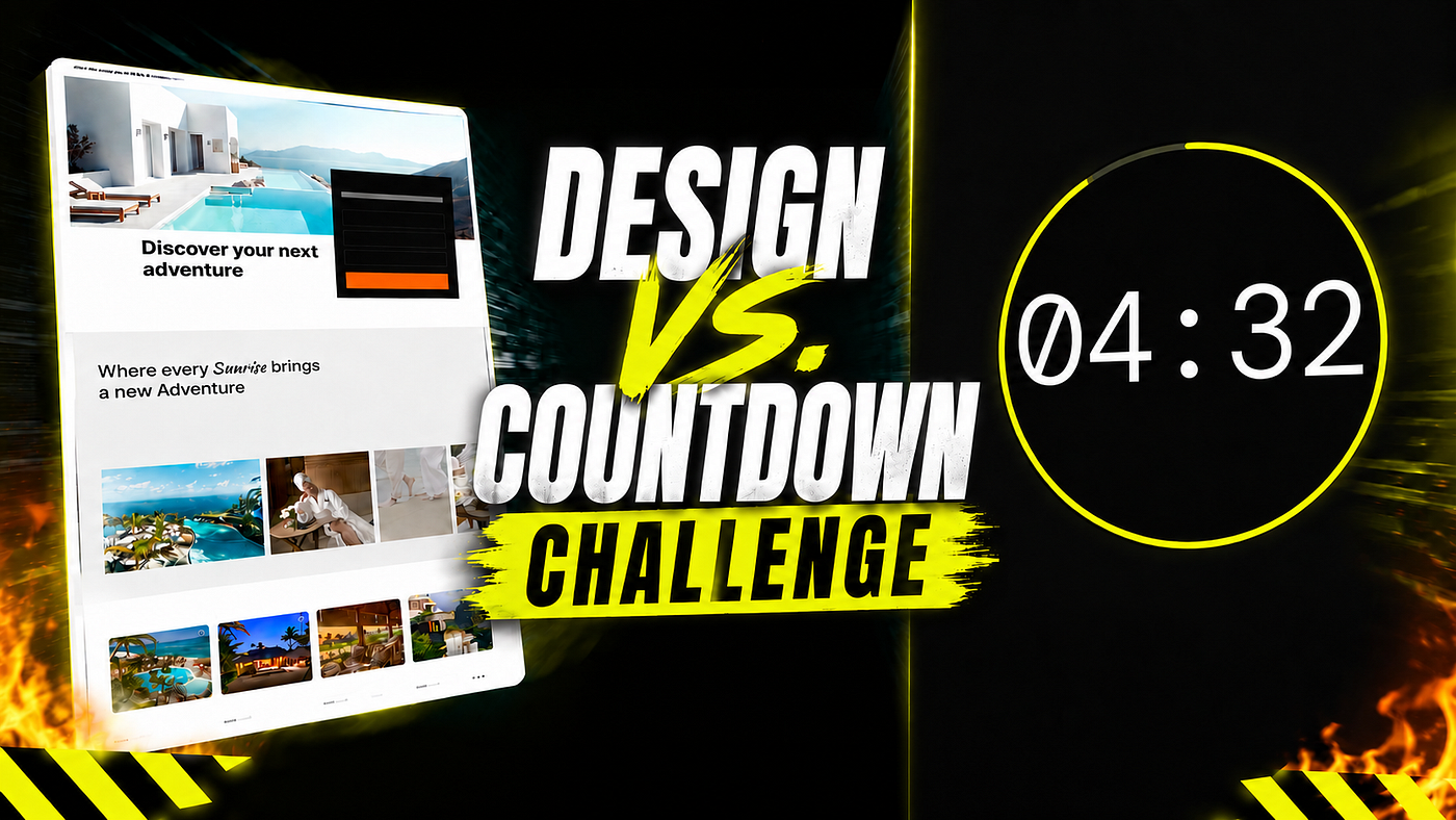
The hero had to come first — it sets the tone for every decision that follows. I grabbed the full-bleed travel hero from Made in Figma: a stunning poolside shot, bold headline, booking widget floating on the right with location, departure, and return fields. Orange CTA. Pasted. Positioned.
The clock was at 4:16 when I moved on.
No tweaking. No “maybe a different image.” The component was already good — my call was simply yes or keep scrolling, and I chose yes.
Minutes Two and Three: Build the Scroll
The middle of a landing page is where visitors either lean in or bounce. I needed rhythm and variety — not just a wall of cards.
A serif headline section came next, followed by a horizontal photo strip of destination shots spanning the full width. Both: copy, paste, arrange. Then the resort discovery grid — eight cards across two rows, each pre-loaded with an image, resort name, location, nightly rate, and star rating. The whole section took under ninety seconds because I wasn’t building any of it. I was sequencing it.
This is the skill Made in Figma quietly forces you to develop: not “can I design a card?” but “does this card belong here, and does it follow naturally from what came before it?”
The clock hit 2:30 as the grid locked into place.
The Final Two Minutes: Close Strong
A testimonials section — three quote cards with star ratings — came together in seconds. Social proof, done. Then a full-width CTA banner with a “Book Now” button for the mid-page hook. Then the FAQ accordion. Then the footer: logo, five link columns, language selector, legal line, payment logos.
Every piece already existed. Every piece just needed a home.
The Finish: 0:31 Left on the Clock
When the timer hit one minute, I had the footer left. The temptation was to slow down — to nudge spacing, check alignment, reorder a section. I didn’t. I pasted the footer, checked that the layout read top to bottom in a way that made sense, and stopped the clock.
31 seconds remaining.
What the Challenge Actually Tests
I wanted to find out one thing: how fast can I put together a landing page using MadeinFigma?
The answer: five minutes. With 31 seconds to spare.
Every component was already there — I just had to browse the library, copy what I needed, paste it into Figma, and arrange it into a layout that made sense. No building from scratch, no time lost on production. Just speed.
The Finished Design
The finished design covers every section a travel landing page needs: a hero with an integrated booking widget, a destination inspiration strip, a resort discovery grid, social proof, a bold mid-page CTA, an FAQ accordion, and a complete footer.
Every component came from MadeinFigma. The layout — the sequence, the hierarchy, the story it tells from top to bottom — that part was mine.
And it came in with 31 seconds to spare.
메타데이터
- post_id
- 3b8d3b2dc561
- slug
- design-vs-countdown-i-had-5-minutes-to-design-a-landing-page-3b8d3b2dc561
- url
- https://medium.com/@ryan.almeida86/design-vs-countdown-i-had-5-minutes-to-design-a-landing-page-3b8d3b2dc561
- canonical_url
- https://medium.com/@ryan.almeida86/design-vs-countdown-i-had-5-minutes-to-design-a-landing-page-3b8d3b2dc561
- author_url
- https://medium.com/@ryan.almeida86
- status
- ok
- fetched_at
- 2026-06-09 15:37:30