Designing a Reporting Tool based on a Taxonomy: A Journey Through Complexity
How do you design an intuitive user experience based on a taxonomy structure?
Designing a Reporting Tool based on a Taxonomy: A Journey Through Complexity
Designing an intuitive user experience based on a taxonomy structure is no small feat — and it’s a challenge that will only grow as companies move toward *net zero*.
The **European Sustainability Reporting Standards (ESRS), developed under the [Corporate Sustainability Reporting Directive (CSRD)](https://finance.ec.europa.eu/regulation-and-supervision/financial-services-legislation/implementing-and-delegated-acts/corporate-sustainability-reporting-directive_en), mark a major shift in how companies report on non-financial performance. By defining environmental, social, and governance (ESG) disclosures in a structured, machine-readable format using [eXtensible Business Reporting Language (XBRL)](https://www.xbrl.org/the-standard/what/what-is-xbrl/), the ESRS** promises greater transparency and accountability across European companies.
But for those tasked with turning this taxonomy into a usable reporting tool — something real people can interact with — the challenge goes far beyond technical implementation.
What begins as a data and compliance exercise quickly becomes an intricate problem of design, semantics, and usability. This article explores what it takes to build a usable ESRS reporting tool — and what we learned along the way, and what we are still learning.
It’s a structure still in its infancy: the raw clay before it becomes the brick.

Photo by Alex Jones on Unsplash
1. ESRS Was Built for Structure, Not for Humans
Let’s start with the obvious: the ESRS taxonomy wasn’t designed with users in mind.
Titles and labels are long, formal, and regulatory — intended for traceability, not readability. You encounter disclosures like:
“Disclosure on policies adopted to manage material impacts, risks and opportunities and actions taken, and the result of such actions with respect to climate change mitigation and adaptation.”
Now imagine fitting that neatly into a responsive UI.
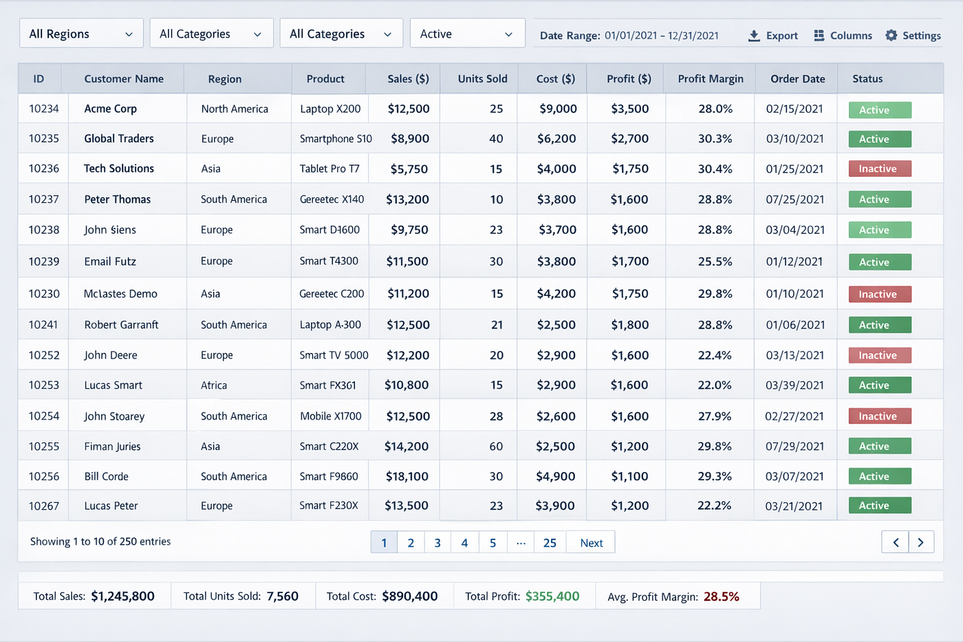
Designing a tool that presents such language without overwhelming the user is a serious challenge. Even worse, many disclosures are nearly identical, making it hard for users to know which applies without expert guidance.
We found ourselves juggling between faithfulness to the taxonomy and clarity for the user — using long labels, nested layouts, and sometimes cryptic section names just to make sense of it all.
2. It’s Not Just a Table — It’s a Multi-Dimensional Matrix
The ESRS taxonomy isn’t flat; it’s a deeply interconnected web of tables, dimensions, and relationships. A single climate disclosure might span:
- Narrative descriptions (qualitative policies)
- Quantitative KPIs (GHG Scope 1, 2, 3)
- Temporal dimensions (current, prior, and target years)
- Entity scopes (consolidated vs. individual entities)
What looks like a simple form field is actually a dynamic, context-sensitive matrix. The UI must adapt intelligently — displaying the right fields, units, and contexts — without confusing the user.
Balancing flexibility with simplicity became a constant negotiation. We wanted to give users options — but not overwhelm them.

Photo by Markus Spiske on Unsplash
3. Labels, Sections, and Hierarchies Are Confusing
The ESRS taxonomy’s semantic structure doesn’t map cleanly to how humans think.
Its section groupings follow legal logic rather than practical workflows. Labels come straight from directive text. Relationships between disclosures are often ambiguous: sometimes cumulative, sometimes alternative, and sometimes both — depending on interpretation.
This forces a fundamental design decision:
- Mirror the taxonomy faithfully, and risk confusing users,
or
- Redesign for usability, and risk diverging from the official standard.
Neither path is “correct.” Both involve trade-offs between compliance and clarity.
4. Validation Logic Is Heavy and Context-Dependent
The taxonomy includes validation rules through XBRL formula linkbases — and even conditional logic that depends on prior user inputs.
For example:
If a company declares that climate change is not material, it must provide a justification.
Simple enough in theory. In practice, these dependencies aren’t always encoded in machine-readable ways. Some validations live outside the taxonomy, buried in the ESRS Application Guidance (AG).
This leads to three major issues:
- Incomplete automation — Not all rules can be programmatically checked.
- Non-obvious errors — A single input may cause cascading issues elsewhere.
- Conditional complexity — UIs must dynamically show or hide fields, complicating validation and completeness checks.
The result: every design choice ripples across the entire reporting experience.

Photo by Alina Grubnyak on Unsplash
5. The Taxonomy Evolves — and May Break Everything
Like any XBRL taxonomy, the ESRS will evolve. New disclosures will appear, definitions will shift, inconsistencies will be fixed.
This is good for accuracy — but challenging for tool builders.
A reporting tool can either:
- Lock users into one taxonomy version (limiting flexibility), or
- Rebuild dynamically with each new release (requiring a robust metadata engine).
Each update risks breaking old reports or altering expectations. Supporting ‘diffing’ — i.e. comparing two versions to see what’s changed — as well as change alerts become important for long-term usability and trust.
6. Bridging the Gap Between Technical Accuracy and Usability
At the heart of it all lies a deep tension:
The ESRS taxonomy is technically accurate — but not designed for humans.
Building a reporting tool means acting as a translator between two worlds:
- The rigid language of regulation,
and
- The fluid experience of human understanding.
Bridging that gap requires rewriting labels, designing contextual help, grouping related data, and guiding users through both what they must report and why it matters.
This translation layer isn’t optional — it’s where most of the real work happens.

Photo by Ben Stein on Unsplash
Final Thoughts: Designing for Transparency
The ESRS taxonomy is a monumental step forward for sustainability reporting. But to fulfil its potential, the tools that support it must be just as ambitious — technically, semantically, and experientially.
To build a truly usable ESRS reporting tool, teams must:
- Abstract complexity without oversimplifying
- Design multi-layered experiences for different roles
- Build context-aware workflows, not static forms
- Collaborate across technical and policy domains
- Translate regulation into meaningful interaction
Ultimately, the ESRS is more than a compliance framework. It’s a design challenge.
And the way we meet that challenge today will define how transparent, effective, and accessible sustainability reporting becomes tomorrow.
Find out more about our ESG reporting tool, KINTO Zero.
메타데이터
- post_id
- 3d8bb66a1d21
- slug
- designing-a-reporting-tool-based-on-a-taxonomy-a-journey-through-complexity-3d8bb66a1d21
- url
- https://medium.com/the-design-loop/designing-a-reporting-tool-based-on-a-taxonomy-a-journey-through-complexity-3d8bb66a1d21
- canonical_url
- https://medium.com/the-design-loop/designing-a-reporting-tool-based-on-a-taxonomy-a-journey-through-complexity-3d8bb66a1d21
- author_url
- https://medium.com/@polly.taylor
- status
- ok
- fetched_at
- 2026-06-13 07:35:29