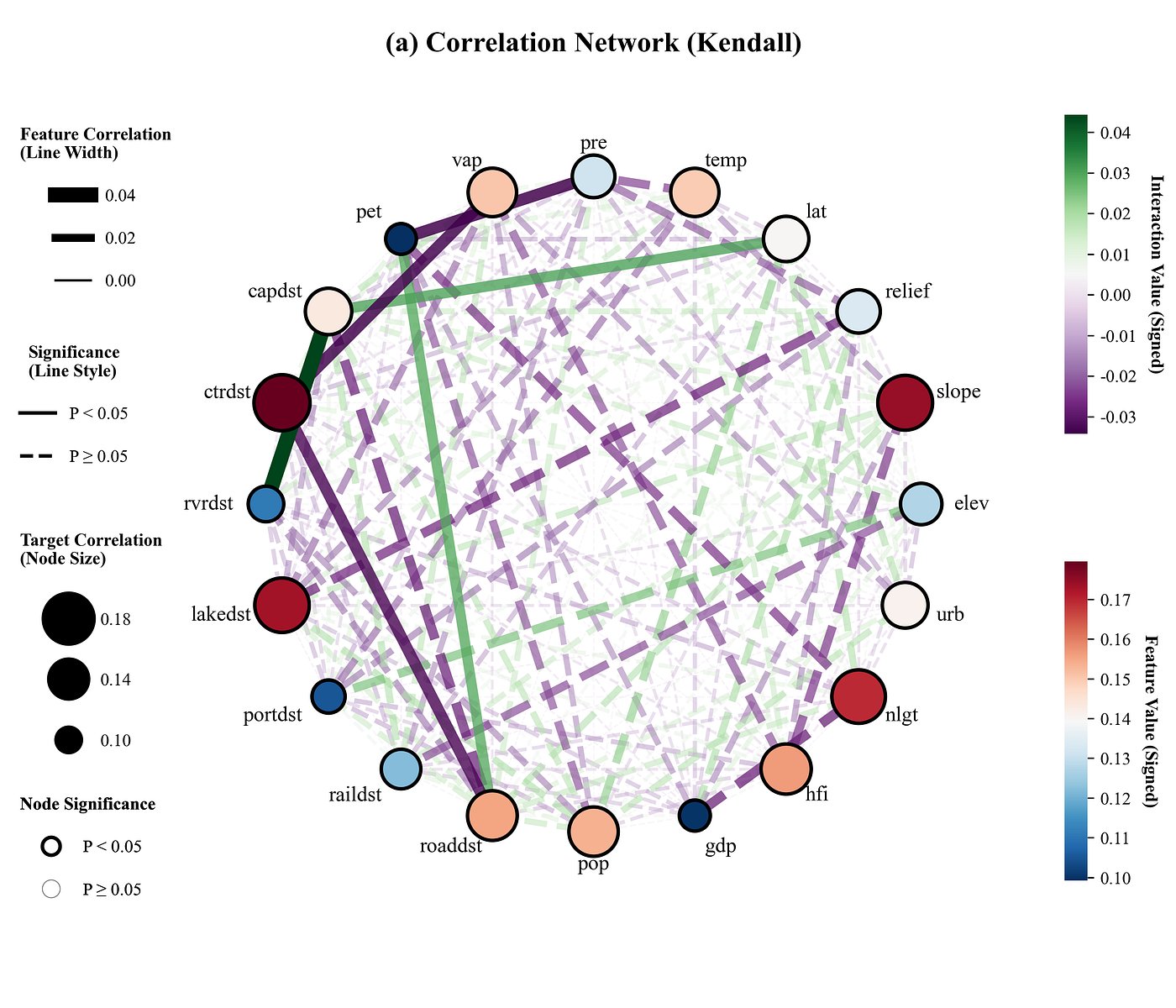
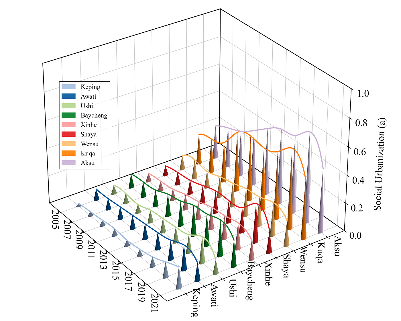
Journal Figure Replication | Plotting a Horizontal Percent Stacked Bar Chart with Python
Horizontal Percent Stacked Bar Chart
Journal Figure Replication | Plotting a Horizontal Percent Stacked Bar Chart with Python
Result
Paper: A land–water–energy–greenhouse gas nexus framework informs climate change mitigation in agriculture: A case study in the North China Plain

Imitation:

Code Explanation
- Importing libraries and configuring fonts
import matplotlib.pyplot as plt
import numpy as np
import matplotlib
matplotlib.rcParams['pdf.fonttype'] = 42
matplotlib.rcParams['ps.fonttype'] = 42
plt.rcParams['font.family'] = 'serif'
plt.rcParams['font.serif'] = ['Times New Roman']
plt.rcParams['axes.unicode_minus'] = False- Color library setup and color scheme selection
COLOR_SCHEMES = {
    1: ['#5D2126', '#A6302E', '#CD7D4E', '#EFE68A', '#DBEFF9'],
}

SCHEME_INDEX = 1
current_colors = COLOR_SCHEMES[SCHEME_INDEX]- Plotting function initialization and figure setup
def draw_and_save_chart(categories, labels, data, colors):
    fig, ax = plt.subplots(figsize=(10, 6))  # Create the canvas/figure
    bar_height = 0.75  # Width (thickness) of the horizontal bar chart
    y_pos = np.arange(len(categories))  # Generate position indices for the Y-axis ticks
    # Initialize the left margin to track the starting X-coordinate for each row's stacked bars
    left_bottom = np.zeros(len(categories))
    # Save the right-edge coordinates of each segment to draw connecting lines later
segments_right_edges = np.zeros((len(categories), len(labels)))- Loop to plot the stacked bar chart
        bars = ax.barh(y_pos,
                       values,
                       height=bar_height,
                       left=left_bottom,
                       color=color,
                       edgecolor='white',
                       linewidth=0.5,
                       label=label.replace('\n', ' '),
                       zorder=0)
        #Track the current segment's right edge
        segments_right_edges[:, i] = left_bottom + values
            ax.text(bar.get_x() + bar.get_width() / 2,
                    bar.get_y() + bar.get_height() / 2,
                    f'{val:.2f}',
                    va='center',
                    ha='center',
                    color=text_color,
                    fontsize=11,
zorder=15)- Draw hierarchical connecting lines
    # Draw connecting lines
    for row in range(len(categories) - 1):  # Iterate through each row of categories
        for col in range(len(labels)):  # Iterate through columns
            x1 = segments_right_edges[row, col]  # Get the right-edge X-coordinate of the bar segment in the current row
            y1 = y_pos[row] + bar_height / 2  # Upper-edge Y-coordinate of the current row's bar

            ax.plot(
                [x1, x2],
                [y1, y2],
                color='black',
                linewidth=1,
                zorder=10,
clip_on=False)- Chart styling and details configuration
    ax.set_yticks(y_pos)  # Set the primary ticks on the Y-axis
    ax.set_yticklabels(categories, fontsize=12)  # Set the tick labels text for the Y-axis
    ax.set_xlabel('Proportion of GHG emissions (%)', fontsize=12)  # Set the X-axis title
    ax.set_xlim(0, 100)  # Display range for the X-axis
    ax.tick_params(axis='x', labelsize=12)  # Set tick label font size for the X-axis

    # Configure horizontal background dashed lines
    minor_locs = np.arange(len(categories) - 1) + 0.5  # Position of minor ticks on the Y-axis
    ax.set_yticks(minor_locs, minor=True)  # Set the minor ticks on the Y-axis
    # Draw horizontal background dashed grid lines at the minor tick positions
    ax.grid(which='minor', axis='y', linestyle='--', alpha=0.7, color='gray', zorder=0)

    # Hide specified spines (borders)
    ax.spines['top'].set_visible(False)
    ax.spines['right'].set_visible(False)

    # Configure tick parameters
    ax.tick_params(axis='y', which='major', left=True, right=False, length=5, width=1, direction='out')
ax.tick_params(axis='x', direction='out')- Legend Setup
handles, plot_labels = ax.get_legend_handles_labels()
    #Add legends
    ax.legend(handles,
              labels,
              loc='upper left',
              bbox_to_anchor=(1, 1),
              frameon=False,
              fontsize=12,
              handlelength=1.0,
              handleheight=1.0)

plt.tight_layout()- Data preparation & plotting function execution
if __name__ == "__main__":
    categories = ['BS', 'S1', 'S2', 'S3', 'S4', 'S5']  # List of categories for the Y-axis
    labels = ['Rice', 'Agricultural\nland', 'Diesel use', 'Irrigation', 'Indirect']  # List of labels for the stacked segments

    # Define the data matrix where each row corresponds to a category and each column corresponds to a label
    data = np.array([
        [42.96, 9.57, 16.38, 16.60, 14.49],
        [38.28, 10.21, 17.49, 18.55, 15.47],
        [43.07, 9.35, 16.42, 16.64, 14.53],
        [44.19, 9.85, 16.85, 14.21, 14.90],
        [45.65, 10.17, 13.92, 17.63, 12.63],
        [42.36, 11.02, 15.48, 17.10, 14.04]
    ])

    draw_and_save_chart(categories, labels, data, current_colors)
Complete Code
# =========================================================================================
# ====================================== 1. Environment Setup =======================================
# =========================================================================================
import matplotlib.pyplot as plt
import numpy as np
import matplotlib
matplotlib.rcParams['pdf.fonttype'] = 42
matplotlib.rcParams['ps.fonttype'] = 42
plt.rcParams['font.family'] = 'serif'
plt.rcParams['font.serif'] = ['Times New Roman']
plt.rcParams['axes.unicode_minus'] = False

# =========================================================================================
# ====================================== 2. Color Library ==========================
# =========================================================================================
COLOR_SCHEMES = {
    1: ['#5D2126', '#A6302E', '#CD7D4E', '#EFE68A', '#DBEFF9'],
    2: ['#264653', '#2A9D8F', '#E9C46A', '#F4A261', '#E76F51'],
    3: ['#003f5c', '#58508d', '#bc5090', '#ff6361', '#ffa600'],
    4: ['#335c67', '#fff3b0', '#e09f3e', '#9e2a2b', '#540b0e'],
    5: ['#d72631', '#a2d5c6', '#077b8a', '#5c3c92', '#e2d810'],
    6: ['#ef476f', '#ffd166', '#06d6a0', '#118ab2', '#073b4c'],
    7: ['#f94144', '#f3722c', '#f8961e', '#f9c74f', '#90be6d'],
    8: ['#54478c', '#2c699a', '#048ba8', '#0db39e', '#16db93'],
    9: ['#0d3b66', '#faf0ca', '#f4d35e', '#ee964b', '#f95738'],
    10: ['#5f0f40', '#9a031e', '#fb8b24', '#e36414', '#0f4c5c'],
    11: ['#22223b', '#4a4e69', '#9a8c98', '#c9ada7', '#f2e9e4'],
    12: ['#606c38', '#283618', '#fefae0', '#dda15e', '#bc6c25'],
    13: ['#1d3557', '#457b9d', '#a8dadc', '#f1faee', '#e63946'],
    14: ['#8ecae6', '#219ebc', '#023047', '#ffb703', '#fb8500'],
    15: ['#cdb4db', '#ffc8dd', '#ffafcc', '#bde0fe', '#a2d2ff'],
    16: ['#000000', '#14213d', '#fca311', '#e5e5e5', '#ffffff'],
    17: ['#50514f', '#f25f5c', '#ffe066', '#247ba0', '#70c1b3'],
    18: ['#7400b8', '#6930c3', '#5e60ce', '#5390d9', '#4ea8de'],
    19: ['#386641', '#6a994e', '#a7c957', '#f2e8cf', '#bc4749'],
    20: ['#355070', '#6d597a', '#b56576', '#e56b6f', '#eaac8b'],
}

SCHEME_INDEX = 1
current_colors = COLOR_SCHEMES[SCHEME_INDEX]

# =========================================================================================
# ====================================== 3. Plotting Function ==========================
# =========================================================================================
def draw_and_save_chart(categories, labels, data, colors):
    fig, ax = plt.subplots(figsize=(10, 6))  # Create the canvas/figure
    bar_height = 0.75  # Width (thickness) of the horizontal bar chart
    y_pos = np.arange(len(categories))  # Generate position indices for the Y-axis ticks
    # Initialize the left margin to track the starting X-coordinate for each row's stacked bars
    left_bottom = np.zeros(len(categories))
    # Save the right-edge coordinates of each segment to draw connecting lines later
    segments_right_edges = np.zeros((len(categories), len(labels)))

    # Loop to plot each layer of the stacked bar chart
    for i, (label, color) in enumerate(zip(labels, colors)):  # Iterate through each label and color
        values = data[:, i]  # Extract the numerical values of the current sub-item across all categories
        # Plot horizontal bars
        bars = ax.barh(y_pos,
                       values,
                       height=bar_height,
                       left=left_bottom,
                       color=color,
                       edgecolor='white',
                       linewidth=0.5,
                       label=label.replace('\n', ' '),
                       zorder=0)
        # Record the right edge position of the current segment
        segments_right_edges[:, i] = left_bottom + values

        for bar, val in zip(bars, values):  # Iterate through each generated bar object and its value
            text_color = 'white' if i < 3 else 'black'  # Determine text color by layer: white for the first 3 layers, black otherwise
            # Add numerical value label to the center of the bar segment
            ax.text(bar.get_x() + bar.get_width() / 2,
                    bar.get_y() + bar.get_height() / 2,
                    f'{val:.2f}',
                    va='center',
                    ha='center',
                    color=text_color,
                    fontsize=11,
                    zorder=15)
        # Update the left starting point for the next drawing layer
        left_bottom += values

    # Draw hierarchical connecting lines
    for row in range(len(categories) - 1):  # Iterate through each row of categories
        for col in range(len(labels)):  # Iterate through columns
            x1 = segments_right_edges[row, col]  # Get the right-edge X-coordinate of the bar segment in the current row
            y1 = y_pos[row] + bar_height / 2  # Upper-edge Y-coordinate of the current row's bar
            x2 = segments_right_edges[row + 1, col]  # Right-edge X-coordinate of the bar segment in the next row
            y2 = y_pos[row + 1] - bar_height / 2  # Lower-edge Y-coordinate of the next row's bar
            # Draw a straight black line connecting the two points
            ax.plot([x1, x2],
                    [y1, y2],
                    color='black',
                    linewidth=1,
                    zorder=10,
                    clip_on=False)

    ax.set_yticks(y_pos)  # Set the primary ticks on the Y-axis
    ax.set_yticklabels(categories, fontsize=12)  # Set the tick labels text for the Y-axis
    ax.set_xlabel('Proportion of GHG emissions (%)', fontsize=12)  # Set the X-axis title
    ax.set_xlim(0, 100)  # Display range for the X-axis
    ax.tick_params(axis='x', labelsize=12)  # Set tick label font size for the X-axis

    # Configure horizontal background dashed lines
    minor_locs = np.arange(len(categories) - 1) + 0.5  # Position of minor ticks on the Y-axis
    ax.set_yticks(minor_locs, minor=True)  # Set the minor ticks on the Y-axis
    # Draw horizontal background dashed grid lines at the minor tick positions
    ax.grid(which='minor', axis='y', linestyle='--', alpha=0.7, color='gray', zorder=0)

    # Hide specified spines (borders)
    ax.spines['top'].set_visible(False)
    ax.spines['right'].set_visible(False)

    # Configure tick parameters
    ax.tick_params(axis='y', which='major', left=True, right=False, length=5, width=1, direction='out')
    ax.tick_params(axis='x', direction='out')

    handles, plot_labels = ax.get_legend_handles_labels()  # Get legend handles and labels from the current chart
    # Add the legend
    ax.legend(handles,
              labels,
              loc='upper left',
              bbox_to_anchor=(1, 1),
              frameon=False,
              fontsize=12,
              handlelength=1.0,
              handleheight=1.0)

    plt.tight_layout()  # Automatically adjust the layout

    # Save the chart
    plt.savefig(fr"D:\folder\chart_{SCHEME_INDEX}.png", dpi=300, bbox_inches='tight')
    plt.savefig(fr"D:\folder\chart_{SCHEME_INDEX}.pdf", format='pdf', bbox_inches='tight')

# =========================================================================================
# ====================================== 4. Data Analysis & Execution =====================
# =========================================================================================
if __name__ == "__main__":
    categories = ['BS', 'S1', 'S2', 'S3', 'S4', 'S5']  # List of categories for the Y-axis
    labels = ['Rice', 'Agricultural\nland', 'Diesel use', 'Irrigation', 'Indirect']  # List of labels for the stacked segments

    # Define the data matrix where each row corresponds to a category and each column corresponds to a label
    data = np.array([
        [42.96, 9.57, 16.38, 16.60, 14.49],
        [38.28, 10.21, 17.49, 18.55, 15.47],
        [43.07, 9.35, 16.42, 16.64, 14.53],
        [44.19, 9.85, 16.85, 14.21, 14.90],
        [45.65, 10.17, 13.92, 17.63, 12.63],
        [42.36, 11.02, 15.48, 17.10, 14.04]
    ])

    draw_and_save_chart(categories, labels, data, current_colors)  # Call the function to plot and save the chart
Thank you for reading.
메타데이터
- post_id
- 3f25299e4780
- slug
- journal-figure-replication-plotting-a-horizontal-percent-stacked-bar-chart-with-python-3f25299e4780
- url
- https://medium.com/top-python-libraries/journal-figure-replication-plotting-a-horizontal-percent-stacked-bar-chart-with-python-3f25299e4780
- canonical_url
- https://medium.com/top-python-libraries/journal-figure-replication-plotting-a-horizontal-percent-stacked-bar-chart-with-python-3f25299e4780
- author_url
- https://medium.com/@benjamin_hui
- status
- ok
- fetched_at
- 2026-06-14 16:15:44